Apdex score
Overview
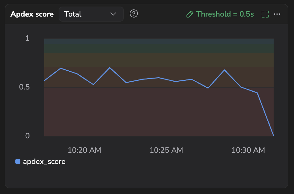
Application Performance Index (Apdex) is a standardized metric used to measure and quantify user satisfaction with the response time of software applications. It provides a numerical score on a scale of 0 to 1, mapped to five satisfaction tiers: Unacceptable (0–0.5), Poor (0.5–0.7), Fair (0.7–0.85), Good (0.85–0.94), and Excellent (0.94–1).
Apdex takes into account the response time threshold, categorizing user interactions as satisfied, tolerated, or frustrating based on a predefined performance threshold. This metric is particularly valuable for organizations and developers in assessing and optimizing application performance, as it offers a concise and standardized way to communicate and benchmark user satisfaction with application responsiveness.
How it works
An Apdex score is calculated using a simple formula that involves defining a response time threshold and then categorizing "Satisfied" user requests based on those thresholds. The formula is as follows:

In this formula, request satisfaction is categorized as follows:
-
Satisfied requests: The response time is less than or equal to T (Threshold).
-
Tolerated requests: The response time is greater than T and less than or equal to 4T.
-
Frustrated requests: The response time is greater than 4T or the request returns a server-side error (not shown in the formula).
-
Total requests: The total number of requests.
Configure response time threshold
The threshold (T) is used to calculate Apdex and classify requests as satisfactory (≤ T), tolerated (> T and ≤ 4T), or frustrated (> 4T). For example, if T = 2 seconds, then 0–2s is satisfactory, 2–8s is tolerated, and ≥ 8s is frustrated. Apdex then produces a score from 0 to 1, where values closer to 1 indicate higher user satisfaction.
For example, if the threshold is 0.5 seconds (default value), it produces the following response times:
-
0 - 0.5 seconds: Satisfied
-
0.51 - 2 seconds: Tolerated
-
2+ seconds: Frustrated
To configure response time threshold for your service:
-
In your Coralogix toolbar, navigate to APM, then Service Catalog.
-
Select a service to view the Overview widgets.
-
From the Apdex score widget, select Threshold.
-
Select the threshold and unit for the Apdex score.

The Latency graph shows your selected threshold along with the P99, P95, P75 and Average latencies, enabling you to see how the threshold compares with the current latency of your service.
This graph offers a clear context to evaluate the appropriateness of your threshold. For instance, setting a threshold of 5 seconds for services with a p99 latency of 1 second can be overly tolerant, indicating a need for a more stringent threshold.
-
Select Save changes.
Reading the Apdex score chart
The Apdex score widget plots your service's Apdex over the selected timeframe on a fixed 0 to 1 axis, so the score is always shown in full context instead of zoomed to a narrow range. Colored quality bands sit behind the line to show how the current score compares against the satisfaction tiers (from Unacceptable to Excellent) and hovering any point shows the exact score alongside its quality rating, for example Fair or Good.
Apdex details
Open the Apdex details panel from the Apdex score widget: select the ellipsis, then View details. The panel breaks the score down and shows which operations affect it most.
The panel header shows the service name, its Current apdex score, and the Threshold (for example, Threshold = 500ms).
Apdex count buckets over time
This chart plots how many requests fell into each Apdex rating band over the selected timeframe, as a stacked bar per time bucket, so you can see how the mix of ratings shifts. It has three series, colored by band:
- Satisfied (green): response time at or under the threshold (
≤ T). - Tolerating (orange): response time between the threshold and four times it (
T–4T). - Frustrated (red): response time over
4T, or any request that ended in an error.
The legend embeds the current threshold: at the default 500 ms threshold the bands read Satisfied ≤500ms, Tolerating 500–2000ms, and Frustrated >2000ms or error. Hover a bar to see each band's request count for that time bucket.
The chart shows No Apdex data to display when the service has no Apdex data for the range, or when its latency histogram has no buckets aligned to the threshold, so requests can't be rated.
Top incoming operations
A table of the operations that most affect the service's Apdex score, transactions with the largest impact on this service's Apdex score, sorted worst-first. Use the search box to filter by operation name. The table shows:
| Column | What it shows |
|---|---|
| Name | The operation name. |
| Method | The request method, where applicable (for example, GET or POST). |
| Impact | The operation's impact on the service's Apdex score. The table is sorted by this column, worst-first, by default. |
| Total Time Spent | The operation's total time consumed over the timeframe. |
| Requests/s | Requests per second. |
| Total Requests | Total requests over the timeframe. |
| Error rate | Errors as a share of the operation's requests. |
| Errors/s | Errors per second. |
| Avg latency | Average response time. |
| P95 latency | 95th-percentile response time. |
Select an operation to open its operation drilldown, with its latency, success and error counts, and individual spans.
When Apdex cannot be calculated
If your service's duration histogram is missing the threshold bucket (le=T) or its 4× counterpart (le=4T), the Apdex score widget cannot run the calculation and shows an empty state in place of a score.
To resolve this, configure your collector so both T and 4T are present in the histogram bucket list. For the full setup, see Apdex settings under Span Metrics configuration.
Next steps
Compare Apdex across releases by enabling Group by service version.