Service Governance
Service Governance gives each APM service its own ingestion budget across the 16 APM spanmetrics. You manage and investigate it in the APM Metrics tab of the Metrics Usage Analyzer, which adds the service dimension to per-metric measurements you already have in the All metrics tab. Throughout the tab, Cardinality and Time series refer to the same value.
Service explosions
A service explosion is a sudden, large growth in the number of unique time series a single service produces, and the most common cause of an unexpected APM cost spike. Without per-service limits, a runaway service can exhaust the account's APM ingestion budget and spill into other services' data. Service Governance contains the damage: when a service trips its per-service limit, Coralogix throttles only that service, and the account's overall quota stays safe.
Before per-service governance, a rogue label on a single service exhausted the account's trace billing units, caused an APM outage for the affected metric across the account, and took down other services that shared the metric (noisy neighbor). Service Governance prevents that by splitting APM usage and limits per service:
- Per-service attribution. Coralogix tracks each service's share of APM volume, time series, and units independently, so the source of any spike is obvious.
- Per-service limits. Each service has its own APM usage budget across all 16 APM spanmetrics. When a service hits its limit, Coralogix limits only that service's data. Every other service keeps reporting at full resolution.
Common causes
- Unsanitized labels. High-cardinality label values such as raw URL paths in
span_name, user IDs, request IDs, or trace IDs that vary on every request. A single unsanitized field can turn a single time series into thousands within minutes. - Newly added labels. A new attribute added to spans is the most common cause of an overnight time series jump, especially when the label takes many distinct values.
- High-cardinality dimensions. Labels such as
pod_name,operation, orcustomer_idthat scale with deployment size, traffic, or customer count. These are sometimes intentional, but rarely worth the cost without a query that filters on them.
Impact
When a single service produces a runaway label, it can:
- Consume a disproportionate share of the account's APM ingestion budget and billing units.
- Trip the per-service limit, after which Coralogix writes the service's data straight to the archive instead of the live store.
- Slow queries and dashboards that fan out across the inflated time series count.
Use the APM Metrics tab to see how each service is tracking against its limit. Service Governance helps observability teams:
- Track APM volume and cost per service.
- Find services approaching their per-service limit and act before they reach it.
- Compare services to prioritize cleanup.
What you need
- The
METRICS.DATA-ANALYTICS#HIGH:READpermission.
Open the APM Metrics tab
- Go to Settings, then select Metric data.
- Select the APM Metrics tab.
- Use the date picker to select a day. The current day is the default.
- Select Share to copy a permalink to the current view.
Review top-level usage
Three summary charts aggregate ingestion across every APM service on the selected day, so a spike there signals account-wide pressure even before you know which service is responsible. Use the charts to understand how APM volume and time series count change over time:
-
Total samples: Metric data points ingested on the selected day.
Use this chart to spot ingestion spikes or drops that might indicate deployment issues, noisy services, or unexpected increases in span volume.
-
Total cardinality: Unique time series on the selected day.
Use this chart to detect sudden growth in time series count, often caused by new services, unsanitized labels (for example, raw URL paths in
span_name), or dimensions that produce many time series. -
Total units: Billing units generated on the selected day.
Use this chart to see how ingestion or time series changes influence your cost. A spike in units without a matching spike in samples often points to a small number of services producing excessive time series.
Hover any bar to see the exact value for that day.
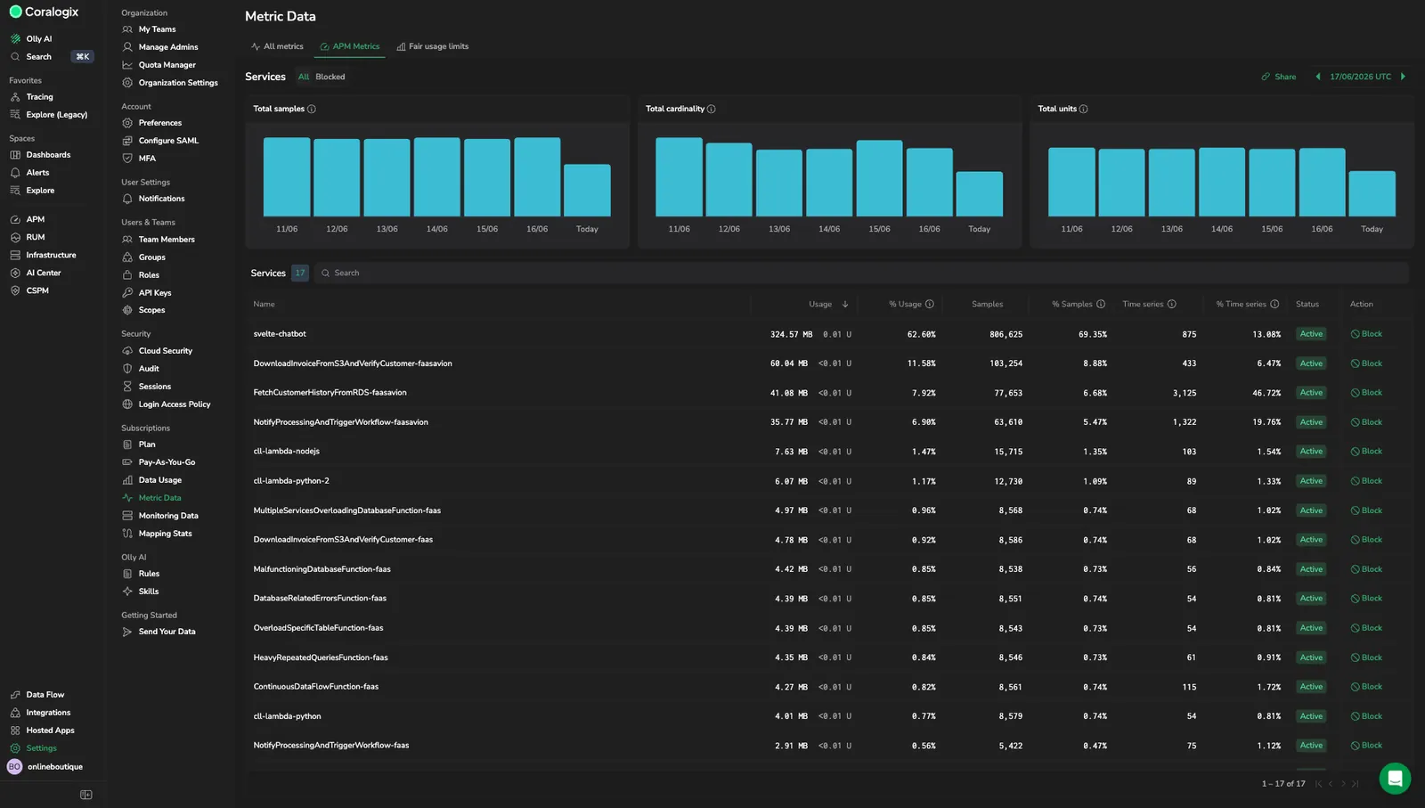
Explore the Services table
The Services table attributes APM volume, time series, and units to each service that emitted APM data on the selected day, so the source of any account-level spike is a single row away. A single service that starts producing a runaway label appears as an outsized share of the account total before it eats into the account's trace budget or trips its per-service limit.
Use the All and Blocked sub-tabs above the table to switch between every service and the services you have manually blocked:
- All: every service that emitted APM data on the selected day.
- Blocked: only services that are currently blocked. Use this view to confirm what is currently stopped and to unblock a service when you are ready to let it emit metrics again.
The table includes the following fields:
-
Name: The
service_namelabel value. -
Status: The service's current limit state. Use this to spot services that are approaching or have already exceeded their service-level limit.
-
Action: The Block button stops the service from emitting APM metrics. See Block or unblock a service for the full flow.
-
Usage: Aggregate data volume (in GB or TB) and billing units across all 16 APM spanmetrics for this service.
Use this column to identify services that consume the most storage or cost.
-
% Usage: This service's share of total APM usage across all services.
Use this to compare the relative cost impact of each service.
-
Samples: Total sample count for this service across all 16 APM spanmetrics.
Use this to understand ingestion volume and confirm whether high-unit services truly have high sample counts.
-
% Samples: This service's share of total APM samples across all services.
-
Time series: Total unique time series across all 16 APM spanmetrics for this service.
Use this to locate services that contribute most to your APM time series footprint. This is the key metric for service-level time series limits — configure them under Fair usage limits, in the APM service level limits section.
-
% Time series: This service's share of total APM time series across all services.
Use this to rank services by their impact on time series count.
Use the Search field to filter services by name. Sort any column by selecting its header. The default sort is by Usage descending — highest-usage services appear first.
Investigate and optimize APM ingestion
Use the Services table to:
- Rank services by cost. Sort by Usage or % Usage to find the highest-cost services.
- Identify high-time-series services. Sort by Time series or % Time series to see which services create the most time series.
- Spot outliers. A small number of services often account for a disproportionate share of time series. Look for services whose share of samples is in the single digits but whose share of time series is in the double digits.
Drill into a specific service
Once a service stands out in the Services table, the drilldown isolates its contribution so you can find the specific metric driving the spike. Select any row in the Services table to open the service drilldown. The drilldown header shows the service name, total Cardinality, total Usage (GB and units), and total Samples on the selected day, along with a date picker.
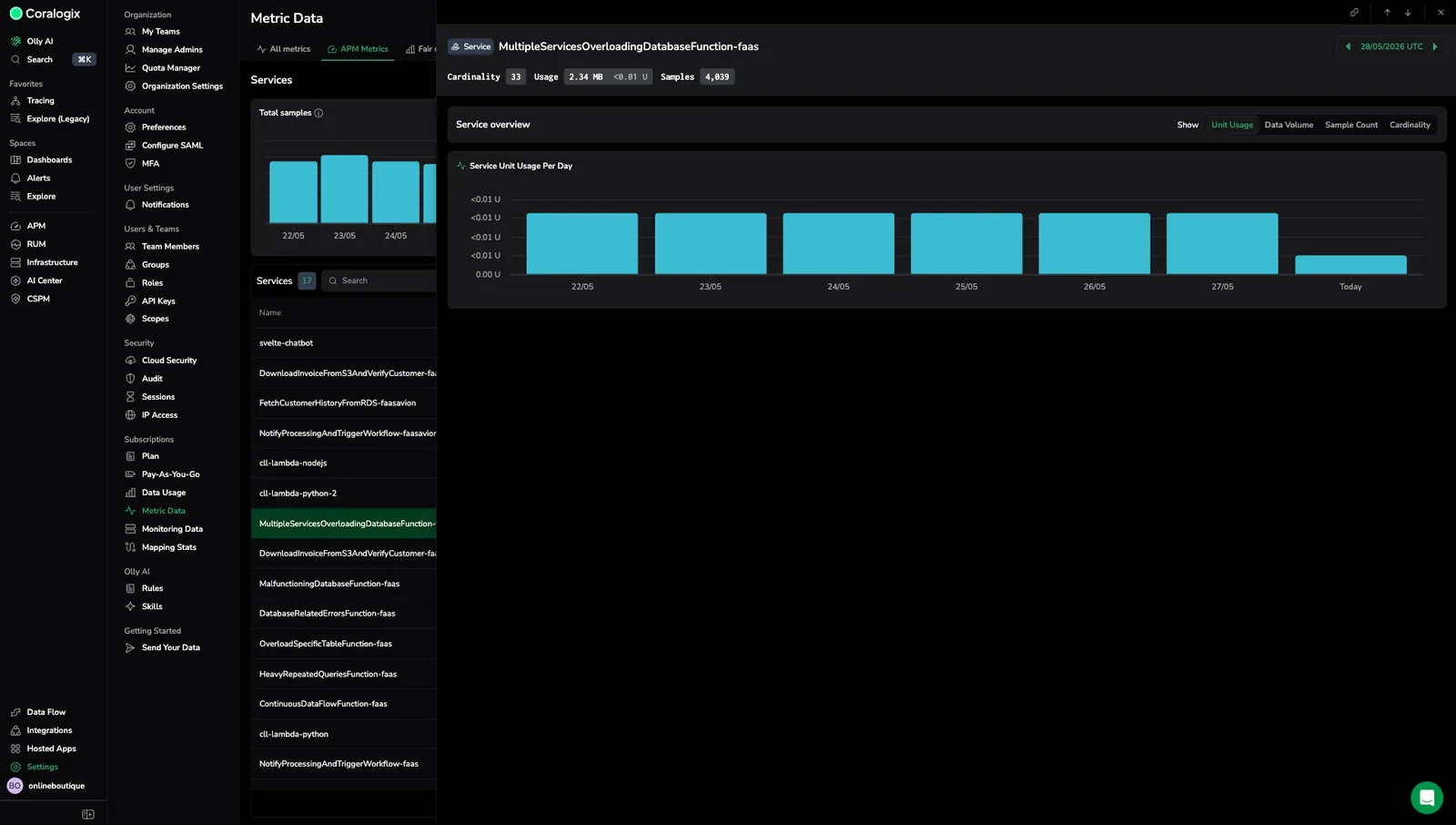
The Service overview panel visualizes daily ingestion trends for the service.
Use the Show toggle to switch the unit displayed across all charts:
- Unit Usage: Billing units per day.
- Data Volume: Bytes ingested per day.
- Sample Count: Data points per day.
- Cardinality: Unique series per day.
The drilldown includes a Service [mode] Per Day panel: a bar chart showing the selected mode aggregated across all 16 APM spanmetrics for this service, broken down by day.
Use the drilldown to:
- Detect ingestion spikes or drops on a specific day.
- Compare trends across modes. For example, a cardinality climb without a matching sample-count climb often indicates a label-value explosion.
Block or unblock a service
Blocking a service stops it from emitting APM metrics, so a runaway service can no longer consume ingestion budget or inflate time series counts while you investigate. Use this when a service is producing a known label explosion that you cannot fix immediately at the source.
To block a service:
- In the Services table, find the service in the All sub-tab.
- In the Action column, select Block on that row.
The service moves to the Blocked sub-tab and stops emitting APM metrics across all 16 spanmetrics.
To unblock a service:
- Open the Blocked sub-tab.
- Locate the service and select Unblock on its row.
The service resumes emitting APM metrics on the next ingestion cycle.
Blocking applies to APM spanmetrics only. It does not change the data the service sends to other Coralogix surfaces such as traces, logs, or non-APM metrics.
Troubleshooting
To remediate a service explosion once you have spotted it in the Services table or the service drilldown:
- Identify the source. Sort the Services table by Time series or % Time series to locate the service driving the spike. Outliers usually have a single-digit share of samples but a double-digit share of time series.
- Open the service drilldown. Use the Service [mode] Per Day panel to confirm whether ingestion volume or cardinality is driving the climb. A cardinality climb without a matching sample climb almost always points to a label-value explosion.
- Sanitize the label. Strip user / request / trace IDs from label sets unless a real query filters on them. Replace raw URL paths in
span_namewith normalized templates. - Drop dimensions you don't query. Use Coralogix recording rules to remove labels that don't carry analytical value before they ingest.
- Verify against the limit. Return to the Services table and watch the Status column. As ingestion settles, the service moves back under its per-service limit.
See Service explosions for the causes and impact behind each step.
Limitations
- The APM Metrics tab covers only the 16 APM spanmetrics. For other metrics, use the All metrics tab.
Limit enforcement
Coralogix enforces service-level APM limits automatically. When a service exceeds its limit, the service writes straight to the archive. Use the limita.labsViolation dataset to continue the workflow.