Cursor
The Cursor dashboard has three tabs: Overview, Usage, and Users. Every figure is derived from Cursor's own usage data over the time range and filters you've set.
Before the dashboard shows data, set up the integration — see Connect Cursor.
Overview
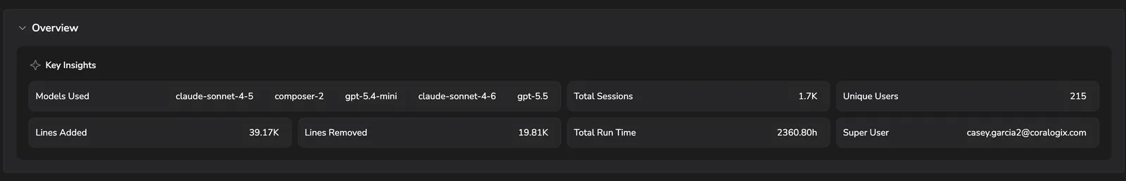
A snapshot of how Cursor is being used across your org — models in use, total sessions, unique users, lines added and removed, total run time, and your super user.
Usage
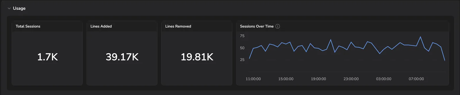
- Total sessions, Lines added, Lines removed — headline counters for the period.
- Sessions over time — when sessions peaked across the window.
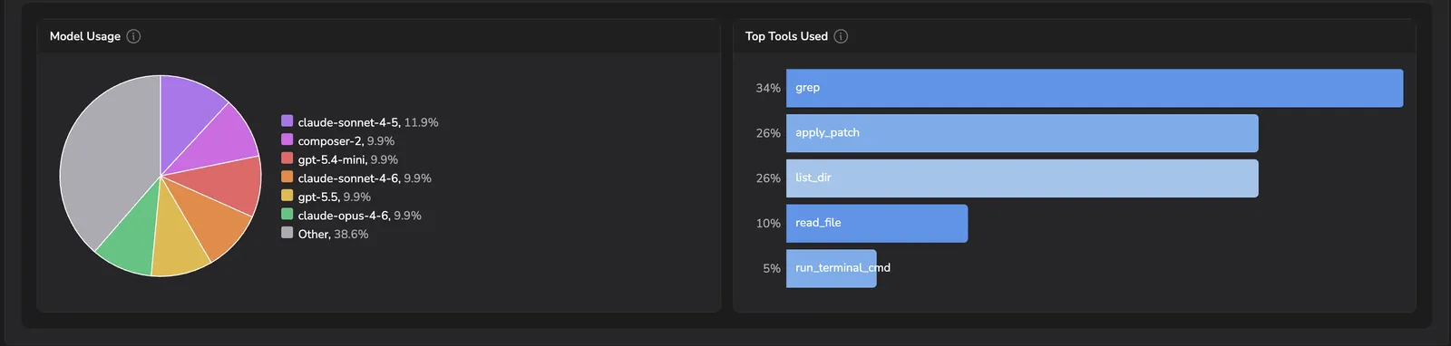
- Model usage — share of sessions by model. Confirm usage sits on the models you intend.
- Top tools used — the tools Cursor invoked most across sessions.
Users
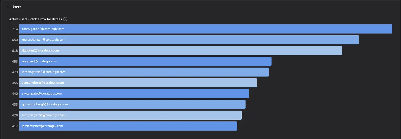
Active users ranked by activity. Select any row to drill into that user's session activity and code output.
Last updated on