Runtime metrics
The Runtime tab in the APM entity drilldown displays JVM runtime metrics - heap memory, garbage collection, thread states, CPU usage, and class loading - alongside service latency. It correlates JVM internals with user-facing performance, so you can diagnose memory leaks, GC pressure, and thread contention without leaving APM.
Use it to:
- Catch a memory leak: watch the live set (heap after GC) climb over time to confirm a leak before it causes an out-of-memory crash.
- Diagnose GC pressure: correlate garbage-collection pause spikes with the latency your users feel.
- Find thread contention: spot blocked or waiting threads behind a stalled service.
- Isolate one bad pod: use the JVM instances filter and the per-instance heatmap to find the single instance dragging down the fleet.
Why it matters
When a Java service slows down, throws errors, or pegs CPU, the cause is often invisible from traces and span metrics alone. The usual suspects - long GC pauses, heap exhaustion, thread contention, classloader leaks - happen inside the JVM, one layer below where APM normally looks.
The Runtime tab pulls JVM internals onto the same screen as your traces, so you can:
- Tie latency spikes to GC pauses. The Service latency vs pauses widget overlays GC events on request latency. If a spike lines up with a pause marker, you have your answer.
- Tell a memory leak apart from normal allocation pressure. Three separate memory widgets (Heap used vs memory, Live set - memory after GC, Heap by pool) let you read the heap properly instead of guessing from a single line.
- Distinguish CPU saturation from lock contention. Looking at CPU usage and thread states side-by-side makes it obvious whether the service is busy doing work (CPU-bound) or stuck waiting (locks).
- Isolate one bad pod. The JVM instances filter and the per-instance heatmap let you find the single misbehaving instance dragging down the cluster average.
What you need
The Runtime tab reads only JVM metrics that follow the OpenTelemetry JVM semantic conventions - for example, jvm.memory.used, jvm.gc.duration, jvm.thread.count. Metrics that use other naming conventions (such as the Micrometer/Prometheus form jvm_memory_used_bytes) are not recognized and the tab does not show them. If your services emit JVM metrics under a different naming convention, migrate the instrumentation to the OpenTelemetry conventions before the tab can render data for them.
To make a Java, Scala, or Kotlin service report JVM metrics in the supported format:
- Attach the OpenTelemetry Java agent (
opentelemetry-javaagent.jar) to the service process. The agent collects all stablejvm.*metrics from the OpenTelemetry semantic conventions automatically. See Java OpenTelemetry instrumentation for installation steps, or follow Send JVM metrics for the end-to-end setup. - Required JDK: Java 8 or later for the stable metric set.
- The metrics must include the
service.nameresource attribute so they correlate with the service in the catalog.
The Runtime tab is available for services whose detected language is Java (JVM); databases never show it. How the tab behaves for other services depends on what Coralogix knows about the language, taken from the telemetry.sdk.language resource attribute:
- Known non-JVM language (Python, Go, Node.js, and so on): the Runtime tab is not shown at all.
- Language not yet determined: the tab remains, but displays Runtime metrics are available for Java services only.
- Java service not yet reporting
jvm.*metrics: the tab shows an empty state (see When no JVM metrics are detected) that points you to instructions for sending the metrics.
How JVM metrics reach the tab
The OpenTelemetry Java agent collects JVM metrics from your service and sends them to Coralogix tagged with service.name. The tab uses that tag to correlate the metrics to the service, and groups JVM instances by k8s.pod.name to render the per-instance panels.
Access the Runtime tab
- In your Coralogix toolbar, select APM.
- Select a Java service to open its drilldown.
- Select the Runtime tab.
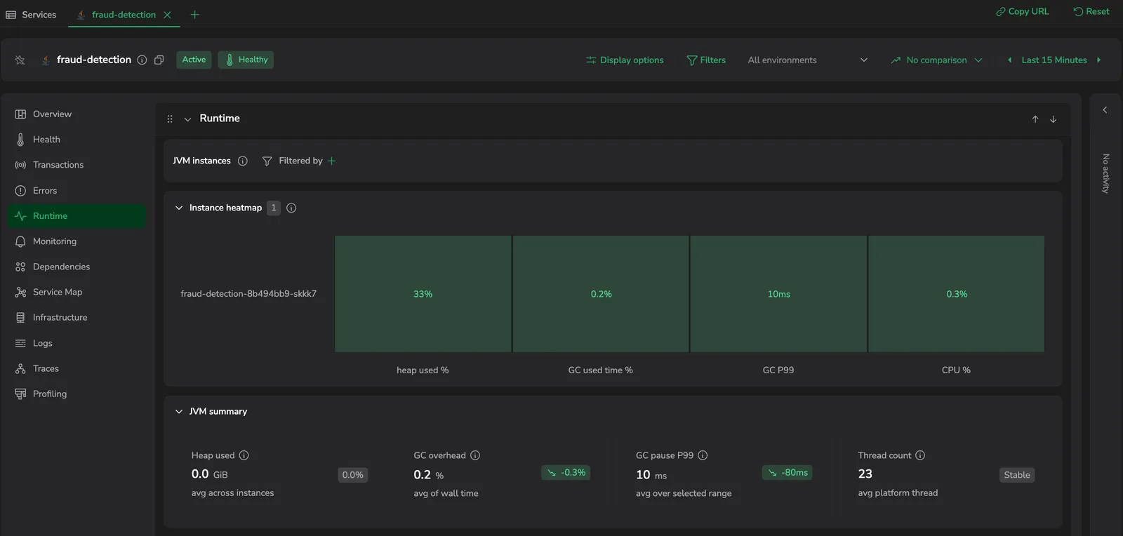
The tab loads with the default time range. A JVM instances control bar sits at the top, above a set of collapsible sections - Instance heatmap, JVM summary, Memory, CPU, and GC.
When no JVM metrics are detected
If you open the Runtime tab for a Java service that has not yet started sending JVM metrics in the OpenTelemetry format, the tab loads with an empty state instead of the widget grid. The empty state explains what JVM metrics unlock and lists the setup steps, with a Start now button that opens the Send JVM metrics guide in a new tab.
The tab continues to show the empty state until at least one jvm.* metric is observed for the service in the current time window. Once metrics start flowing, the widgets render automatically - no configuration change is needed inside the tab itself.
A service running a known non-JVM language (such as Python or Go) does not show the Runtime tab at all. The empty state is reserved for Java services that are eligible to report jvm.* metrics but have not yet done so.
Layout
The Runtime tab is organized top to bottom as:
- JVM instances: a control bar that scopes every panel below it to a subset of running JVM instances.
- Instance heatmap: a row that shows the health of each instance at a glance.
- JVM summary: four stat cards spanning full width.
- Memory: Heap used vs memory, Live set - memory after GC, Heap by pool.
- CPU: JVM CPU utilization, Thread count by state, Class loading.
- GC: GC pause duration, GC event count, Service latency vs pauses.
The five content sections (Instance heatmap, JVM summary, Memory, CPU, GC) are collapsible cards; the JVM instances control bar is always visible. When a section is collapsed it keeps its at-a-glance signal: the JVM summary cards collapse into chips that still show their current value and trend, and the Memory, CPU, and GC headers show their widget titles as chips.
Hovering any chart syncs the crosshair across the other widgets in the tab, so you can correlate the same point in time across memory, CPU, and GC at once.
Card controls
Every chart card exposes the same two affordances on hover:
- A controls menu (the pencil) whose options depend on the chart: a Chart type and Stacking control on the charts that support them, a Scale control (linear or logarithmic) on the single-axis charts, and a Time bucket selector on every chart. The scale and time bucket apply across the whole section, so the charts stay at one resolution; chart type and stacking are set per chart.
- A card menu with View query (opens the underlying query) and Open in Metrics Explorer (opens the chart's queries in the Metric Explorer).
JVM instances
The JVM instances control bar sits at the top of the tab and scopes every widget to a subset of the running JVM instances. It is a filter builder keyed on the instance (pod): by default no instance is selected, so every widget aggregates across all instances reporting metrics for the service.
JVM metrics are emitted per JVM process. In a horizontally scaled service, every pod runs its own JVM, and aggregate values hide the most common failure mode - one bad instance. A memory leak on a single pod, GC pauses isolated to one instance, or a thread leak on one node is invisible in the aggregate view until the pod fails. The selector lets you narrow to one suspect instance and compare it against the rest of the fleet.
Selecting one or more instances filters every widget below to just those instances. Leave the filter empty to keep the aggregated, fleet-wide view. To compare instances side by side, use the instance heatmap below, which shows one row per instance.
Instance heatmap
Below the instances control bar is a collapsible per-instance overview. When expanded, it renders a compact grid with one row per JVM instance (pod) and four columns - heap used %, GC used time %, GC P99, and CPU %. Each cell is color-coded by severity (green, amber, red), so an instance that is misbehaving on any single dimension is visually obvious without selecting each instance one by one.
| Column | Source | Severity rule |
|---|---|---|
| heap used % | jvm.memory.used ÷ jvm.memory.limit | Green at low utilization, amber as it climbs, red at sustained high utilization |
| GC used time % | Share of wall time spent in GC pauses, from jvm.gc.duration | Green when the JVM spends little wall time paused for GC; red when pauses dominate |
| GC P99 | 99th-percentile jvm.gc.duration | Green for short pauses, red for long pauses |
| CPU % | jvm.cpu.recent_utilization | Green at low utilization, amber as it climbs, red near saturation |
Selecting any row filters every widget below it to that instance. The heatmap shows five instances per page; use the paginator below it to step through larger fleets.
JVM summary
The summary strip displays four headline numbers an on-call engineer checks first. Each card shows an aggregated current value with a short context line and a directional delta versus the previous equivalent window (↗ red = worsening, ↘ green = improving, - neutral).
| Card | What it measures | Card subtitle |
|---|---|---|
| Heap used | Heap currently allocated (jvm.memory.used, summed across heap pools), with the percentage of the configured limit | avg across instances |
| GC overhead | Percentage of wall time the JVM was paused for garbage collection | avg of wall time |
| GC pause P99 | 99th-percentile garbage-collection pause duration, taken at the service level over the selected range | avg over selected range |
| Thread count | Total platform threads (jvm.thread.count) | avg platform thread |
What to look for:
- A red ↗ trend arrow on any card means the metric got worse since the previous window: cross-check with the detailed widgets below to see what is driving it.
- Heap used climbing toward the heap limit is a pre-OOM warning.
- GC overhead above a few percent is unhealthy: the JVM is losing meaningful wall time to GC. Drill into GC pause duration and GC event count to see whether long pauses or frequent collections are responsible.
- GC pause P99 rising means tail pauses are stretching, which directly hurts user-facing latency. Confirm against Service latency vs pauses.
- Thread count drifting up without matching traffic growth is a thread leak. A sudden drop usually means a thread pool was resized at deployment.
Two cards surface contextual badges when a specific signal appears:
- GC overhead shows a Driven by pod badge when one instance is responsible for most of the GC overhead: flags a single bad pod without needing to expand the heatmap.
- Thread count shows a Stable badge when the thread count is steady across the window: confirms no thread leak or runaway pool growth.
The GC overhead card reports the percentage of wall time the JVM was paused for garbage collection. It is not the same as CPU consumed by GC. Concurrent collectors such as ZGC and Shenandoah can spend significant CPU on garbage collection while showing low values here, because they do most of their work without stopping application threads.
Memory
The Memory row answers three distinct questions, each on its own widget: how much memory is the JVM using, how much is retained after each garbage collection, and how is that usage distributed across heap pools.
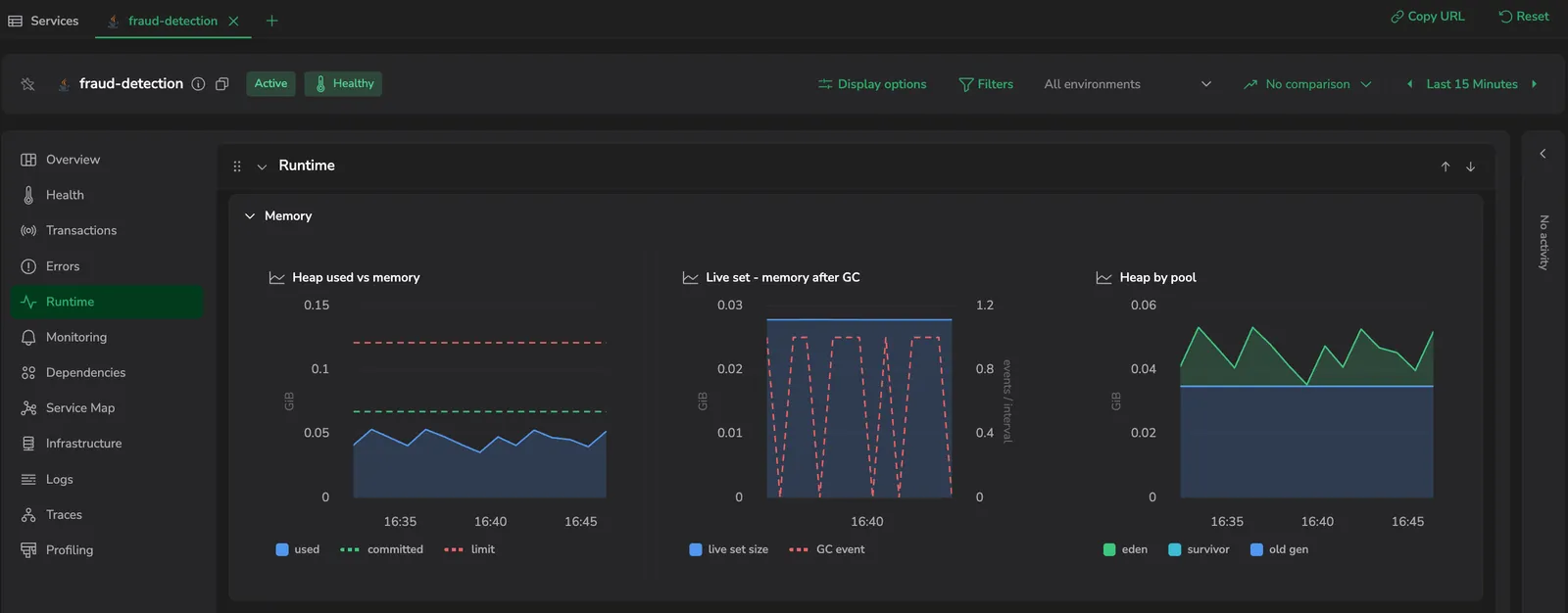
Heap used vs memory
Tracks heap memory over time. Y-axis: GiB, single axis, floored at zero. Underlying data: jvm.memory.*.
| Series | Source | Style | What it shows |
|---|---|---|---|
| used | jvm.memory.used | Filled area | Currently allocated heap |
| committed | jvm.memory.committed | Dashed line | Memory the OS has reserved for the JVM |
| limit | jvm.memory.limit | Dashed reference line | Heap ceiling (-Xmx) |
What to look for:
- The gap between used and limit is your headroom before an out-of-memory error.
- The gap between used and committed is memory the OS has reserved but the JVM is not using yet. A shrinking gap under load is an early warning that the JVM is running out of slack.
For leak detection, use Live set - memory after GC instead - the used line bounces with every GC cycle, which makes trends hard to read.
Live set - memory after GC
The cleanest signal of a memory leak. This is a dual-axis chart: the live set is a filled area on the primary axis (GiB, floored at zero), and GC events are drawn as a dashed line on a secondary axis (events / interval). Underlying data: jvm.memory.used_after_last_gc summed across heap pools, with the GC event rate derived from jvm.gc.duration.
| Series | Source | Axis | What it shows |
|---|---|---|---|
| live set size | jvm.memory.used_after_last_gc | Primary (GiB) | Memory retained after the most recent GC |
| GC event | Derived from jvm.gc.duration | Secondary (events / interval) | How often GC fired |
What to look for:
- A roughly flat baseline means the service is healthy under steady load: the GC is reclaiming whatever is not needed.
- A rising staircase, where the live set settles higher after each collection, means more memory is being retained after every GC cycle. That is the classic leak pattern.
Heap by pool
Breaks heap usage down by memory pool. Style: stacked area (switch chart type and stacking from the card's controls). Y-axis: GiB, floored at zero. Underlying data: jvm.memory.used split by memory pool, filtered to the heap.
Pool names depend on the active GC algorithm - G1, ZGC, Shenandoah, and Parallel GC each report different pool sets. The widget shows whatever pools the JVM reports; the common three are:
| Series | What it shows |
|---|---|
| eden | Short-lived allocations |
| survivor | Objects that survived at least one minor GC |
| old gen | Long-lived objects |
What to look for:
- eden is where new objects are allocated. It should rise and fall quickly with each young-generation collection: that is normal.
- old gen holds long-lived objects. If it climbs steadily and never drops back down, the service is heading toward an out-of-memory error.
- survivor holds objects that survived at least one collection. If it stays unusually large, the JVM is keeping objects around longer than expected before promoting them to old gen.
CPU
The CPU row separates JVM CPU consumption, thread state composition, and class-loading activity into three widgets so each signal is readable on its own axis.
JVM CPU utilization
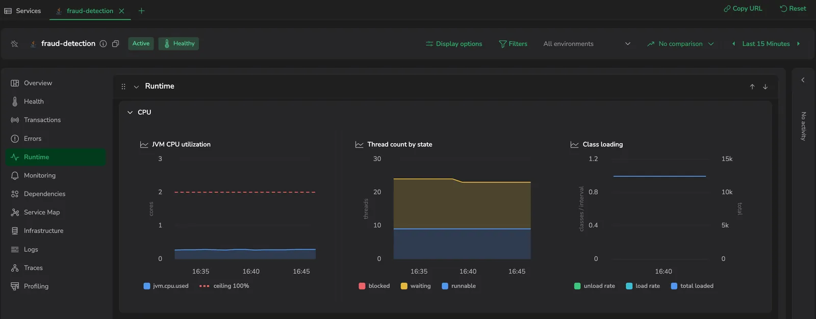
Style: filled area with a reference line. Y-axis: cores (CPU usage expressed in core-equivalents), floored at zero. A 100% ceiling reference line marks the total available cores, so the saturation point is always in view.
| Series | Style | What it shows |
|---|---|---|
| jvm.cpu.used | Filled area | CPU consumed by the JVM process, in core-equivalents |
| 100% ceiling | Dashed reference line | Total available cores - the saturation ceiling |
What to look for:
- Usage hitting the 100% ceiling line combined with mostly runnable threads in the next widget means the service is CPU-bound: typically a hot loop or heavy compute.
- Usage well below the ceiling with a high blocked thread share means the service is stuck waiting on locks, not doing work.
Thread count by state
Style: stacked area or columns (switch from the card's controls). Y-axis: threads, floored at zero. Underlying data: jvm.thread.count grouped by thread state.
| Series | Source | What it shows |
|---|---|---|
| runnable | jvm.thread.count, state = runnable | Threads currently running or ready to run |
| waiting | jvm.thread.count, state = waiting | Threads waiting on another thread or condition |
| blocked | jvm.thread.count, state = blocked | Threads waiting to acquire a monitor lock |
The stacked composition matters as much as the total height.
What to look for:
- A healthy service usually shows most threads in runnable (doing work) or waiting (idle between requests).
- A spike in blocked threads means lock contention: threads are queued up waiting on a monitor.
- A growing total stack height over time without matching traffic growth is a thread leak.
Class loading
Style: stacked bars with a line on a secondary axis. Y-axis: classes / interval (left), total (right). Underlying data: jvm.class.loaded, jvm.class.unloaded, jvm.class.count.
| Series | Source | Style | What it shows |
|---|---|---|---|
| load rate | jvm.class.loaded | Bars | Classes loaded per interval |
| unload rate | jvm.class.unloaded | Bars | Classes unloaded per interval |
| total loaded | jvm.class.count | Line (secondary axis) | Currently loaded classes |
What to look for:
- The total class count should level off after the application warms up. If it keeps growing without an increase in load rate, you have a classic classloader leak: common in OSGi containers, plugin-heavy applications, or services that hot-reload code in production.
- Unload activity is normally near zero in a healthy JVM.
GC
The GC row separates pause duration from event frequency - they answer different questions and combining them on one chart obscures both signals - and pairs them with a latency overlay so GC pauses can be aligned with end-user impact.
GC pause duration
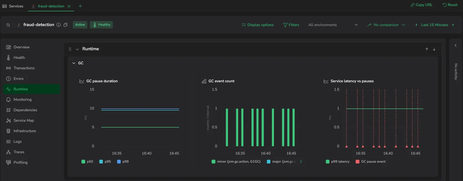
Three percentile lines of garbage-collection pause time. Y-axis: ms. Underlying data: jvm.gc.duration. When a service runs more than one collector, each percentile is taken as the maximum across collectors - a percentile from two collectors cannot be summed - so the chart shows one line per percentile, not one per collector.
| Series | What it shows |
|---|---|
| p50 | Median pause time |
| p95 | 95th-percentile pause time |
| p99 | 99th-percentile pause time |
What to look for:
- A widening gap between p50 and p99 means pauses are becoming unpredictable: most are short, but some run long. This usually points to a fragmented heap or a GC that is struggling to keep up with allocation.
GC event count
Garbage-collection events per interval, as stacked bars. Y-axis: events / interval. Underlying data: jvm.gc.duration event counts, split into minor and major collections.
| Series | What it shows |
|---|---|
| minor (jvm.gc.action, G1GC) | Minor (young-generation) collections per interval |
| major (jvm.gc.action, G1GC) | Major (full) collections per interval |
When the JVM reports jvm.gc.action, the widget uses it to separate minor from major collections. As with GC pause duration, it does not force a minor-vs-major split across collectors that do not have one.
What to look for:
- A high event rate with low pause durations (in GC pause duration) is healthy GC: collections fire often but finish quickly.
- A low event rate with high pause durations is the dangerous pattern: infrequent but expensive full GCs.
- A step-change in event rate at a deployment timestamp means the new code allocates more memory per request than the previous version.
Service latency vs pauses
Overlays service request latency with GC pauses so you can line the two up. Y-axis: ms (P99 request latency, floored at zero). Underlying data: P99 request latency from the service's span metrics, with jvm.gc.duration events marked on the time axis. Both series are scoped to the same service and time window as the rest of the tab.
| Series | Source | Style | What it shows |
|---|---|---|---|
| p99 latency | Span metrics for the service | Line | End-user request latency over time |
| GC pause event | jvm.gc.duration events | Vertical dashed markers on the time axis | Each GC pause, marked at the time it occurred |
Span metrics and JVM metrics live on the same platform, so no cross-system correlation is needed.
What to look for:
- A latency spike that lines up with a GC pause marker is GC-caused. The pause stopped all application threads, so any in-flight request piled up wait time during that window.
- A latency spike with no nearby pause marker is not GC-related. Look at downstream calls in Dependencies or lock contention in Thread count by state instead.
- A pause marker with no matching latency spike means requests were short enough, or concurrency low enough, that no request happened to span the pause.
Common use cases
| Symptom | Where to look first |
|---|---|
| Intermittent latency spikes, traces look fine | Service latency vs pauses: align spikes with GC pause markers |
| Service throws an out-of-memory (OOM) error intermittently | Heap used vs memory: check used approaching limit, then confirm in Live set - memory after GC whether the live set is rising |
| Memory never returns to baseline after deployment | Live set - memory after GC: a rising staircase after the deployment timestamp indicates a leak introduced in the new version |
| Service is slow but spans show low self-time | Thread count by state: high blocked share with low CPU in JVM CPU utilization is lock contention |
| CPU pegged at the ceiling but throughput is low | JVM CPU utilization combined with Thread count by state: runnable threads dominating with high CPU is a hot loop or a GC pressure spiral; cross-reference with GC pause duration and GC event count |
| Class count keeps growing | Class loading: total count rising after warm-up indicates a classloader leak |
| GC overhead jumped after a code change | GC event count: step change in bar height at deployment time means the new code allocates more per request |
Limitations
- JVM metrics are emitted at the JVM process level. Multiple deployed applications inside a single JVM (Tomcat, JBoss, WebLogic) cannot be visualized separately: heap usage, GC behavior, and thread counts reflect the entire JVM process.
- JVM instances are grouped by
k8s.pod.name. For services running outside Kubernetes, make sure each JVM reports a distinct per-instance attribute so instances don't collapse into one value: see Send JVM metrics. - Instances that have stopped reporting (terminated pods) are dropped from the filter selector once they no longer appear for the selected time range.
Next steps
If your service is not yet sending JVM metrics, follow Send JVM metrics to enable the OpenTelemetry agent's metrics exporter.