Services
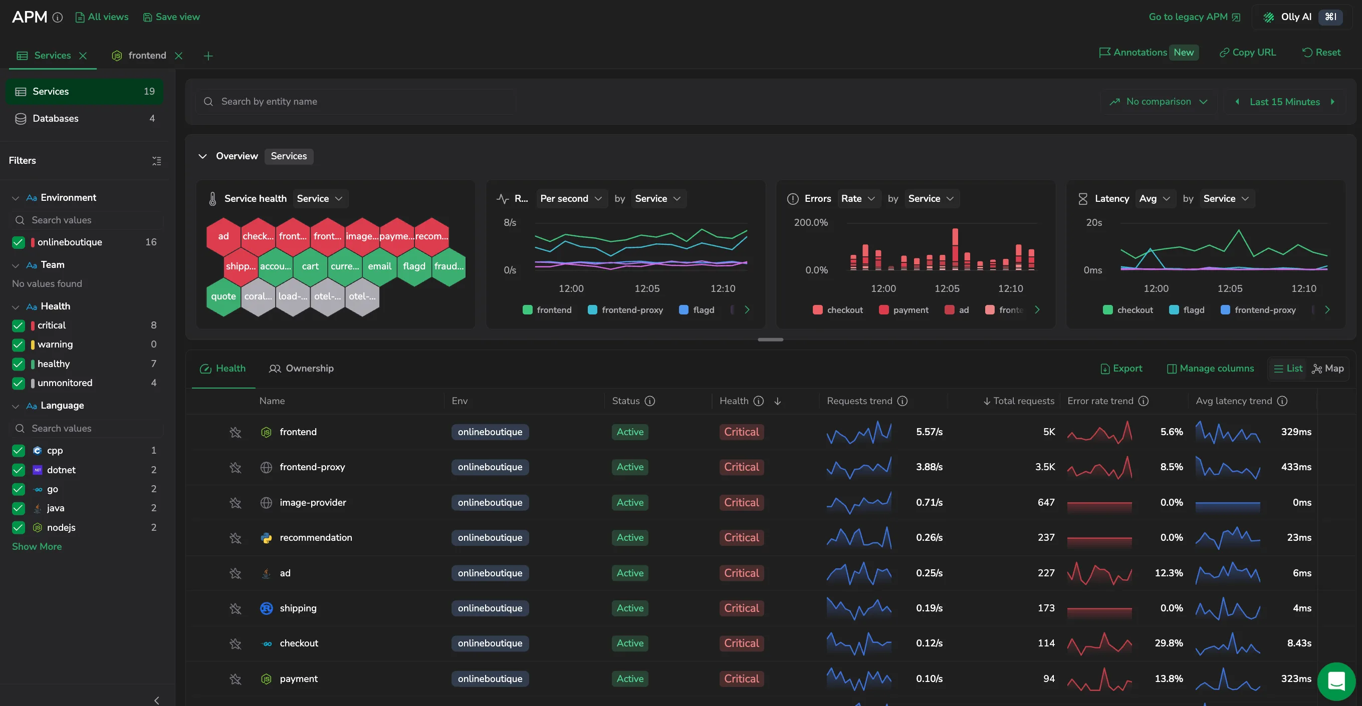
Services are the instrumented applications APM v2 monitors. The catalog opens on them - every instrumented service in a single table, with overview widgets above it that summarize request, error, latency, and health trends across the services in view. Switch the sidebar to Databases to see the databases your services query, covered in Databases. From the catalog you filter, sort, compare, and open any service to drill into its telemetry. The APM v2 header also links to Go to legacy APM, which opens the equivalent location in the legacy APM experience.
Use it to:
- Spot unhealthy services at a glance: sort by health to surface the services that are critical or warning right now.
- Focus on what you own: filter by team or environment to see only the services and databases you're responsible for.
- Compare across entities: rank services by request volume, error rate, or latency to find the busiest or most error-prone.
- Start any investigation: open an entity to drill into its traces, errors, and dependencies.
What you need
- Instrumented services that send spans to Coralogix. See the APM onboarding tutorial.
- Compact span metrics for your services. The new APM reads these to populate the Services catalog - regular Span Metrics alone is not enough. See Using compact Span Metrics.
- Compact database metrics for the Databases catalog. Without them, Services still work and Databases are unavailable - legacy APM remains available for databases.
Choose which entities to view
The sidebar switches the catalog between two scopes:
- Services: instrumented applications. This page covers the Services scope.
- Databases: database systems your services query. See Databases.
The overview widgets, table columns, and filters adapt to the selected scope.
Overview widgets
Above the table, four widgets summarize the entities currently in view - Service health, Requests, Errors, and Latency. Each reflects the active filters, environment, and time range. The Overview section is collapsible and opens collapsed by default, so the entity table sits at the top of the page; expand it to read the widgets, and a saved view or shared link can carry it open.
- Service health: one hexagon per entity, colored by its current health: critical, warning, healthy, or unavailable. Hover a hexagon to identify the entity; when there are too many entities or environments to show individually, the widget groups them by environment or by health.
- Requests: incoming request traffic per entity, as requests per second or a total count.
- Errors: failed requests per entity, as an error rate, a total count, or errors per second.
- Latency: response time per entity at the selected percentile (P50-P99) or as an average.
Widget controls
The Requests, Errors, and Latency widgets share a header row of controls, and the Service health widget offers a subset:
- Unit: how the metric reads - Requests as Per second or Count, Errors as Rate, Count, or Per second, and Latency as Avg or a percentile (P50-P99, multi-select to overlay several lines).
- Group by (by): split the series - Requests, Errors, and Latency by Service (Database in the Databases scope), Environment, or Version, and Service health by the same entity option, Environment, Team, or Health. Grouping Service health by Team draws one hexagon per team, with entities that have no owner under No team; if there are more than 500 teams, it falls back to grouping by health.
- Compare to: overlay a baseline from an earlier period. Choosing the previous period of equal length draws a comparison line on the chart, so you can spot meaningful changes in requests, errors, and latency; this comparison is available on every overview and drilldown chart.
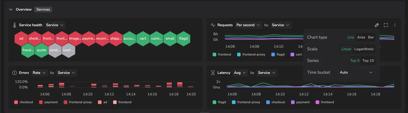
- Configure: open the configuration panel to set Chart type (Line, Area, or Bar), Scale (Linear or Logarithmic), Series (the top 5 or top 10 entities), and Time bucket (the aggregation interval, Auto by default). When a widget is configured away from the APM account default, it's flagged with a one-click Reset to APM default.
- Full view: expand the widget to fill the screen.
- More actions: Create alert on the metric, Open in Metrics Explorer to continue there, or View query to see the underlying query.
The entity table
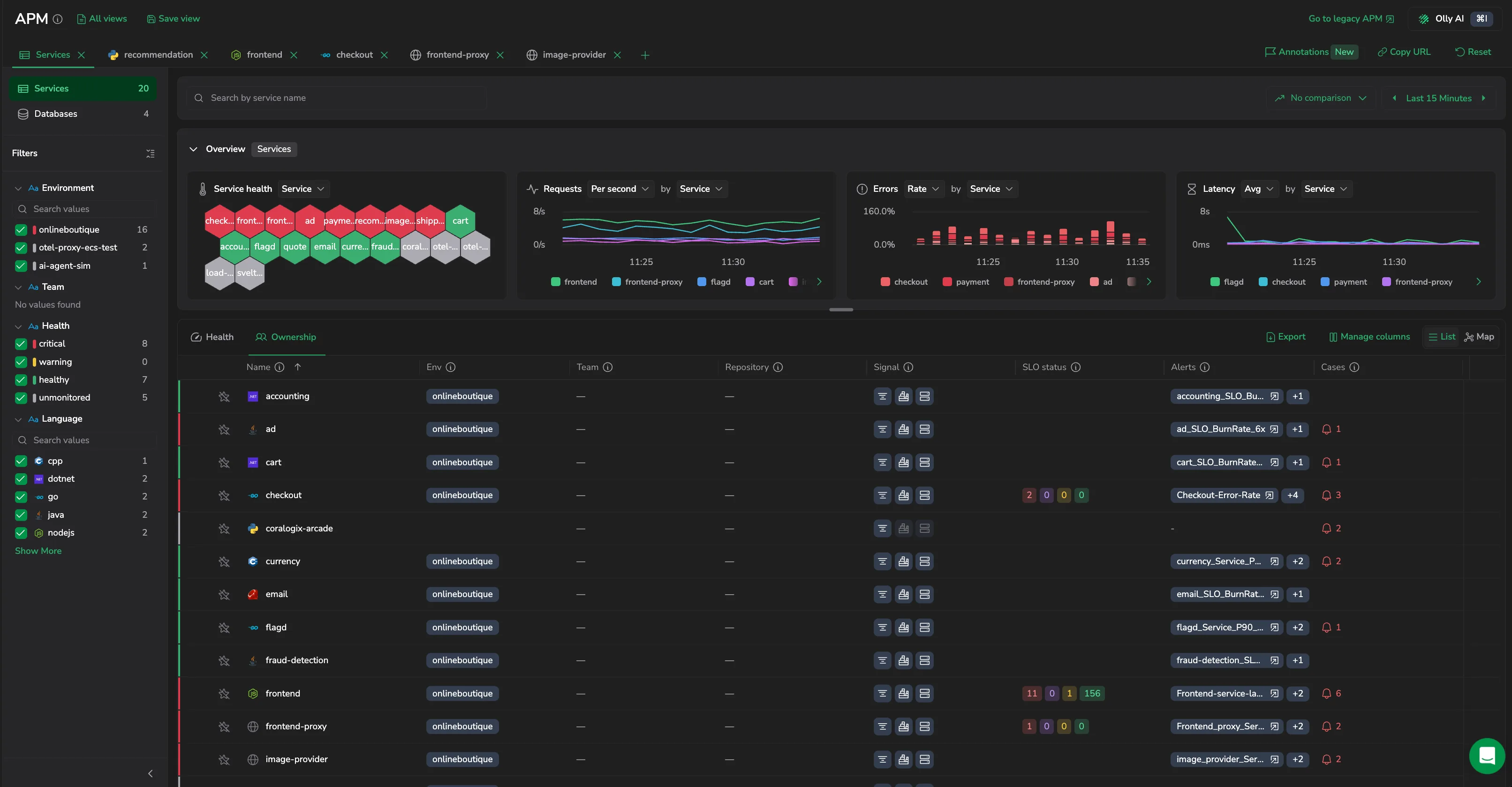
The table lists one row per entity. Two views organize the columns:
- Health: performance and health columns: requests, errors, latency, and health state.
- Ownership: attribution columns: team, environments, alerts, cases, and SLO status.
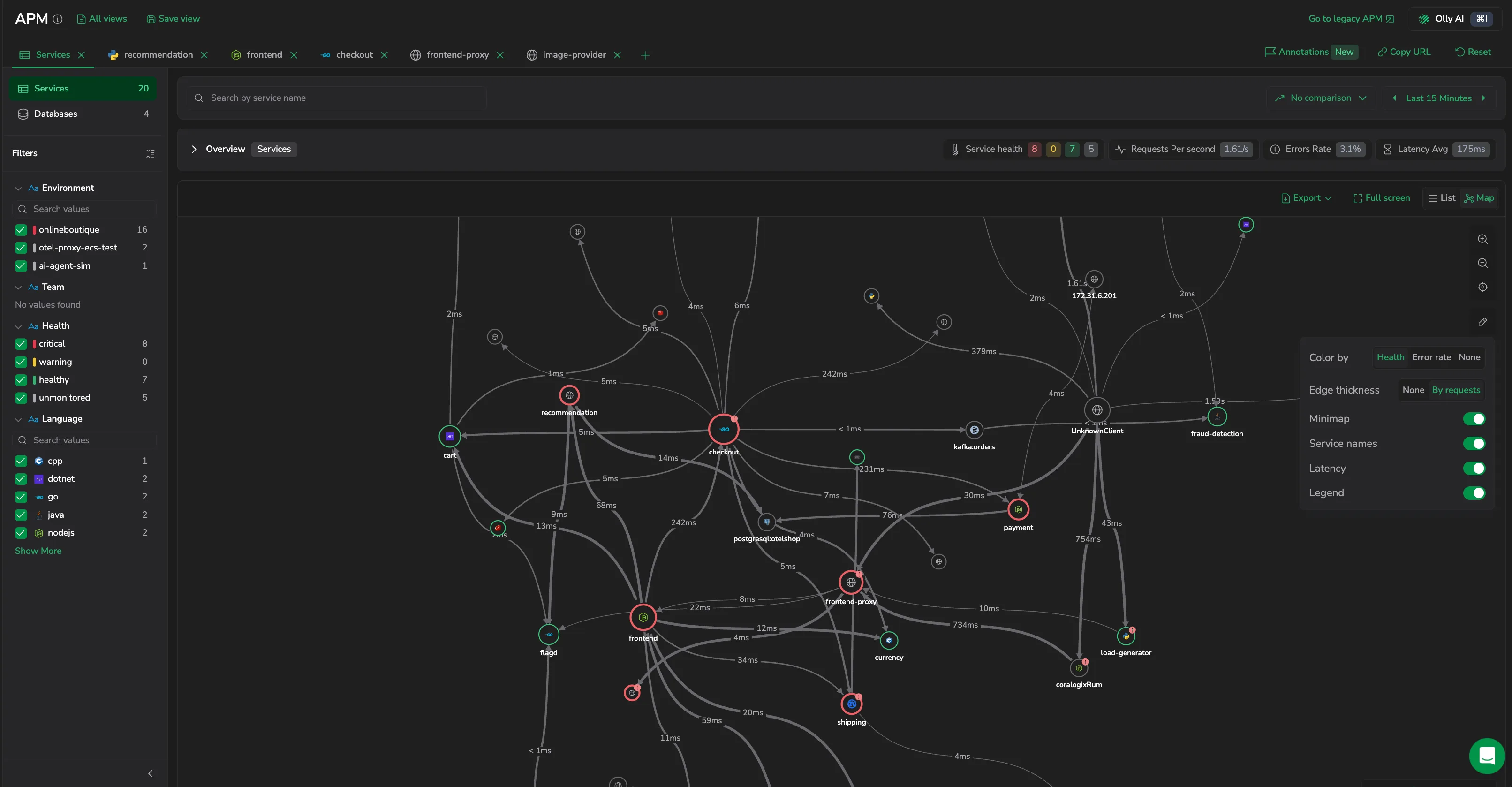
Switch between the List and Map views (top right) to see the entities as a table or as a service map. Select Export to download the current table, and use the star icon to add an entity to your favorites so it sorts to the top.
Select a row's actions menu (the icon) to jump to the entity's Logs or Traces drilldown section, to View on map (the Map view focused on that entity), or - for a service - to Add SLO or Create alert, each opening the matching create flow prefilled for the service.
Expand a service row to see its per-environment breakdown. Environment rows have their own actions menu, headed with the service name and the environment it covers. It offers the same actions as the service row, with two differences: View service opens the drilldown scoped to that one environment, and Create alert prefills the alert with that environment rather than the page's environment filter. View on map and Create SLO still act on the service, because neither is per-environment.
Columns
Select Manage columns to add, remove, and reorder columns. Availability depends on the entity type.
| Column | Applies to | Description |
|---|---|---|
| Name | Services, Databases | Entity name. Hover the cell to reveal a Copy service name (or Copy database name) button. |
| Env / Environments | Services, Databases | Environments the entity runs in. |
| Health | Services, Databases | Current health state. |
| Status | Services, Databases | Whether the entity is active or inactive in the selected range. |
| Requests | Services | Incoming request throughput, with an optional trend sparkline. |
| Incoming / Internal / Outgoing requests | Services | Request throughput split by direction. |
| Error rate | Services, Databases | Percentage of requests returning errors. The numeric column is hidden by default; the Error rate trend sparkline (on by default) carries the rate. Add the numeric column from Manage columns. |
| Internal / Outgoing error rate | Services | Error rate split by direction. |
| Total requests / Total errors / Total failures | Services, Databases | Cumulative counts over the range. |
| Avg latency | Services, Databases | Average response time, with an optional trend sparkline. |
| P95 latency | Services, Databases | 95th-percentile response time. |
| P50 / P75 / P90 / P99 latency | Services, Databases | Other response-time percentiles, added from Manage columns. |
| Throughput | Services | Requests processed per second. |
| Queries / Total queries | Databases | Query volume, with an optional trend sparkline. |
| Last seen | Services, Databases | When the entity last reported data. |
| Alerts | Services, Databases | Active alerts on the entity. |
| Cases | Services, Databases | Open cases linked to the entity. |
| SLO status | Services | Per-tier counts of the service's SLOs as colored badges - OK, Warning, Critical, and Breached. A service with no SLO shows a Create SLO button on hover (requires SLO-edit permission) that opens the create drawer prefilled. |
| Signal | Services, Databases | Coverage chips for Traces, Profiling, Infra, Transactions, and Runtime metrics. |
| Team | Services, Databases | The team that owns the entity, or blank when it has no owner. |
| Repository | Services, Databases | The entity's linked source repository, from its metadata, shown as a tag with the provider's icon. Select it to open the repository in a new tab. Rows with no repository show N/A. Add the column from Manage columns in the Ownership view. |
| Deployments | Services | Deployment count over the range. |
Signal column

The Signal column shows, as a row of icon chips, which data sources are reporting for each entity. It tracks five signals:
- Traces: distributed traces from the entity.
- Profiles: CPU profiles from Continuous Profiling.
- Infra: infrastructure metrics for the hosts, pods, and containers the entity runs on.
- Transactions: transaction data from Span Metrics with transactions enabled.
- Runtime metrics: runtime data from the service. Currently available for Java services that send JVM metrics, so the chip stays dimmed for services in other languages.
A signal is populated from the data the entity actually sends: its chip is active once that data source starts reporting for the entity. The column therefore reflects what is reporting now, not what is configured.
Hover an active signal for a short description, then select the chip (or Go to signal) to open it for the entity, filtered to the selected time range - Traces opens the entity's traces, Profiles its profiles, Infra its infrastructure, Transactions its transactions, and Runtime metrics its runtime section.
When a signal isn't sending, its chip is dimmed. Hover it to see why and how to fix it - for example, No trace data from this service yet. Set up distributed tracing for this service to see traces here. - with a Learn more link to the setup guide.
Health state
APM derives each entity's health from its monitoring policies - apdex, cases, error rate, latency, log errors, and SLOs. The health tooltip lists which policies are breached, evaluated against the last point in the selected time range.
Map view
Select Map (top right) to replace the entity table with a system-wide, force-directed graph of every entity in view and the calls between them. Each node is a service or dependency, sized by how many connections it has; each edge is an observed call, with thickness reflecting call volume and color reflecting errors on the connection. Node labels thin out as you zoom out, so only the busiest hubs stay named. Service nodes carry a health indicator (critical, warning, healthy, or unavailable), and databases, messaging systems, and object storage appear as their own node types. Select List to switch back. Choosing View on map from a row's actions menu (or an Overview hexagon) opens this view focused on that entity; if the entity has no traced activity in the selected range, the map notes that it isn't on the map. On very large accounts, the map draws the 20,000 most active entities (ranked by activity) and says so above the graph; an entity outside that set isn't drawn, so filter the catalog or switch to List to reach the rest.
This whole-system map is not the same as a single entity's Service map drilldown tab, which graphs only that one entity's upstream and downstream dependencies.
Read a node or edge
Hover a node to see its Requests, Errors (count and rate), and Avg latency. Hover an edge to see the same metrics for that specific call, plus P99 latency. Select a service or database node to open its drilldown. The sidebar filters, search, environment, and time range all scope the map: matching nodes stay lit while non-matching ones dim, so you keep the surrounding topology in view.
Graph controls
The in-graph toolbar provides zoom in, zoom out, and fit view. Select Configure map to open a popover that sets Color by (Error rate, Health, or None), Edge thickness (None or By requests), the Latency percentile, and toggles for the Legend, Minimap, and Service names. Export (PNG or JSON) and Full screen sit in the page toolbar above the graph. Pan the canvas and drag nodes to rearrange them, and hold Cmd/Ctrl and scroll to zoom; a minimap tracks your position in a large graph. When no dependencies exist for the range, the map shows No dependencies found for the selected time range.
Search and filter
- Search by entity name to narrow the table. As you type, matching entities appear as suggestions. On the highlighted suggestion, select Go to service or Go to database (or press Shift+Enter) to open that entity's drilldown directly, instead of selecting it to filter the catalog.
- Filters in the sidebar scope the catalog, presented as a searchable field list you can expand or collapse. Available filters depend on the entity type: environment, team, and health for both scopes, language for services, and DB system and Calling service for databases. Filtering by environment shows only the entities present in that environment. The Team filter narrows the catalog to the entities a team owns (in either scope); entities with no recorded owner appear under No team. Calling service narrows the Databases scope to the databases called by the services you pick, so you can start from a service and see only what it talks to.
- A filter with no values to offer is left out of the sidebar rather than shown empty, so the list only ever holds filters you can act on. Health always shows, since its four states are fixed.
Compare to a previous period
Select Compare to to measure current performance against an earlier period. Choose the previous consecutive period (the equal-length window immediately before the selected range), 1, 2, or 7 days ago, or a custom timeframe. The control then shows the selected period; select No comparison to clear it.
Turning on comparison changes both the widgets and the table:
- On each chart, the comparison period is overlaid as a dashed, muted line, time-shifted to align with the current range - so you read the current period (solid) against the earlier one (dashed) at the same points in time. Hovering a point shows both the current and compared values.
- Next to each metric, in the widgets and in the table rows, a delta shows the change against the compared period, colored by whether it's an improvement or a regression.
Saved views
The catalog opens in tabs, and each tab is a view that captures the entity scope, the sidebar filters, the visible columns, the column mode (Health or Ownership), and any active comparison - so you can keep a purpose-built cut of the catalog and return to it in one click. See Saved views.
Alerting
Create a metric alert from the catalog without leaving it. The More actions menu on a Requests, Errors, or Latency overview widget and the Create alert action in an entity row's menu both open the alert editor prefilled from that metric, scoped to the entity and your current environment and filters. See APM monitoring with alerts.

Annotations
Chart settings control the annotations overlaid on the overview widgets - deployments, alerts, feature flags, campaigns, and configuration changes. See Annotations.
When the catalog is empty
If no entity reports data, APM shows a setup screen instead of the table. Enable span metrics and instrument your services to populate the catalog. See the APM onboarding tutorial.
If the catalog fails to load instead, the table shows a load-error state with a Retry button that refetches with your current filters and sort.
Olly AI
Select Olly AI in the APM v2 header, or press Cmd+I / Ctrl+I, to open the Olly drawer scoped to the catalog you're viewing - the entities in view, your filters, and the selected time range - so you can ask what's unhealthy or what changed without describing your view first.
Next steps
Explore the databases your services query in Databases.