Monitor CPU consumption
Continuous Profiling enables deep, function-level analysis of CPU usage across your services, allowing you to detect inefficiencies, uncover bottlenecks, and optimize runtime behavior. This page explains how to use the Profiles UI to visualize CPU consumption, explore aggregated stack traces, and correlate performance trends with infrastructure or code-level changes. You can also compare profiles within a selected timeframe. To learn about compare mode in Continuous Profiling, see Compare Profiles.
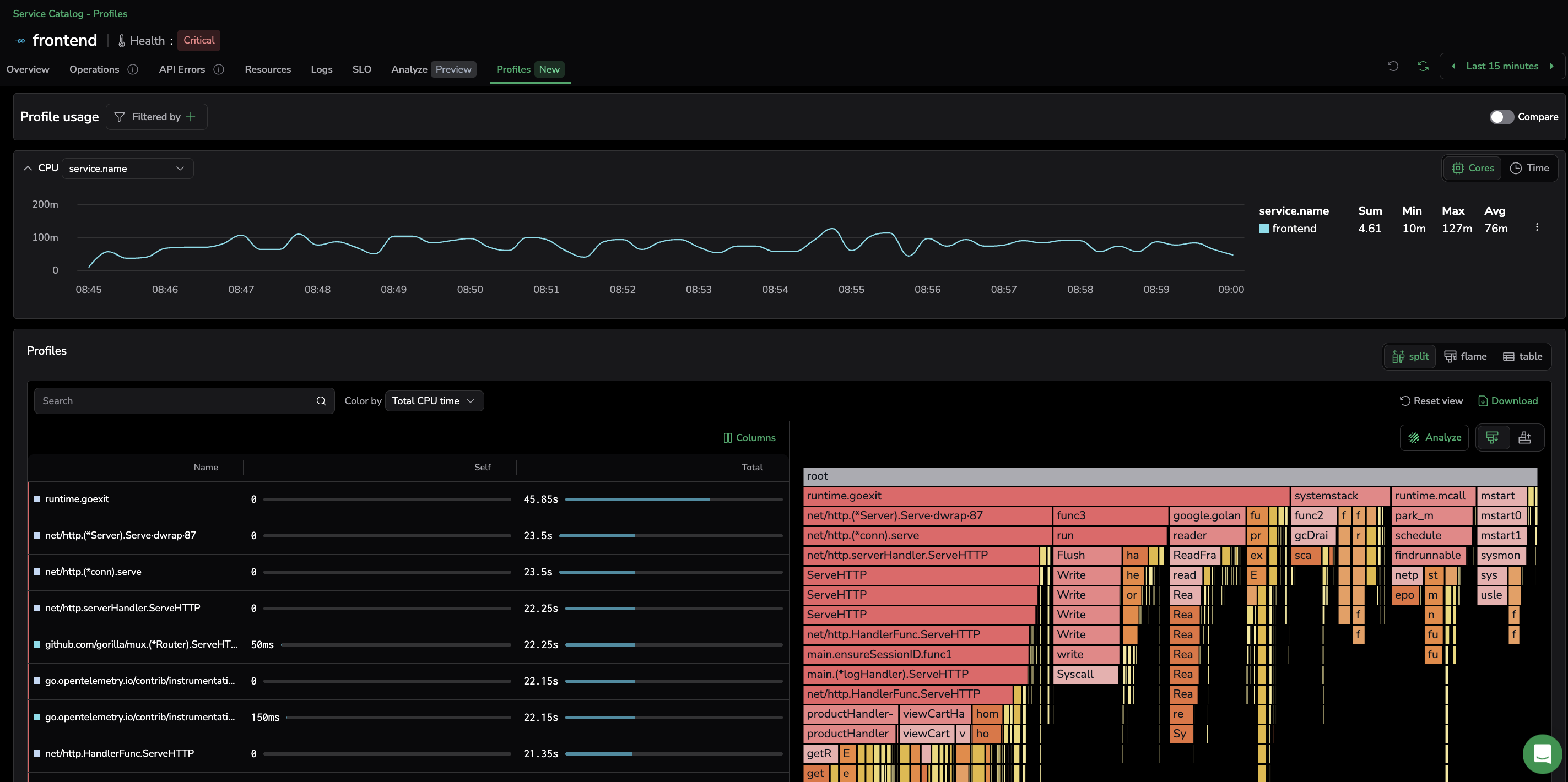
The Profiles UI shown above displays:
- High-level CPU usage trends: Helps detect performance spikes, inefficiencies, and correlations with deployments or system events.
- Function-level CPU breakdown: Identifies which functions consume the most CPU time, allowing for targeted optimizations.
- Stack trace visualization & analysis: Visualizes execution flow to pinpoint bottlenecks and inefficient code paths.
Access CPU profiles
To investigate CPU usage and performance bottlenecks:
- Select APM, then Service Catalog.
- Switch to the Profiles tab.
- From the Profiles view dropdown, select CPU.
- Select a service to open its profiling drilldown.
- In the Profiles tab of the service drilldown, the Profile usage card opens with the CPU profile displayed by default. Use the dropdown next to the CPU label to group series by an attribute such as
service.name.
Switch between mCore and Wall
The CPU card at the top of the drilldown exposes two profile variants through a dropdown:
- mCore: the CPU profile. Frame width is proportional to CPU time consumed.
- Wall: the wall-clock profile. Frame width is proportional to elapsed time, including time spent waiting (I/O, locks, sleep). Use Wall to investigate latency that does not show up in CPU profiles.
Selecting a variant loads its flame graph and time series into the Profile usage card and updates the profileType URL parameter, so the choice survives reloads and shared links. Each option is enabled only when that profile type has data; the CPU card is disabled only when both have no data.
If you enter the drilldown from the catalog with CPU selected but the service has no CPU data, the view falls back to Wall when Wall data is available. When neither variant has data, the view stays on CPU.
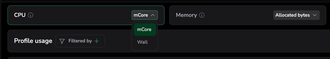
The Profiles catalog CPU view exposes the same wall data as two extra columns: Avg. wall (sparkline) and Wall samples per second. See Profiles catalog.
Customize the UI to fit your needs
Filter by environments
The Environment filter provides an easy and consistent way to query, filter, and group profiling data by environment (for example, dev, staging, or prod). It is enabled for Span Metrics users in both compact and full modes.
Filter by dimensions
If you’ve set up APM dimensions, filter by these labels to slice and dice the data as needed.
Filter Profile usage
Filter usage by pod, node or other OTel labels to display data that is relevant to your specific needs. The image below shows the Profile usage filters.

Visualize high-level CPU trends over time
Visualize CPU consumption over time for a particular service to detect performance trends.

- Y-axis (CPU time): Measures CPU time, the total processing time used by the service. Spikes might indicate heavy computations, inefficient queries, or memory management issues.
- X-axis (time): Helps correlate CPU trends with deployments, traffic changes, or system events.
When you spot an anomaly, hone in by narrowing down on the UI time picker or clicking or highlighting the point of interest to refocus the graph.
Filter from the chart
Select a series in the CPU time chart tooltip or legend table and choose Add to filter to filter the profiling view by that value. This lets you quickly isolate a specific pod, node, or label directly from the chart without manually configuring filters.
Read per-series stats
The legend table next to the chart shows Sum, Min, Max, and Avg values per series, summarizing each one over the selected timeframe.
Grouping profile attributes
The group-by labels feature allows to sum profiling metrics across processes by grouping them with specific labels, such as host_id, os_type, pod, or envr. Ideal for large infrastructures, select a group-by label to view its aggregated metrics over time. This helps to quickly analyze resource usage across multiple processes or pods.
Toggle between Time and Core views
Toggle between the Time and Core views. The former presents the total processing time, while the latter helps diagnose whether your application is effectively utilizing multiple CPU cores or if certain threads are causing contention.
If CPU time is increasing steadily, your service might have inefficiencies that need optimization. On the other hand, sudden spikes or dips can signal an issue such as inefficient garbage collection, unexpected traffic loads, or code regressions. Once you’ve detected when and how CPU consumption changes, use the stack trace visualization to dig deeper and find which functions are driving high CPU usage.
Pinpoint functions with highest CPU consumption
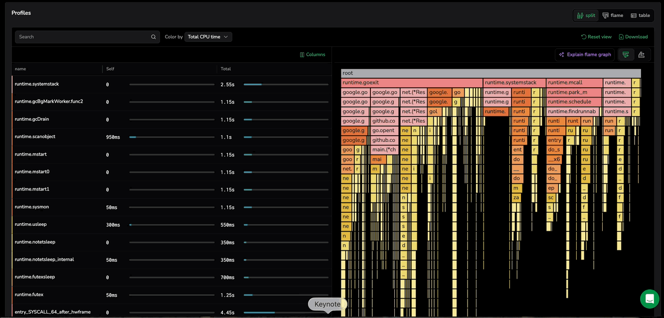
The Profiles grid presents a structured breakdown of CPU usage at the function level. Complementing the CPU consumption graph, it reveals which specific functions are responsible for high CPU consumption. Functions are presented along with their self-CPU time and total CPU time.
Self CPU time ("Self"): The amount of CPU time spent exclusively in that function (not including calls to other functions). Sort by Self CPU time to find the functions consuming the most processing power.
Total CPU time ("Total"): The total CPU time spent in that function, including time spent in any functions it calls. High Total CPU time suggests functions that call expensive operations.
Focus on functions with both high Self and Total CPU time to reduce overall load.
Drill down with profiled stack traces
Visualize performance analysis easily and efficiently with a flame graph, a visual representation of profiled stack traces, where the width of each function block indicates its resource consumption, helping identify performance bottlenecks in a program.
Icicle graphs, a variant of flame graphs, provide an alternative visualization approach for performance analysis. Unlike flame graphs, which present the call stack with the root at the bottom and branches extending upward, icicle graphs invert this structure—placing the root at the top and leaves at the bottom.
Locate functions in flame graph
When selecting a function from the table row in Split view, the flame graph automatically narrows to the stack traces that involve that function. This removes unrelated call paths so you can immediately see where the function is being called from and what it calls next, without scanning the entire graph.
If the same function appears in multiple stack traces, the flame graph still keeps the view focused on that function. You can optionally step through each occurrence to inspect every call path instance one at a time. When multiple matches exist, use the Show matches toggle to choose how you review them:
Toggle off (default): shows all matching occurrences at once, together with the surrounding call-path context so you can compare where they appear.
Toggle on: enables match navigation control (Prev/Next) so you can cycle through occurrences one at a time and inspect each call path in isolation.
Select the function again to return to the full flame graph, and loading new profiling data resets the focused view.
Flame graph components
The image below explains the main flame graph components.

Frames
- Each frame in the stack represents a function call or method known as a frame. A method is a function that belongs to a class and operates on an object.
- The width of a frame represents CPU consumption, where wider rectangles indicate higher resource usage per execution compared to narrower ones. This width includes both the time spent directly in the method (self-time) and the time spent in its child frames.
- For icicle graphs, frames are stacked from bottom to top in the order they were executed during the program’s runtime. (Remember, the opposite is the same for flame graphs.)
- The topmost frame, known as the “root frame,” represents the combined resource usage of all its child frames. Compare it to a pie chart, where the root frame is the entire pie, and each stack trace forms a segment.
- The bottom frame, known as the “leaf frame”, represents the last method called in the stack. The leaf frame only represents its self-time because it has no child frames.
- Side-by-side methods can be executed in parallel or in any order, as frames are sorted alphabetically from left to right.
X-axis
- The x-axis represents total CPU usage, not the passage of time over which profiles were collected. Functions are sorted alphabetically.
Y-axis
- The y-axis represents the stack depth or the number of active function calls. The function at the bottom is the one using the most resources, while those above it represent its call hierarchy. A function directly above another is its parent.
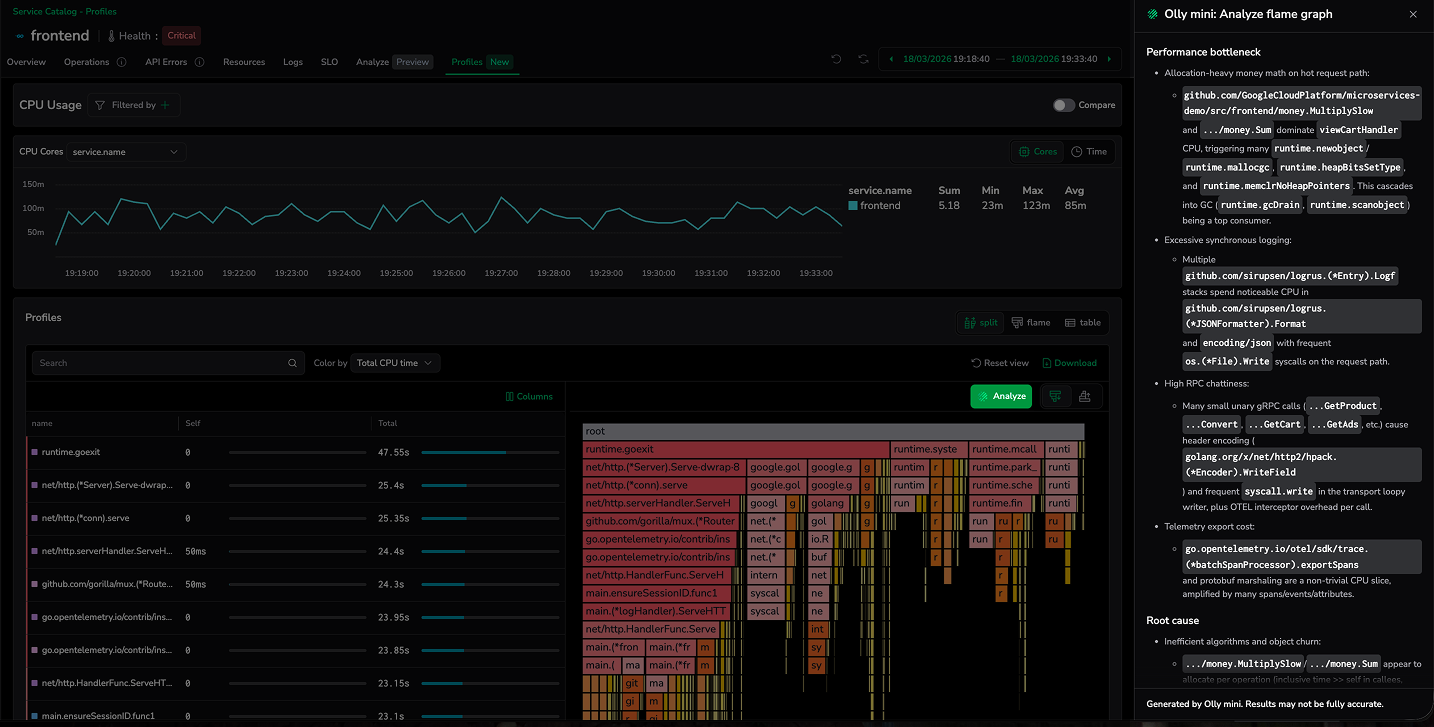
Analyze flame graph with Olly mini
Analyze provides AI-powered analysis of profiling data to help you quickly understand performance behavior and optimization opportunities. It enables developers—even without deep profiling expertise—to analyze flame graphs and extract meaningful insights.
The feature analyzes flame graphs to identify performance changes, root causes, bottlenecks, and the most problematic functions, and then suggests recommended fixes. The analysis adapts over time as your application evolves, ensuring insights remain relevant for ongoing performance optimization.
Customizing your visualization
Color by frame classification
Color flame graph nodes by their frame classification to see at a glance where CPU time is spent across different code layers. Select Frame classification from the Color by menu to apply classification-based coloring.
Each frame is assigned one of the following categories:
| Classification | Description |
|---|---|
| User code | Your application code |
| Standard library | Standard library functions |
| External library | Third-party library code |
| Native | Native or system-level code |
| Kernel | Kernel-level operations |
| Unknown | Frames that could not be classified |
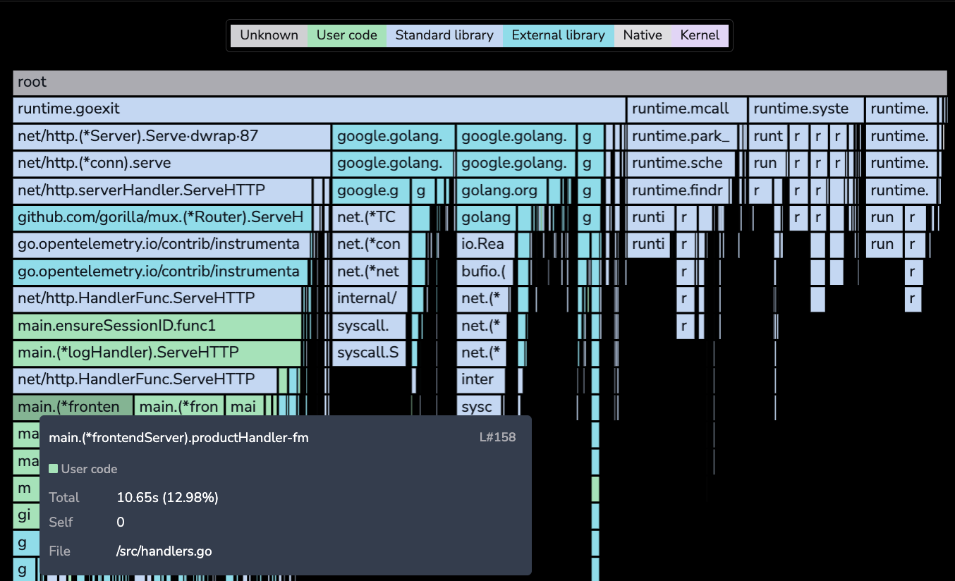
When Frame classification is active:
- Each flame graph node is colored by its category, making it easy to identify whether CPU time is consumed by your own code, libraries, garbage collection, or system operations.
- A legend displays the color mapping for each classification category. Use it to quickly interpret what each color represents.
- The tooltip displays the classification label with a colored indicator next to the function name.
- The function table shows a classification dot next to each function name.
If classification data is not available for a frame, the flame graph falls back to coloring by frame type (for example, interpreted, JIT-compiled, native) to ensure all frames remain visually distinguishable.
Use this mode to quickly answer questions like "How much time is spent in GC vs user code?" or "Are third-party libraries contributing to this latency?"
To switch back to the default view, select Total CPU time from the Color by menu.
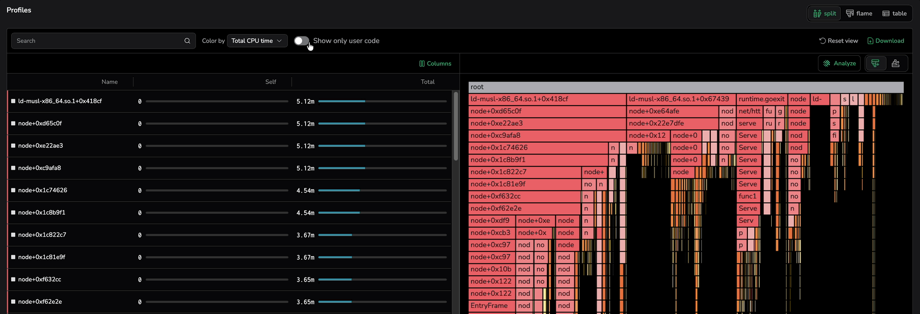
Show only user code
Filter the flame graph and the stack-trace table to frames classified as User code, hiding standard library, external library, native, kernel, and unclassified frames. In a typical profile, library and runtime frames dominate by area and bury the actionable signal — your own application code. This filter strips them out so you start from the functions that drive the work.
The Show only user code toggle sits next to the Color by dropdown on the Profiles tab. It is off by default, so opening a profile shows the full stack trace including library, runtime, and system frames. Turn the toggle on to filter to user code.
When the toggle is on:
- The stack-trace table drops rows whose classification is not User code.
- The flame graph hides every frame outside the User code category and promotes its User code descendants to the nearest User code ancestor. The chain of user-code calls stays contiguous; intermediate library and runtime hops collapse out.
- Visibility aligns with the colors produced by Color by, then Frame classification — what you see is the set of green-painted frames.
Switching the toggle off shows every frame again. The toggle composes with the search box, so results match User code and the search term together. It also composes with the Color by dropdown: switching to Frame classification while the toggle is on still shows only green rectangles, since frames in other categories are already hidden.
Toggle state persists across reloads and shared links, so a teammate opening your profile link sees the same filtered view you do.
Sorting stack traces
Customize the icicle graph to sort stack traces by function, cumulative value, or different value.
Hide binaries
Hide a specific binary from the icicle graph to focus on the remaining data. This is especially useful for Python workloads that call native extensions, where viewing only interpreted frames is insufficient—the goal is to hide the Python runtime frames while still exposing the native code execution paths.
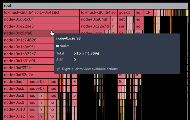
Right-click actions on the flame graph
Right-click any frame in the flame graph to open a context menu with per-frame actions. The menu opens at the cursor and stays anchored to the frame you clicked.
The menu offers four actions:
- Focus on this frame — zooms the flame graph to the frame and its descendants, with the same effect as left-clicking the frame.
- Copy function name — copies the frame's function name to the clipboard.
- Copy stack trace — copies the full stack trace from the root frame down to the selected frame to the clipboard. Each level is indented with two spaces.
- Search for this frame — pre-fills the flame graph's search input with the function name and activates match navigation.
Every frame tooltip shows a Right-click to view available actions hint at the bottom so the menu is discoverable as you hover.
Press Escape or click outside the menu to dismiss it. The menu is available in both single-profile views and Compare mode (merged and side-by-side flame graphs).
Method name convention
Coralogix Continuous Profiling follows the standard naming conventions used in stack traces for each programming language when displaying method or function names. For instance, Ruby and Python stack traces typically show the file name rather than the class name. As a result, the profiler uses the file name in the profile output for these languages.
In contrast, Java stack traces include the class name, so the profiler uses the class name in Java profiles. For example, you might encounter a method name like Database.queryData(Database$Connection).
Here's how to interpret the format:
Database.queryDatarefers to the methodqueryDatain theDatabaseclass.Database$Connectionrepresents the argument passed to the method.
Method names may be displayed in different formats, as shown in the table below:
| Representation | Description |
|---|---|
Database.queryData(Database$Connection) | The method name without line numbers, as shown in the UI. |
Database.queryData(Database$Connection):L#58 | The method name along with the line number, as shown in the UI. |
queryData | The method name as it appears in the source code (for example, in Database.java). |
All of these variations refer to the queryData method.
Next steps
Learn how to see performance changes between two CPU profiles in Compare profiles.