Custom Dashboards
Coralogix Custom Dashboards give you a flexible, high-performance workspace to visualize logs, metrics, and traces, together, in real time.
Whether you're monitoring a critical release, investigating latency, or trying to understand system behavior, Custom Dashboards give you the power to ask complex questions and see immediate, visual answers.
Explore our tutorials to start building your first dashboard.
Data sources
Coralogix brings logs, metrics, and traces together in a single dashboard interface. While each widget focuses on a specific data type, dashboards can seamlessly combine visualizations from all three, making it easier to correlate and act on your data.
Queries: turn raw data into answers
Behind every widget is a powerful query. Coralogix supports:
- DataPrime for complex, cross-source, data-transformative queries.
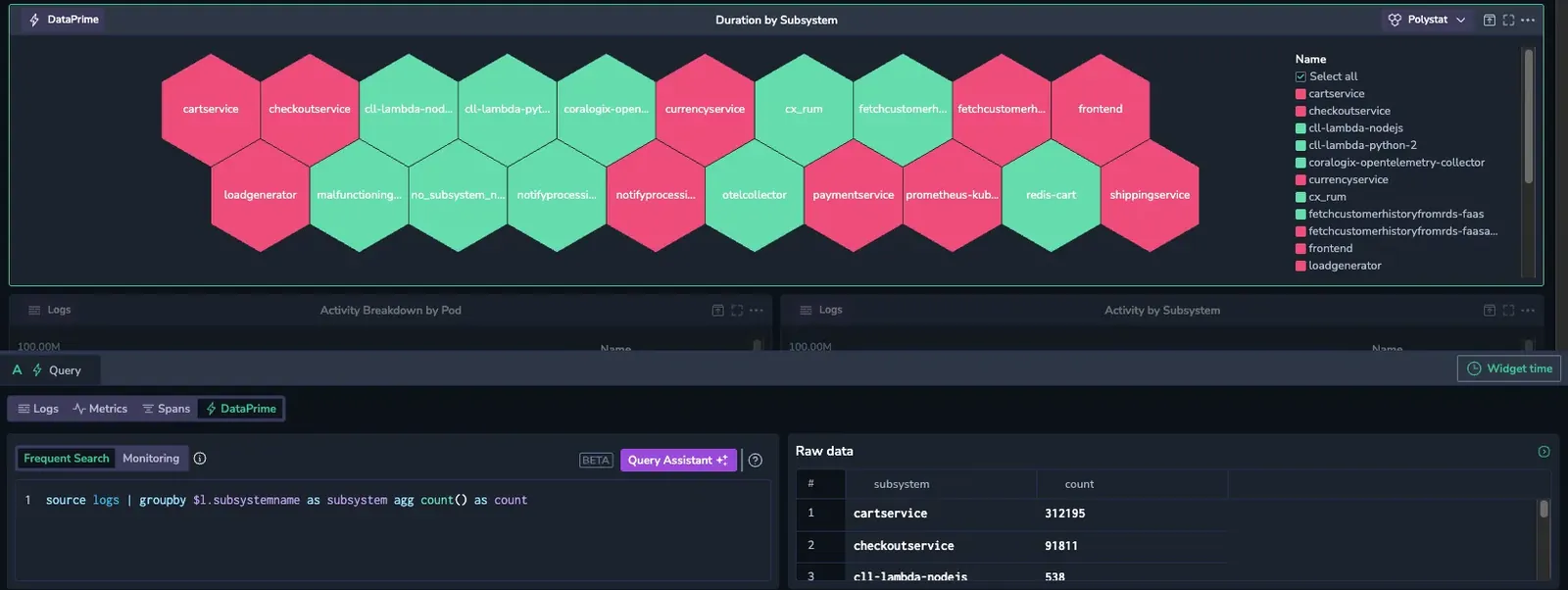
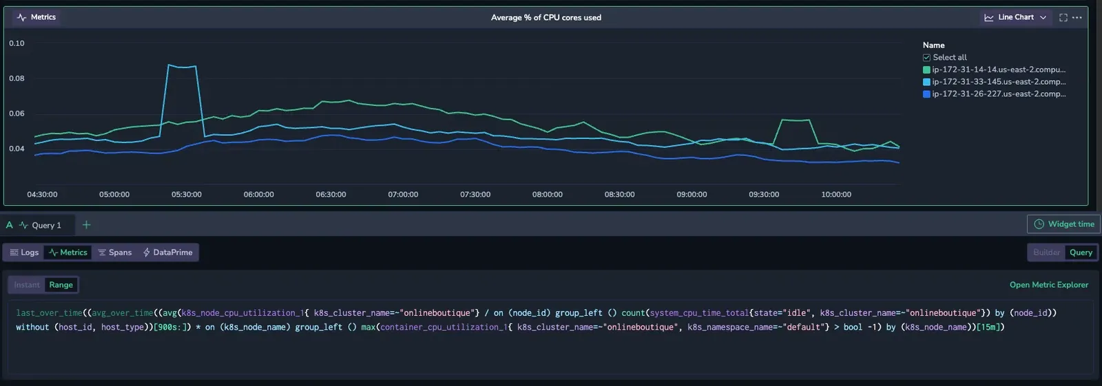
- PromQL for metric queries.
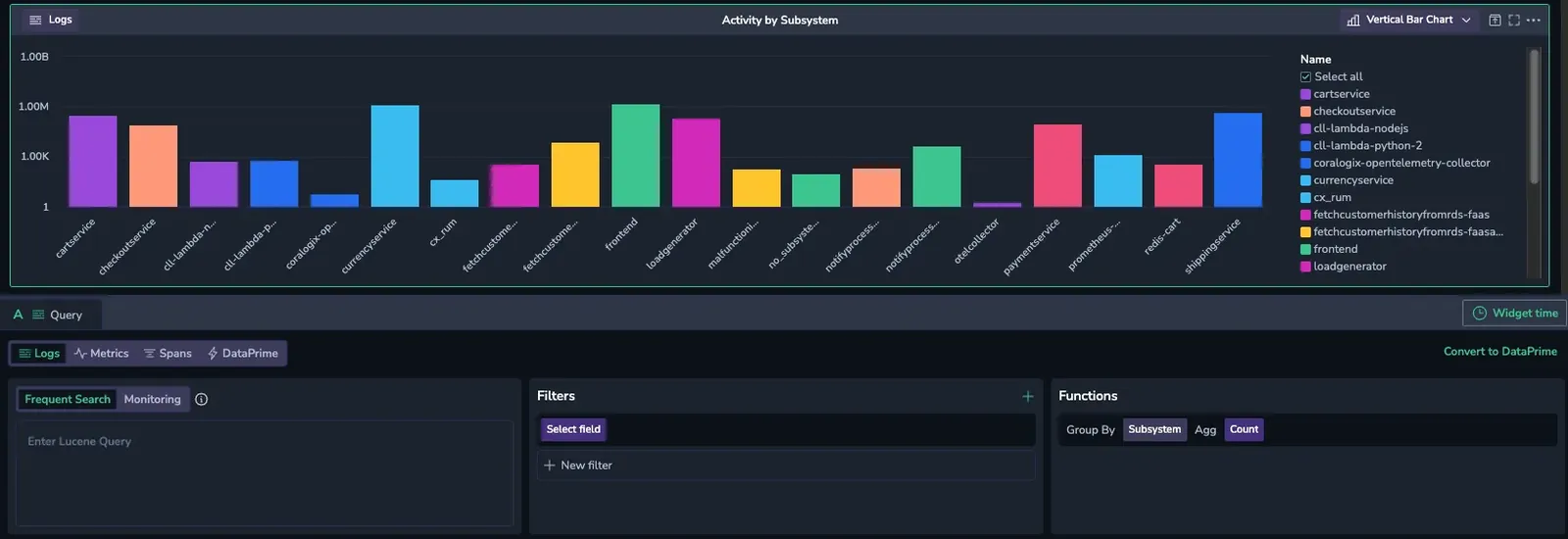
- Lucene for log and span queries.
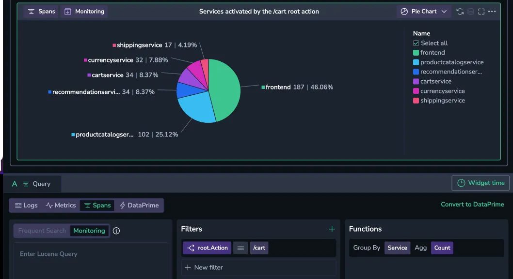
- Relational queries in the Query Builder to query spans by their relationships in a trace.
Queries allow you to define what data you’re visualizing. Use the out-of-the-box Query Builder to effortlessly construct the most complex queries, whether you're counting errors, tracking throughput, or correlating latency spikes.
Variables and filters let you reuse and refine these queries dynamically, so dashboards become interactive tools, not static reports.
Custom widgets
Each query feeds into a widget, a visual representation of your data. Coralogix offers a rich variety of widget types to help you explore patterns, spot anomalies, and track key metrics.
- Time series: Visualize trends over time with line charts. Ideal for performance metrics and alerts.
- Metrics: Gauges and polystats highlight current values, thresholds, and statuses at a glance.
- Tables: Display structured data for detailed side-by-side metric inspection.
- Charts: Use bar and pie charts for proportional breakdowns of value.
- Text widgets: Add markdown-based explanations, headers, or contextual notes directly. within the dashboard.
By combining these widget types, you can build focused, interactive dashboards, tailored to your observability and monitoring needs.
Widget layout
Custom Dashboards arrange widgets on a grid of rows. Each row holds a maximum number of widgets, which varies by widget type because some widgets stay readable at smaller sizes than others:
| Widget type | Maximum per row |
|---|---|
| Gauge | 6 |
| Stat | 10 |
| All other widget types (line chart, bar chart, pie chart, data table, Polystat, heatmap, markdown, DataPrime, and so on) | 5 |
When you mix widget types in the same row, the maximum depends on the combined widget sizes. A gauge that shares a row with other widget types renders at single-gauge width.
When a row is full, the dashboard prevents you from adding another widget to it. Add the widget to a new row instead. By default, widgets in a row share the available width evenly, but you can resize them horizontally.
Resize widgets
Widgets don't have to keep their default width. To give one widget more room than the others, drag the handle on its right edge. The widget snaps to the grid as you drag, and the widget immediately to its right grows or shrinks by the same amount, so the row stays full, for example, you can widen a line chart while keeping a neighboring stat or gauge compact. Only widgets that have a neighbor to their right show the resize handle.
A widget can't be resized below the minimum width for its type, and it can't grow so far that the adjacent widget would drop below its own minimum.
Feature overview
Custom Dashboards help you to go from high-level monitoring to granular investigation in just a few clicks.
- Add custom actions to jump from a chart in one custom dashboard to another with the same filters.
- Use custom annotations to mark deployments or incidents.
- Create variables once and reuse them across your widgets.
- Auto-refresh dashboards at a fixed interval for live, streaming updates.
- Share, export, or duplicate dashboards to scale your workflows across teams.
- Hand a dashboard to Olly with Olly dashboard watch and let it monitor the dashboard for you, surfacing only the changes that matter.
Ask Olly about a widget
Hover over a widget to reveal its toolbar, then select the Add to Olly context icon at the top right (to the left of the more actions menu) to pin the widget to an Olly chat and open the Olly drawer.
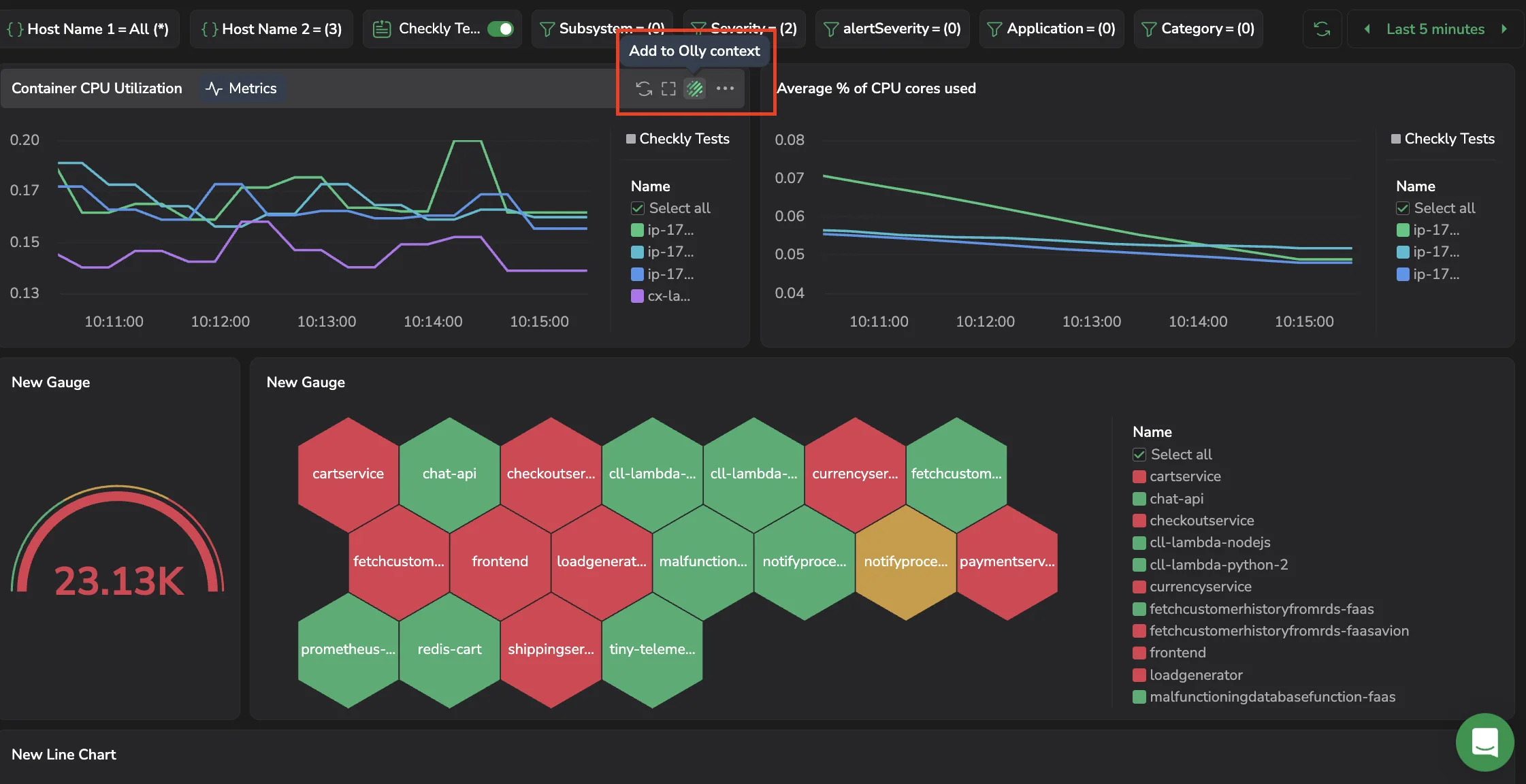
Olly receives the widget's query and data, so you can ask what's driving a spike, summarize what the widget shows, or compare it against another time range. The widget is added as a removable chip in the prompt; see Page and data context for chip behavior and removal.
Additional resources
Next steps
Learn how to configure time intervals for time-axis widgets.