Visualizing multiple queries in Custom Dashboards
What multi-query lets you do
Coralogix supports multiple queries per widget in your Custom Dashboards. You can use it to compare related values side by side in a single widget, reducing dashboard clutter and eliminating the need to manually compare the same categories across separate widgets.
Use multi-query when you want to:
- Compare different aggregations of the same data
- Add context from a related query
- Present multiple perspectives of a shared dimension such as service, endpoint, or city in the same place.
How multi-query works
Each query runs independently using its own data source and aggregation. The widget then combines the results using predefined behavior based on the widget type.
How multi-query combines results
When you use multiple queries in a single widget, the way results are combined depends on the shape of the data returned by the queries. The system determines whether results should be combined by shared fields or by time.
Multi-query combines query results depending on the following join models:
- Field-based join: Used by tables. The widget combines results by matching field values that share the same name and type—preserving all categories even if a value appears in only one query. This behavior is consistent with outer join behavior and ensures that all relevant categories remain visible.
- Time-based join: Used when queries return time-bucketed results. Data points align by timestamp, and only combine data points that fall within the same time bucket, ensuring accurate time-series comparisons.
Supported data sources and field alignment
Multi-query can combine different data sources, such as logs and metrics, as long as each query returns a field with the same name and data type. In practice, this may require normalizing field names across sources. You can use DataPrime transformations, such as aliasing fields with as, to align fields before combining results in a widget.
Example: aligning metrics and logs for multi-query
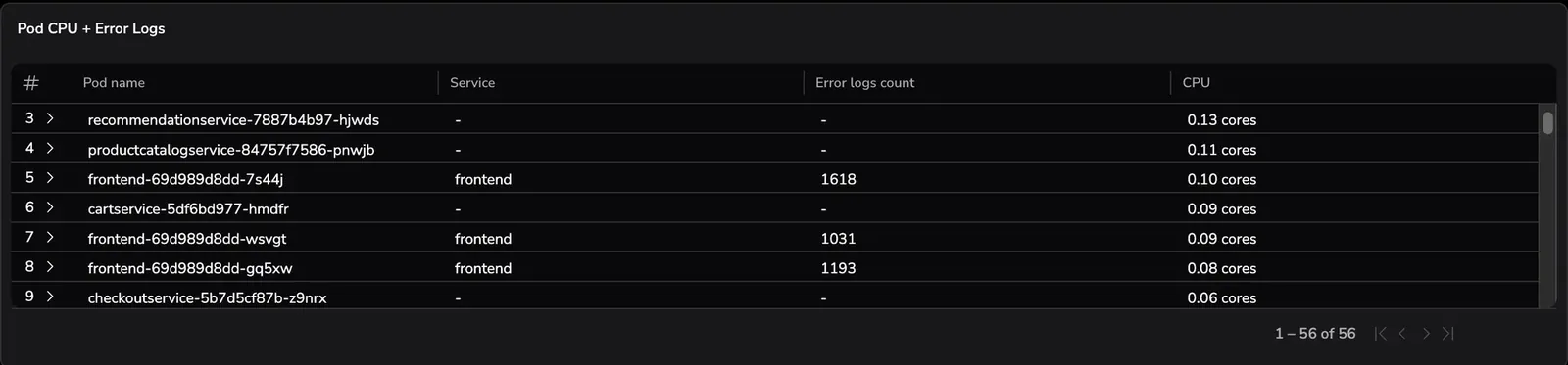
The example below shows a cross-source multi-query where a metrics query and a logs query are combined by a shared field (k8s_pod_name). The logs query also includes an additional field (subsystemname) to provide service context.
Some column headers in this table have been renamed for readability using table display rules in Dynamic Widgets. These rules change how values are presented without modifying the underlying query results. Learn more in the Dynamic Widget table configuration.
Metric query (PromQL): CPU usage by pod
sum by (k8s_pod_name) (rate(container_cpu_time_s_total[5m]))
This query calculates per-pod CPU usage (rate over five minutes) and groups the results by the k8s_pod_name label.
Log query (DataPrime): error count by pod
source logs
| filter$m.severity == ERROR
| groupby$d.kubernetes.pod.name as k8s_pod_name,$l.subsystemname
  aggregate count()
This query counts error logs per pod. It aliases the Kubernetes pod field to k8s_pod_name so it matches the metric query’s grouping field, and also returns subsystemname to provide additional context alongside each pod.
Because both queries return a field named k8s_pod_name, the widget can automatically combine the results and display CPU usage and error counts side by side for each pod. Fields that appear in only one query (such as subsystemname) are shown where available and remain empty for rows that exist only in the other query.
If the log query does not alias the pod field to k8s_pod_name, the widget cannot combine the results and displays an unable-to-join state until the fields are aligned.
Multi-query joins are handled automatically at the visualization layer. If you need explicit control over join conditions, join types, or join order, use the DataPrime join command within a single query. DataPrime joins operate in the query layer and produce a single result set before visualization. See the DataPrime language reference for details.
Visualize multiple queries
You can add multiple queries to the same dashboard widget to compare and combine related results within a single visualization. Use multi-query for the following visualizations:
Multi-query in tables
The example below shows a table combining results from two log queries that share the same subsystem field.
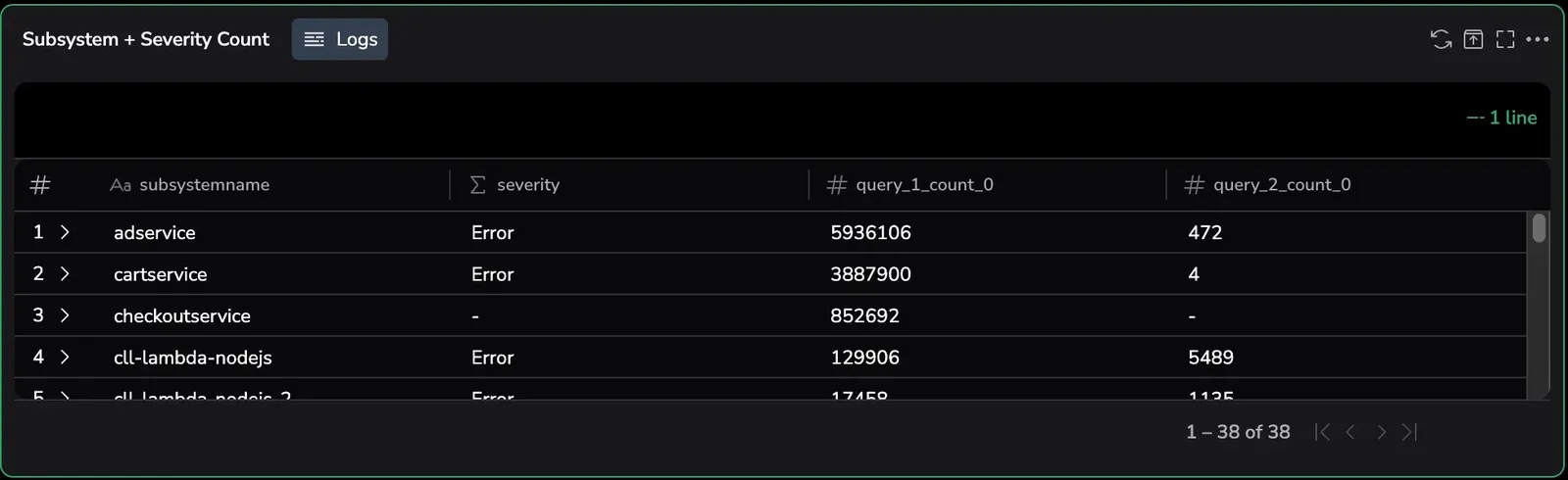
Results are combined using field-based joins on shared fields that have the same field name and data type. All rows from all queries are displayed using outer-join semantics, so data that appears in only one query remain visible with empty values in the other columns. Queries must return projected results (grouped or aggregated). If queries do not share compatible fields, results are displayed side by side rather than merged. Learn more about projected queries.
Multi-query in bar charts
The example below shows a multi-query bar chart comparing two duration metrics across cities. Each query appears as a separate series for the same category field.
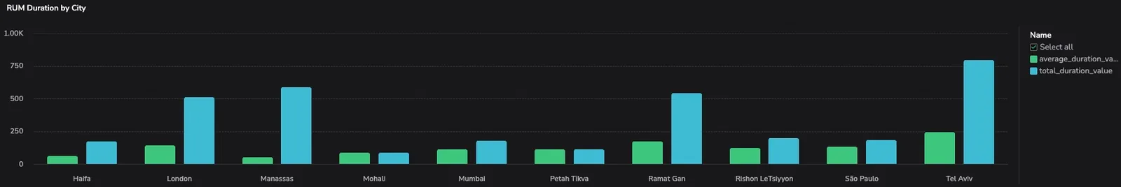
Multi-query bar charts are supported only in Dynamic Widgets.
Vertical and horizontal bar charts support multi-query for side-by-side comparison across categories. Each query contributes one or more value series aligned by shared fields such as service, severity, or city. Join behavior follows the same field-based outer-join model used by tables. When results from multiple queries are combined, only rows that contain values for the displayed series are rendered in the chart. Rows that contain missing values remain visible in table views but are not included in the bar chart series.
Multi-query in line charts
The image below illustrates how multiple queries appear when plotted together in a line chart.
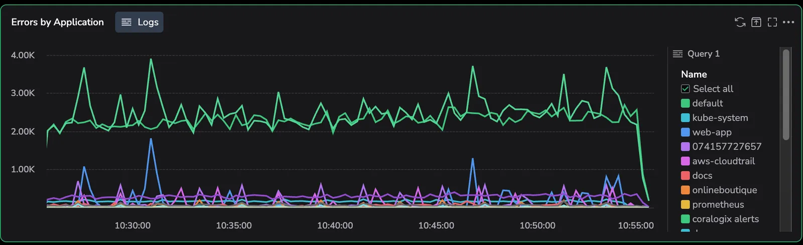
Line charts support multi-query by aligning series over time. Multiple time series are plotted on the same x-axis, with each query rendered as an independent series. Multi-query line charts match data points by timestamp, not by shared fields. This differs from other multi-query widgets, which combine results by matching shared fields.
Group series by query (legend behavior)
When a line chart includes multiple queries, an additional legend setting, Group by Query, becomes available that controls how data series are organized.
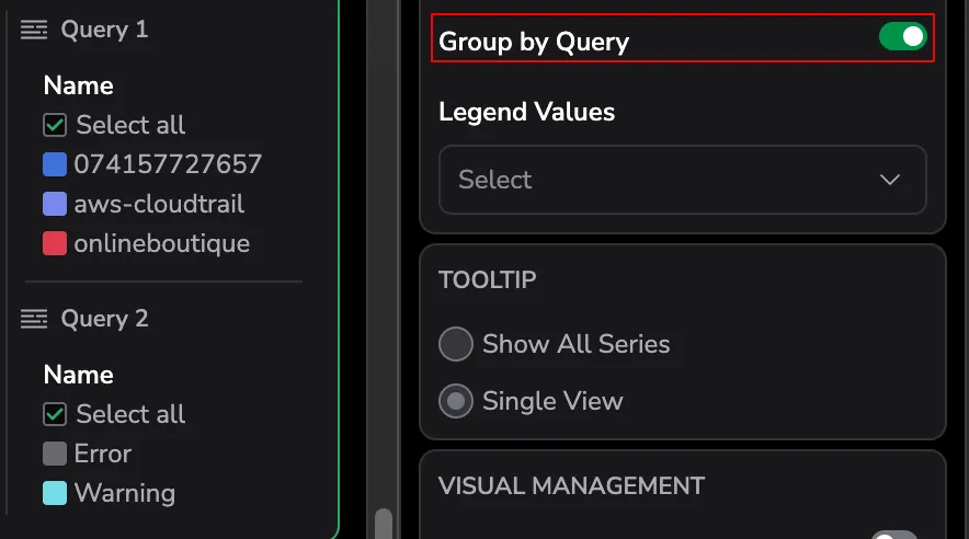
By default, the series is grouped by query in the legend, showing which data series belong to each query. When you disable this setting, all series appear in a single list, regardless of which query produced them.
This setting affects legend organization only. It does not change how data is aligned over time or how multi-query results are combined.
Requirements and constraints
- If queries do not share a common field, the widget displays an empty or unable to join state until the queries are aligned.
- Queries must return projected results to participate in field-based joins.
- Only string fields are used as join keys.
- Tables use outer-join semantics only, whereas line charts use time-based alignment.
- Multi-query is disabled for unprojected queries. Mixed data sources are supported only when fields are aligned.
To learn more about projected queries, see the Dynamic Widget documentation.
Practical example of multi-query
Use multi-query to compare two perspectives of the same RUM data—typical performance and overall impact—across cities in a single widget.
Query 1: average RUM duration by city
This query calculates the average RUM duration for each city, showing the typical user experience in that location.
Returns one row per city with:
- City
- Average RUM duration
Query 2: total RUM duration by city
This query calculates the total (sum) of RUM duration for each city, showing the overall impact based on traffic volume.
Returns one row per city with:
- City
- Total RUM duration
How the widget combines results
The table below shows the result of combining two queries grouped by the same city field, with each query contributing a separate value column.
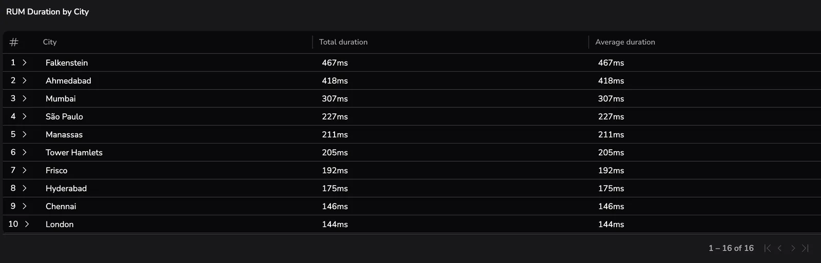
Column titles in this table were customized using Dynamic Widget table settings. Learn more about column configuration in the Dynamic Widget documentation.
Both queries return the same shared field (city) with the same field name and data type. The widget automatically combines the results using an outer join on that field. Each city appears once in the visualization, with both the average and total duration values displayed side by side. Cities that appear in only one query are still shown, with an empty value for the other metric.
Common pitfalls
- Expecting inner-join behavior
- Mixing projected and unprojected queries
- Assuming field-based joins apply to line charts
- Forgetting to align fields across data sources can lead to empty values or unexpected results.
Related resources
Next steps
Learn how to set up scheduled reports for your dashboards.