Data tables
Create a data table in Custom Dashboards to visualize logs, metrics, or spans.
Getting started
To add a widget to a custom dashboard, click the + icon. Then, drag and drop the data tab;e widget from your left-hand sidebar.
Use the Query Builder to create a query
In the bottom panel, build your query using Query Builder.
Define the widget parameters
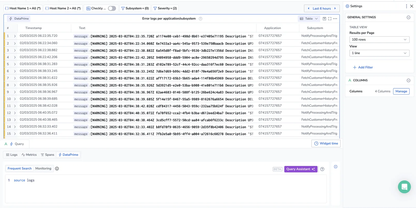
Define the parameters for your widget in the right-hand sidebar and click SAVE.
Table view
When using logs or spans as the data source, you can choose between the Events and Aggregated view. Spans are currently limited to a single aggregation column per table widget.
-
Events view presents a table with a list of logs or spans ordered by time (you can change this to be sorted by other columns later) with additional metadata and labels relevant to those events, similar to the view you see in the Explore screen.
-
Aggregation view presents a table of values, grouped by a field or fields you specify. Each column represents a different value depending on the chosen group. Values could be a simple count or an average of the values for the specific field, for each of the defined group-by values. Add and edit columns and filters for the aggregation table using the right-hand side bar.
Select the number of results to be displayed per page.
Columns
Manage columns by selecting one or more relevant fields.
Limitations
The data table widget is limited to 500 rows. Aggregated values are based on this sample data only.
Next steps
Learn how to use the stat widget to display a single value as a compact indicator.