Basic gauges
Create a customized gauge visualization in Custom Dashboards.
Overview
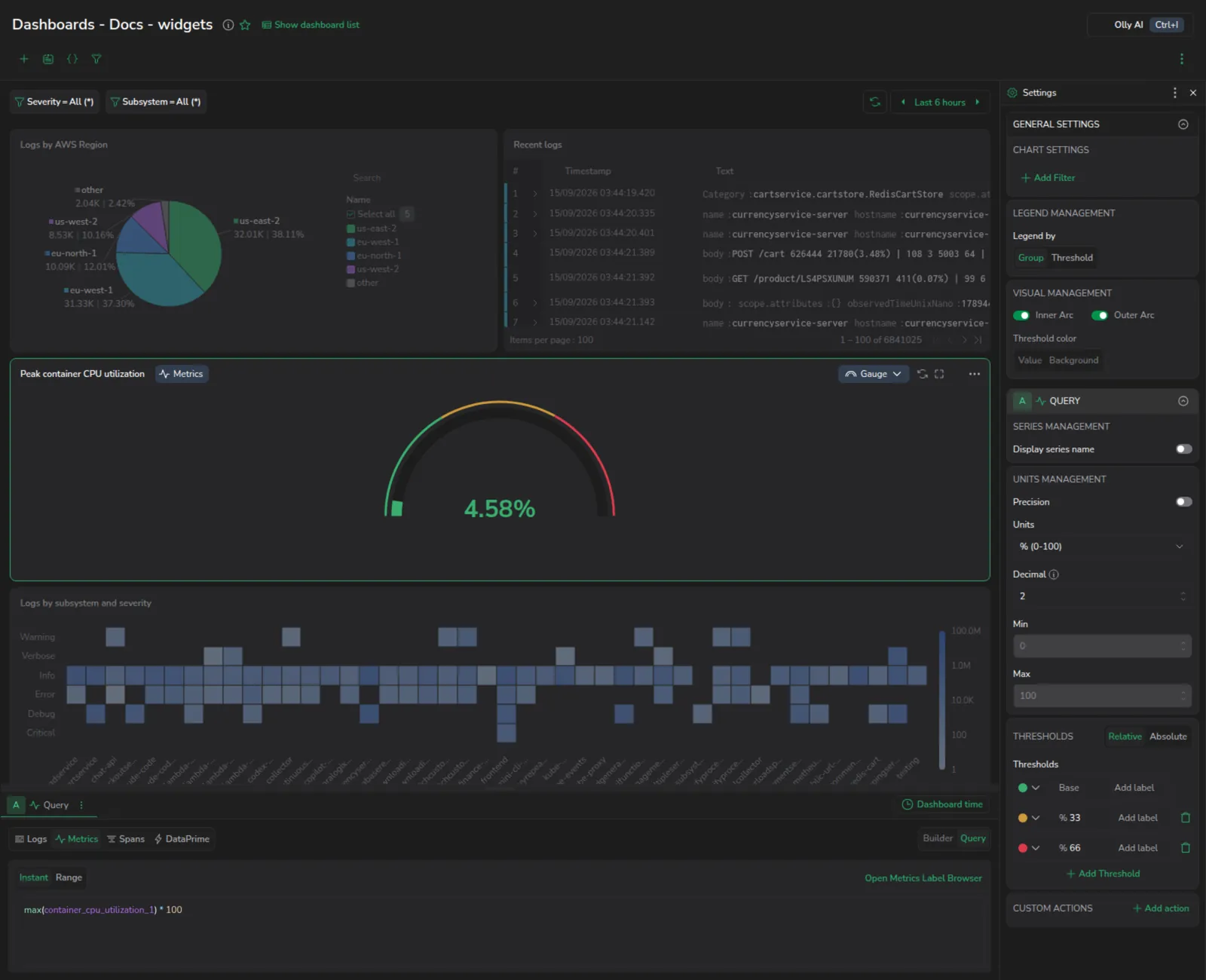
A gauge is a visual tool that displays a single value within a specified range, often resembling a speedometer or dial. It is typically used to represent key metrics and performance indicators at a glance.
Getting started
To add a widget to a custom dashboard, click the + icon. Then, drag and drop the gauge widget from your left-hand sidebar.
Use the Query Builder to create a query
In the bottom panel, build your query using Query Builder.
Aggregation. If you have chosen logs or spans as your data source, show an aggregated value using one of the following functions.
| Aggregation | Description |
|---|---|
| Count | The total number of data points within the selected time range. |
| Count Distinct | The number of unique data points within the selected time range. |
| Sum | The sum of all data points within the selected time range. |
| Min | The smallest value among the data points within the selected time range. |
| Max | The largest value among the data points within the selected time range. |
| Average | The average value of all data points within the selected time range. |
| Percentile XX | Represents the value below which XX% of the data points fall. For example, Percentile 95 is the value below which 95% of data points fall. |
Calculation. If you have chosen metrics as your data source, show a calculated value using one of the following functions.
| Calculation | Description |
|---|---|
| Instant | The value at the current point in time. |
| Last | The most recent value within the selected time range. |
| Min | The smallest value within the selected time range. |
| Max | The largest value within the selected time range. |
| Avg | The average value of all data points within the selected time range. |
| Sum | The total sum of all data points within the selected time range. |
| None | No calculation is applied; raw data is used. |
Define the widget parameters
Define the parameters for your widget in the right-hand sidebar.
General settings
Define the parameters for your gauge in the right-hand sidebar.
Add a filter. [Optional] Add one or more filters specific to the widget to narrow down the data displayed in your gauge. Select a label and its corresponding value. Note that filters applied at the widget level work alongside dashboard filters. If conflicts exist, the dashboard filters take precedence over widget filters.
Legend management. This parameter determines how the legend organizes and displays information.
-
Group organizes the legend based on different data entities, such as servers or applications, displaying each as a separate entry.
-
Threshold categorizes values based on predefined limits (e.g., normal, warning, critical), helping to visualize whether a metric is within an acceptable range or has crossed into a warning state.
Visual management. Use Arc display to show or hide the gauge arcs, then enable or disable each arc individually.
- The Value arc is the wide inner arc that fills to show the current metric value.
- The Threshold arc is the narrow outer arc that displays the threshold zones you have defined.
If you disable both arcs, the widget displays the numeric result of your query as a stat value. You can then control whether the threshold color applies to the value or the background.
Values display. Toggle Min Max to label the gauge with its minimum and maximum values, placed at the start and end of the arc. The labels appear only while the Value arc is displayed.
Threshold color. Set the color/s for the values and background in your visualization.
Query parameters
Group by. If you wish to generate multiple gauges, incorporate the group by functionality in your query. See our Multi-Gauge documentation here.
Units management. Manage the way units are displayed in your widget.
-
Min/Max. Set the minimum and maximum values used in percentage threshold calculations. You may choose to enter a static range of numbers or a range between 0-1 or 0-100. When left empty, the fields show the current data-inferred range as a placeholder hint, so you can preview the auto-scaled range before overriding it.
-
Units. Choose one of the unit types or create a custom unit. Custom units are not added to a list of units, but are saved with the specific widget.
Select Custom unit, then enter the text to append. The gauge shows it after the value, so a custom unit of
FGrenders as232.87K FG.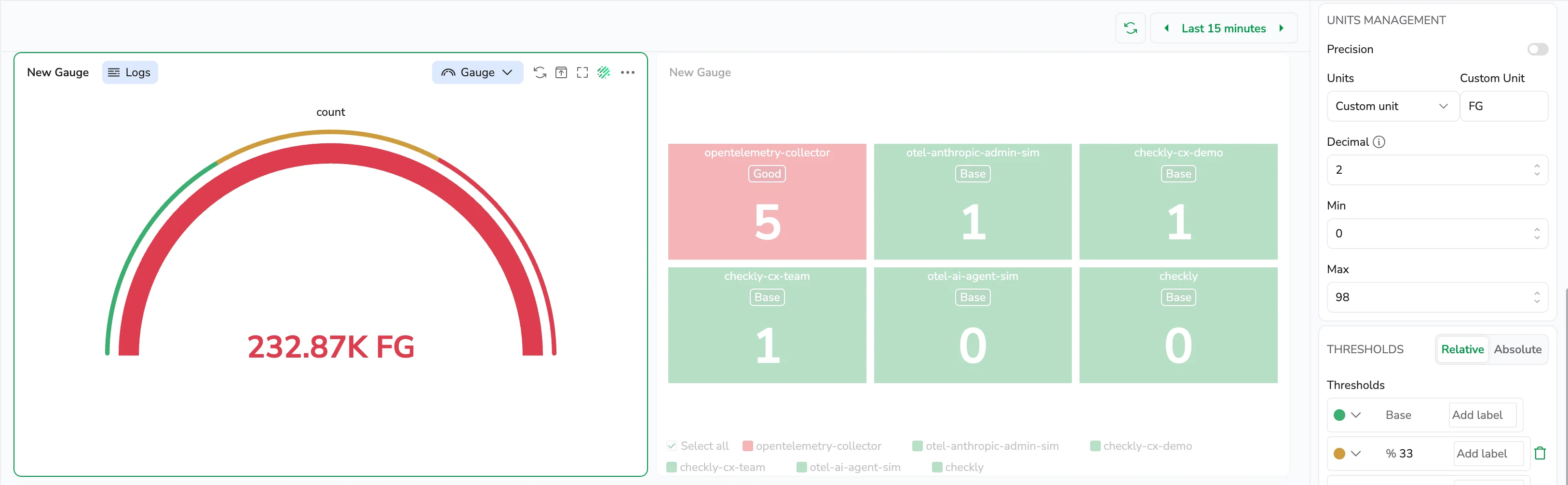
-
Decimal. Specify the number of decimals displayed in the calculated value, from 0 - 15.
-
Precision. Toggle Precision to display the full, unrounded numerical value inside the gauge. When disabled, the values are shortened for readability using unit-based formatting, based on the selected Decimal setting.
Thresholds. A threshold is a value you set for a number that, when met or exceeded, changes the visualization's appearance based on the query results. Choose the base Thresholds, that is, when the gauge should appear green and red. Add additional thresholds if necessary.
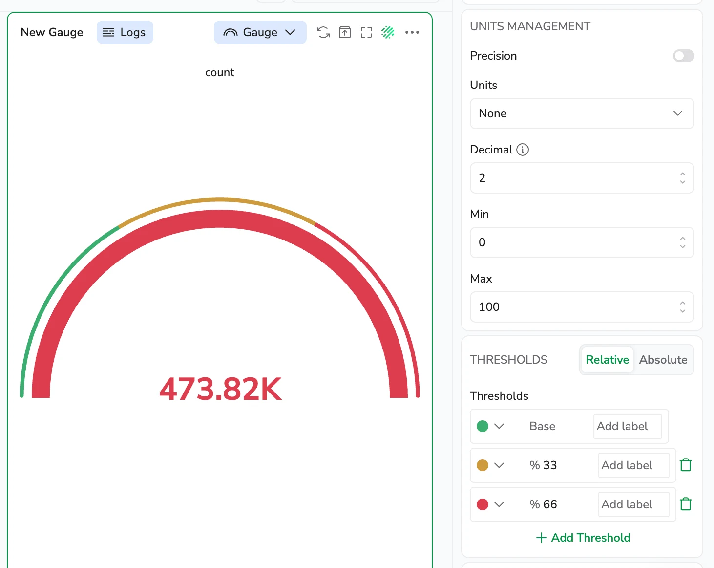
The gauge above reads 473.82K against a Max of 100. A value past the top of the range fills the value arc completely and takes the color of the highest threshold it has passed.
Set the following options:
-
Value. This is the value that triggers the threshold. You can assign a specific color to this value.
-
Labels. Add labels to each threshold. For example, you may choose the label "good" for the base green threshold.
-
Threshold type. Choose between Relative and Absolute.
-
Relative: evaluated as a percentage of the range between Min and Max.
-
Absolute: evaluated as an exact number.
-
Next steps
Learn how to use Multi-Gauges to display multiple gauge values in a single widget.