Legend configuration for widgets
Overview
A widget legend is essential for creating clear and understandable visual data representations, enhancing the usability and effectiveness of the entire dashboard. Use your widget legends to:
-
Clarify data representation
-
Enhance data understanding and usability
-
Help users understand how to read and interact with the dashboard effectively
This document explains how to customize legends for all types of widgets supported by Coralogix, and apply additional actions to enhance the data exploration capabilities.
Legend settings
Configure a widget legend to appear at the side or bottom of your widget, show or hide it, and select which value columns it displays.
-
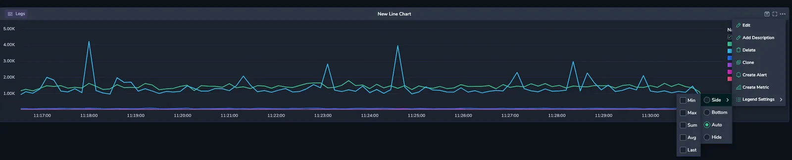
Select the ellipsis (…) at the top right corner of your widget and select Legend Settings.
-
Select the legend location (Side or Bottom) or hide it. Alternatively, set it to Auto to let the UI determine the best placement: the legend appears at the bottom on compact widgets and at the side on wider widgets.

-
Select which value columns to display. The available columns depend on the widget type: line charts offer Min, Max, Sum, Avg, and Last, while some widgets, such as bar charts, offer a single Value column. Value columns are available for both Side and Bottom legends, and Coralogix keeps your column selection when you switch between placements.
Drag the inner edge of a side legend to resize its width. Double-click the same edge to discard the custom width and return the legend to automatic sizing. The width is stored in your browser per widget, so it persists across reloads until you reset it.
Bottom legend layout
A bottom legend adapts to whether you display value columns:
-
Condensed: the default when a legend has no value columns. Legend entries wrap across one or more rows beneath the chart. When entries overflow, select Show More... to expand the full, scrolling list, then Show Less... to collapse it.
-
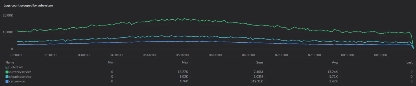
Expanded table: applied when a legend has one or more value columns. Entries appear in a vertical table beneath the chart, with column headers and a Select all row. The table displays up to three rows before it scrolls, so the legend never overtakes the chart area.
Search the legend
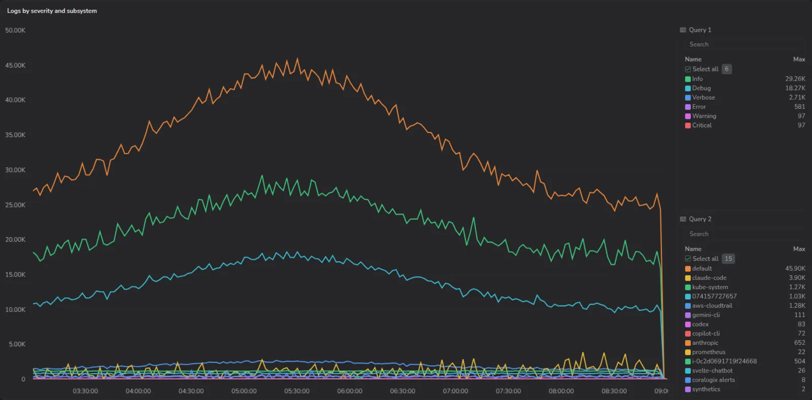
Side legends include a search bar above the series list, whatever the number of series. Bottom legends don't. A bottom legend is a full-width strip under the chart, so it renders the same way it did before search existed.
Type to filter legend entries by series name. Only matching entries are shown, and Select all applies to the filtered results only. The count beside Select all shows the total number of series when no search is active, and switches to selected/filtered while you type. For example, 2/15.
When a widget has more than one query, each query group gets its own search bar and filters independently.
Sort the legend
When a legend displays value columns, select any column header (Name, Min, Max, Sum, Avg, or Last) to sort the entries by that column. Select the same header again to reverse the order, and a third time to restore the original order. Sorting on Name is case-insensitive, so entries beginning with lowercase letters sort alongside their uppercase equivalents.
Legend sorting applies to the current view and isn't saved with the dashboard. When you reload the dashboard, the legend returns to its default order.
Hide/show data series
In complex charts or graphs with multiple data series, you can remove unnecessary entries to achieve a cleaner and more focused dashboard.
-
In your widget legend, select a data series to display it or unselect it to hide. When hidden, the data series is removed from the view, but not from the underlying data.
-
Choose Select all to display all series or unselect it to hide all of them.

Your selection is saved with the dashboard, not just with your browser, so it counts as an unsaved change until you save. Once saved, everyone opening the dashboard sees the same series hidden.
If you change the widget's query or its group-by fields, the selection resets and all series become visible again, because the previous series may no longer exist.
This is different from the legend's width and sort order. A resized legend is remembered per widget in your browser only, and sorting applies to the current view and is not saved at all.
Advanced data series actions
-
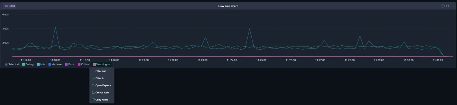
Hover over a data series and click the ellipsis (…).
-
In the context menu, the following actions are available:
-
Filter out - Exclude data series from the query. This action is applied to all widgets related to the same data source.
-
Filter in - Include data series into query. This action is applied to all widgets related to the same data source.
-
Open Explore - Create a log or span query on the Explore page, based on the widget conditions, such as timeframe, query, and filters. This option is relevant for widgets that use logs or spans as their data sources. Explore opens on the same data tier the widget reads from, so a widget set to load data from Frequent Search opens on
frequentsearch/logsorfrequentsearch/spansrather than on the archive tier. -
Create alert - Create an alert based on data series, where applicable
-
Copy name - Copy data series name
-
You may also access the actions menu by clicking on the widget.
Color hashing for consistent series coloring
When viewing multiple widgets on a dashboard, it’s important to maintain visual continuity, so that a data series, like eu-west-1, always appears in the same color across charts. Color hashing ensures consistent color assignment for string-based values (such as service names, host names and labels) across visualizations.
The example below shows two different charts both displaying AWS region values with color hashing applied. Notice how each region keeps the same color in both visualizations. This helps users instantly correlate regions between widgets, even when the chart types differ.

Let’s say you're visualizing CPU usage grouped by Kubernetes node. With color hashing enabled, each node keeps its own color consistently across all bar charts, line charts, and pie charts on your dashboard.
Enable color hashing
- Click on a widget to open the Settings panel.
- Scroll to the LEGEND MANAGEMENT section.
- Toggle Legend Color Hashing.

Once enabled, colors are assigned deterministically from a fixed palette based on the string value of each data series. This behavior applies to any string-based grouping, such as regions, services, or Kubernetes nodes. These color mappings are consistent across all widgets that display the same data series strings and have color hashing enabled. You can enable or disable color hashing individually for each widget. The assigned colors appear in the legend next to their corresponding data series and are reflected in the chart visualization.
Keep in mind:
- Color assignments can’t be manually assigned or updated.
- If the number of unique data series in the widget exceeds the available colors in the palette, colors will be reused.
- Coloring hashing is supported for line, vertical, horizontal bar, and pie charts.
Next steps
Learn how to switch between visualizations in Custom Dashboards.