Pie charts
Create a customized pie chart visualization in Custom Dashboards.
Getting started
To add a widget to a custom dashboard, click the + icon. Then, drag and drop the pie chart from your left-hand sidebar.
Use the Query Builder to create a query
In the bottom panel, build your query using Query Builder.
Define the widget parameters
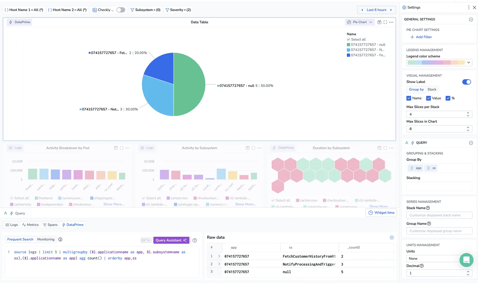
Define the parameters for your widget in the right-hand sidebar.
General settings
Define the parameters for your gauge in the right-hand sidebar.
Add filter. [Optional] Add a filter to your pie chart.
-
As opposed to the dashboard filter in the left-hand sidebar which affects the entire dashboard, this filter only affects the widget.
-
The widget and dashboard filters operate in parallel to one another and intersect. If they negate one another, dashboard filters override widget filters.
Legend management. Select the color scheme for your chart. Choose between seven different color schemes. Only the default color scheme is supported when stacking is enabled.
Visual management. Define the following options:
-
Group by. Select up to two fields from the dropdown menu.
-
Stack by. Optionally select a field to stack the chart by. This shows you a second layer of data on the table.
-
Max slices in the chart. Select the maximum number of slices to show in the pie chart.
Query parameters
Query. Define which fields to group or stack by.
Series management. Define custom stack and group names using free text and/or labels, e.g., "Application:{{application}}".
Units management. Define the following options:
-
Select the units to display in the pie chart.
-
Specify the number of decimals displayed in the calculated value, from 0 - 15.
-
Toggle Precision to display fully un-rounded numerical values in your chart. When enabled, data series values shown in the tooltip (on hover) will reflect the complete, raw value returned by the query. When disabled, values are rounded based on the selected Decimal setting.
If you want to save your dashboard for future use, click SAVE in the upper right-hand corner.
Next steps
Learn how to use line charts in your dashboards.