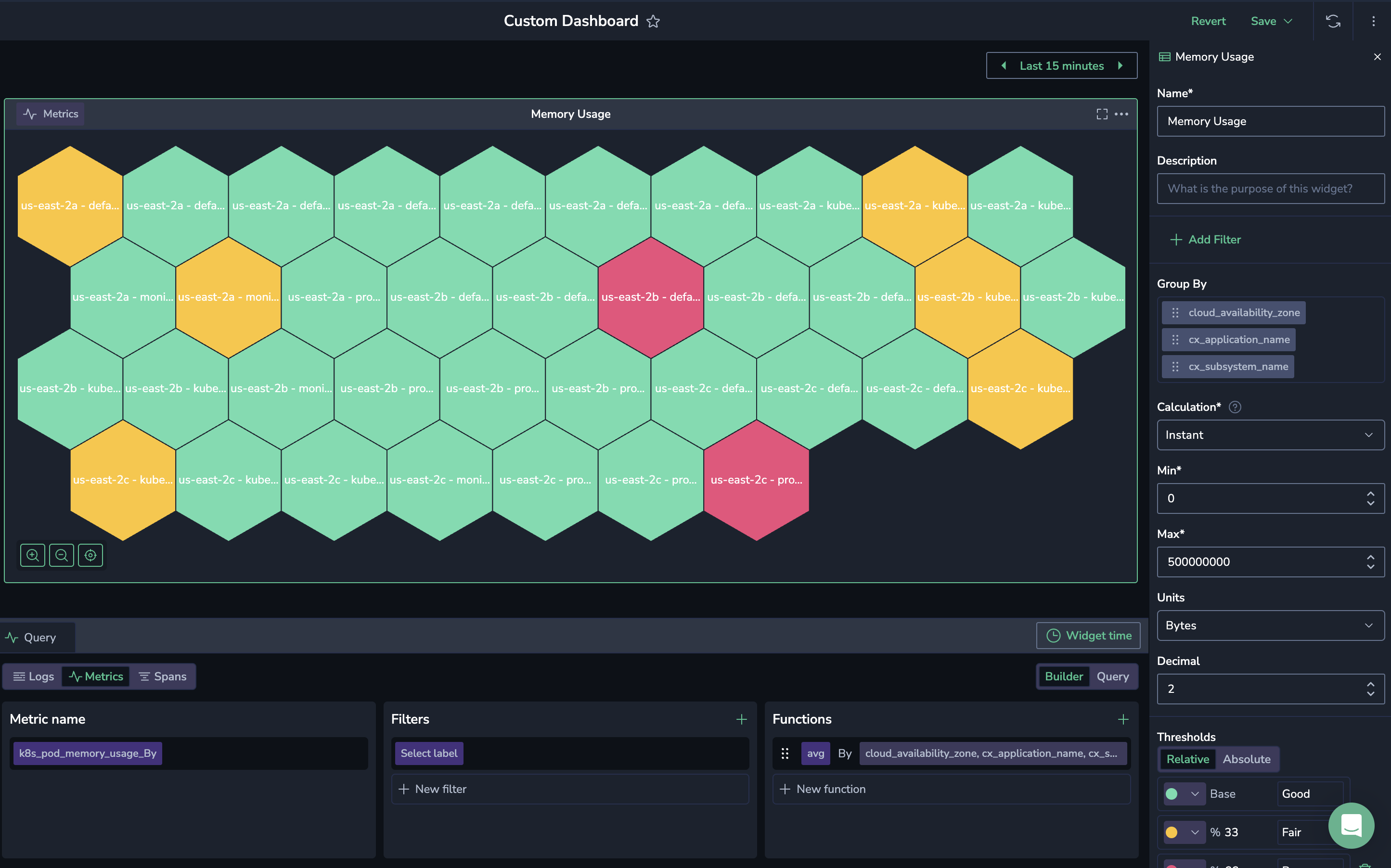
Polystat Widget

The Polystat widget presents time series data in a hexagonal grid, where each hexagon represents an individual value sourced from logs, metrics, or spans. It enables grouping multiple values into a single, consolidated view, allowing you to display values simultaneously. For example, a user may configure the widget to track CPU usage across all pods in a system and set thresholds for what is critical, acceptable, or optimal.
A key feature of the Polystat widget is its threshold definition, which applies uniformly across all displayed values. These thresholds are specific values that, once met, trigger a color change in the hexagon, serving as an immediate visual alert for potential issues. For example, hexagons turning yellow or red highlight areas needing attention, helping users swiftly detect and address system performance concerns.
When dealing with high-cardinality data, where the number of values is especially large, opt for the Polystat over the Multi-Gauge widget.
Getting started
To add a widget to a custom dashboard, click the + icon. Then, drag and drop the Polystat widget from your left-hand sidebar.
Use the Query Builder to create a query
In the bottom panel, build your query using Query Builder.
Define your Polystat parameters
Define the parameters for your polystat widget in the right-hand sidebar.
Name
Text entered in this field appears at the top of your panel in the panel editor and above the widget in the dashboard.
Description
Text entered in this field appears in a tooltip in the upper-left corner of the panel. Add a description to a panel to share important information with your team, such as its purpose.
Group by
Group query results by a label or field value.
Calculation
If you have chosen metrics as your data source, show a calculated value using one of the following functions.
| Calculation | Description |
|---|---|
| Instant | The value at the current point in time. |
| Last | The most recent value within the selected time range. |
| Min | The smallest value within the selected time range. |
| Max | The largest value within the selected time range. |
| Avg | The average value of all data points within the selected time range. |
| Sum | The total sum of all data points within the selected time range. |
| None | No calculation is applied; raw data is used. |
Data management
- Min/Max. Set the minimum and maximum values used in percentage threshold calculations.
- Units. Choose one of the unit types or create a custom unit. Custom units are not added to a list of units, but are saved with the specific widget.
- Decimal. Specify the number of decimals displayed in the calculated value, from 0 - 15.
Thresholds
A threshold is a value you set for a number that, when met or exceeded, changes the visualization's appearance based on the query results. Choose the base Thresholds – that is, when the hexagons making up the widget should appear green and red. Add additional thresholds if necessary. You may choose between percentage or absolute numbers.
Set the following options:
- Value. This is the value that triggers the threshold. You can assign a specific color to this value.
- Labels. Add labels to each threshold. For example, you may choose the label “good” for the base green threshold.
- Threshold type. Choose between Absolute and Percentage.
- Absolute: Defined by a specific number
- Percentage: Relative to the minimum or maximum value (e.g., 80 percent)
Visualization
Hover over any hexagon in your Polystat to view the threshold label, value name, and query output.
Zoom in and out as needed.
Next steps
Ready to jump in? Check out our Polystat Tutorial to kick-start your setup.
Support
Need help?
Our world-class customer success team is available 24/7 to walk you through your setup and answer any questions that may come up.
Feel free to reach out to us via our in-app chat or by sending us an email at [email protected].