Switching between visualizations in Custom Dashboards
Effortlessly toggle between different visualizations in Custom Dashboards without the need to recreate widgets from scratch. This allows you to view your data from various perspectives while maintaining your original query intact.
How to switch visualizations
Open widget options
Click the ellipsis (...) on the right side of any widget in Custom Dashboards.
Enter edit mode
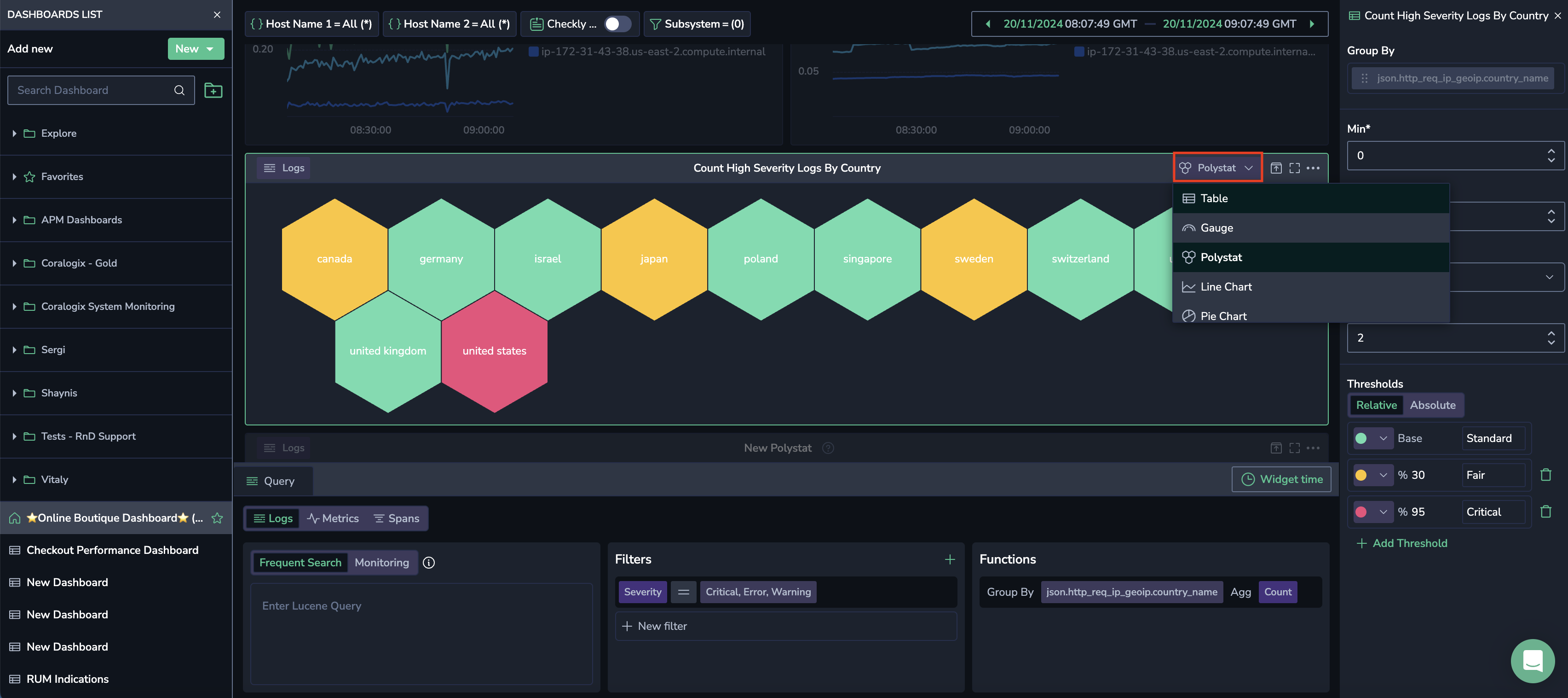
Select Edit. The Switch Visualization option will appear in the widget's top bar.
Choose a new visualization
Pick an alternate visualization for your query.
Once selected, the widget updates to the new visualization type, retaining your original query in the Query Builder. Parameters for the new widget will appear in the right-hand modal.
Use case: CPU usage analysis
Scenario
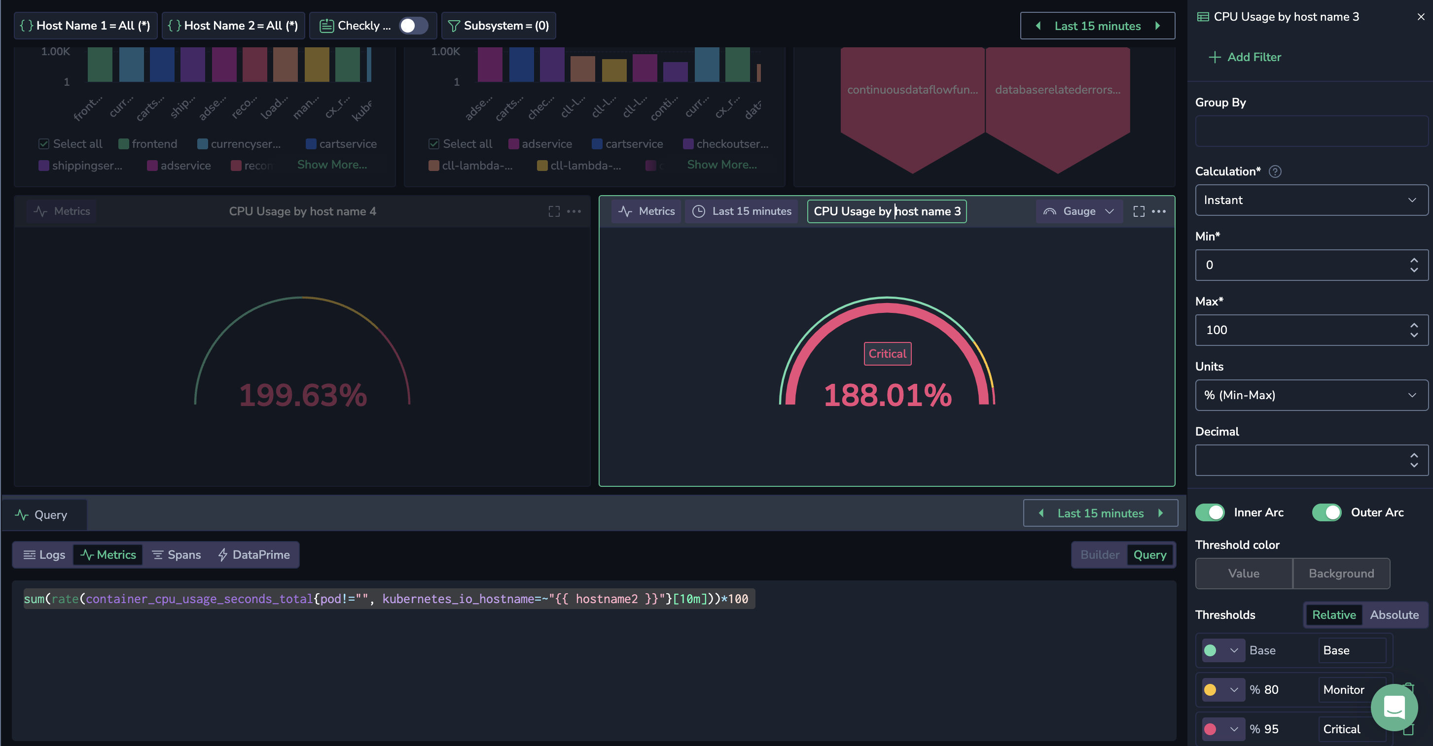
A user monitors the total CPU usage rate as a percentage for all containers running on specific Kubernetes nodes, using a Gauge. Upon receiving an alert that CPU usage has exceeded a critical threshold, the user wants to analyze the trajectory leading up to the breach.
Solution
The user edits the widget and selects a Line Chart instead. By expanding the widget's time window, they can view the long-term trajectory and pinpoint when the threshold was breached.
Switching to a time-series visualization provides deeper insights, replacing a snapshot with a detailed timeline.
Support
Need help?
Our world-class customer success team is available 24/7 to walk you through your setup and answer any questions that may come up.
Feel free to reach out to us via our in-app chat or by sending us an email to [email protected].
Next steps
Review the permissions required to work with Custom Dashboards.


