Browse metric labels and values
To run PromQL queries, visualize results, and drill down by label dimensions, see Metric Explorer.
Browse metric labels and values is a no-code interface for navigating Prometheus-compatible metrics, so you can move from raw telemetry to actionable insights without writing PromQL. It builds the queries behind the scenes and opens as a drawer, so you explore without leaving your current view.
Use it to:
- Search and explore unknown metrics: Start with a simple string search to discover relevant metric names, associated labels, and their values, even when the structure or naming conventions are unfamiliar.
- Identify common patterns: Uncover shared labels and values across multiple metrics to inform join queries and enrich your analysis. Surface metrics related to the one in focus to expand your investigation.
- Break down metrics: Slice data by metric name, label, or value to detect anomalies and investigate root causes.
Open Browse metric labels and values
Browse metric labels and values opens as a drawer from Visual Explorer or Custom Dashboards, rather than as a standalone screen.
- From Visual Explorer
- From Custom Dashboards
- In Visual Explorer, use the Query Builder to select metrics as your source.
- From the metrics search dropdown, select Open Metrics Label Browser.
- After you generate a PromQL query, select Apply query to bring it back into Visual Explorer.

- During widget setup, a query panel appears in the lower part of the dashboard panel. Toggle between Builder and Query modes.
- In Builder mode, select metrics as your source.
- Select Open Metrics Label Browser.
- After you generate a PromQL query, select Apply query to view it in Custom Dashboards.

Get started
Begin your metrics exploration in two ways, depending on your investigation path:
- Begin with a metric name if you're looking into a broad system behavior (e.g., high CPU or memory usage) and want to drill into what’s happening across services or infrastructure.
- Begin with a label/value if you're already focused on a specific entity (e.g., a service, container, or cluster) based on an incident, alert, or known context.
Begin with a metric name
Use the Metric search panel to find and select metrics by name or keyword. Selecting a metric name focuses the investigation on the nature of the data being collected, such as CPU usage, memory consumption, network errors, or disk IO.
Selecting a metric name surfaces only the relevant labels associated with it, making subsequent filtering more precise.
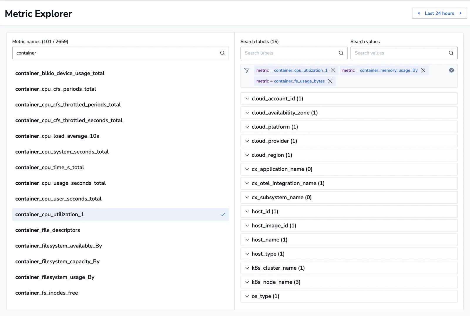
Example:
You search for container and select container_memory_usage_By, container_cpu_utilization_1, and container_fs_usage_bytes.
Why it matters:
Starting with a metric name is ideal for system-wide investigations where the symptom (e.g., CPU spikes) is known but the specific source is not. It enables broad visibility into how the selected resource behaves across different services, nodes, and environments, leading to faster problem isolation.
Begin with a label/value
Use the Label search panel to find and select metrics by label or label/value pair. Selecting a label or value focuses the investigation around a specific entity, such as an application, container, service, or cluster.
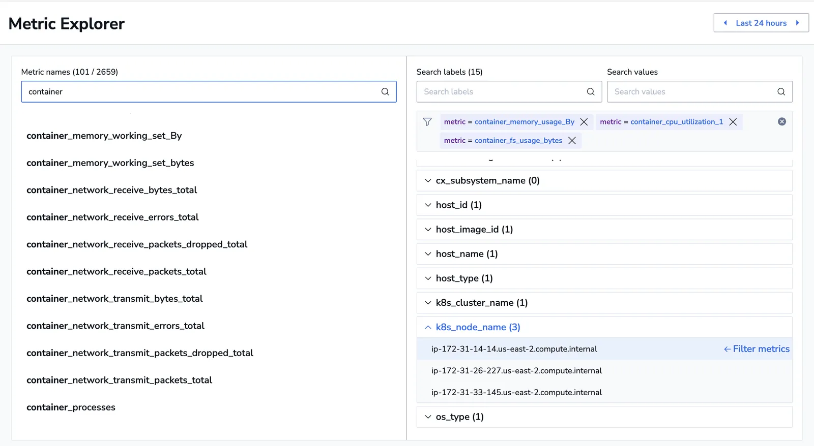
Example:
You search for the label k8s_node_name and select the value ip-172-31-14-14.us-east-2.compute.internal.
This action filters the view to display only metrics associated with this Kubernetes node, making it easy to analyze CPU usage, memory consumption, error rates, and response times for that node.
Why it matters:
Starting with a label or value is ideal when the problem space is already narrowed based on external triggers (e.g., user-reported incidents, monitoring alerts). It accelerates time-to-insight by immediately focusing the exploration on the affected service or environment.
Filter to refine your analysis
Filtering works in both directions, so you can narrow from whichever side you know:
- With labels or label/value pairs selected, select Filter metrics to reduce the metric list to the metrics carrying them.
- With metrics selected, select Filter labels to reduce the label list to the labels those metrics actually use.
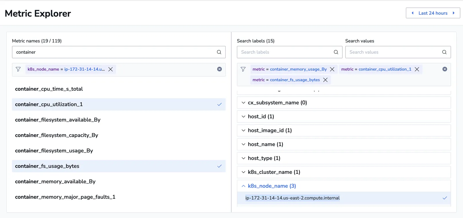
Once a filter is in place, you may search for specific metrics within the filtered pool.
A filter that matches almost everything is treated as no filter at all: the panel returns the full list and tells you the selection was too broad. Narrow it with a more specific label or value. On very large label sets, the browser may also load a partial set of values and say so, rather than making you wait for all of them.
Generate a PromQL query
As you select metrics, labels, and values, Browse metric labels and values dynamically generates a PromQL query that reflects your current state.
The generated query appears in the Generated PromQL Query section at the bottom of the screen, next to the Metric analysis results. From there you have two ways out:
- Copy PromQL query puts the expression on your clipboard, to reuse in an alert, a dashboard, or a manual Prometheus query.
- Apply query hands it straight back to whatever you opened the browser from, so you land in Visual Explorer or a dashboard widget with the query already in place.
The header also carries Open in Visual Explorer and Open in Custom Dashboard, which take the current selection into either destination without going through the clipboard.
The automatic query builder bridges the gap between visual exploration and repeatable configuration, allowing users to move seamlessly from investigation to alerting or dashboard creation without needing to construct queries manually.
Example:
After selecting container_cpu_utilization_1 and filtering by k8s_node_name = 'ip-172-31-14-14.us-east-2.compute.internal', the system generates:
container_cpu_utilization_1{k8s_node_name = 'ip-172-31-14-14.us-east-2.compute.internal'}
Select Copy Query to save it for reuse.
Visualize metrics
Automatically generate visualizations for the filtered data, selecting the most appropriate chart type based on the metric type (e.g., counter, gauge). Select Show chart.
Metrics are displayed individually.
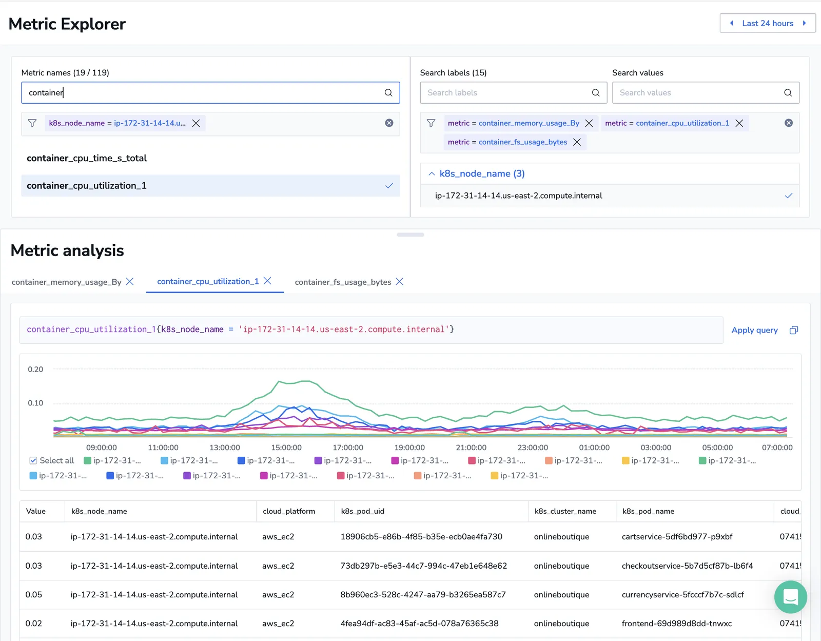
Example:
View line graphs for CPU usage, memory consumption, and response time for selected containers or services.
Why it matters:
Time-series visualizations help users quickly detect anomalies, spot performance regressions, and correlate events across different dimensions, significantly speeding up root cause analysis.
Investigate metric permutations
Visualize all permutations of a metric, grouped by selected labels such as service, team, environment, or node.
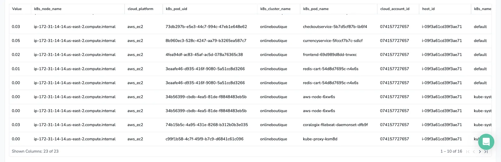
Example:
You explore CPU usage across Coralogix environments, teams, services, and pods to identify which combinations show anomalies or outliers.
Why it matters:
Comparing metric permutations surfaces hidden patterns, outliers, or systemic problems that may not be obvious when viewing aggregate or isolated metrics.
Next steps
Create ad-hoc visualizations from logs, spans, and metrics in Visual Explorer.