Explore metrics with metric explorer
Query any Prometheus-compatible metric, visualize the results, and drill down by label dimensions without setting up a dashboard first. Metric Explorer gives you a dedicated workspace to investigate metric behavior, compare series across labels, and surface outliers across your entire label space from a single screen.
Use Metric Explorer to:
- Query without a dashboard: Build and run PromQL queries in a dedicated workspace, using a no-code builder or a code editor.
- Visualize and compare: See metric trends as time series charts, filter by labels, apply aggregations, and combine expressions to derive new signals.
- Find what's driving anomalies: Drill down by label dimensions to identify which label values are contributing to unusual behavior, without writing additional queries.
Several capabilities on this page are rolling out gradually: running more than one query per tab, query aliases, Range and Instant modes, and the built-in PromQL variables. If your query editor does not show an Add query control, they are not enabled for your team yet. To request access, contact your account representative or Support.
What you need
- The
METRICS.DATA-API#HIGH:READDATApermission. - Metrics data ingested into Coralogix.
Open Metric Explorer
Navigate to Explore, then Metric Explorer.
Work in tabs
Metric Explorer opens with one query tab and holds up to five. Each tab keeps its own query, results, and chart, so you can compare two metrics side by side, or park a working query while you chase something else, without losing either.
- Select Add tab to open another. The control is unavailable once five tabs are open.
- Rename a tab so it reads
checkout latencyrather thanTab 2. - Duplicate a tab to copy its query: the quickest way to try a variation without retyping the original.
Tabs last for the browser session. They survive a page reload, but not a new session.
Build a query
Metric Explorer provides 2 query modes: Builder and Query. Use Builder for guided, no-code query construction. Switch to Query to write PromQL directly. Your choice is remembered as a preference, so new tabs open in the mode you last used, unless the query is one the builder cannot represent, which always opens in Query mode.
Filter by label
Use Filter by to narrow the metric to a specific subset of your data before running the query. Select a label from the dropdown, then select a value to apply as a filter.
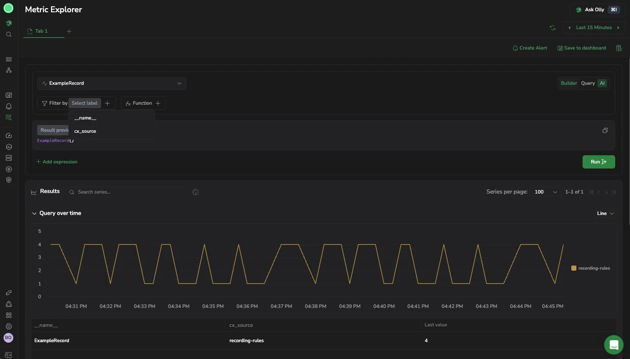
Shows the RUM_duration metric with the Filter by label dropdown open. The available labels include city, source, and replica fields. Selecting a label filters all results to matching series only, and the chart and table update immediately.
Use case
You are investigating elevated RUM page load times across your application. You select the RUM_duration metric and open Filter by to see which labels are available. You select the city label to understand how duration varies by city, immediately surfacing that Frankfurt am Main (last value: 320) and Mumbai (last value: 251) are the highest contributors.
Add a function
Use Function to shape your query results. Select from aggregation, count, rollup, and rank functions.
Aggregation
Aggregation functions calculate a set of values and return a single value. Once you select the function, select the label to aggregate by.
| Function | Description |
|---|---|
avg | The average value of all data points within the selected time range. |
count | The total number of data points within the selected time range. |
min | The smallest value among the data points within the selected time range. |
max | The largest value among the data points within the selected time range. |
sum | The sum of all data points within the selected time range. |
quantile | Computes the phi-quantile for each group of labels within the time series. The value of phi must fall within the range [0, 1]. |
histogram_quantile | Computes the phi-percentile based on the provided histogram buckets. The value of phi must be between 0 and 1. |
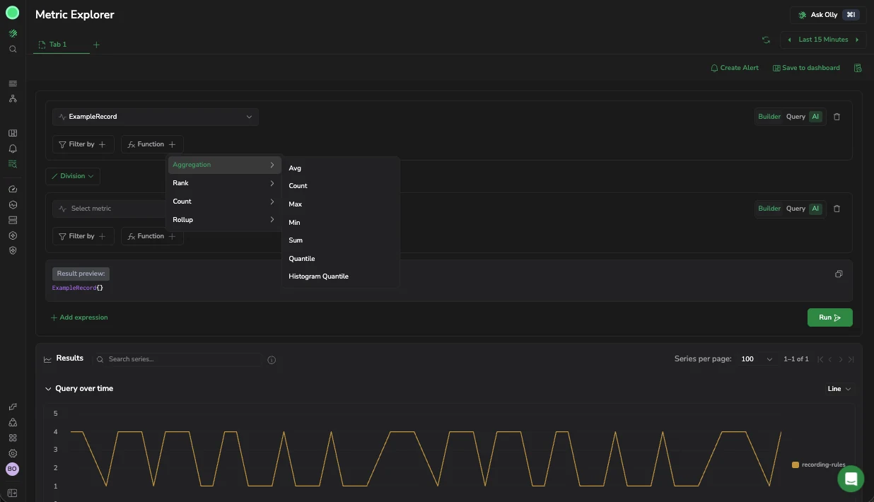
Shows the Function menu open with all aggregation options visible. Selecting Avg with a By label groups the average across each dimension, producing 1 series per label value in the chart and table.
Use case
After filtering by city, you add an aggregation to see the average load time per city over the last 15 minutes. You select Function → Aggregation → Avg, then set By to the city label. The chart shows a separate trend line per city, making it easy to compare which cities are consistently exceeding your latency threshold.
Count
Count functions run calculations on a set of values and return a single value.
| Function | Description |
|---|---|
count | The total number of data points within the selected time range. |
absent | Returns 1 if time series have no data points. Otherwise, returns an empty result. |
absent over time | Returns 1 if the provided time range contains no raw samples. |
present over time | Returns 1 if there is at least 1 raw sample in the provided time range. |
changes | The number of times the time series value changed within the provided time range. |
resets | The number of counter resets within the provided time range. |
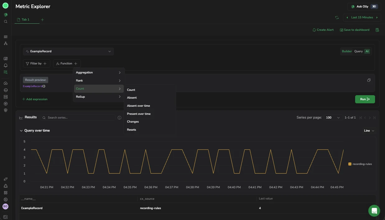
Rollup
Rollup functions aggregate time series data over a specified time range. Once you select the function, select the range to query as a hard number or ${__range} (the duration of the selected time range).
| Function | Description |
|---|---|
average over time | Computes the average of time series values over a time range. |
max over time | Finds the maximum value of time series data over a time range. |
min over time | Determines the minimum value of time series data over a time range. |
sum over time | Calculates the sum of time series values over a time range. |
count over time | Counts the number of elements with valid numeric values in the time series over a time range. |
quantile over time | Computes the specified quantile of time series data over a time range. |
Rank
Rank functions sort, rank, and filter data within your queries.
| Function | Description |
|---|---|
TOPK | Retrieves the top K results from a dataset based on a specified metric. |
SORT | Orders data in ascending order based on the selected metric. |
SORT Descending | Orders data in descending order based on the selected metric. |
Write a query directly
Switch to Query mode to write PromQL expressions directly. The Result preview shows the generated query string as you type, so you can verify the syntax before running.
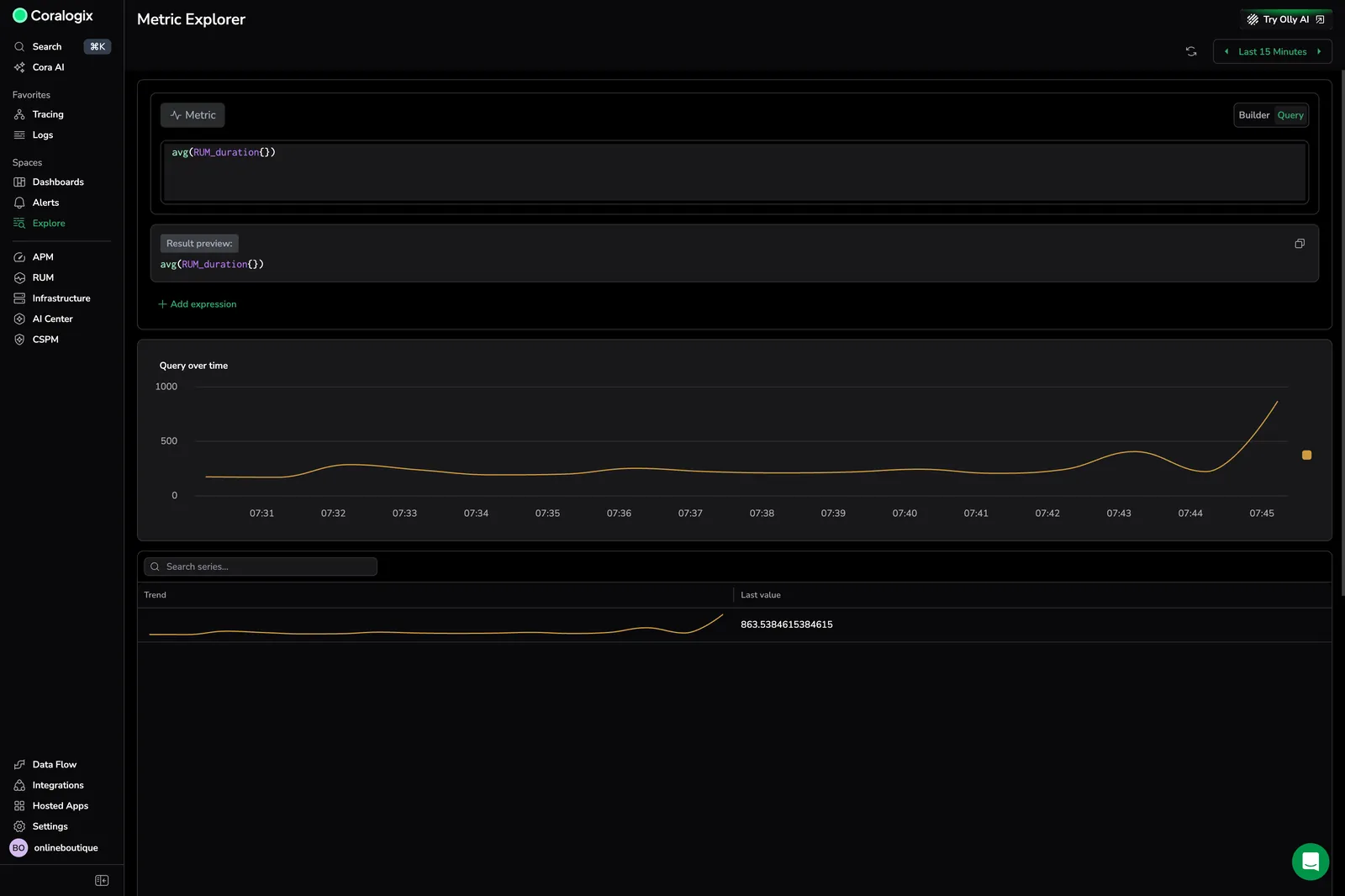
Shows a PromQL expression entered in the code editor. The result is a single aggregated series displayed in the chart, with a trend line and last value in the table.
Use case
You want to calculate the global average RUM duration, unfiltered by city or source. You switch to Query mode and enter avg(RUM_duration{}). The chart shows a single line trending upward near the end of the 15-minute window, confirming a recent degradation that is not city-specific.
Generate a query with Olly
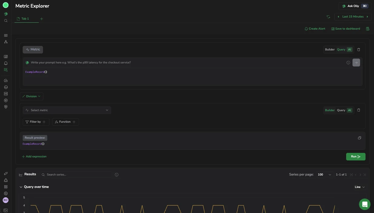
In Query mode, describe what you're looking for in plain language and let Olly write the PromQL for you. When Olly query assistance is available, the Query tab shows an AI badge and the query prompt appears above the query editor.
- Select Query mode.
- In the prompt box (Ask Olly to write a query…), describe the data you want. To get started, you can select one of the suggested prompts, such as:
- Show requests per second by endpoint
- How many pod restarts happened in the last hour?
- Compare CPU usage between staging and production
- Select Generate query, or use the Enter key. Olly writes a PromQL query and places it in the query editor.
- Review and adjust the query, then run it.
Generating a query consumes AI units; writing PromQL yourself is always free. Olly's query assistance works the same way wherever you query in Explore, for enablement, more examples, and limitations, see DataPrime query assistance.
Set the time range and automatic refresh
Use the time range picker to control the window of data Metric Explorer analyzes. The Quick tab provides preset options from Last 1 minute to Last 7 Days. Use Relative, Custom, or Tag to define a precise range.
Turn on Refresh query automatically to keep the results live. Set the refresh interval (for example, 30 seconds) so the chart and table update without manual intervention.
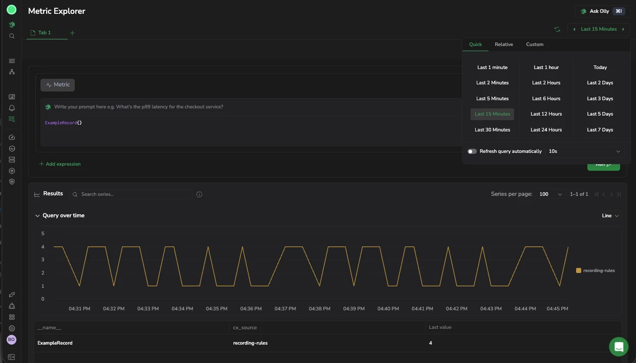
Shows the time range picker open with Last 15 Minutes selected and automatic refresh set to 30 seconds.
Use case
You are watching for a RUM duration spike during a deployment that recently rolled out. You set the time range to Last 15 Minutes and turn on Refresh query automatically at 30 seconds. The chart updates every 30 seconds, so you can watch the trend in real time.
Set the time interval
Time interval controls the resolution the chart aggregates to. Smaller intervals show more detail; larger ones smooth the line and return fewer points. It is separate from the time range: the range decides how much history you see, the interval decides how finely it is bucketed.
Auto (recommended) derives the interval from the range and the width of the chart, within bounds you set:
| Field | What it does |
|---|---|
| Max data points | The most points any one series returns. The interval widens automatically to stay under this. Accepts a whole number. |
| Min interval | The smallest interval Auto is allowed to pick. Use it to stop buckets becoming finer than your data, which wastes work and can double-count. |
Switch to Manual to set one exact interval instead, from 15 seconds up to 12 hours. Manual is the exact step, so it ignores the Auto bounds entirely, including Min interval.
Either way, the control reports the Effective interval it settled on. That can be larger than what you asked for, because data resolution, engine limits, and chart width all apply after your setting.
Use built-in PromQL variables
Write these in a query instead of hard-coding a duration, and Metric Explorer substitutes them at run time. They carry the same meaning as in Custom Dashboards, so a query moves between the two without edits.
| Variable | Resolves to |
|---|---|
${__range} | The duration of the selected time range |
${__interval} | The step the run is using, from Time interval |
${__rate_interval} | A window safe for rate(): the step plus one scrape interval, floored at four scrape intervals |
Each also has _s and _ms forms that resolve to a plain number of seconds or milliseconds rather than a duration, for the places PromQL wants a number: ${__range_s}, ${__interval_ms}, ${__rate_interval_s}, and so on.
Use ${__rate_interval} rather than ${__interval} inside rate(). A short step can otherwise cover fewer than the two samples rate() needs, and returns nothing when a scrape is missed. The four-scrape floor exists to prevent exactly that.
The interval variables resolve only once the run has a step. Before that, only the range variables substitute.
Combine expressions
Select Add expression to add a second metric or expression to the query. You can combine 2 expressions using arithmetic: Division, Multiplication, Addition, or Subtraction. Use this to derive new signals such as ratios, deltas, or normalized values from multiple metrics.
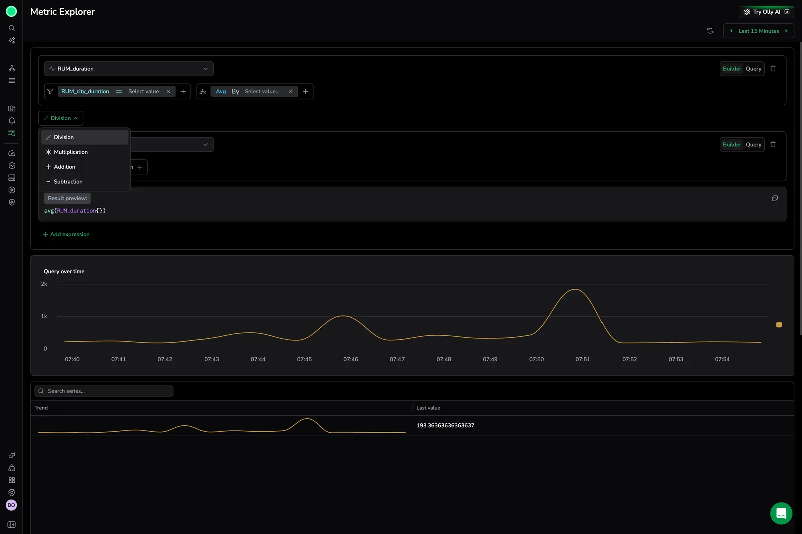
Shows the expression operator menu open with Division selected. The first expression uses a filtered RUM_duration metric, and the result preview reflects the combined formula.
Use case
You want to calculate the ratio of average city duration to the global average to normalize for baseline performance differences. You add a second expression for the global average and set the operator to Division. The result shows how much each city deviates from the global average, making outliers stand out clearly.
Switch the metric without losing your context
To change the metric, select a different metric in your query. Metric Explorer keeps your filters and group-by expressions in place, so you can explore one metric across a cluster or environment, then swap to another metric while keeping the same expressions, instead of rebuilding the query each time.
If the new metric does not carry a label you filtered on, the results show no data. This is expected: adjust or remove that filter to see results for the new metric.
Run more than one query
If your query editor shows an Add query control, a tab can hold several queries that run together and plot on one chart, which is how you compare two metrics directly rather than eyeballing two tabs.
- Select Add query to add one. Each query takes a letter (
a,b,c) and a color that its series keep in the chart and the legend. - Duplicate query copies a query with its expression, and Remove query deletes it.
- Hide query takes a query's series off the chart without deleting it, and Show query brings it back. Hiding applies immediately, with no re-run, and the hidden query is left out of the next request.
A query that fails does not take the others down with it: each query reports its own error, and the rest still render.
Name series with an alias
By default a series is named after its label values, such as api - prod. Use the Query alias field to name them yourself. The alias is a template, so one alias covers every series the query returns:
| Token | Renders |
|---|---|
{{pod}} | The value of the pod label for that series |
{{ $labels.pod }} | The same value, in the syntax dashboards use |
{{__name__}} | The metric name |
Two behaviors are worth knowing. A token for a label the series does not carry stays on screen as literal text, so a legend reading {{pod}} tells you that series has no pod label rather than silently rendering blank. And an alias replaces the name outright, a token-free alias names every series of that query identically, which is why a {{label}} token is what keeps them apart.
Renaming re-labels the chart straight away. It does not require another run.
Query a single point instead of a range
The Range and Instant controls decide what a run returns:
- Range returns a value over time for every query, the default, and what you want for a trend.
- Instant returns one value per series, evaluated at the end of the selected time range, what you want for a snapshot, such as current usage per pod.
The setting applies to the whole page rather than to one query, because a chart mixing a trend with a single point has no coherent time axis. Switching between them never runs on its own: Run becomes available so you decide when the request fires.
The chart Metric Explorer picks follows the shape of the response, not the mode you selected. An instant run that returns a single value per series renders as a column chart, while an instant run over a range selector such as metric{}[10m] comes back as a series and renders as a time series.
Run a query
After you build or edit a query, select Run, or use the Command+Enter or Control+Enter keyboard shortcut, to run it. Metric Explorer runs a query only when you ask it to, so you control exactly when a query fires.
Set the time interval
Next to Run, the Time interval control sets how coarsely a range query samples, which is the step PromQL evaluates at.
- Auto (recommended) derives the step from the time range and the width of the chart, so a long range does not return more points than the chart can draw. The control shows the Effective interval it settled on.
- Manual hands you the step directly. Set Max data points to cap how many points a series returns, and Min interval to set the finest step your data can support.
Reach for Manual when a metric arrives at a known frequency and an automatic step blurs it, or when you are comparing runs and want the same step every time. A step finer than the scrape interval adds gaps rather than detail.
Run query stays available after a run, so pressing it again refreshes the same query against current data. You do not need to change anything to re-run.
Reuse an earlier query
Select Query history in the header to see the queries you have already run, then select one to load it back into the current tab. History is kept in your browser, so it persists across sessions and stays local to you.
Read query error messages
When a query cannot run, Metric Explorer shows the specific reason and how to resolve it rather than a generic failure. For example, a series limit reached message means the query matches too many series. Narrow the query with filters, or use recording rules to pre-aggregate the data.
Visualize results
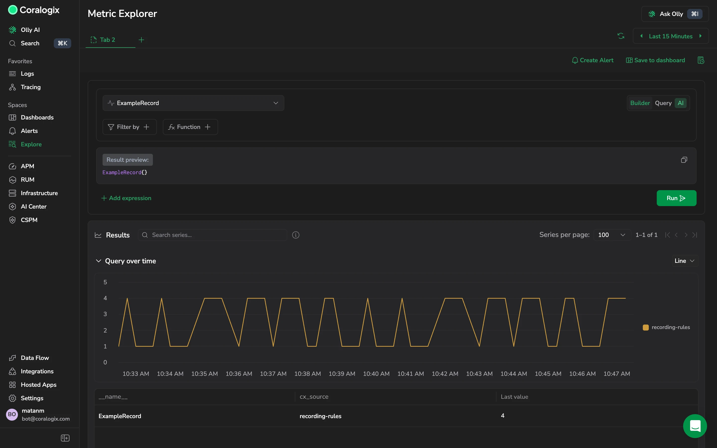
After running a query, Metric Explorer displays results in the Query over time chart and a table.
The chart shows each series as a color-coded line. Hover over any timestamp to see the exact values for each series at that moment. Use the legend to identify or toggle individual series.
The table lists each series with:
- Trend: a trend line showing the shape of each series over the selected period.
- Label columns: the label dimensions that differentiate each series.
- Last value: the most recent recorded value for the series.
Select a column header to sort the table. Use Search series to filter rows by label value. The search covers every series the last run returned, not only the rows on the page in view, and the table re-pages around the matches, so a series that matches deep in the results still surfaces. Use Series per page to change how many rows a page holds.
Page through the series
The Results header reports how many series the last run returned, as a range such as 1–1 of 1, with controls to move between pages.
Series per page sets how many series the chart and table show at a time. It does not cap how many the query returns, so lowering it makes a wide result readable rather than reducing the work the query does. To return fewer series, narrow the query.
Search series filters across every series in the last run, not only the page on screen, and re-pages the results around what matches. A series on page four is still found from page one.
Change the chart type
The chart renders as a line by default. Switch the chart type to Line, Area, Stacked area, Scatter, Bar, or Pie depending on what you are reading for. Stacked area suits parts of a whole over time, such as CPU by pod adding up to cluster usage. Pie suits a single point-in-time comparison rather than a trend.
The table and chart interact: hovering or selecting a row in the table highlights the corresponding series in the chart.
Filter values from the table
Hover over a value in the results table to filter it in or out. Metric Explorer adds the filter directly to your query, so you do not edit the expression by hand. Run the query again to apply the new filter.
Group by a column from the table
Hover over a column header to reveal its menu icon, then select an aggregation to group by that column: avg, sum, max, min, or count. Metric Explorer adds the aggregation to your query, for example sum(rum_data_cx_docs_total{}) by (context_rating), without requiring you to write PromQL.
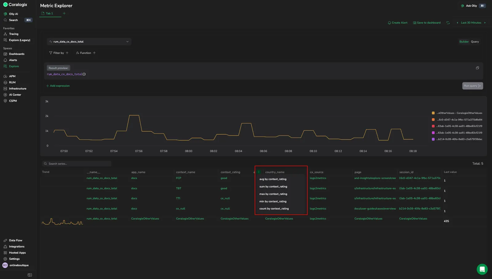
Shows the group-by menu on a results-table column, with the avg, sum, max, min, and count options.
Use case
You are investigating why your documentation site shows degraded performance. You select the rum_data_cx_docs_total metric and select Run. The table returns many series across pages, ratings, and countries, so you hover the good value in the context_rating column and filter it out to focus on the ratings that need attention. To break the remaining volume down, you hover the context_rating column and group by it with Sum. One grouped row carries most of the volume, so you select its drilldown arrow to open Drill-down by label dimensions and find that a single page and country drive the result. You then switch the metric to a related latency metric, keeping the same filter and group-by, to confirm the same page is also slow. This chains the new controls into one path: run on demand, narrow from the table, aggregate without PromQL, drill into the cause, then pivot to a related metric without rebuilding the query.
Drill down by label dimensions
Select any row in the table to open the Drill-down by label dimensions panel. Use it to understand how the selected series distributes across all available label dimensions without writing additional queries.
When a query is aggregated with a group-by, each grouped row shows a drilldown arrow at the end of the row. Select it to open the panel for that row. Unaggregated queries have nothing to drill into, so the arrow does not appear.
The panel applies the selected series value as a filter to the query and shows a grid of subseries charts, one chart per available label. Each chart displays all values for that label as separate series, so you can compare behavior across dimensions.
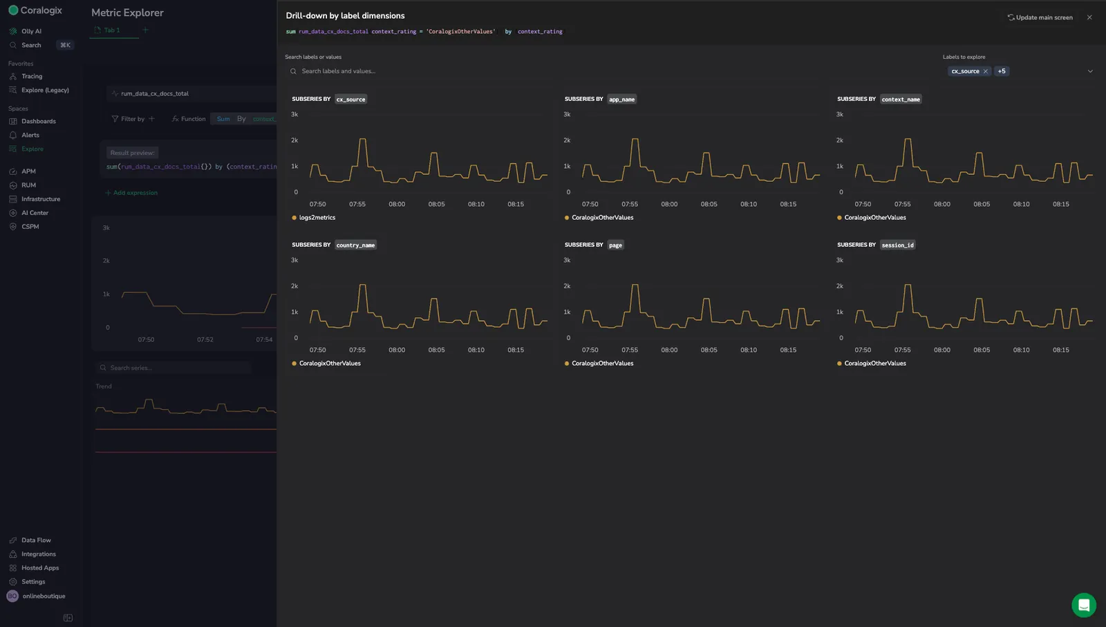
Shows the Drill-down by label dimensions panel with one subseries chart per label.
To control which labels appear in the grid, use Labels to explore in the panel. You can add or remove labels, with up to 30 labels visible at a time. The panel opens with the six labels it ranks most relevant already selected, so you start on a useful subset rather than every label at once.
A label with more than 100 series is charted as its top 100 series rather than in full. That keeps a high-cardinality label such as pod readable instead of rendering thousands of lines, at the cost of hiding the smallest series.
Select Update main screen to apply the current drilldown selections back to the main query view.
Explore metric labels and values
Metric Explorer does not include the label browser. To explore metrics, labels, and label values without writing PromQL, open Browse metric labels and values from the Visual Explorer or Custom Dashboards query builder, generate a starting query there, and bring it back.
Permissions
| Permission | Action |
|---|---|
METRICS.DATA-API#HIGH:READDATA | Access Metric Explorer and run queries |
Learn more
Next steps
Navigate metrics, labels, and label values without writing PromQL in Browse metric labels and values.