Signals tab
The Signals tab in the spans query results panel surfaces the RED signals (Rate, Errors, and Duration) for the active query and time range. Inside Signals you pick between two layouts:
- Outliers (default): overlays latency percentiles, span counts, and individual span samples on a single chart, so error spikes, latency regressions, and traffic shifts line up on the same time axis.

- RED metrics: renders Rate, Errors, and Duration as three side-by-side charts, each with its own configuration.
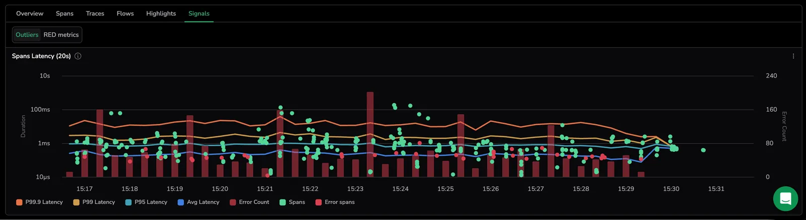
Use Signals to spot trends before drilling into individual spans, a spike in errors or a latency shift is often visible in the charts before it's reported as an incident.
Open the Signals tab
In Explore, run a query against the spans dataset, then select Signals in the query results panel, next to Overview, Spans, Traces, Flows, and Highlights. The tab is only available when the active dataset is spans.
Inside Signals, a button group at the top of the tab toggles between Outliers (default) and RED metrics. Coralogix remembers the last sub-view you selected, leaving Signals for another tab and coming back restores your choice instead of resetting to Outliers.
Outliers
The Outliers chart gives you a unified view of span performance across three signal types simultaneously.
What it shows
- Lines, latency trends over time. Four percentile series: P99.9 Latency (orange), P99 Latency (yellow), P95 Latency (cyan), and Avg Latency (blue).
- Dots. Individual span samples plotted by duration. Green dots represent successful spans, red dots indicate error spans.
- Bars. Span count per time bucket, scaled to the right Y-axis.
The legend at the bottom of the chart lists all active series: P99.9 Latency, P99 Latency, P95 Latency, Avg Latency, Error Count, Spans, and Error spans. Select any series in the legend to toggle it on or off.

Y-axes
- Left axis: Duration on a logarithmic scale (
10μs → 10s). - Right axis: Count on a linear scale, tracking the Spans and Error Count series.
How to use it
- Hover any point to see exact latency values (P99.9, P99, P95, Avg) and error count for that timestamp.
- Select any data point to open the tracing drilldown for that specific span, with full context and related data.
- Drag across a time window to zoom in and focus on a specific period.
- Toggle specific metrics on or off from the legend at the bottom of the chart.
Why use it
Instead of switching between separate graphs for latency, errors, and traffic, Outliers surfaces all three signals in one place, making it immediately visible when error spikes correlate with latency regressions, without any manual cross-referencing.
RED metrics
The RED charts render from the active query and time range and stay in sync with the query builder, grouping and aggregation changes in the builder apply to all three charts at once.
| Metric | Meaning |
|---|---|
| Rate | Span rate over time. In the Traces tab, this is the trace count per time bucket. |
| Errors | Count or rate of error spans over time. |
| Duration | Aggregated latency over time. Default aggregation is Avg. Available aggregations: Avg, Min, Max, Median, p75, p90, p99. |
Per-graph configuration
Group by and Aggregation are set at the query level using the chips at the top of Explore. They apply to all three RED charts and to the Outliers chart at once.
Each chart also has its own configuration panel for how the data is rendered. Open the edit icon on a chart header to access:
| Setting | Options |
|---|---|
| Visualisation | Vertical bar, Line chart, or Area chart. Line chart is the default. |
| Scale | Linear (default) or Logarithmic. |
| Time bucket | Auto, or a custom interval. |
The Duration chart additionally exposes an aggregation switcher in its header. Select between Average (default), Min, Max, Median, P75, P90, and P99 to change how span durations are aggregated.
Chart interactions
- Hover to see the grouped value, aggregated result, and selected time range in a tooltip.
- Drag across a time window to zoom all charts in the active sub-view simultaneously. Zooming updates the time range picker, so the entire query reflects the new window.
- Scroll or pinch to zoom into a specific interval on a focused chart.
Chart action menu
Select any data point to open the chart action menu.
| Action | What it does |
|---|---|
| Filter raw spans | Opens the Spans tab filtered to the selected value, so you can inspect the underlying spans. |
| Drilldown spans | Opens the spans info panel for the selected aggregation row, showing every span that contributed to that group. Use this when you want to inspect all underlying spans rather than a single representative one. The label switches to Drilldown logs on the logs dataset. |
| View tracing drilldown | Opens the tracing drilldown drawer on a representative span for the selected data point. Available on the Rate, Errors, and Duration charts in RED metrics. The selected span follows the aggregation type. See Tracing drilldown span selection. |
| Include in query | Adds the selected value as an include filter. |
| Exclude from query | Adds the selected value as an exclude filter. |
| Copy value | Copies the selected value. |
| Copy key | Copies the field name for the selected data point. |
| Copy query | Copies the full query used to generate the chart. Use this to replicate the query in DataPrime or share it with a teammate. |
Tracing drilldown span selection
View tracing drilldown is available from both Outliers and RED metrics, and from the custom chart that renders when a custom aggregation is active. When you select a data point, Coralogix picks the most representative span for that aggregation type, so the span you see in the drilldown is always contextually relevant to what you were analyzing. Selecting a data point opens the tracing drilldown drawer with full context preserved:
- The drilldown respects the selected timeframe and the active Group by field or tag.
- It works across the Dependencies, Gantt, and Flame views. State is cached locally as you switch views, so you don't lose context.
- The drawer auto-focuses on the first span within the selected timeframe and group, chosen by the chart's aggregation:
| Aggregation | Span selected | Best for |
|---|---|---|
| Min Duration | Fastest span | Optimizations and baselines. |
| Max Duration | Slowest span | Debugging slowness. |
| Average Duration | Span closest to the mean | Understanding normal flow. |
| P99 | 99th percentile span | Tail latency, SLA breaches. |
| P95 | 95th percentile span | Common SLA targets. |
| P50 | Median span | Representative sample. |
| Count | First span from the API response | Quick exploration. |
| Error Count | First error span from the API response | Error investigation. |
Per-chart actions
Every chart in Outliers and RED metrics carries the same set of header controls:
| Action | Where to find it | What it does |
|---|---|---|
| Graph configuration | Pencil icon on the chart header | Opens the per-chart configuration panel. See Per-graph configuration. |
| Focus / Exit focus | Expand arrow on the chart header | Expands a single chart and hides the others. Select the icon again to return to the side-by-side layout. |
| Legend Settings | Kebab menu (⋮) on the chart header | Changes the legend position. See Legend. |
| Copy Graph image | Kebab menu (⋮) on the chart header | Copies the current chart as an image to the clipboard. |
| Export Graph as PNG | Kebab menu (⋮) on the chart header | Downloads the current chart as a PNG file. |
In RED metrics, the Duration chart additionally exposes an aggregation switcher next to its title. See Per-graph configuration.
Legend
The legend shows the top series and their running metric values. From the more actions menu on any chart, choose Legend settings to change the layout.
| Setting | Options |
|---|---|
| Legend position | Side (default), Bottom, Hide. |
| Legend columns | Any combination of Last, Min, Max, Avg, Total. |
Select a legend value to focus the chart on that series. The other series are hidden and the Y-axis re-scales to the selected series; a Reset link appears in the chart to restore all series.
Next steps
Refine your results with error filters, duration filters, and groupings in Query builder for spans.