Viewing the topology map
Use the Map view in Infrastructure Explorer to see the shape of your infrastructure at a glance and tell whether it is healthy before you drill into any single resource.
Each resource type page offers two views of the same filtered set of resources. The Table view lists resources row by row, with the overview widgets and full detail. The Map view renders those same resources as a grid of hexagons colored by health, so a large environment reads as one picture instead of thousands of rows.
The Map view is built for the moments when a list is too much detail:
- Triage at a glance. Open a page and know immediately whether things are healthy, without scanning a table.
- Judge the scope. See how far a problem reaches across a resource type, service, environment, or team.
- Find the usual offenders. Spot which groups are repeatedly unhealthy, because unhealthy resources sort to the front of every group.
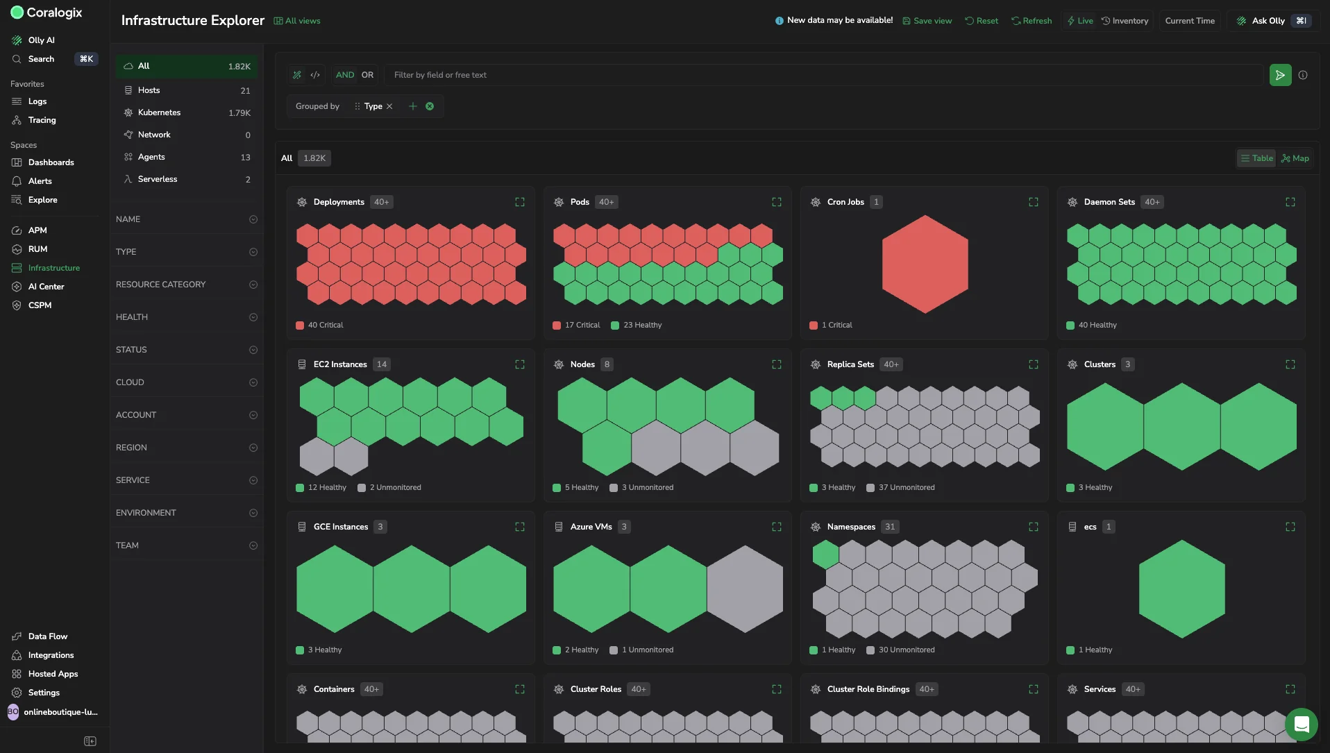
Shows one card per resource type, with each hexagon representing a single resource colored by its health.
What you need
Access the Map view when all of the following are true:
- You have access to Infrastructure, then Infrastructure Explorer.
- Infrastructure Explorer is in Live view. The Map view is not offered in Inventory view, because a topology snapshot over a historical time range is not meaningful.
- You have the
INFRASTRUCTURE-EXPLORER:READpermission. See the centralized Permissions list for the system roles that include it.
Open the Map view
To switch to the Map view:
- Select Infrastructure, then Infrastructure Explorer.
- Confirm the page is in Live view.
- In the top right of the results area, select Map.
Understand the map
Each hexagon represents a single resource, colored by its health status.
| Color | Health status |
|---|---|
| Red | Critical |
| Green | Healthy |
| Grey | Unmonitored |
The Map organizes resources into cards. When you set no grouping, the Map applies a minimal default:
- On the All resources page, the Map groups by Type, with one card per resource type such as Deployments, Pods, or Nodes.
- On a single resource type page, the Map renders one card titled with that resource type.
When you set a field in the Grouped by control, that grouping takes precedence. Grouping and filters are shared with the Table view, so switching between Table and Map keeps the same population in context. You can group by up to 3 fields, the same as the Table view. For how grouping and defaults behave, see Explore infra resources.
Within each card, resources sort by health with unhealthy resources first, and a card shows a representative subset rather than every resource in the group. This answers "is this group healthy?" without scrolling. To widen a single card to the full width of its container, select the expand control in the top right of that card.
How it works
The Map view reads the same discovered resources, filters, search, and grouping as the Table view, and changes only how that set is visualized. Health color reflects the resource's current state in Live view, based on metrics averaged over the last 15 minutes.
Limitations
Be aware of the following constraints:
- The Map view is available in Live view only.
- Each card shows a subset of resources sorted unhealthy first, not the full list. Use the Table view for the complete list.
- Grouping supports up to 3 fields.
- A resource without health data appears as Unmonitored.
Next steps
Read the health of a group or resource type over time by following Scan infra health at a glance.