Visual Explorer
Overview
Visual Explorer is a powerful tool that integrates a multifunctional Explore display with customizable dashboard widgets, enhancing your log, span and metrics exploration. It provides a fast and easy way to add query-based graphs without the need for setting up custom dashboards. Use Visual Explorer to identify anomalies within your application or infrastructure more quickly. Instead of manually sifting through raw logs, tracing or metrics data, you can quickly pinpoint the source of issues using log patterns and visual indicators. The ad-hoc visualizations can be created using a simplified query builder or by leveraging query languages like DataPrime, Lucene or PromQL.
Multiple queries from different data sources can be displayed side-by-side on the same Visual Explorer page, making it easier to correlate data and providing a more comprehensive view of your system.
Organize investigations with tabs
Use tabs to structure multiple Visual Explorer investigations within the same workspace. Each tab contains its own set of queries and visualizations, allowing you to explore different signals, environments, or hypotheses without replacing your current view.
Tabs make it easier to compare results, test alternative queries, and organize complex investigations.
For detailed instructions, see Use Tabs in Visual Explorer.
Query builder
Build queries for your widgets without the burden of knowing the exact DataPrime, Lucene or PromQL syntax. Easily create DataPrime queries as the basis for your widget using Convert to DataPrime function. You may also use logs, metrics or spans as data sources for your widgets.
- Filters. If needed, add filters to your queries to narrow down results based on specific attributes or categories, making it easier to find relevant data.
- Functions. You can enhance your queries by using the following functions:
- Grouping. Group query results by a label to get a more granular view.
- Aggregation. Calculate a set of values and return a single value.
These functions includeSUM(),AVG(),MIN(),MAX(),COUNT(), and others. Once you choose the function, select the label to aggregate in the dropdown menu or type it.
Multiple queries
Create up to 4 queries on a single Visual Explorer page, each with dedicated attributes tailored to specific needs. From there, you can either add a new graph or duplicate an existing one, retaining all of its settings and configurations.
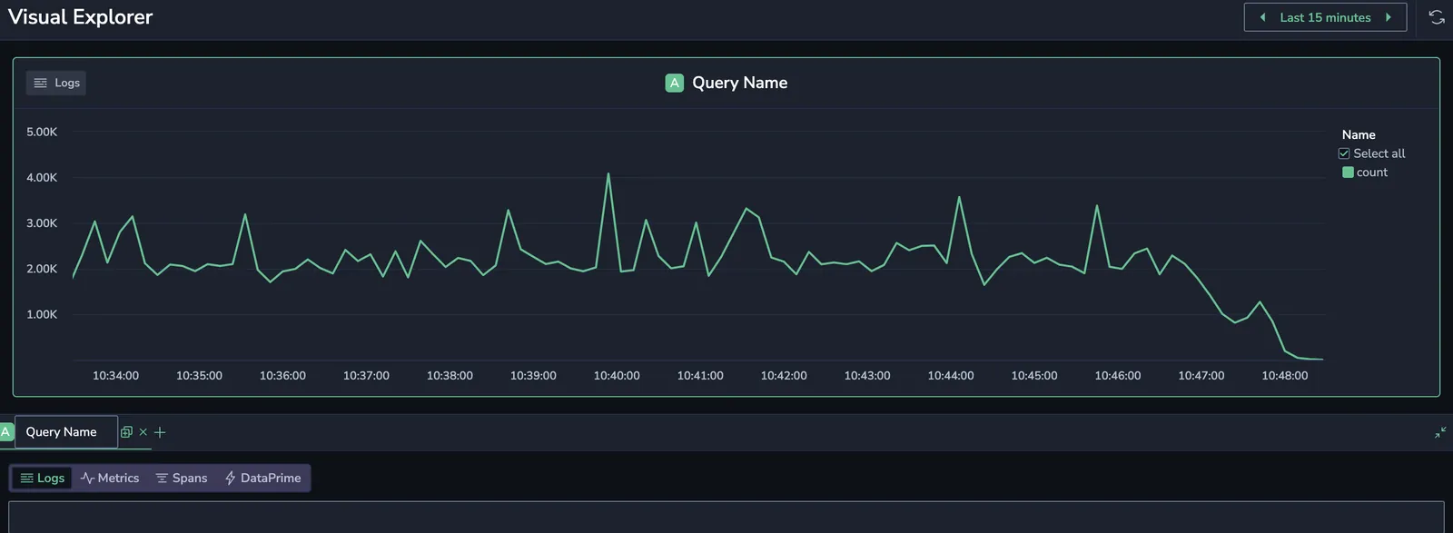
Visualize your queries
Enhance and simplify your data analysis by turning your log-, span-, or metric-based queries results into visual representations.
-
Navigate to Explore > Visual Explorer.
-
Use the query panel at the bottom of the Visual Explorer page to configure your query:
- Assign a meaningful name to your query by selecting the Query Name field.
- Choose your data source for the query (logs, metrics, spans, or a DataPrime query). See the relevant sections below. When you create a logs-based or spans-based query, you have the option of converting it to DataPrime syntax language by clicking Convert to DataPrime in the upper right corner of the Builder
- You can create up to 4 query charts on a single Visual Explorer page. To create a new query, click +. To duplicate an existing query, use Duplicate Query, available either from the more actions menu inside the visualization, or by hovering over the Query Name tab in the query builder.
More actions menu
Each query chart includes a more actions menu in its top-right corner. This menu provides quick access to advanced widget-level options:
-
Delete: Remove the current query chart from the Visual Explorer page. This action is permanent and can't be undone.
-
Duplicate Query: Create an exact copy of the current query chart. This includes the query number, data source, filters, functions, and widget type—ideal for comparing visualizations of the same query.
-
Legend Settings: Configure how the legend appears on the chart:

- Placement: Choose between Side, Bottom, or Auto positioning. When set to Auto, the system selects the best location based on the chart size.
- Value columns: (available when legend is on the side): Show or hide summary values such as Min, Max, Sum, Avg, or Last for each data series. When value columns are displayed, you can sort the value columns by ascending or descending order to highlight the highest and lowest values at a glance.
- Series-level more actions: Each data series in the legend also includes a more actions menu. From here, you can copy the series name or open the Explore screen for either logs or traces The Explore screen opens, pre-filtered with the context of that data point to provide deeper investigation.
-
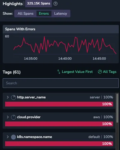
Highlights(span-based queries only): Quickly surface patterns and outliers across your system’s span data by analyzing consistencies and anomalies across key attributes, such as
k8s.namespace.nameorhttp.server_name. Use highlights to accelerate root cause analysis by helping you identify:- Latency spikes
- Error-prone services
- Irregularities or unexpected values in span fields
Metrics-based query
When using metrics as your data source, toggle between Builder and Query modes.
Data source
In Builder mode, select metrics as your source.

Metric name
Choose your preferred metric from a dynamically filled dropdown menu of available metrics. Use the autocomplete function to explore the metric name, labels, and values.
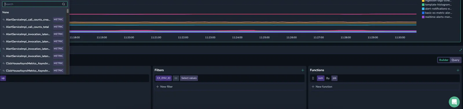
Filters
To add a filter, click +. Choose a metric label and an associated value to filter your metric.
Select the = or != operator from the drop-down menu to include or exclude one or more values, respectively.
To add additional label-value pairs, click the + button.
Functions
Selecting metrics and labels already builds a valid Prometheus query, but you can create more complex queries using functions.
To add a function, click +. Select between aggregation, count, rollup and rank functions.
Aggregation
Aggregation functions calculate a set of values and return a single value. These functions include SUM(), AVG(), MIN(), MAX(), COUNT(), and others. Once you choose the function, select the label to aggregate in the dropdown menu or type it.
| Aggregation | Description |
|---|---|
average | The average value of all data points within the selected time range. |
count | The total number of data points within the selected time range. |
min | The smallest value among the data points within the selected time range. |
max | The largest value among the data points within the selected time range. |
sum | The sum of all data points within the selected time range. |
quantile | The quantile(phi, q) by (group_labels) function is an aggregate that computes the phi-quantile for each group of labels within the time series returned by q. The value of phi must fall within the range [0...1]. The quantile is calculated separately for each set of points that share the same timestamp. This function is supported by PromQL. |
histogram_quantile | The histogram_quantile function is a transformation function that computes the phi-percentile based on the provided histogram buckets. The value of phi must be between [0...1]. For example, histogram_quantile(0.5, sum(rate(http_request_duration_seconds_bucket[5m])) by (le)) returns the median request duration for all requests in the last 5 minutes. |
Count
Count functions perform calculations on a set of values and return a single value. These functions include Count(), Absent(), Absent over time(), Present over time(), Changes(), Resets()and others.
| Count | Description |
|---|---|
count | The total number of data points within the selected time range. |
absent | Returns 1 if time series have no points. Otherwise, it returns an empty result. |
absent over time | Returns 1 if the provided time range does not contain raw samples. |
present over time | Returns 1 if there is at least a single raw sample in the provided time range. |
changes | The number of times that the time series value has changed within the provided time range. |
resets | The number of counter resets within the provided time range. |
Rollup
A rollup function refers to functions that aggregate time series data over a specified time range. These functions compute metrics like average (avg_over_time), sum (sum_over_time), minimum (min_over_time), maximum (max_over_time), count (count_over_time), and quantiles (quantile_over_time) over a window of time. They are used to summarize and analyze metric data.
| Rollup | Description |
|---|---|
average over time | Computes the average of time series values over a time range. |
max over time | Finds the maximum value of time series data over a time range. |
min over time | Determines the minimum value of time series data over a time range. |
sum over time | Calculates the sum of time series values over a time range. |
count over time | Counts the number of non-NaN elements in the time series over a time range. |
quantile over time | Computes the specified quantile of time series data over a time range. |
Once you choose the function, select the range to be queried as a hard number or ${__range}. This variable represents the duration of the dashboard time range. It is rendered as an interval string supported by PromQL. For example, if one selects a time range from 13.00 to 14.30, the ${__range} variable will be rendered as 90m. For detailed information about pre-defined variables, see this tutorial.
Rank
Rank functions allow you to sort, rank, and filter data within your queries. You can use them to refine your results based on specific metrics and values.
To add a rank function, click + and choose from TOPK, SORT, or SORT Descending. Once you select a rank function, configure it by specifying the metric and parameters (e.g., populate the number of K results you would like the query to retrieve for TOPK).
| Rank Function | Description |
|---|---|
TOPK | Retrieves the top K results from a dataset based on a specified metric. Use this to show the highest-ranking data points. |
SORT | Orders data in ascending order based on the selected metric. Use this to organize data from the smallest to the largest value. |
SORT Descending | Orders data in descending order based on the selected metric. Use this to prioritize the largest values at the top of the result set. |
Log-based query
Data source
Select logs as your data source.
Data pipeline
Choose to query Frequent Search or Monitoring logs.
Filters
To add a filter, click +. Choose a label and an associated value.
Select the = or != operator from the drop-down menu to include or exclude one or more values, respectively.
To add additional label-value pairs, click the + button.
Functions
To add a function, click +. Show an aggregated value using one of the following functions.
| Function | Description |
|---|---|
| Count | The total number of data points within the selected time range. |
| Count Distinct | The number of unique data points within the selected time range. |
| Sum | The sum of all data points within the selected time range. |
| Min | The smallest value among the data points within the selected time range. |
| Max | The largest value among the data points within the selected time range. |
| Average | The average value of all data points within the selected time range. |
| Percentile XX | Represents the value below which XX% of the data points fall. For example, Percentile 95 is the value below which 95% of data points fall. |
With Group by, you may group query results by one or more fields.
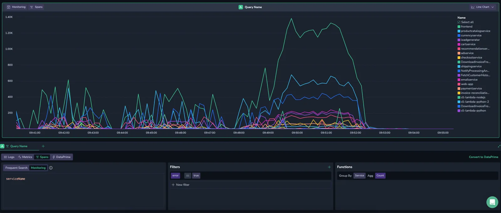
Span-based query
The span-based Query Builder allows you to create complex queries by crafting Lucene-based queries and then adding filters and functions.
Data source
In Builder mode, select spans as your source.
Data pipeline
Choose to query Frequent Search or Monitoring spans. Find out more about TCO pipelines for spans here.
Filters
To add a filter, click +. Choose a label and an associated value.
Select the = or != operator from the drop-down menu to include or exclude one or more values, respectively.
To add additional label-value pairs, click the + button.
Functions
To add a function, click +. Show an aggregated value using one of the following functions.
| Function | Description |
|---|---|
| Count | The total number of data points within the selected time range. |
| Count Distinct | The number of unique data points within the selected time range. |
| Sum | The sum of all data points within the selected time range. |
| Min | The smallest value among the data points within the selected time range. |
| Max | The largest value among the data points within the selected time range. |
| Average | The average value of all data points within the selected time range. |
| Percentile XX | Represents the value below which XX% of the data points fall. For example, Percentile 95 is the value below which 95% of data points fall. |
With Group by, you may group query results by one or more fields.
Query spans by their relationships in a trace — Use relational queries in the Query Builder to explore root, parent, or any span relationships for deeper application insights.
Investigate spans with Highlights
Highlights show how spans are distributed across fields, so you can quickly spot commonalities, outliers, and root causes.
To access it, select the more actions menu within your widget and open Highlights. Use Compare mode to understand what changed between two time periods—whether a sudden spike, a regression, or a recurring pattern.
For span-based queries, when you use Highlights with Compare mode, you can’t execute a relational query.
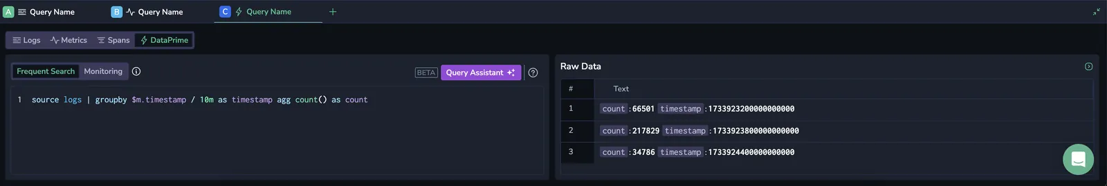
DataPrime query
You may create a DataPrime query as the basis for your widget. The default view includes a log-based line chart widget with a DataPrime query (source logs | groupby $m.timestamp / 1m as timestamp agg count() as count).
This query retrieves logs, groups them into 1-minute intervals based on their timestamp, and then counts how many log entries appear in each of those 1-minute intervals.
Data pipeline
Choose to query Frequent Search or Monitoring data. Find out more about TCO pipelines for logs here and for spans here.
DataPrime Query Assistance
Use the DataPrime Query Assistance to describe your query in natural language and the system will transform your input into a structured query. Learn more about the DataPrime functionality through its dedicated portal.
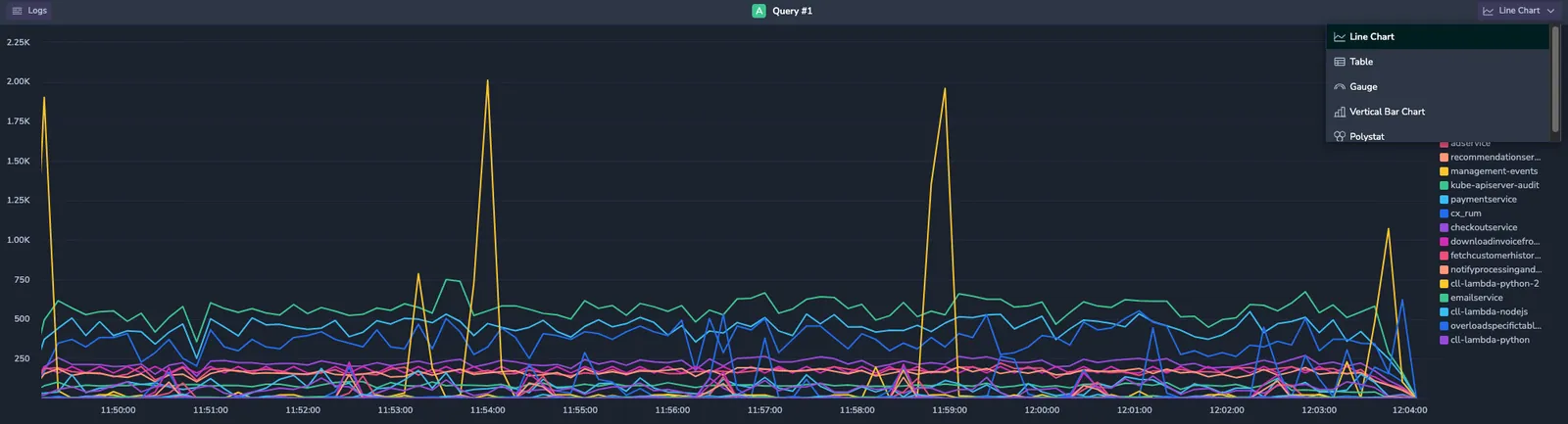
Switching between visualizations
Easily switch between various chart visualizations in Visual Explorer without having to recreate the widgets. This lets you explore your data from multiple angles while keeping your original query unchanged.
Use the dropdown menu at the top right of the chart to toggle between different views.
How suggested visualizations respond to your actions
Visual Explorer uses dynamic widgets to automatically recommend the most suitable visualization based on the shape of your query results. As you modify a query—by changing groupings, aggregations, or filters—the system may update the suggested visualization to better represent the data.
When a visualization becomes fixed
Once you explicitly indicate how you want to view the data, Visual Explorer preserves that choice. The visualization type stops automatically changing, even as you continue to refine the query. This ensures the system assists exploration without overriding your intent. Visualization options remain available at all times. You can manually switch views by selecting Suggest Visualizations.
You can also select how tabular results are displayed. Use the visualization dropdown to switch between the Dynamic widget table or the Legacy table. Both options are fully supported and designed for different exploration needs.
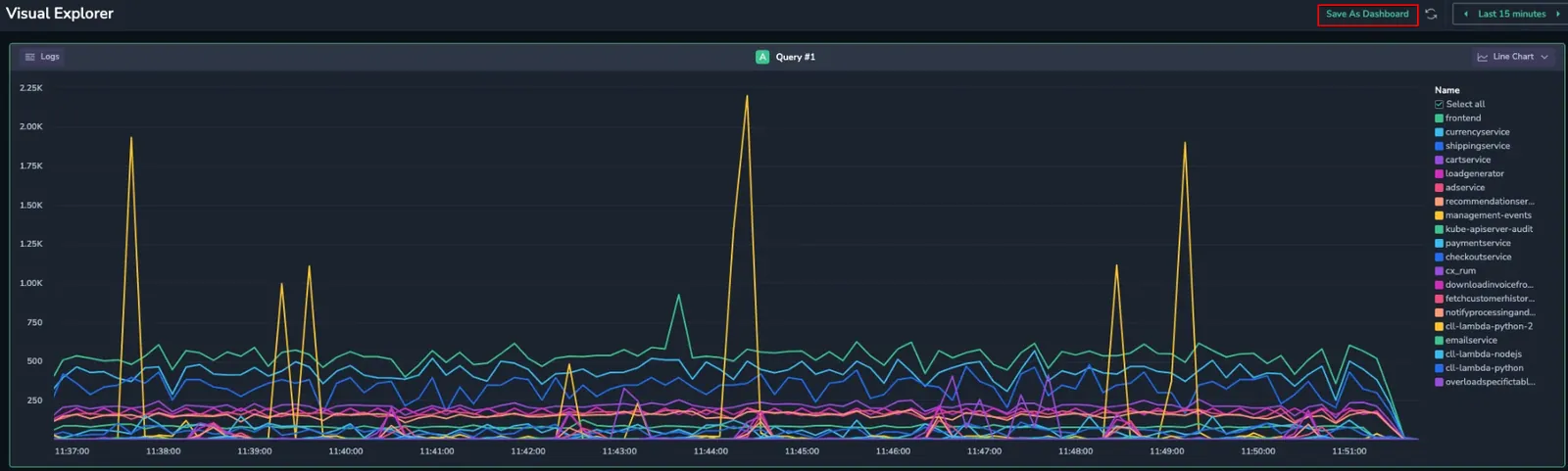
Saving charts as dashboards
While Visual Explorer charts are temporary by default, you can save them as fully-fledged dashboards for future reference or to share your analysis with your team.
-
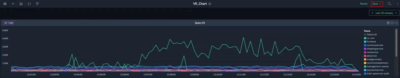
At the top right of the chart, click Save As Dashboard.
The Custom Dashboard page opens in a new browser tab, where the Visual Explorer chart is displayed as a standard dashboard widget.
-
Provide a meaningful name to the dashboard and click Save to finish.
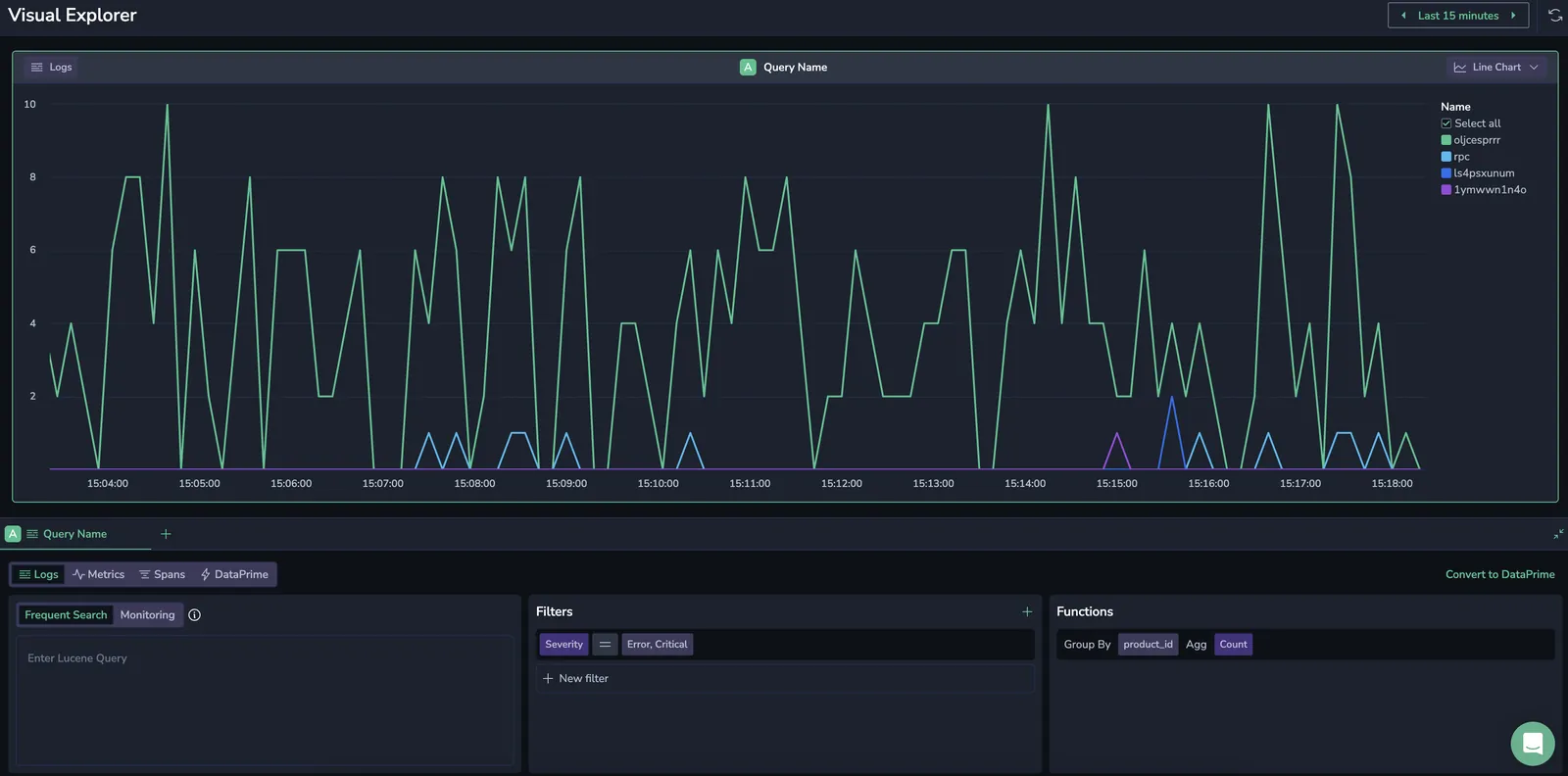
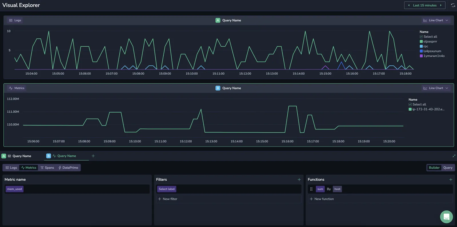
Typical use case
Combine two graphs on a single page to correlate logs with Error and Critical severity levels with the memory usage of the host running the services.
Adding log query
This graph displays logs with Error and Critical severity levels, specifically for services of interest.
- Select Logs as your data source.
- Add Group by
product_idfunction. - Filter by
Severity=Error, Critical.
Adding metrics query
Create an additional graph to visualize the memory usage of the host running the services.
- Click + at the top of the Builder panel to add a new chart.
- Select Metrics as your data source.
- Select the
mem_usedmetrics. - Add the
sumbyhostfunction.
Next steps
Organize multiple query visualizations into logical groups with Tabs in Visual Explorer.