Heatmaps
A heatmap shows how users interact with a page by overlaying aggregated interaction data on a screenshot of that page. The Top elements view ranks the page's controls by clicks, the Click map view shows where clicks land as color spots, and the Scroll map view shows how far down the page users reach, so you can see which parts of your interface get attention and which go unused.
Heatmaps are built on the sessions, views, and actions your RUM SDK collects. See the data model for how these events work.
What you need
- The
PRODUCT-ANALYTICS:READpermission. - A web application instrumented with the Browser Real User Monitoring SDK (version 3.24.0 or later), generating action events on the pages you want to analyze. Heatmaps are not available for mobile applications. Heatmaps read screenshots captured from Session Replay, so the SDK must be capturing sessions for the page.
View a heatmap
- In Product Analytics, open Heatmaps. The application in view appears in the selector at the top left.
- Select the page to analyze. Use Search a view to filter the picker, which lists the pages captured for the application (for example
home,/,route-one,route-two) each with its session count; hovering an option spells the count out, for example route-one appeared in 42 sessions. You can also jump straight to one of your most popular pages; the application and view selectors then fill in automatically once the heatmap renders. - Select a device size (Mobile (< 768px), Tablet (768px–1023px), Desktop (≥ 1024px), or a Custom width range) to view the heatmap as it rendered on that form factor.
- Select a view (Top elements, Click map, or Scroll map) to change what the overlay measures.
- Set the period to analyze with the time range picker.

The page displays a screenshot of the selected view with interaction data overlaid, alongside a panel that changes with the selected view.
Top elements

The Top elements view ranks the ten most-clicked elements on the page and labels each one on the screenshot with its rank; hovering a badge reveals that element's name. The Top Clickable Actions list beside the screenshot names each action (for example click on Add Dependency) with a Type column carrying any frustration badge for it, and a Clicks count, which is the cumulative number of clicks on that element over the selected time range (one user can account for several). This surfaces the controls that draw the most attention first.
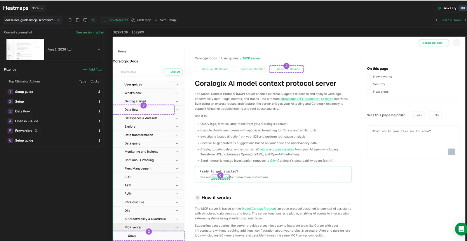
An element Product Analytics can't identify appears as Unnamed element. Give it a readable name by adding an aria-label or a data-cx-action-name="your-element-name" attribute to it in your application. The name then shows in Top elements and the click map. See Name your clickable elements for why stable names matter, and use the Coralogix Analytics Tool to find the element and rename it without reading the code.
A heatmap overlays clicks on a single captured screenshot, and the page changes over time, so an element that was clicked may not be present in the screenshot you're viewing. When that happens, its row in Top Clickable Actions carries a crossed-eye icon labeled Not highlighted in the selected screenshot. Its clicks still count toward the ranking, the element just can't be drawn on this image. Where another capture does contain it, the tooltip says so, for example This element can be found in screenshot 3.
Click map
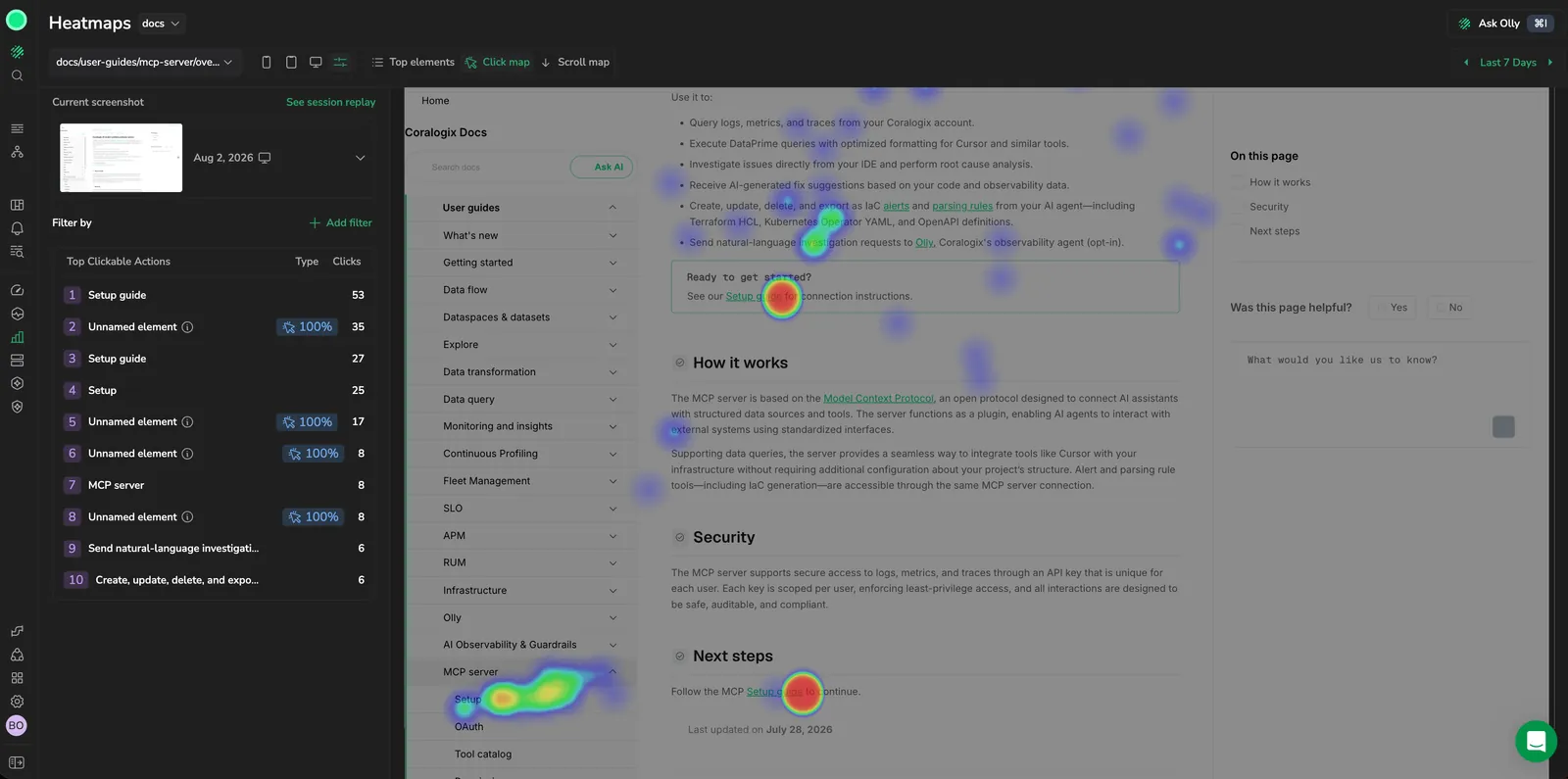
The Click map view overlays clicks on the screenshot as color spots, warmer, brighter spots mark the elements users select most, while the rest of the page dims. The Top Clickable Actions list beside the map shows each element's click count in order, so you can match a hotspot to its action.
Scroll map
The Scroll map view shows how far down the page users scroll. A color gradient over the screenshot marks the share of users who reached each depth, an Average fold line marks where the page is typically cut off by the viewport, and hovering a depth shows a tooltip such as 100% of users reached this point, with the number of users in parentheses. Use it to tell whether content below the fold is reaching your audience.
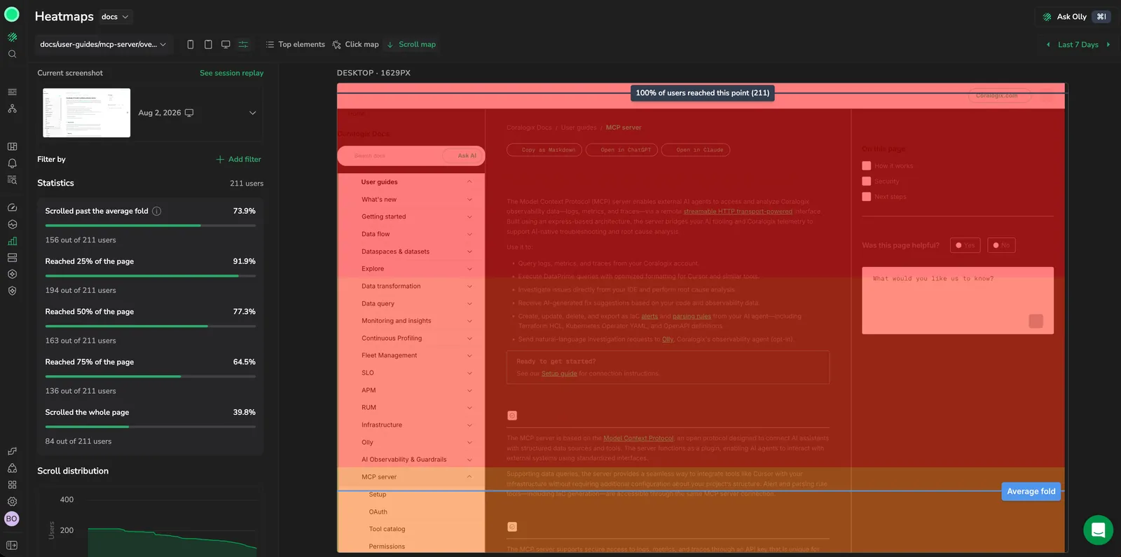
The gradient runs from where every user reached down to where the last user stopped, so a sharp color change marks the depth at which people drop off. It shades continuously rather than in bands, and the readout reports the user count at the exact depth under your cursor. The top of the page always reads as fully reached, because every user who opened the page saw it.
The panel beside the screenshot summarizes scroll behavior:
- Statistics reports the number of users it covers in its header, then the share who reached each depth as a labeled bar: Scrolled past the average fold, Reached 25% of the page, Reached 50% of the page, Reached 75% of the page, and Scrolled the whole page. Each carries the underlying count beneath it, for example 15 out of 17 users.
- The Scroll distribution chart plots the number of users against the percentage of the page scrolled. Hover over a point to see how many users reached that depth, for example 0 users reached 90% of the page.

The view may have no scrollable content. If the page fits within the viewport, or scrolling is disabled (for example, overflow: hidden), there's no scroll depth to measure and the scroll map has nothing to show.
Work with screenshots
The interface a user sees changes over time, so each heatmap is tied to a screenshot captured for a point in time. Screenshots come from Session Replay, if the SDK isn't capturing sessions for a page, no screenshot is available.
The screenshot in view is labeled Current screenshot, with its capture date, the device it was taken on, and a count of how many captures the page has. The strip above the canvas identifies the capture by view, device, and width, for example route-one · DESKTOP · 1920px. Expand the panel to see the other screenshots captured for the page and select one to view the interaction data against the interface as it appeared then.
Drag the trailing edge of the elements panel to resize it, or select Hide the elements panel to collapse it to a rail and give the screenshot the full width.
Drill into an element
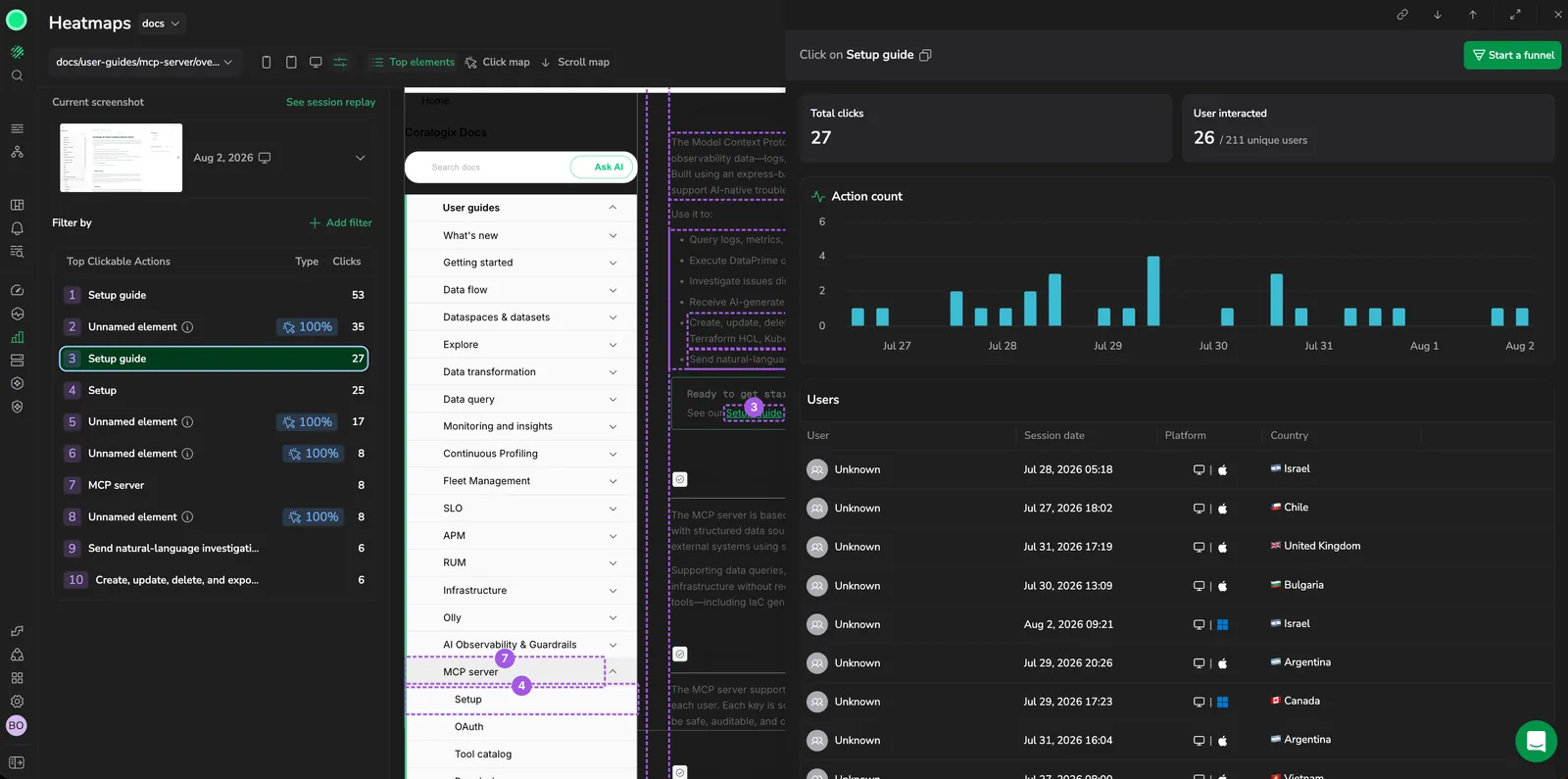
Select a ranked element (from the Top Clickable Actions list or its numbered badge on the screenshot) to open a drilldown drawer for that element. The drawer breaks down how users engage with that one control:
- Total clicks on the element over the selected time range, and Unique users, which leads with the share of the view's unique users who interacted with it and spells the counts out beneath, for example 12 of 340 unique users.
- A chart of the element's action count across the time range.
- A Users list of the people who interacted with the element, up to 100, where each row shows the User, Account, Session date, Platform, and Country. Select the play icon at the start of a row to open that user's Session Replay; the icon is greyed out and reads No session replay where no recording exists. Select Download CSV to export the list, which also carries the user's name, email, and ID, and the account name and ID, as separate columns.
- A Start a funnel action that seeds a funnel from the element. See Start a funnel from a heatmap.
Spot user frustration
Product Analytics flags two kinds of frustrated interaction on an element:
- Rage clicks: rapid repeated clicks on the same element, a sign a user expected something to happen and it didn't.
- Dead clicks: clicks that produced no response.
Where either is detected, the element carries a badge in the Type column of Top Clickable Actions showing the share of its clicks that were rage or dead clicks, and its drilldown drawer opens with a frustration-signal banner naming the signal. Use these to find controls that look interactive but don't behave as users expect.
Dead clicks deserve particular attention. They usually mean a control is broken or unresponsive: a button wired to nothing, a handler that silently failed, or a static element that looks clickable. An element with a high dead-click share is often the first thing worth fixing, because users are trying to act and getting no response at all.
Watch the session behind an interaction
Select View session replay, beside the current screenshot's title, to open the Session Replay at the moment the active screenshot was captured. This takes you from an aggregate click count to the individual session, so you can watch the interaction in the context of the user's full journey, actions, resources, errors, and network activity. The link stays disabled until the screenshot and its session have loaded, and it always points at whichever screenshot is currently active.
Filter by instrumentation
Top elements and Click map carry an Auto / Manual instrumentation toggle in the sidebar; it's hidden in Scroll map mode, since scroll maps don't use clicks. Auto, the default, includes every click the SDK captured plus the manually tagged ones. Manual shows only elements tagged with data-cx-action-name. A tagged element's action name shows in bold ahead of its element name in Top Clickable Actions. Saving a heatmap remembers the selected filter, and loading one restores it; a heatmap saved before this filter existed loads as Auto.
Narrow the data
Narrow the interactions a heatmap includes with session filters. Select an attribute and the values to keep, and the heatmap recomputes over the matching sessions. The available attributes are the same as a funnel step filter, Browser, OS, Device type, Platform, Country, City, URL path, URL domain, URL host, Referrer URL, User email, Account ID, Account name, App version, and Environment. Combine more than one attribute to narrow further.
Save and reuse a heatmap
Once a heatmap is useful, save it to keep its configuration and return to it later. Select Save as to name it under Heatmap name, then Save. A saved heatmap holds the view it analyzes, the screenshot it was built against, the view mode (Top elements, Click map, or Scroll map), the session filters, and the time range, so reopening it reproduces the analysis rather than a fresh default.
Open All heatmaps in the header to search your saved heatmaps and load one, or select New to start over. Once a saved heatmap is loaded, Save changes updates it, and Rename and Delete heatmap are available from its actions. Deleting asks you to confirm and can't be undone. A heatmap covering more than one application can't be saved.
Saving, renaming, and deleting a heatmap needs the PRODUCT-ANALYTICS:MANAGE permission. With PRODUCT-ANALYTICS:READ alone you can open and view saved heatmaps but not change them.
Start a funnel from a heatmap
From the element drilldown drawer, select Start a funnel to build a funnel seeded from the element (a two-step funnel of the page view followed by the click on that element) then refine the steps in the Funnels view. See Funnels.
Additional resources

Next steps
Measure conversion across a multi-step flow: Funnels.