Overview
Overview is the Product Analytics landing page: a high-level read on how users engage with one view, or your whole application, over a time range. It leads with the top-line numbers, unique users, sessions, and page views, and how they moved against the previous period, breaks them down by a session attribute such as account or country, and shows the users behind them, before handing you off to a heatmap or a funnel to dig into any group you spot.
Overview is built on the sessions, views, and actions your RUM SDK collects. See the data model for how these events work.
What you need
- The
PRODUCT-ANALYTICS:READpermission. - A web application instrumented with the Browser Real User Monitoring SDK (version 3.24.0 or later), generating session, view, and action events.
Open Overview
- In Product Analytics, open Overview. It's the first item in the menu and the view you land on by default. Select the application to analyze from the applications selector at the top.
- Select All views to analyze the whole application, or search for a specific view (for example
/explore) in the view picker. - Select Group by to choose the session attribute every widget splits its data by: Account, Country, OS, or Platform. Account is the team or organization an event's account name identifies in your own application, not a Coralogix team. Overview defaults to Account when the application's events carry one, and to Country otherwise; where no account name was detected, an info icon beside the picker explains how to start sending one from the RUM SDK. Your choice sticks per application.
- Set the period to analyze with the time range picker.
- Narrow the data further with session filters, added from the Filtered by + control above the widgets. The available attributes are the same ones Heatmaps filters on. Filters persist independently of Group by, so you can filter sessions to one attribute (for example a country) while the breakdown and viewer widgets group by another (for example account).

Each section below (Summary, the group breakdown, Viewers) collapses to its compact KPI summary from the chevron beside its title; reopening it doesn't re-run its query.
Summary
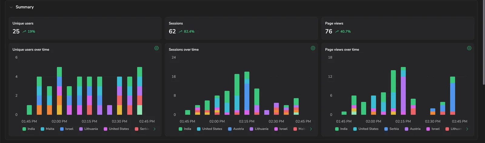
The Summary section leads with three KPI cards, Unique users, Sessions, and Page views, each compared to the equivalent previous period (for example, a one-day range compares to the same hours yesterday; a longer range compares to the equal span immediately before it). A green, rising arrow marks an increase and a red, falling arrow marks a decrease over the period chosen in the time picker, next to the percentage change.
Below the cards, three trend charts, Unique users over time, Sessions over time, and Page views over time, plot each metric across the selected range, broken down by the current Group by dimension.
Breakdown by group
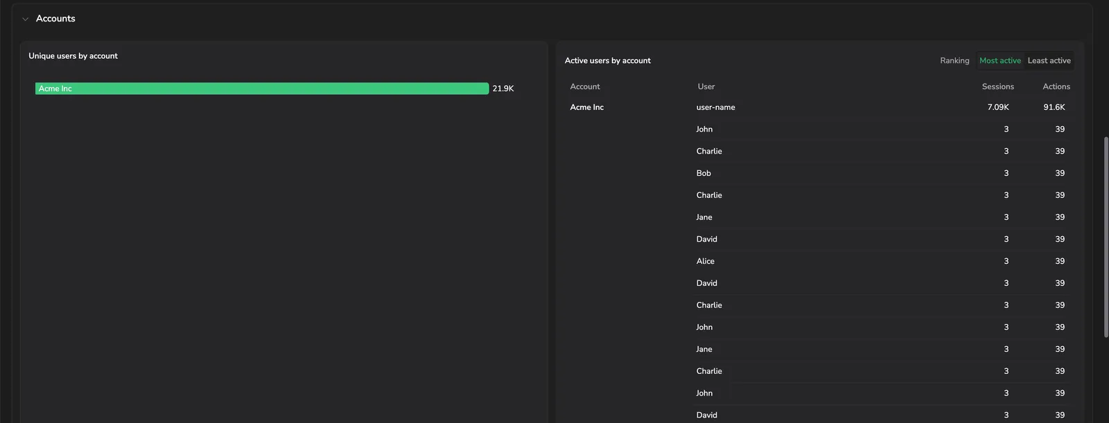
The second section is named for the selected dimension, for example Accounts or Countries, and has two widgets:
- Unique users by <dimension> ranks the top 20 groups by unique users as a horizontal bar chart.
- Active users by <dimension> lists identified users under their group, ranked by activity, with Most active and Least active toggles. Each row carries the group, the User, and that user's Sessions and Actions counts on the selected view.
Viewers
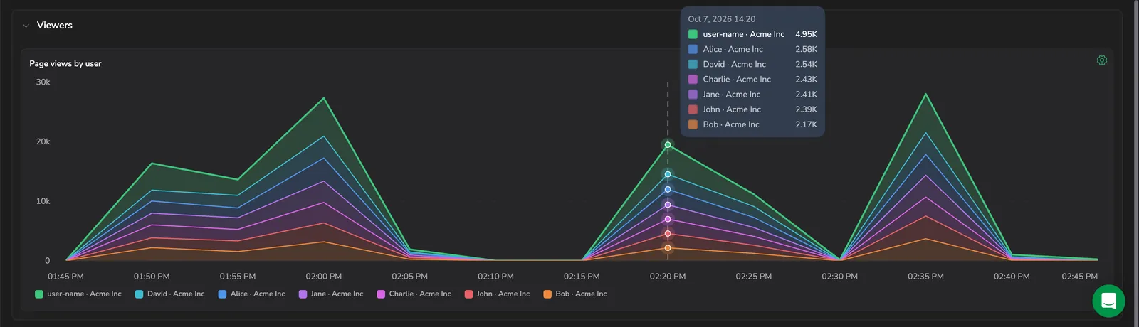
The Viewers section's Page views by user chart stacks page views over time by the users responsible for the most of them, grouping the rest as Other. A session with no identified user appears as Unknown user. Hover a point to see every user's share at that moment.
Jump into a heatmap or a funnel
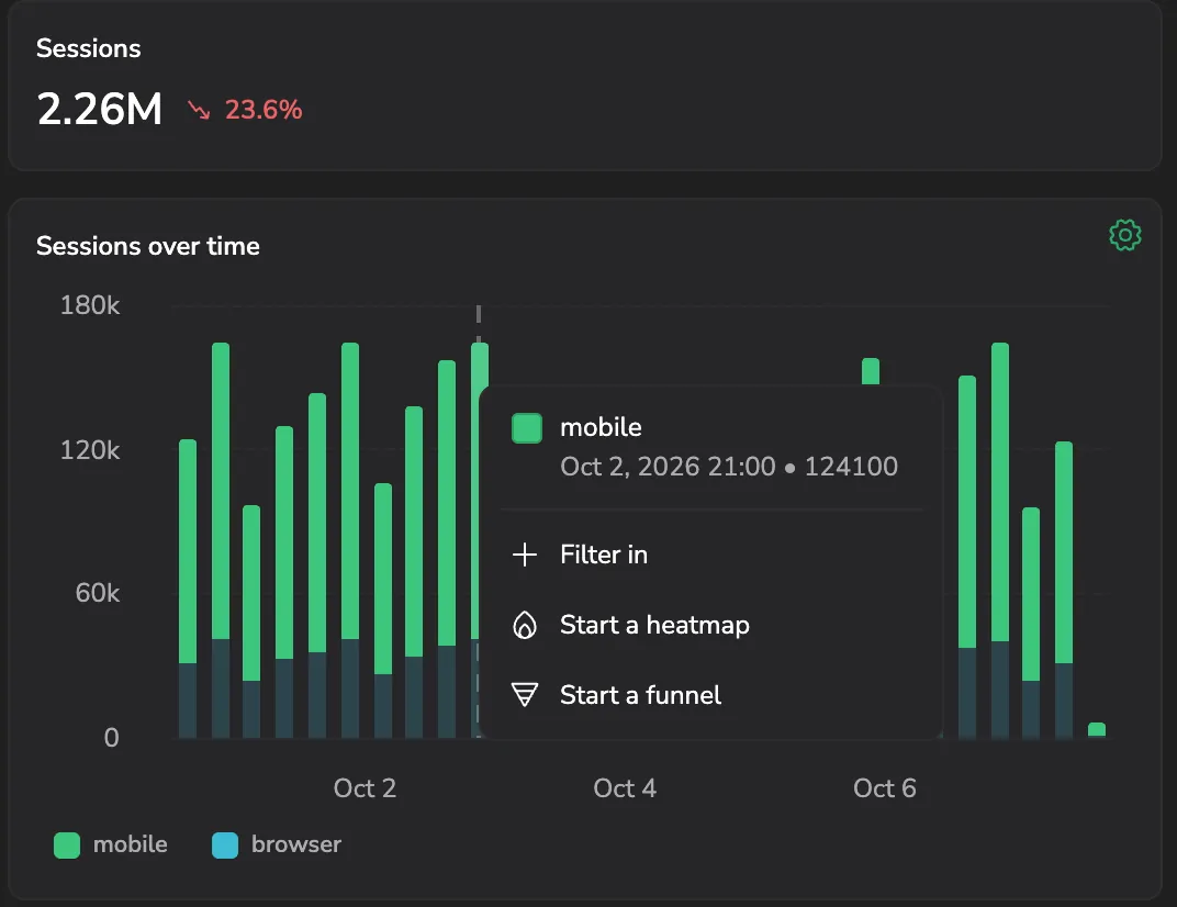
Select a group, in a trend chart, the breakdown chart, or the active users table, to see that point's value and open its actions menu:
- Filter in adds that group to the page's session filters, narrowing every widget to it. The same entry reads Filter out once applied, to remove it.
- Start a heatmap opens a new tab with a heatmap for the selected view (or Heatmaps' own busiest-view pick, when All views is selected), filtered to that group.
- Start a funnel opens a new tab with a funnel seeded from the selected view as its first step, filtered to that group.
Use this to move from a trend you notice in Overview straight into an investigation, without rebuilding the filter from scratch.
Configure a chart
Select the gear icon on a trend chart to open Chart settings:
- Chart type: Column, Area, or Line.
- Stacking: Stacked or Individual, where the chart has more than one series.
- Series: how many of the top groups to plot individually (Top 5, Top 10, or Top 20) before folding the rest into Other.
- Scale: Linear or Logarithmic.
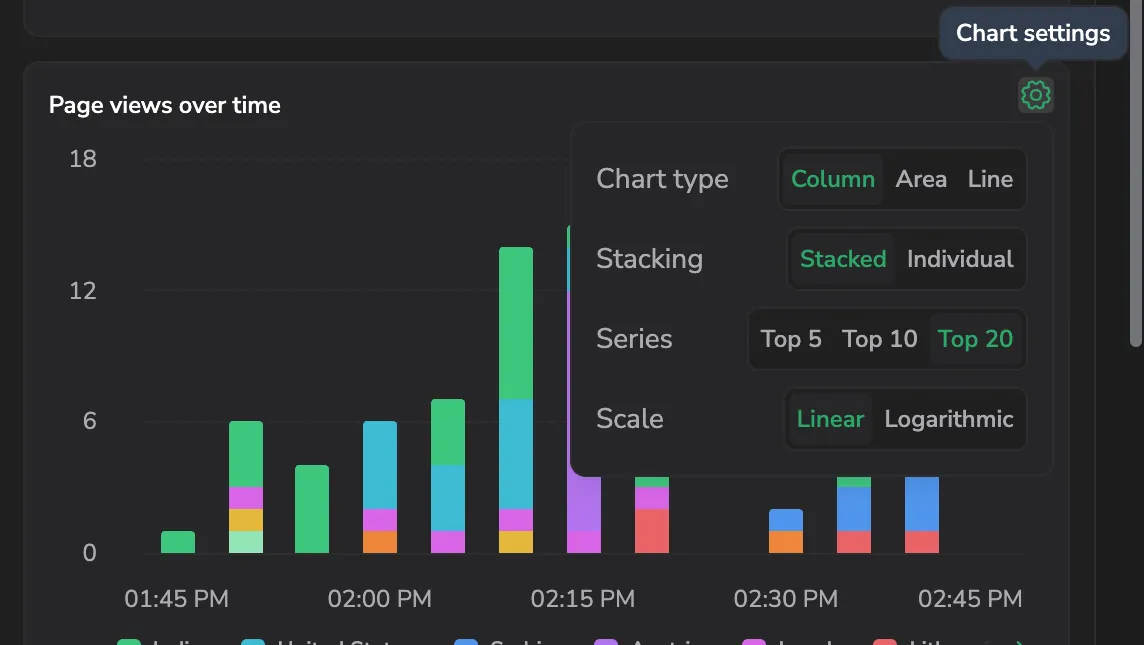
Settings apply per chart and persist for your visit.
Next steps
See where users click and scroll on a page: Heatmaps.