Drill down into a specific SLO
Each row in the SLO Center represents an SLO group. A single SLO definition that may produce multiple permutations if grouping labels were used (for example, by service, region, namespace).
Selecting an SLO group opens its permutations, allowing you to drill down into the list of SLO permutations and analyze each one. Opening a group selects its first permutation by default, so the initial view is predictable.
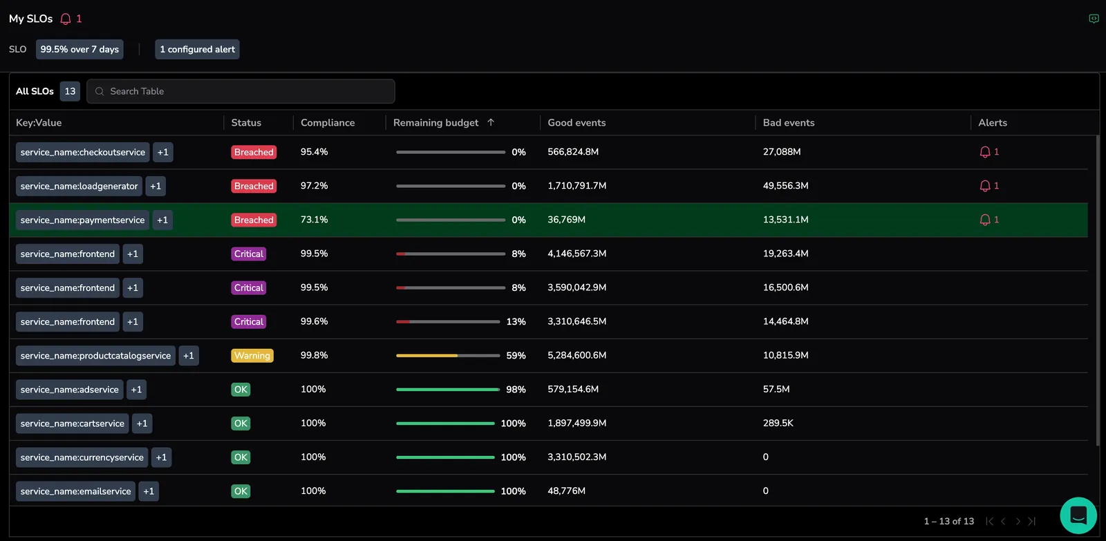
View SLO definitions and statistics

| Parameter | Description |
|---|---|
| SLO name | The name assigned to the SLO. |
| Selected permutation | Each SLO is evaluated per permutation. If the SLO is grouped, the displayed charts and statistics reflect only the currently selected permutation. |
| SLO status | Status of the selected SLO permutation (Critical, Warning, Breached, OK). |
| SLO target | The defined performance goal for the SLO, for example, 99% over the past 14 days. |
| Current compliance | The latest SLI value of the selected SLO permutation. |
| Error budget remaining | Shown as a progress bar (for example, 94%). |
| Alerts for this permutation | Hovering over this element reveals the alert names associated with this permutation. Selecting opens the SLO Alert Configurator, allowing you to view or edit the alert configuration. |
Selecting a permutation opens the SLO drawer which is the primary workspace for analyzing a specific permutation. It contains two tabs:
- Highlights: Use it to identify which labels contribute to bad events.
- Performance: Use it to see SLO performance trends over time and to reconcile the SLO engine view against the raw metric.
The time picker is shared between both tabs.
Highlights
The Highlights tab is designed for quickly identifying what is driving SLO degradation by breaking down bad events into their top contributing dimensions. This tab allows to:
- See what is driving your bad events
- Identify which labels or values contribute most
- Understand what changed inside the selected time range that caused degradation
This tab consists of two components, as described in subsequent sections.
All events
This is the starting point of the Highlights workflow. The chart shows the total good and bad events over the selected period of time per permutation.

Inside the graph, you can select, drag, and resize a time window to focus the analysis, toggle between absolute counts and percentages of bad events, and view the query for the selected permutation.
Time window behavior
Selecting a time window defines the time range used for the Highlights analysis:
- Only bad events that occurred within that portion of the timeline are evaluated.
- The analysis focuses on what happened during that specific period.
- Bad events can then be broken down into multiple time series based on the underlying metrics and their label values observed during that timeframe.
Investigation view
The Investigation view visualizes how bad events behave inside the selected window. When viewing it’s default state, without grouping or filtering, the graph shows a single time series of bad events and reflects exactly the bad-event counts inside the selection window.
This view allows you to:
- Quickly inspect the shape of bad events in the chosen range.
- Verify whether failures are bursty or gradual.
- Understand time-based context before grouping or filtering.

When you change the time window, the graph immediately updates.
To open Metric Explorer pre-filtered to the SLO's labels and underlying query, select Go to Metric Explorer next to the time-window chip. Use it to inspect the raw metric across labels that fall outside the SLO definition.
Grouping and filtering
By default, Investigation view shows a single aggregated time series representing all bad events for the selected SLO and time window.
Grouping and filtering allow you to progressively refine this view and understand which dimensions and values are driving error budget burn.

You can sort the bad events breakdown by total (time series with the highest number of bad events across the selected time window) or by maximum (time series with the highest single peak of bad events within the selected time window), and limit the view to the Top 5, Top 10, or Top 20 contributors.
Group by – splitting the bad events
Adding a Group by label splits the single aggregated bad-events series into multiple series, one per combination of labels and values. Each series represents the contribution of one or more labels with their values to bad events over time.
Example 1:
If you group by k8s.namespace.name:
- The original single Bad events graph is split into multiple series, such as:
namespace = checkoutnamespace = paymentsnamespace = auth
- Each line shows the bad events produced only by that namespace over the selected time window.
Example 2:
Adding an additional group-by label increases the granularity of the breakdown. Grouping by both k8s.namespace.name and status.code produces series such as:
checkout + 500checkout + 503payments + 500
This makes it easy to see which combinations of dimensions are responsible for most of the error budget burn.
Filters – removing noise from the analysis
Adding Filter by does not split the data further. Instead, it removes label values that are not relevant to the investigation, allowing you to focus only on meaningful contributors.
Example 1:
You group by status.code but want to exclude client errors:
- Add a filter:
status.code != 4xx - The graph now shows only server-side failures (for example,
500,503), removing noisy but expected traffic.
Example 2:
- Group by
k8s.namespace.name - Add a filter:
namespace != load-generator - This removes synthetic or test traffic that would otherwise distort the analysis.
Time window behavior
The selected time window controls which bad events participate in the breakdown:
- Only label values that produced bad events within the selected window appear.
- Top contributors are recalculated when the window changes.
- Label values may appear or disappear as the window shifts.
Together, grouping breaks bad events into meaningful dimensions, and filters remove noise, enabling precise, window-focused root cause analysis.
Performance
The Performance tab visualizes SLO behavior using recording-rule data, so charts stay fast and scalable even over long time ranges. When the SLO engine and the underlying raw metric appear to disagree, expand the Per-minute snapshot panel to validate the recording-rule output against the raw query.
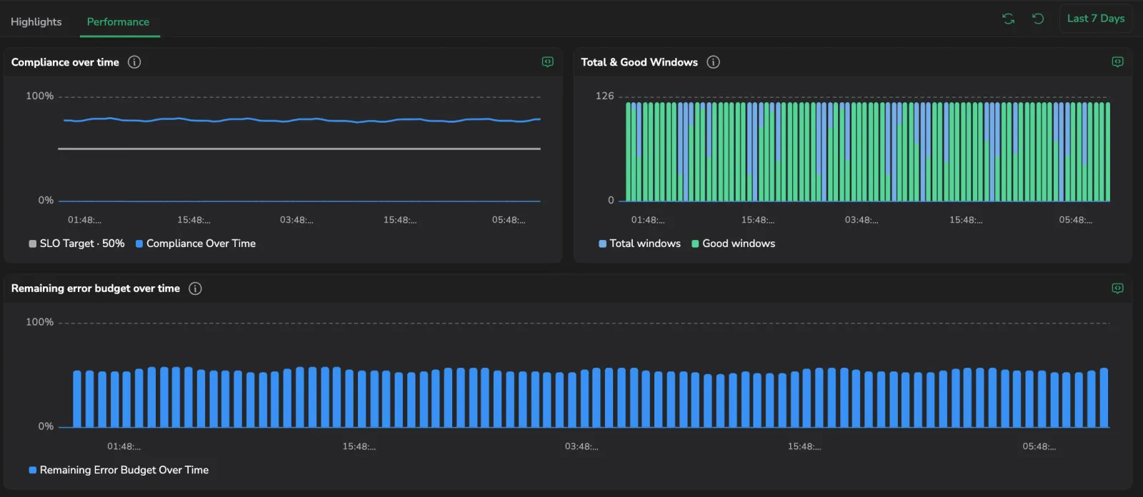
Visualize SLO performance metrics
Performance charts show how your SLO is trending over time. These visualizations help you understand whether you're within budget, approaching a threshold, or burning error budget too quickly.
| Chart | Position | Description |
|---|---|---|
| Compliance over time | Top left | SLI performance measured at each time step, drawn as a line. Helps spot patterns without relying on a rolling average. |
| Total & Good Events | Top right | Total and good counts at each time step, as evaluated by the SLO engine recording rule. Useful for pinpointing failure surges. Window-based SLOs show Total & Good Windows instead. |
| Remaining error budget over time | Full width below | Tracks the available error budget over time, based on the SLO time frame. For example, in a 14-day SLO, each point represents the remaining error budget over the trailing 14 days from the selected point. |
The Performance tab allows you to:
- Understand whether the service is trending toward an SLO breach.
- Identify when failures or degradation started increasing.
- Detect patterns of instability or recurring performance issues.
- Reconcile the SLO engine view against the raw metric by selecting a point on any chart to open the Per-minute snapshot panel.
Each chart shows an info icon you can hover for the metric definition.
Set the time range
The time picker above the charts controls all three charts at once and supports both Custom and Quick ranges. The minimum range is 24 hours - shorter ranges are not selectable because the underlying recording rule emits points too sparsely to draw a meaningful trend below that.
When the selected range reaches earlier than the SLO's creation time, the charts clamp the query to the creation timestamp and show a caption such as Created Jun 12, 2026 - a signal that the chart already covers the entire lifetime of the SLO.
To clear the current time range and any selected point, select the Reset icon next to the picker.
Compare the recording rule against the raw SLI
The three charts above show the SLO engine's recording-rule output. To validate that view against the underlying raw metric, for example to investigate why an alert fired while the SLO looks healthy, expand the Per-minute snapshot panel below the charts.
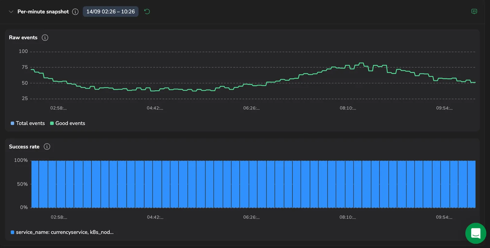
- Select any point or bar on the Compliance over time, Total & Good Events, or Remaining error budget over time chart. The selected interval appears as a chip next to the panel title.
- Select Show next to Per-minute snapshot to expand the panel. It runs the SLO's raw SLI query at 1-minute resolution for the selected interval. Request-based SLOs show the Raw events (total and good counts) and Success rate views; window-based SLOs show a single Total & Good Windows view.
- Compare the raw data against the charts above. Some difference is expected, because the recording rule aggregates over a coarser window, but a large or sustained gap is a signal to investigate ingestion, the query definition, or the recording-rule cadence.
- Select Hide to collapse the panel, or select another point to re-run the query for a different interval.
Before you select a point, the panel shows the prompt Click a bar on any chart above to see the raw query data for that interval. If the raw query returns no points for the selected interval, the panel shows No raw data available for this window.
Monitor specific permutations
For grouped SLOs, all permutations are displayed. Triggered alert events per permutation appear in the Alerts column. Select the bell icon to see the alerts list and the latest triggered alert event within the Watch Data UI.
Troubleshooting missing or partial data in permutations
If a specific permutation of an SLO shows missing or partial data on the Performance tab charts, it is often due to inconsistent data ingestion, that is, the underlying time series is not continuously reporting.
This situation also invalidates the burn rate calculation for that permutation during the affected window, which affects burn rate alerts.
How to investigate
-
Identify the SLI query used in the SLO definition (good and bad event expressions).
-
Locate the SLO time window (for example, 7 or 28 days).
-
In Grafana, paste the SLI query and apply the same time range as defined in the SLO.
Inspect the graph
If you see gaps or intermittent data, the time series is inconsistent. This confirms the issue and invalidates burn rate metrics for that time period.
Resolution options
-
Fix instrumentation issues causing gaps in reporting to restore valid SLO evaluation.
-
Treat the permutation as intermittent (for example, a scheduled or bursty service):
-
Recognize that burn rate is not applicable for such patterns.
-
Avoid assigning burn rate alerts to intermittent permutations.
-
As a best practice, split SLOs between continuous and noncontinuous permutations to preserve alert accuracy and meaningful budget tracking.