[Live Webinar] Next-Level O11y: Why Every DevOps Team Needs a RUM Strategy Register today!

Getting Started with Grafana Dashboards using Coralogix

  • Mary Mats
  • April 16, 2020
Share article
Grafana Coralogix

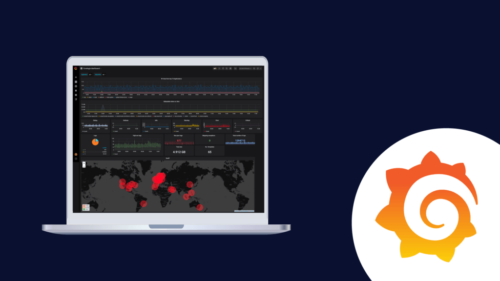
One of the most common dashboards for metric visualization and alerting is, of course, Grafana. In addition to logs, we use metrics to ensure the stability and operational observability of our product. 

This document will describe some basic Grafana operations you can perform with the Coralogix-Grafana integration. We will use a generic Coralogix Grafana dashboard that has statistics and information based on logs. It was built to be portable across accounts. 


Grafana Dashboard Setup

The first step will be to configure Grafana to work with Coralogix. Please follow the steps described in this tutorial.

Download Coralogix-Grafana-Dashboard

Import Dashboard:

  1. Click the plus sign on the left pane in the Grafana window and choose import
  2. Click on “upload .json file” and select the file that you previously downloaded
  3. Choose the data source that you’ve configured
  4. Enjoy your dashboard 🙂


Basic Dashboard Settings

Grafana Time Frame

  1. Change the timeframe easily by clicking on the time button on the upper right corner.
  2. You can select the auto-refresh or any other refresh timeframe using the refresh button on the upper right corner.


Grafana Panels

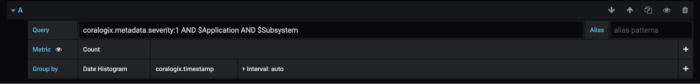
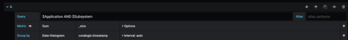
Panels are the basic visualization building block in Grafana.

Let’s add a new panel to our dashboard:

1. Click the graph button with the plus sign on the upper right corner – A new empty panel should open. 

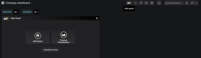
2. Choose the panel type using the 3 buttons:

  • “Convert to row” – A row is a logical divider within a dashboard that can be used to group panels together. Practically creating a sub dashboard within the main dashboard.
  • “Add a new query” – “Query” is a graph that describes the results of a query. It outlines the log count that the query returns per the time frame. Queries support alerts.
  • “Add a new visualization” – Visualsions allows for a much reacher format, giving the user the option to choose between graph bars, lines. Heat maps etc.

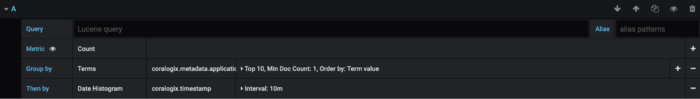
3. Select “Add a new query”. It will open the query settings form and you will be able to make the following selections:

  • choose the data source that you want to query.
  • Write your query in Lucene (Elastic) syntax. 
  • Choose your metric
  • You can adjust the interval to your needs


Grafana Variables

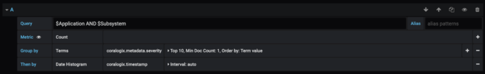
Variables are the filters at the top of the dashboard.

To configure a new variable:

  1. Go to dashboard settings (the gear at the top right)
  2. Choose variables and click new
  3. Give it a name, choose your data source, and set the type to query
  4. Define your filter query. As an example, the following filter query will create a selection list that includes the first 1000 usernames, ordered alphabetically {“find”: “terms”, “field”: “username”, “size”: 1000}
  5. Add the variables’ names to each panel you would like the filter to be applied to. The format is $username (using the example from step 4).


Grafana Dashboard Visualizations

Now, let’s explore the new dashboard visualizations:


  1. Data from the top 10 applications: This panel (of type query) displays the account data flow (count of logs) aggregated by applications. You can change the number of applications that you want to monitor by increasing/decreasing the term size. You can see the panel definition here:

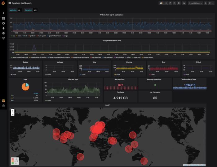
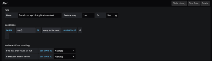
This panel includes an alert that will be triggered if an average of zero logs were sent during the past 5 minutes. To access the alert definition screen click on the bell icon on the panel definition pane. Note that you can’t define an alert when you apply a variable on the panel.

  1. Subsystem sizes vs. time: in this panel (of type query), you can see the sum by size. The sums are grouped by a subsystem, you can see the panel definition here:
  2. Debug, Verbose, Info, Warning, Error, Critical:  In these panels (of type query), you can see the data flow segmented by severity. Coralogix severities are identified by numbers 1-6 designating debug to critical. Here is the panel definition for debug:
  3. Logs:  In this panel (of type visualization), we’ve used the pie chart plugin, it shows all the logs of the selected timeframe grouped by severity. You can use this kind of panel when you want to aggregate your data by a specific field. You can see the panel definition here:
  4. The following 5 panels (of type visualization) are similar to each other regarding definition. They use the stat visualization format and show a number indicating the selected metric within the time frame. Here’s on example of the panel definition screen:
  5. GeoIP: In this panel (of type visualization), we use a world map plugin. Also, we’ve enabled the geo enrichment feature in Coralogix. Here is the panel definition:

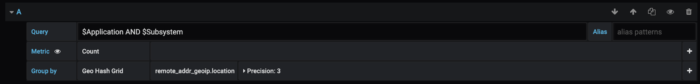
Under the “queries” settings choose to group by “Geo Hash Grid”, the field should be from geo_point type.

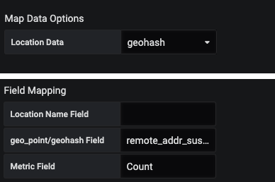
Under the Visualization, settings select these parameters in “map data options” and add to the field mapping the name of the field that contains the coordinates (the same field you chose to group by). To access visualizations settings click on the graph icon on the left-hand side.


For any further questions on Grafana and how you can utilize it using Coralogix or even if managing your own Elasticseach, feel free to reach out via chat. We’re always available right here at the bottom right chat bubble. 

Where Modern Observability
and Financial Savvy Meet.

Live Webinar
Next-Level O11y: Why Every DevOps Team Needs a RUM Strategy
April 30th at 12pm ET | 6pm CET
Save my Seat