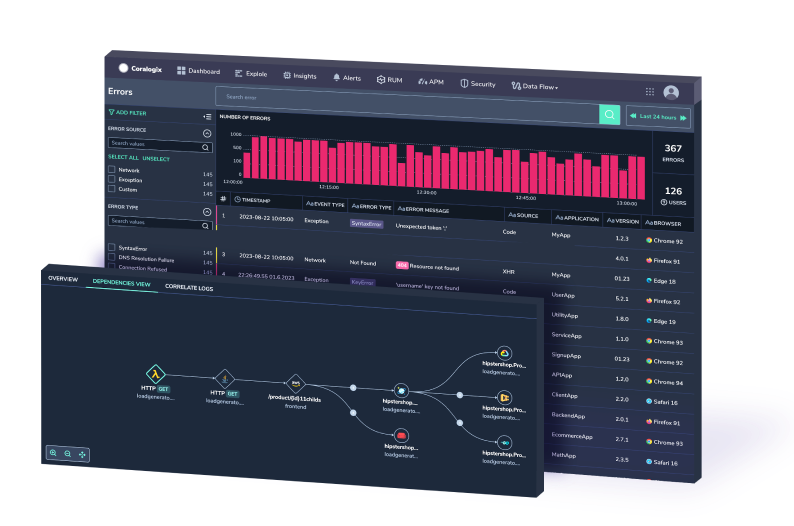
Ship OpenTelemetry Data to Coralogix via Reverse Proxy (Caddy 2)
It is commonplace for organizations to restrict their IT systems from having direct or unsolicited access to external networks or the Internet, with network proxies serving…

When we look at information, numbers, percentages, statistics, we tend to have an easier time understanding and interpreting them if they’re also represented by corresponding visual cues. Kibana Canvas is a tool that helps us present our Elasticsearch data with infographic-like dashboards – fully visual, dynamic, and live.
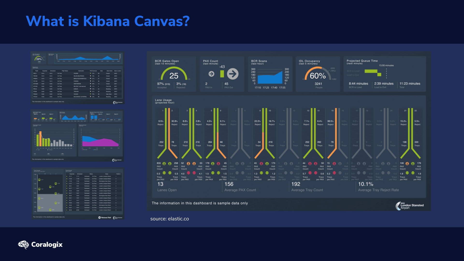
A Kibana Canvas presentation is a bit like a PowerPoint presentation. We can generate bar charts, plots, and graphs or fully customized visualizations to showcase pertinent data that address specific needs. But Canvas goes way beyond PowerPoint. Kibana Canvas extracts whatever live data from our Elasticsearch cluster we need, processes it to prepare it for our visualizations, and then generates the graphical representations that we define.
The first step in Canvas is to create a so-called workpad which is basically or workspace where we build the graphical representation of our Elasticsearch data. Workpads can be composed of a single page, or multiple pages. You could think of these pages as dashboards. Within the pages, we add graphical elements to represent our data any way we need to.
Let’s go through a few examples of the elements that Kibana Canvas has to offer:
Each element needs a way to extract the data that will be represented. The data sources an element can use include:
Everything that’s happening in Canvas is driven by the custom expression language, similarly to Kibana Timelion. We chain defined functions by piping results (which are also known as contexts). Piping simply means that we take the result from one function and send it to another function, to be further processed. All of this gives us a lot of freedom in choosing how to extract the data we need and transform it in a way that is usable and meaningful for our infographics.
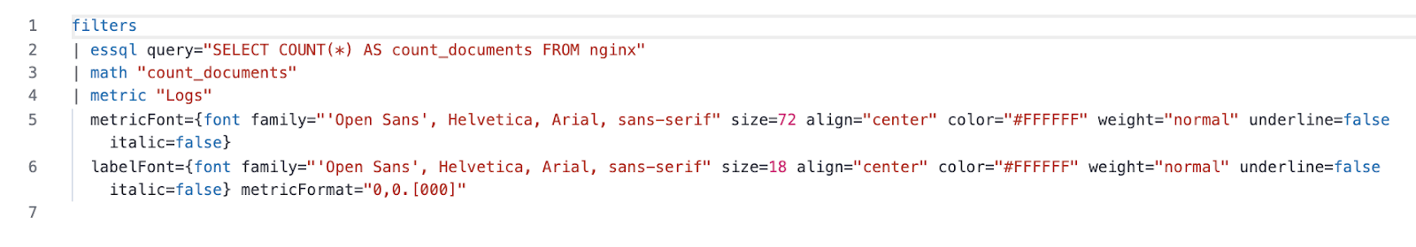
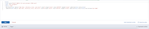
Here, we have an example of a custom expression for Canvas:
In this example of a Metric element definition we can see that:
To get a more in-depth look at Timelion functions, check out this article on the topic which also includes a summary of Elasticsearch SQL functions for quick reference.
Well, that covers the basics of how Canvas works. So now let’s learn create our own Kibana Canvas workpad and see what it can do for our users.
To get started with the exercise, we need to get some sample data to work with. We’ll accomplish this with the NGINX web server log provided by Elastic.
To get the saample data:
Here are the commands, in the order they were specified:
wget https://raw.githubusercontent.com/elastic/examples/master/Common%20Data%20Formats/nginx_json_logs/nginx_json_logs

awk '{print "{\"index\":{}}\n" $0}' nginx_json_logs > nginx_json_logs_bulk


curl --request PUT "http://localhost:9200/nginx" \
--header 'Content-Type: application/json' \
-d '{
   "settings": {
       "number_of_shards": 1,
       "number_of_replicas": 0
   },
   "mappings": {
       "properties": {
           "time": {"type":"date","format":"dd/MMM/yyyy:HH:mm:ss Z"},
           "response": {"type":"keyword"}
       }
   }
}'

curl --silent --request POST 'http://localhost:9200/nginx/_doc/_bulk' \
--header 'Content-Type: application/x-ndjson' \
--data-binary '@nginx_json_logs_bulk' | jq '.errors'
After the last command, we should look for the message “false” in the output, which signals that there were no errors.

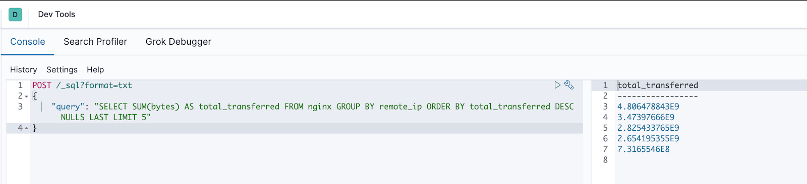
In Canvas, we’ll often use Elasticsearch SQL to retrieve the data for our visualizations. To prepare our queries and test out different variations, we can use Kibana DevTools. To do this, we just need to wrap the SQL query in a simple JSON object and then POST it to the _sql API endpoint. We’ll also need to add “?format=txt” as a query parameter to our POST request, to see the returned result nicely formatted in a text-based table.
While working with an element, we can click the Expression editor in the bottom-right corner. This gives us much more flexibility in changing how the element works. After we get comfortable with the expression language used in Canvas, you’ll notice it’s a more efficient way to work, rather than using the interface and clicking on buttons and menus to edit various functionality.
The documentation for Canvas functions and TinyMath functions will come in handy when you dive deeper into the expression editor.
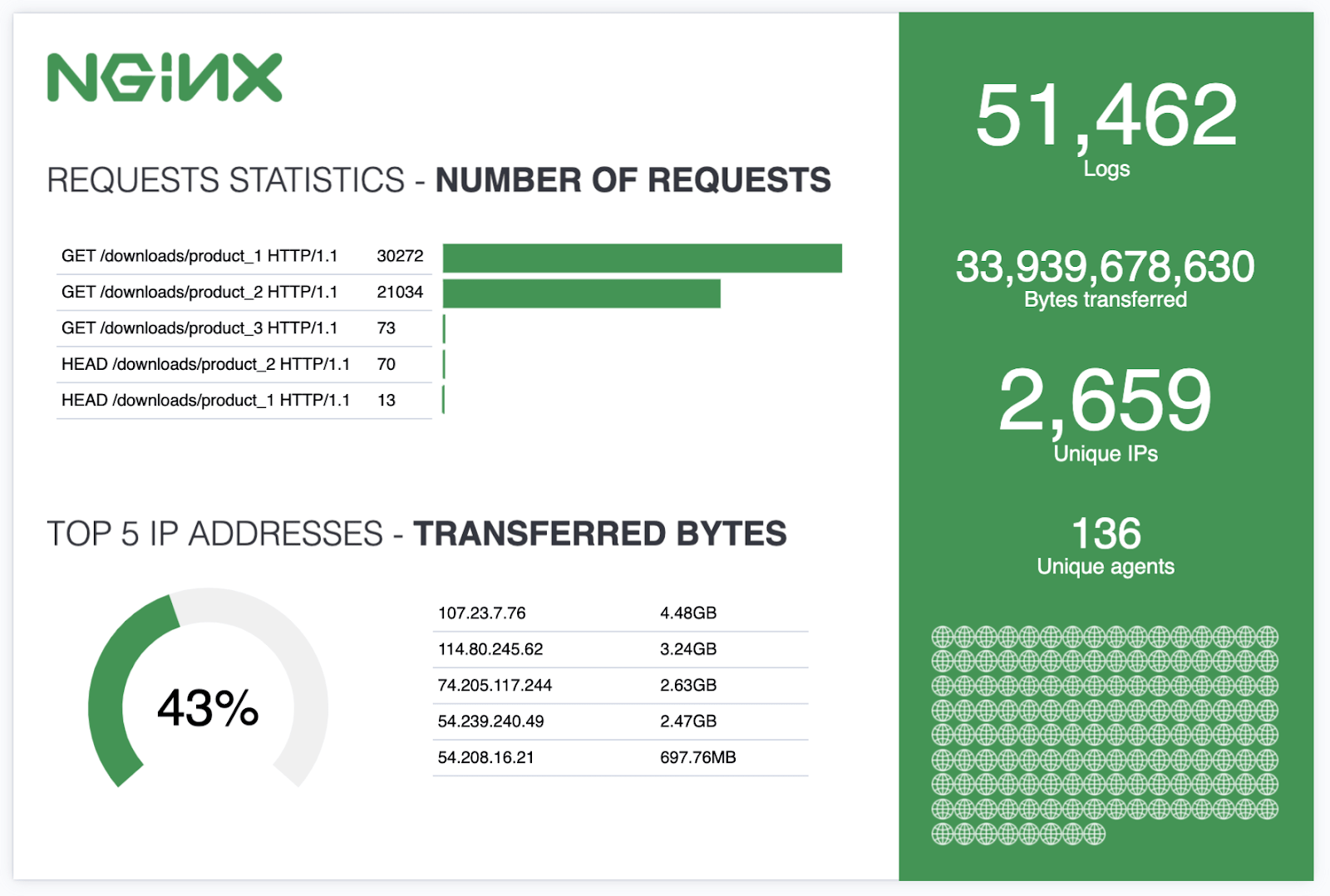
Let’s create our first workpad in Canvas and learn how to build an infographic like the one in this example:
In the top-right corner, above our workpad, notice the Add element button. Let’s click on it and reveal a list of available elements with clear visual representations and descriptions.
Let’s add a new element and pick the Shape type from that list. We’ll use this to create a green background for the right side of our infographic.
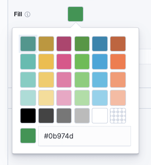
Let’s open the Display section in the right pane and find the Fill box. We’ll use the following color code for the green:
#0b974d
Now it’s time to add our metrics on the right side. To do this, we add a new element and select the Metric type from that list. After we drag it to its place, we also change the Metric and Label text color to white.
Finally, we get to the most important part, bringing in the data from our Nginx index.
After we select the element we want to work with (in this case, the metric we just added), look in the right pane of Canvas for Selected element. Switch from the Display tab to the Data tab, (as we see in this image), and change the data source to Elasticsearch SQL. To change the data source, we click on the underlined, bold text, which might display “Demo data” initially, on some installations.
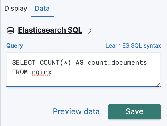
We’ll use the following SQL query, which will return the total number of documents in our index:
SELECT COUNT(*) AS count_documents FROM nginx
After hitting Save we’ll see a warning sign on the screen. The metric doesn’t yet have a source value to use to display data. To fix this, we need to switch back to the Display tab and select count_documents as our Value, (as seen in this image). “count_documents” is generated by our previous SQL query.
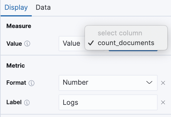
We should also enter the text “Logs”, to use as our Label.
The general procedure for the rest of the metrics is the same.
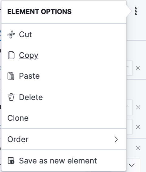
On the right side, in the Selected element pane, we can see the three vertical dots menu option, in the top-right corner. By clicking on it, we can then Clone the element to quickly add similar ones. We can also do this by simply copying with CTRL+C and then pasting with CTRL+V. There’s also an option for saving elements, which we find in the My elements tab when adding a new element.
To add the rest of the metrics, clone the previous one three times and then add the following SQL queries under each one’s Data source.
For the first metric we’ll do the following:
SELECT SUM(bytes) as bytes FROM nginx
And for the second metric:
SELECT COUNT(DISTINCT remote_ip) as remote_ip FROM nginx
Finally, for the third metric:
SELECT COUNT(DISTINCT agent) as agents FROM nginx
Don’t forget to follow the same procedure as we did with our first metric:
We have two image elements in our infographic.
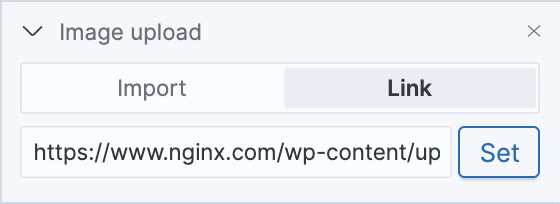
The first one will be used as the logo. To add the logo, we add an Image element and then change the link to point to the Nginx logo.
Next, we’ll add an Image repeat element. As the name suggests, this repeats the defined image, for a number of times, based on underlying data. Similarly, Image reveal shows a portion (or percentage) of the image, based on underlying data.
We’ll use a simple globe icon from wikipedia to represent the 136 unique agents in the right green section of our workpad. After adding the element, you need to explicitly add the Image Size property. We then use the same SQL query in the data section as we used for our “Unique agents” metric.
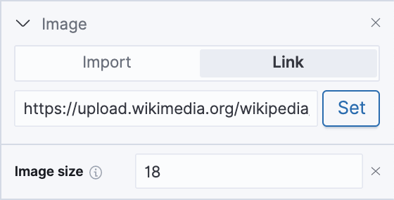
We’ll also need to adjust the size of the repeated image so that they all fit in:
SELECT COUNT(DISTINCT agent) as agents FROM nginx
Now the globe image should appear 136 times. Pretty cool! But there’s a lot more.
Now, let’s add the Text elements.
After inserting the first one, we navigate to the Display section to edit the text, where we copy and paste the following Markdown-formatted content:
## REQUESTS STATISTICS - **NUMBER OF REQUESTS**
For the next text element, we add this content:
## TOP 5 IP ADDRESSES - **TRANSFERRED BYTES**
Now it’s time to add the two Data table elements. The first one will display our request statistics.
The following SQL will select the data we need, grouping results based on the request field and ordering them in descending order, according to the count of requests:
SELECT request, COUNT(*) AS count_requests FROM nginx GROUP BY request ORDER BY count_requests DESC
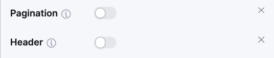
For nicer formatting, we can go to the Display section and hide the Pagination and column Header.
The second table will be very similar, but we’ll learn how to use functions as well.
First, let’s insert the following SQL content for our data source:
SELECT remote_ip, SUM(bytes) AS total_transferred FROM nginx GROUP BY remote_ip ORDER BY total_transferred DESC NULLS LAST LIMIT 5
Now let’s open up the Expression editor, from the bottom-right corner, and use the mapColumn function. Paired with getCell and formatnumber functions, it allows us to change the number format of each value in the total_transferred column and display them in so-called “human-readable” formats, such as GB, MB, KB for gigabytes, megabytes and kilobytes.
So this is the expression we’ll add to do that:
| mapColumn "total_transferred" fn={ getCell column="total_transferred" | formatnumber "0.00b"}
It should be placed right after the ESSQL source definitions, after the SQL query line.
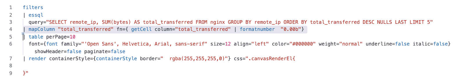
The function uses the NumeralJS library, which defines the formatting notations that can be applied.
The final elements that we’ll add are the charts.
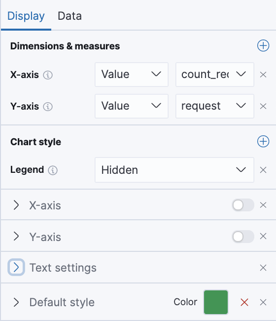
First, let’s add the Horizontal bar chart to visualize the request statistics from our table. We’ll use this SQL query in the Data section:
SELECT request, COUNT(*) AS count_requests FROM nginx GROUP BY request ORDER BY count_requests DESC
Now, we need to link it with the data returned by the query:
We can also disable the axis labels, to give it a cleaner look. To do that, we click on the sliding buttons next to X-axis and Y-axis.
Under the Default style, we’ll pick a green fill color to make it fit with the rest of the design.
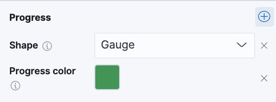
Let’s try taking this even further using Canvas expressions. We’ll apply it to a new element that we’ll add, a Progress Gauge chart.
This progress chart will show the percentage of traffic transferred to the top 5 IP addresses.
After inserting this chart element, we apply this SQL query to its Data section:
SELECT SUM(bytes) AS total_transferred_top5 FROM nginx GROUP BY remote_ip ORDER BY total_transferred_top5 DESC NULLS LAST LIMIT 5
This query alone, however, isn’t enough. That’s because the Progress Gauge chart expects a single value, between 0 and 1, where something like 0.56 would represent 56%. Once again, we’ll achieve what we need with the very useful Expression editor.
The expression will divide the total transferred to the top 5 IPs (which we get from the first SQL query) to the grand total, transferred to all IPs, which we get from the second essql query.
The whole expression will look like this:
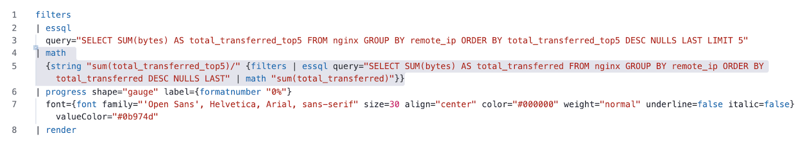
And this is the important part that calculates the number between 0 and 1 (the percentage), for the progress gauge element.
| math
 {string "sum(total_transferred_top5)/" {filters | essql query="SELECT SUM(bytes) AS total_transferred FROM nginx GROUP BY remote_ip ORDER BY total_transferred DESC NULLS LAST" | math "sum(total_transferred)"}}
After adding this to the expression editor, we click Run.
We should also choose the same green color fill for the element and also pick a bigger font size.
We finally created the entire infographic example we initially saw.
Congratulations, you’re ready to explore the incredible capabilities that Kibana Canvas has to offer – beautiful dynamic and interactive representations of your data in exactly the form your users need.

To make sure we can continue with the next lesson in a clean environment, let’s remove the changes we created in this lesson.
First, we can remove the Nginx log files like so:
rm nginx_*
And then, we remove the index where we saved the Nginx sample log data:
curl --request DELETE localhost:9200/nginx
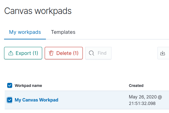
Finally, we remove the workpad we created in Kibana Canvas. To do this, we click in the bottom-left corner, on My Canvas Workpad.
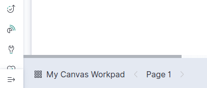
Afterward, we check the box to the left of My Canvas Workpad. Finally, we click on the Delete button. And that gets back to where we first started.

It is commonplace for organizations to restrict their IT systems from having direct or unsolicited access to external networks or the Internet, with network proxies serving…

What is AWS Systems Manager Before we jump into this, it’s important to note that older names, and still in use in some areas of AWS,…

Infrastructure as Code is an increasingly popular DevOps paradigm. IaC has the ability to abstract away the details of server provisioning. This tutorial will look at…