Polystat widget
The Polystat widget presents time series data in a hexagonal grid, where each hexagon represents an individual value sourced from logs, metrics, or spans. It enables grouping multiple values into a single, consolidated view, allowing you to display values simultaneously. For example, a user may configure the widget to track CPU usage across all pods in a system and set thresholds for what is critical, acceptable, or optimal.
A key feature of the Polystat widget is its threshold definition, which applies uniformly across all displayed values. These thresholds are specific values that, once met, trigger a color change in the hexagon, serving as an immediate visual alert for potential issues. For example, hexagons turning yellow or red highlight areas needing attention, helping users swiftly detect and address system performance concerns.
When dealing with high-cardinality data, where the number of values is especially large, opt for the Polystat over the Multi-Gauge widget.
Getting started
To add a widget to a custom dashboard, click the + icon. Then, drag and drop the Polystat widget from your left-hand sidebar.
Use the Query Builder to create a query
In the bottom panel, build your query using Query Builder.
Define the widget parameters
Define the parameters for your widget in the right-hand sidebar.
General settings
Legend management. This parameter determines how the legend organizes and displays information.
-
Group organizes the legend based on different data entities, such as servers or applications, displaying each as a separate entry.
-
Threshold categorizes values based on predefined limits (e.g., normal, warning, critical), helping to visualize whether a metric is within an acceptable range or has crossed into a warning state.
Query parameters
Group by. Group query results by a label or field value.
Units management. Manage the way units are displayed in your widget.
-
Min/Max. Set the minimum and maximum values used in percentage threshold calculations. You may choose to enter a static range of numbers or a range between 0-1 or 0-100.
-
Units. Choose one of the unit types or create a custom unit. Custom units are not added to a list of units, but are saved with the specific widget.
-
Decimal. Specify the number of decimals displayed in the calculated value, from 0 - 15.
-
Precision. Toggle Precision to display the raw numerical value returned by the query in your widget. When enabled, values in the tooltip—visible while hovering over a hexagon—reflect the complete, unrounded value. When disabled, values are shortened and rounded based on the Decimal setting.
Thresholds. A threshold is a value you set for a number that, when met or exceeded, changes the visualization's appearance based on the query results. Choose the base Thresholds – that is, when the gauge should appear green and red. Add additional thresholds if necessary. You may choose between percentage or absolute numbers.
Set the following options:
-
Value. This is the value that triggers the threshold. You can assign a specific color to this value.
-
Labels. Add labels to each threshold. For example, you may choose the label "good" for the base green threshold.
-
Threshold type. Choose between absolute and percentage.
-
Absolute: Defined by a specific number
-
Percentage: Relative to the minimum or maximum value (e.g., 80 percent)
-
Visualization
Hover over any hexagon in your Polystat to view the threshold label, value name, and query output.
Zoom in and out as needed.
Example use-case
In this use-case, we’ll create a Polystat widget to monitor CPU utilization across Kubernetes containers, with each container’s CPU usage displayed in its own hexagon for an immediate snapshot of system health.
Why is CPU a good polystat candidate?
Polystat’s design is perfect for monitoring CPU usage because it displays each container’s CPU utilization in an individual, color-coded hexagon, providing instant visual insights across your system. This layout allows you to quickly identify overused or underutilized containers through configurable thresholds, making it easy to spot issues at a glance.
Polystat works best with high-cardinality metrics. It allows you to break down CPU usage by many labels (like namespace or pod), adding the context needed to monitor performance at scale in Kubernetes environments.
Monitoring CPU
Let’s create a CPU utilization polystat widget that gives a real-time view of how each container is performing.
Step 1: Build your query
Start by adding the Polystat widget to your dashboard.

Once it’s in place, it’s time to build a query to pull in the CPU utilization data. For this, we’ll use Query Builder to fetch the relevant metrics.

Here’s a breakdown of how the query works:
- Metric Source: We’re pulling data from
container_cpu_utilization_1, which gives the CPU utilization percentage for each container. sumbyk8s_container_name: To make this data useful at the container level, we group byk8s_container_nameand usesum. This lets us see the total CPU usage per container, not just per core or thread. By combining metrics this way, we get an easy-to-interpret view of how each container is performing in real time.avg_over_time (Query Range): Usingavg_over_timesmooths out short-term spikes by averaging CPU usage over a specific time range. This way, instead of seeing a jagged, fluctuating number, you get a more stable view of how much CPU each container is actually using, which can reveal patterns or sustained high usage.
Of course, if you are interested in fluctuations in CPU, even short-lived ones, then average is not the best choice, and you should consider a quantile instead.
Step 2: Configure widget parameters
Once the query is set, you’re ready to define the widget parameters. This step ensures that your Polystat widget displays data in a useful and meaningful way.

Here’s what each parameter does:
- Group By: Grouping by
k8s_container_namemeans each hexagon will represent CPU usage for a specific container. This setup gives you a color-coded breakdown of CPU utilization for each container at a glance. - Calculation: Set to
instant, so the widget pulls in the most recent data point for each container. This way, you’re seeing exactly what’s happening in real-time, which is ideal for spotting any container that’s currently under heavy load. - Min and Max / Units: Setting the min to
0and max to1(for 0% to 100% CPU utilization) defines the widget’s display range. Percentages are displayed with two decimal places, so you get an accurate view (e.g., 73.58%) without clutter.
Step 3: Set thresholds for real-time alerts
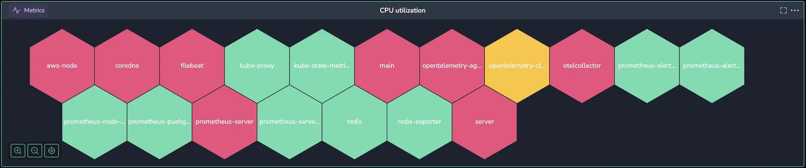
A core feature of Polystat is the ability to apply thresholds for any metric, log, or span value. Here we apply this feature to our mission of visualizing CPU utilization by color-coding based on CPU load, so you can instantly see if a container’s utilization is in the safe zone, trending high, or at a critical level.
Here’s how we’ll set it up:

- Green (Base): Below the first threshold, hexagons will be green, indicating CPU utilization is at a normal level.
- Yellow (Warning): Set to turn yellow at 75**%**, signaling a moderate CPU load.
- Red (Critical): At 90**%** or higher, hexagons turn red, flagging containers under high load that may need attention. At this level, the container is under high CPU load and may soon become bottlenecked. If containers hit this level frequently, they might need additional resources, or the workload may need to be redistributed.
This color-coding makes it easy to spot issues. You don’t have to sift through numbers; instead, a glance at the dashboard tells you where to focus.
Step 4: monitor and respond in real-time
With everything set up, your CPU Utilization Polystat widget is ready to roll! When you start seeing traffic spikes, you’ll get a real-time, color-coded view of CPU usage across your Kubernetes containers. Hovering over a hexagon reveals the exact CPU utilization for each container and the container’s name. For instance, if prometheus-server is showing a CPU usage of around 95% and is marked in red, you know it’s time to investigate or scale up.
With this dashboard, you can make quick, informed decisions, like:
- Scaling up resources for any container in the red zone to handle increased demand.
- Redistributing workloads across other containers to balance the load.
- Proactively monitoring yellow-labeled containers to catch potential issues before they reach critical levels.
Beyond day-to-day monitoring, you can analyze patterns over time. If certain containers, like filebeat or prometheus-server, consistently hit high CPU during peak periods, it might be worth exploring optimizations. Maybe that’s adjusting configurations, or maybe it’s refactoring code to make the container more efficient.
Wrapping up
With this Polystat widget, you’ve created a powerful tool that gives you a clear, real-time view of CPU usage across all your Kubernetes containers. No more guessing which containers might be under strain—you can see it all at a glance.
Whether you’re responding to sudden traffic spikes or analyzing trends for long-term optimizations, this setup helps your team keep applications running smoothly and efficiently, even under heavy load.
Next steps
Learn how to use the DataPrime widget to leverage DataPrime queries in your dashboards.