DataPrime at ingest (DPXL): See the impact of any routing decision


The missing half of routing confidence
TCO policies have always been one of the most impactful cost levers in Coralogix. Route business-critical data to High, push monitoring data to Medium, archive compliance logs to Low. With the addition of DataPrime expressions (DPXL) – a subset of the DataPrime query language designed for inline filtering at ingest – that routing became even more precise, matching on any field in the event payload, not just application, subsystem, and severity.
For the teams tuning these policies, SREs, platform engineers, FinOps leads, the need for review is baked into every adjustment: what does this change actually catch? How much telemetry is affected? What does that mean for cost, and does the routing logic hold up across a full week of real infrastructure behavior, or just the moment you happened to check? Without that visibility, even the most precise expression-based policy is an educated guess that gets validated by the next billing cycle.
The new Historical Traffic Statistics view in the TCO Optimizer closes that gap:
Traditional policies (filtering by application, subsystem, and severity) have always had a traffic preview. With this release, expression-based policies get the same visibility. When you open an existing policy to refine it, you see what it has actually been catching, how much quota it has consumed, and how its tiering is playing out, before you save the change.
What Historical Traffic Statistics now shows
When you open a policy to edit it, a preview panel appears on the right side of the drawer with three sections:
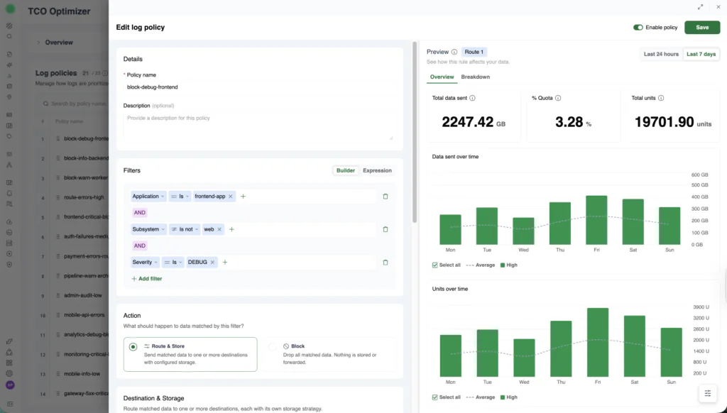
The Historical Traffic Statistics preview panel showing summary counters, data sent over time, and units over time.
Summary counters at the top: total data sent (in GB), percentage of quota consumed, and total units matched by this policy. The data is drawn from the same usage pipeline that drives billing, scoped to the time window you select (last 24 hours or last 7 days), so the numbers reflect real consumption rather than projections.
Data sent over time: a bar chart showing matched volume across the selected time range, broken down by priority tier. You can see daily patterns, weekday spikes, weekend dips, the kind of variance that determines whether a policy that looks right on Tuesday still makes sense on Friday.
Units over time: the same time range rendered in billing units, with an average line so you can spot anomalies at a glance.
A toggle in the top-right corner switches between Last 24 hours and Last 7 days, and the Overview tab provides aggregate statistics across the selected window.
The statistics respond as you edit
The real power is that the statistics update as you change the policy configuration.
Change a policy’s priority from High to Medium, and the counters and charts reflect the difference immediately. Switch the priority to Block, and the bars shift to red, with the volume and unit impact recalculated on the spot.
Every priority tier is a different cost and access tradeoff. High gives you fast queries and alerting but carries the highest unit cost. Medium balances access with spend. Low is archival-only but the cheapest path. Block drops data permanently, maximum savings, zero recoverability. Until now, choosing between these for a DPXL-filtered policy meant reasoning about cost in the abstract. Historical traffic statistics make the tradeoff concrete: you can see the unit difference between routing 2,247 GB to High versus Medium, for this specific traffic, over the last week.
What this looks like in practice
Consider a DPXL policy filtering on $d.environment == 'production' && $m.severity.in(ERROR, CRITICAL) && $d.kubernetes.namespace == 'payments'. This expression targets a narrow, high-value slice of traffic, but without historical data, its actual scope is invisible.
You open the policy in the TCO Optimizer and the preview panel loads immediately. The counters show this policy matched 2,247 GB over the last 7 days, consuming 3.28% of your quota. The “Data sent over time” chart shows a clear weekly pattern, lower volume on Monday, building through the week, peaking on Friday.
That pattern matters. A policy tuned for average daily volume might be fine on Monday but under-scoped by Friday. The 7-day view reveals whether your routing logic holds up across the full cycle of your infrastructure’s behavior, not just the moment you happen to check.
Standard policies vs. quota-based policies
The preview is policy-type-aware and renders accordingly.
Standard policies show a single-color volume chart matching the assigned priority tier, green for High, blue for Medium, and so on. The chart and counters reflect what this policy has historically matched.
Quota-based policies show a transition chart: where data was routed before quota thresholds were hit, and where it shifted after. The storage column in the policy list hints at this with labels like “Medium -> Block,” and the preview panel visualizes exactly where that transition happens over time. For teams managing burst protection, this is where budget overruns become visible before they land – based on recent traffic patterns, so treat it as a planning estimate rather than a guarantee. You can see whether your thresholds are triggering at the right points or whether traffic is spilling into expensive tiers earlier than expected.
Why this matters
Evidence-based routing. Every policy is a hypothesis about which data deserves which tier. Without evidence, that hypothesis gets tested in production, against your bill. Historical traffic statistics let you validate routing decisions against real data before they take effect, so cost allocation reflects actual traffic patterns rather than assumptions about them.
Faster time-to-optimization. Every day between “this policy might be wrong” and “this policy is fixed” is a day of misallocated spend. The old workflow stretched that gap across multiple billing cycles, configure, save, wait, check Data Usage, adjust, repeat. The new workflow closes it in a single session. The team tuning TCO policies moves on, and the corrected routing starts saving from the moment it’s saved.
DataPrime expression (DPXL) granularity with full visibility. DPXL expressions let you route on any field in the event payload, from Kubernetes namespaces to tenant IDs to custom fields. That precision is only useful if you can see what it catches. Historical Traffic Statistics closes that loop, making field-level routing as reviewable as it is precise.
Getting started
The preview panel appears automatically when you edit a DPXL policy in the TCO Optimizer:
- Open TCO Optimizer under Data Flow.
- Edit an existing DPXL policy, the preview panel opens on the right side of the drawer.
- Review the summary counters, “Data sent over time,” and “Units over time” charts.
- Toggle between Last 24 hours and Last 7 days in the top-right corner.
- Change the priority or policy type and watch the preview update.
- Use the Overview tab for aggregate statistics.
For new Dataprime expression-based policies, historical data becomes available after the policy has been active and traffic has been matched.
The pattern: route, then verify
DataPrime expressions brought field-level precision to TCO routing – going beyond application, subsystem, and severity to the ability, to match on any field. Historical Traffic Statistics adds the visibility needed to verify that precision against real traffic. The pattern it establishes is the same one that makes any policy-driven system trustworthy. You wouldn’t deploy a firewall rule without testing it. You shouldn’t deploy a cost routing policy without seeing what it catches.
DataPrime continues to expand its role in the pipeline. The same expressions you write to explore data now route it, budget it, and, with historical traffic statistics, prove what they’re doing before you save.
Ready to see what your expression-based policies are actually catching? Open the TCO Optimizer and review the traffic statistics on any existing policy.