New Explore: Faster answers, less friction, and a better way to investigate your data

There is a moment every engineer knows too well. Something is wrong in production. You have an alert, a vague symptom, and pressure to find the one signal that explains what changed. You open your logs and traces, and you immediately hit the same two problems: the dataset is huge, and the path from “I see something odd” to “I understand why” is full of tiny, exhausting steps.
Meet new Explore, our redesigned investigation experience for logs, traces, and spans. It is built to offer zero learning curve for first-time users, maximize efficiency for daily debugging, and provide true data exploration when you need to turn raw events into an actionable story.
Why data can be hard to explore in the first place
Telemetry is one of the most valuable sources of truth, but it comes with a unique challenge. Logs are often unstructured or semi-structured. Two logs from the same service might not share the same fields, and the underlying infrastructure schema changes continuously. Even when the data is present, investigations slow down because you do not know which fields exist, what values are common, or how to narrow the scope without trial and error.
That is why many teams end up treating log and span exploration like a series of disconnected tasks. Search, scroll, copy a value, paste it somewhere else, adjust the time range, repeat. You spend time operating the tool instead of learning from the data.
New Explore focuses on turning that process into a single, coherent workflow.
A more natural investigation flow
Most investigations start in one of two ways.
Sometimes you know exactly what you are looking for. A request ID, an exception type, a pod name, a customer identifier, or a specific error message. Other times you do not know which log or span you are looking for yet. You only know the symptom. There is a spike in errors, latency climbed, a deployment happened, or a service started restarting. You need to explore the shape of the problem before you can even write the query.
New Explore supports both of these paths across logs and traces without forcing you into separate tools. You can start broadly, narrow quickly, then drill into the exact entry that explains the behavior.
Query Builder: Exploration without writing code
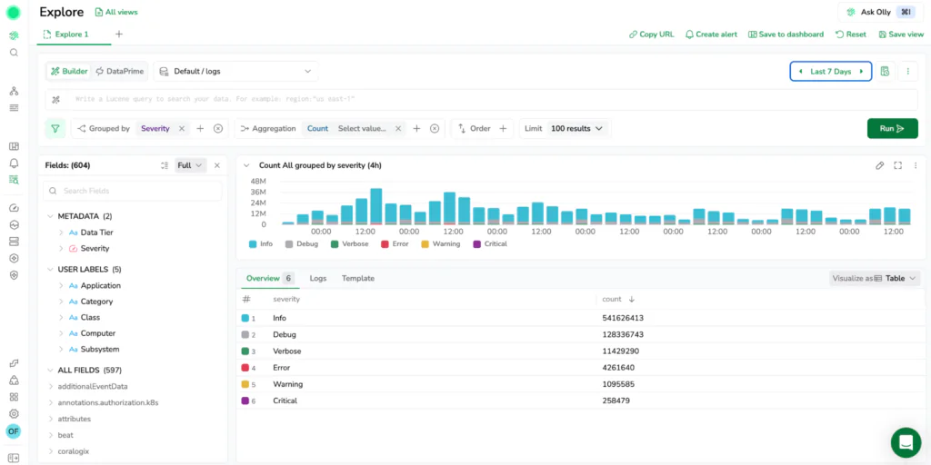
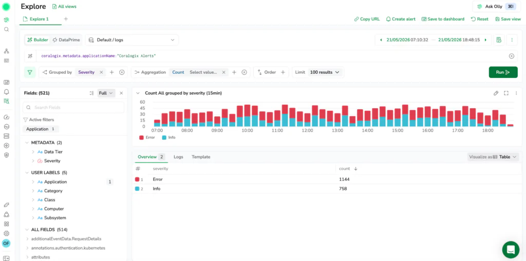
One of the biggest improvements in new Explore is the emphasis on a UI-first Query Builder. The goal is simple: let users filter, group, and aggregate logs and spans through guided visual workflows without needing to switch into a code editor or remember syntax details.
This matters because many useful questions are not “find me the log with this exact value.” They are structural questions like:
- What error types increased in the last 30 minutes?
- Which services are producing most of the warnings?
- Which environment is driving the spike?
- Which region or customer ID is affected?
In this new Explore, these questions are answered directly through interactive controls. Instead of jumping immediately into a complicated query, you can build up the investigation step by step using Group by, aggregation chips, order by and limit as to see the results change, and iterate quickly.
Move from raw data to patterns, not just more scrolling
Scrolling through raw lines is sometimes necessary, but it is rarely the fastest way to understand what is happening. The more effective approach is to summarize, then zoom in.
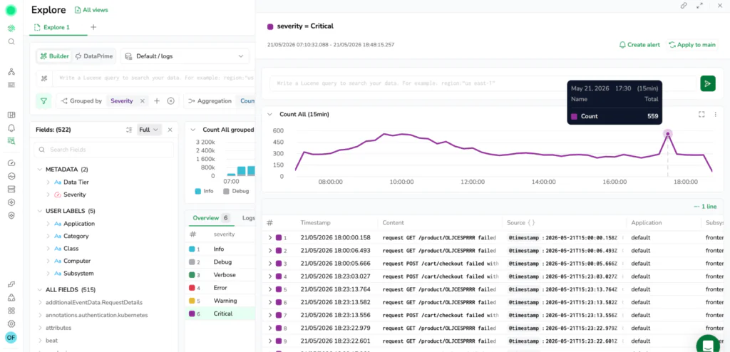
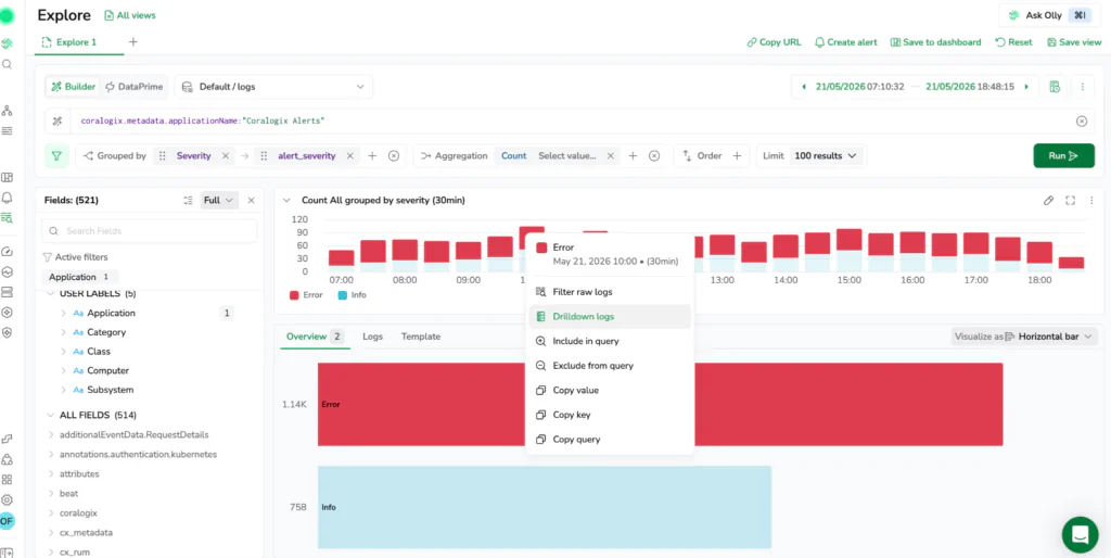
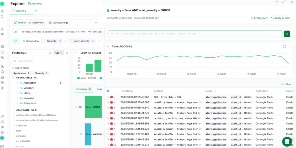
New Explore makes this flow seamless with the Overview tab. When you add a grouping or aggregation in the Query Builder, the interface routes you to an aggregated, sortable view automatically. You can shift from raw events to a table that shows top contributors or quiet outliers, then click through to see the underlying logs or spans that explain a spike. It helps you find exactly what is driving an issue in minutes instead of turning it into a manual sampling exercise. The Overview tab works alongside all other tabs, switch to Logs or Spans at any time to see the raw data behind the aggregation
Context-aware field discovery with Schema Store
In most observability tools, you are stuck guessing which fields exist. In new Explore, you always know.
Traditional log exploration is plagued by inconsistent schemas, forcing engineers to manually type out keys and pray they are spelled correctly or actually present in the data. Explore eliminates this friction by tracking your evolving schema automatically behind the scenes.
The updated Fields panel directly reads the Coralogix Schema Store to understand exactly which fields existed and, crucially, when they existed. This historical tracking makes the autocomplete panel completely context-aware, aligning perfectly with your active time window.
As you search, the Fields panel displays an open list of every detected key for that specific interval. Instead of dealing with rigid, static filters, you can favorite key attributes to pin them to the top of your workspace, view real-time field popularity statistics, and inspect inline value distributions to see the most common values before you even hit run.
Templates: Reduce noise and focus on recurring signals
In high-volume environments, the majority of log volume is repetitive. The same basic messages appear millions of times, creating noise that buries what is actually new.
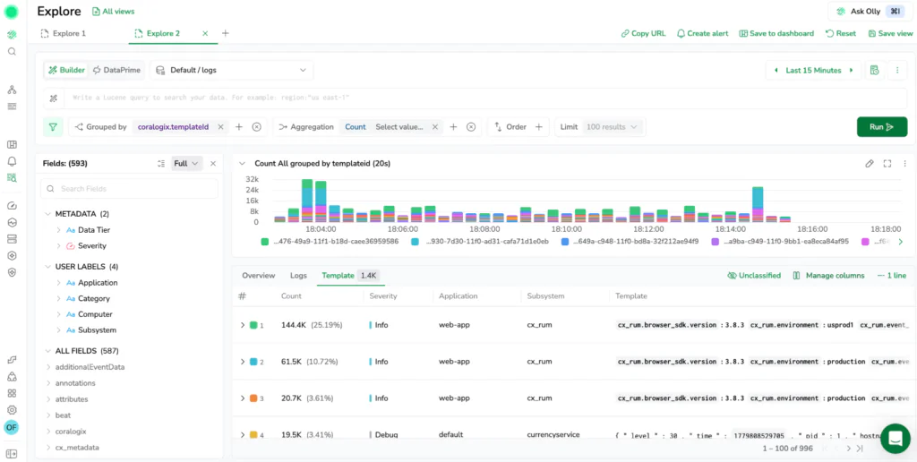
New Explore includes templates as a core part of the experience. Templates use log aggregation algorithms to cluster repetitive logs together automatically so you can focus on patterns instead of reading the same message hundreds of times. When you are investigating an incident, it is often more useful to know that a specific log pattern is suddenly spiking than it is to scan 500 near-identical lines. This makes it easy to isolate rare errors and high-impact anomalies instantly.
An investigation hub, not a single-purpose screen
Log and trace exploration rarely ends with finding a single record. Usually, it triggers a sequence of follow-up questions.
You find the event, then you ask what happened before it, whether other microservices emitted something related, or if the pattern appears in another environment. New Explore
is designed as an interactive hub where those follow-up questions are expected. The experience includes desktop-grade navigation features to keep your workflow continuous:
- Explore Tabs: Open multiple tabs to run queries in parallel. Compare log volume across two different services, or track logs in one tab while inspecting traces in another without losing your place.
- Saved Views: Capture your complete screen configuration, including your query, open tabs, filters, layout, visualizations, and time ranges to return to investigations later.
- Saved Queries: Preserve pure query logic so you can reuse complex expressions across different sessions and time windows.
DataPrime: The default for true data exploration
While a UI-first Query Builder is great for speed, deep data exploration requires full analytical control. New Explore natively integrates DataPrime as the default language for deeply analyzing telemetry.
By switching to code mode, you can leverage DataPrime’s pipeline syntax to write complex queries with joins, unions, and powerful data operators. This is not an isolated “advanced mode” gated for specific users. It is a core part of the workflow. Use the visual builder when you want momentum, and switch to the code editor when you need exactness. Because both modes stay in sync, teams can collaborate on the same investigation regardless of their querying preference.
Interactive visualizations for instant pattern spotting
Turn your query results into charts and tables directly in Explore without rebuilding your work. The platform gives you two distinct options for visualization: tracking metrics over time or analyzing categorical distributions.
You can completely control how your data is presented using the Visualize as dropdown directly above the results panel. If you are inspecting raw rows or grouped results in a table, this button unlocks a variety of interactive chart types, including line, area, vertical or horizontal bar, and pie charts.
This layout becomes incredibly powerful when investigating an anomaly. The interface allows you to view your time-series graph and the categorical Overview visualizations side by side on the same screen. This means you can track a latency spike on a timeline while simultaneously scanning a pie chart of the top contributing microservices or error codes next to it.
Every visual element remains interactive. You can select and drag across a region on a time-series chart to zoom your global time picker into a specific window, or right-click any chart segment to instantly filter a value in or out of your active query.
The takeaway
Telemetry is the fastest way to answer “what actually happened?” but only if the experience supports the way engineers investigate in real life. New Explore is built to make that process faster, more approachable, and completely repeatable. By unifying logs and spans, tracking schemas automatically, and balancing visual building with powerful DataPrime exploration, it helps you go from symptom to story with fewer steps and less guesswork.
For a deep dive into distributed trace investigation with Explore Spans, read our blog focused on Explore for spans here, and our documentation here.