Advanced Guide to Kibana Timelion


Kibana Timelion is a time-series based visualization language that enables you to analyze time-series data in a more flexible way. compared to other visualization types that Kibana offers.
Instead of using a visual editor to create visualizations, Timelion uses a combination of chained functions, with a unique syntax, to depict any visualization, as complex as it may be.
The biggest value of using Timelion comes from the fact that you can concatenate any function on any log data. This means that you can plot a combination of functions made of different sets of logs within your index. It’s like creating a Join between uncorrelated logs except you don’t just fetch the entire set of data, but rather visualize their relationship. This is something no other Kibana visualization tool provides.
In this post, we’ll explore the variety of functions that Kibana Timelion supports, their syntax and options, and see some examples.
Kibana Timelion Functions
View the list of functions with their relevant arguments and syntaxes here.
| Function | What the function does |
|---|---|
| .abs() | Return the absolute value of each value in the series list (Chainable) |
| .add() or .plus() or .sum() | Adds the values of one or more series in a seriesList to each position, in each series, of the input seriesList. (Chainable) |
| .aggregate() | Creates a static line based on result of processing all points in the series. (Chainable) |
| .bars() | Show the seriesList as bars (Chainable) |
| .color() | Change the color of the series (Chainable) |
| .cusum() | Return the cumulative sum of series, starting at a base. (Chainable) |
| .derivative() | Plot the change in values over time. (Chainable) |
| .divide() | Divides the values of one or more series in a seriesList to each position, in each series, of the input seriesList. (Chainable) |
| .es() | Pull data from an elasticsearch instance (Data Source) |
| .es(q) | Query in lucene query string syntax |
| .es(metric) | An elasticsearch metric aggregation: avg, sum, min, max, percentiles or cardinality, followed by a field. E.g. “sum:bytes_sent.numeric”, “percentiles:bytes_sent.numeric:1,25,50,75,95,99” or just “count”. If metric is not specified default option is count so it is redundant to use metric=count |
| .es(split) | An elasticsearch field to split the series on and a limit. E.g., “hostname:10” to get the top 10 hostnames |
| .es(index) | Index to query, wildcards accepted. Provide Index Pattern name for scripted fields and field name type ahead suggestions for metrics, split, and timefield arguments. |
| .es(timefield) | Field of type “date” to use for x-axis |
| .es(kibana) | Respect filters on Kibana dashboards. Only has an effect when using on Kibana dashboards |
| .es(offset) | Offset the series retrieval by a date expression, e.g., -1M to make events from one month ago appear as if they are happening now. Offset the series relative to the charts overall time range, by using the value “timerange”, e.g. “timerange:-2” will specify an offset that is twice the overall chart time range to the past. |
| .es(fit) | Algorithm to use for fitting series to the target time span and interval. |
| .fit() | Fill null values using a defined fit function (Chainable) |
| .hide() | Hide the series by default (Chainable) |
| .holt() | Sample the beginning of a series and use it to forecast what should happen via several optional parameters. In general, this doesn’t really predict the future, but predicts what should be happening right now according to past data, which can be useful for anomaly detection. Note that nulls will be filled with forecasted values. (Chainable) |
| .holt(alpha) | Smoothing weight from 0 to 1. Increasing alpha will make the new series more closely follow the original. Lowering it will make the series smoother. |
| .holt(beta) | Trending weight from 0 to 1. Increasing beta will make rising/falling lines continue to rise/fall longer. Lowering it will make the function learn the new trend faster. |
| .holt(gamma) | Seasonal weight from 0 to 1. Does your data look like a wave? Increasing this will give recent seasons more importance, thus changing the wave form faster. Lowering it will reduce the importance of new seasons, making history more important. |
| .holt(season) | How long is the season, e.g., 1w if your pattern repeats weekly. (Only useful with gamma) |
| .holt(sample) | The number of seasons to sample before starting to “predict” in a seasonal series. (Only useful with gamma, Default: all) |
| .if() | Compares each point to a number, or the same point in another series using an operator, then sets its value to the result if the condition proves true, with an optional else. (Chainable) |
| .if(operator) | comparison operator to use for comparison, valid operators are eq (equal), ne (not equal), lt (less than), lte (less than equal), gt (greater than), gte (greater than equal) |
| .if(if) | The value to which the point will be compared. If you pass a seriesList here the first series will be used |
| .if(then) | The value the point will be set to if the comparison is true. If you pass a seriesList here the first series will be used |
| .if(else) | The value the point will be set to if the comparison is false. If you pass a seriesList here the first series will be used |
| .label() | Change the label of the series. Use %s to reference the existing label. (Chainable) |
| .legend() | Set the position and style of the legend on the plot. (Chainable) |
| .legend(position) | Corner to place the legend in: nw, ne, se, sw. You can also pass false to disable the legend. |
| .legend(columns) | Number of columns to divide the legend into. |
| .legend(showTime) | Show the time value in legend when hovering over graph. Default: true. |
| .legend(timeFormat) | moment.js format pattern. Default: MMMM Do YYYY, HH:mm:ss.SSS |
| .lines() | Show the seriesList as lines. (Chainable) |
| .lines(fill) | Number between 0 and 10. Use for making area charts. |
| .lines(width) | Line thickness. |
| .lines(show) | Show or hide lines. |
| .lines(stack) | Stack lines, often misleading. At least use some fill if you use this. |
| .lines(steps) | Show line as step, e.g, do not interpolate between points |
| .log() | Return the logarithm value of each value in the seriesList (default base: 10). (Chainable) |
| .max() | Maximum values of one or more series in a seriesList to each position, in each series, of the input seriesList. (Chainable) |
| .min() | Minimum values of one or more series in a seriesList to each position, in each series, of the input seriesList. (Chainable) |
| .multiply() | Multiply the values of one or more series in a seriesList to each position, in each series, of the input seriesList. (Chainable) |
| .mvavg() | Calculate the moving average over a given window. Nice for smoothing noisy series. (Chainable) |
| .mvstd() | Calculate the moving standard deviation over a given window. Uses naive two-pass algorithm. Rounding errors may become more noticeav |
| .points() | Show the series as points. (Chainable) |
| .precision() | Number of digits to round the decimal portion of the value to. (Chainable) |
| .range() | Changes the max and min of the series while keeping the same shape. (Chainable) |
| .scale_interval() | Changes scales of a value (usually a sum or a count) to a new interval. For example, as a per-second rate. (Chainable) |
| .static() or .value() | Draws a single value across the chart. (Data Source) |
| .subtract() | Adds the values of one or more series in a seriesList to each position, in each series, of the input seriesList. (Chainable) |
| .title() | Adds a title to the top of the plot. If called on more than 1 seriesList the last call will be used. (Chainable) |
| .trend() | Draws a trend line using a specified regression algorithm. (Chainable) |
| .trim() | Set N buckets at the start or end of a series to null to fit the “partial bucket issue”. (Chainable) |
| .yaxis() | Configures a variety of y-axis options, the most important likely being the ability to add an Nth (e.g. 2nd) y-axis. (Chainable) |
| .yaxis(color) | Color of axis label |
| .yaxis(label) | Label for axis |
| .yaxis(max) | Max value |
| .yaxis(min) | Max value |
| .yaxis(position) | left or right |
| .yaxis(tickDecimals) | The number of decimal places for the y-axis tick labels. |
| .yaxis(units) | The function to use for formatting y-axis labels. One of: bits, bits/s, bytes, bytes/s, currency(:ISO 4217 currency code), percent, custom(:prefix:suffix) |
| .yaxis(yaxis) | The numbered y-axis to plot this series on, e.g., .yaxis(yaxis=2) for 2nd y-axis. If you are not plotting more than one .es() expression there is no meaning to yaxis=2,3,.. |
View the list of functions with their relevant arguments and syntaxes here.
Tips
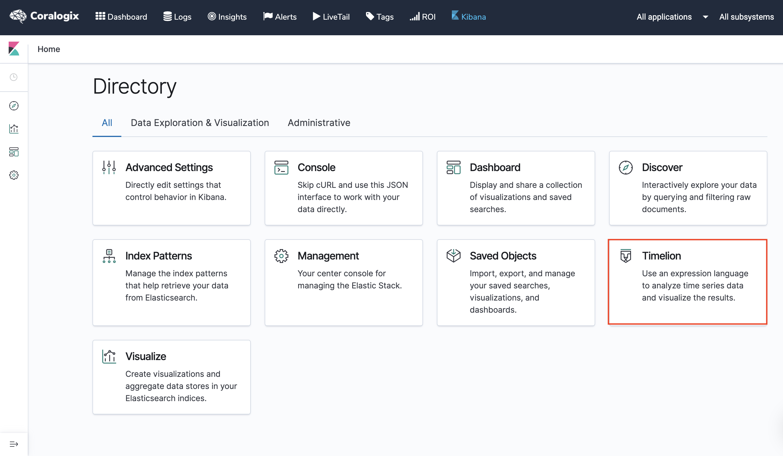
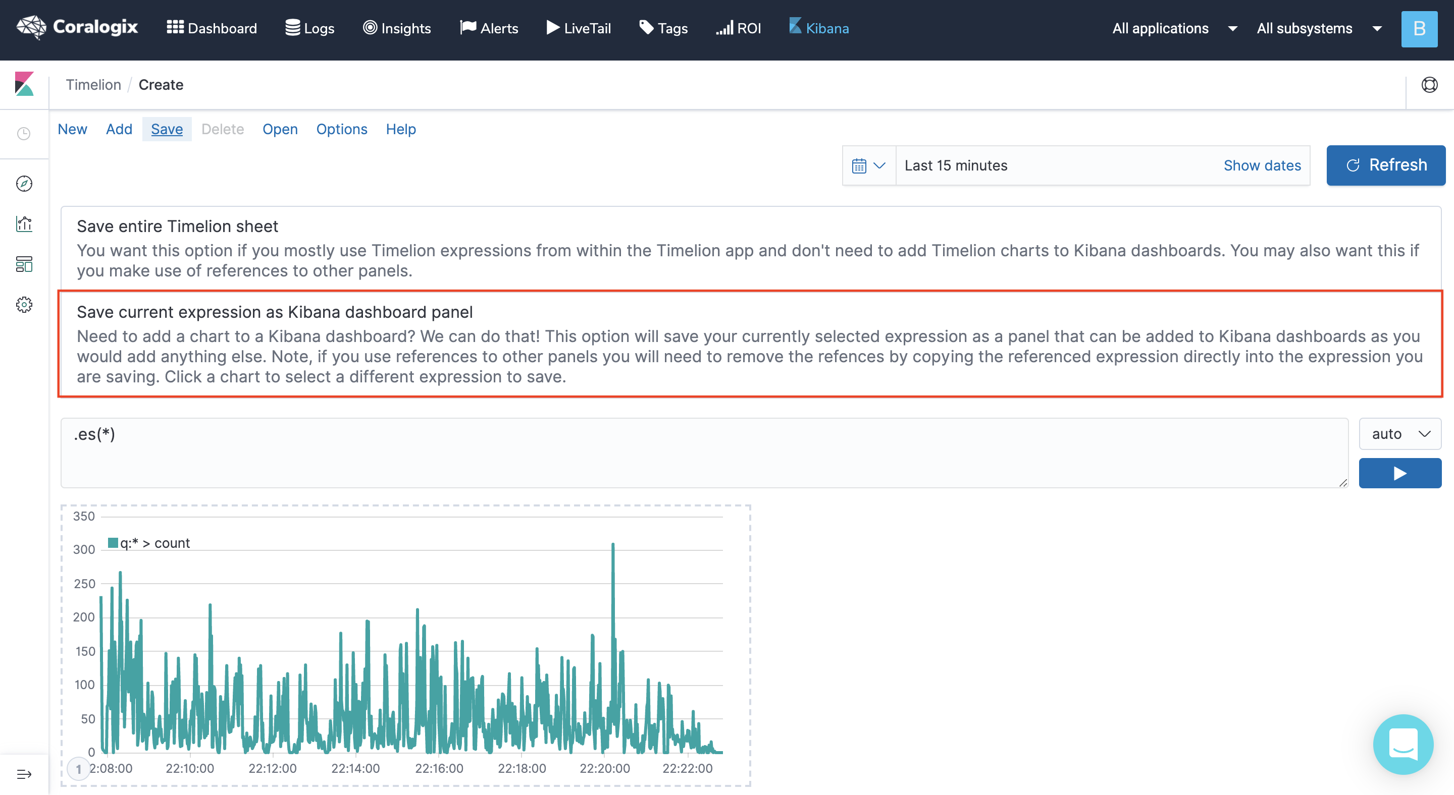
- You can enter the Timelion wizard either from the main page when entering Kibana or from the visualizations section. If you enter it from the main screen make sure you choose “save current expression as Kibana dashboard panel” if your goal is to add the Timelion visualization to a Dashboard.
- Use the index Argument in your .es() functions when building your Timelion expressions. By using it, any element you add, such as a metric, or a field will have auto-suggestions for names when starting to type. For example, .es(index=*:9466_newlogs*).
- If you enable the Coralogix Logs2metrics feature and start to collect aggregations of your logs, using .es(index=*:9466_log_metrics*) lets you visualize those metrics. Using both index patterns in the same expression lets you visualize separate data sources like your logs and metrics. No other Kibana visualization gives you such an option. It will look like this: .es(index=*:9466_newlogs*),.es(index=*:9466_log_metrics*).
- Use the Kibana Argument, with the true option in your .es() functions when building your Timelion expressions if you plan on integrating them with a Dashboard so that they’ll apply the filters in your dashboard. For example, .es(kibana=true).
Examples
Cache Status
.es(kibana=true,q='_exists_:cache_status.keyword', split=cache_status.keyword:5).divide(.es(kibana=true,q='_exists_:cache_status.keyword')).multiply(100).label(regex='.*cache_status.keyword:(.*) > .*', label='$1%').lines(show=true,width=1).yaxis(1,min=0,max=100,null,'Upstream Cache Status (%)').legend(columns=5, position=nw).title(title="Cache Status"),
.es(kibana=true,q='_exists_:cache_status.keyword', split=cache_status.keyword:5).divide(.es(kibana=true,q='_exists_:cache_status.keyword')).multiply(100).label(regex='.*cache_status.keyword:(.*) > .*', label='$1 avg').lines(show=true,width=1).yaxis(1,min=0,max=100,null,'Upstream Cache Status (%)').legend(columns=5, position=nw).title(title="Cache Status").aggregate(function=avg)
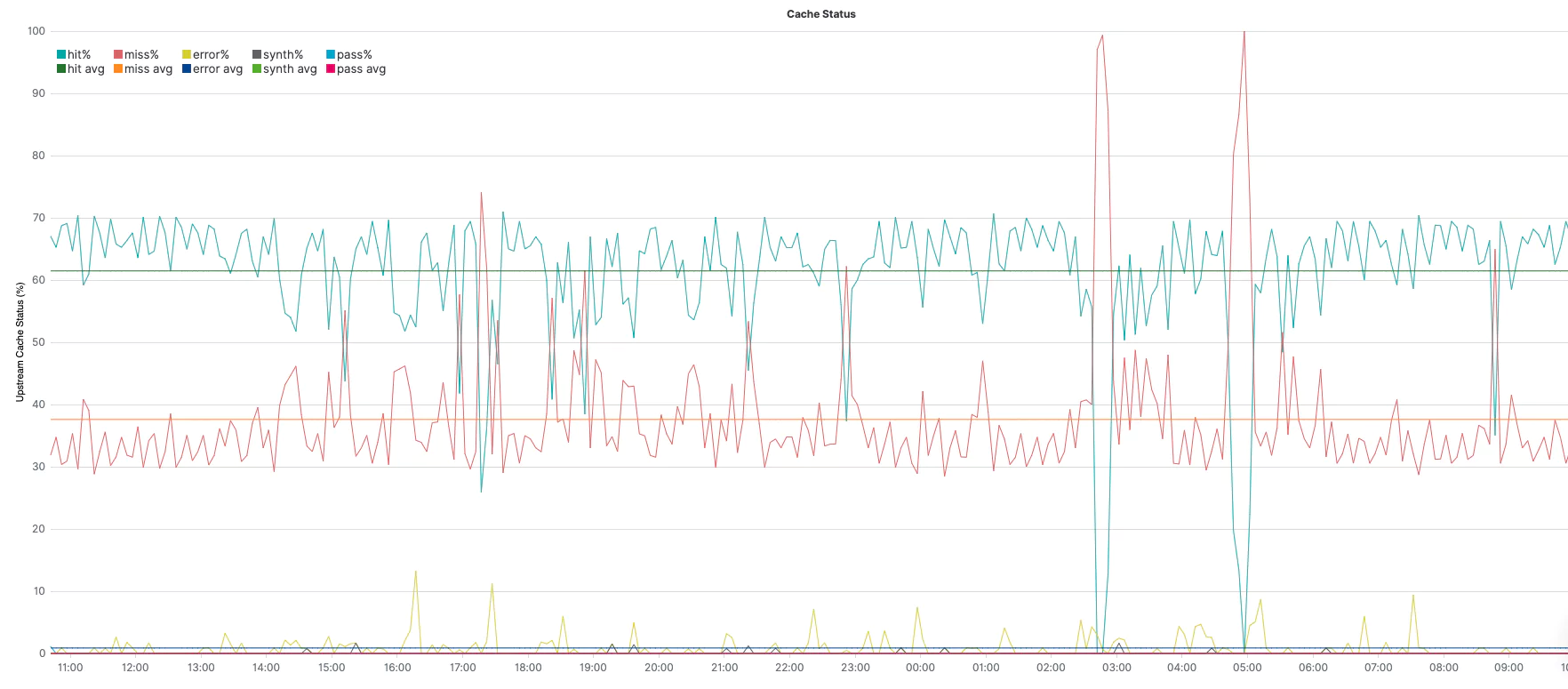
.es(q="_exists_:cache_status.keyword", split=cache_status.keyword:5)– query under q=; aggregate, per top 5 unique values of cache_status field, under split=.divide()– divide the series by whatever is in parenthesis. In this case:.es(q="_exists_:upstream_cache_status.keyword")is the same query above, but without aggregating different values (=all values together). Together, (1) and (2) provide the % of each value..multiply(100)– convert 0..1 to 0..100 for an easier view of %..label(regex='.*upstream_cache_status.keyword:(.*) > .*', label='avg $1%')– change the label of the legend (match the original value with the regex and create a label with the result)..lines(show=true,width=1)– This is the line styling..yaxis(1,min=0,max=100,null,'Upstream Cache Status (%)')the y-axis styling sets the min and max as constants for the %..legend(columns=5, position=nw)– sets 5 columns for the legend, as we have 5 splits in the above series, and place it at the northwest corner..title(title="Upstream Cache Status")– sets a title for the graph..aggregate(function=avg)– averages each of the different series (throughout the whole query timeframe).
Using two series, one for 1 through 8 (without averaging) and another series for 1 through 9 (with averaging), we can get each of the series along with its average in the same graph.
Response Size
.es(kibana=true,q='_exists_:response.header_size', metric=sum:response.header_size.numeric,split=request.protocol.keyword:5).add(.es(kibana=true,q='_exists_:response.body_size', metric=sum:response.body_size.numeric,split=request.protocol.keyword:5)).divide(1024).label(regex='.*request.protocol.keyword:(.*) > .*', label='$1').lines(width=1.4,fill=0.5).legend(columns=5, position=nw).title(title="Total response size (KB) by protocol")
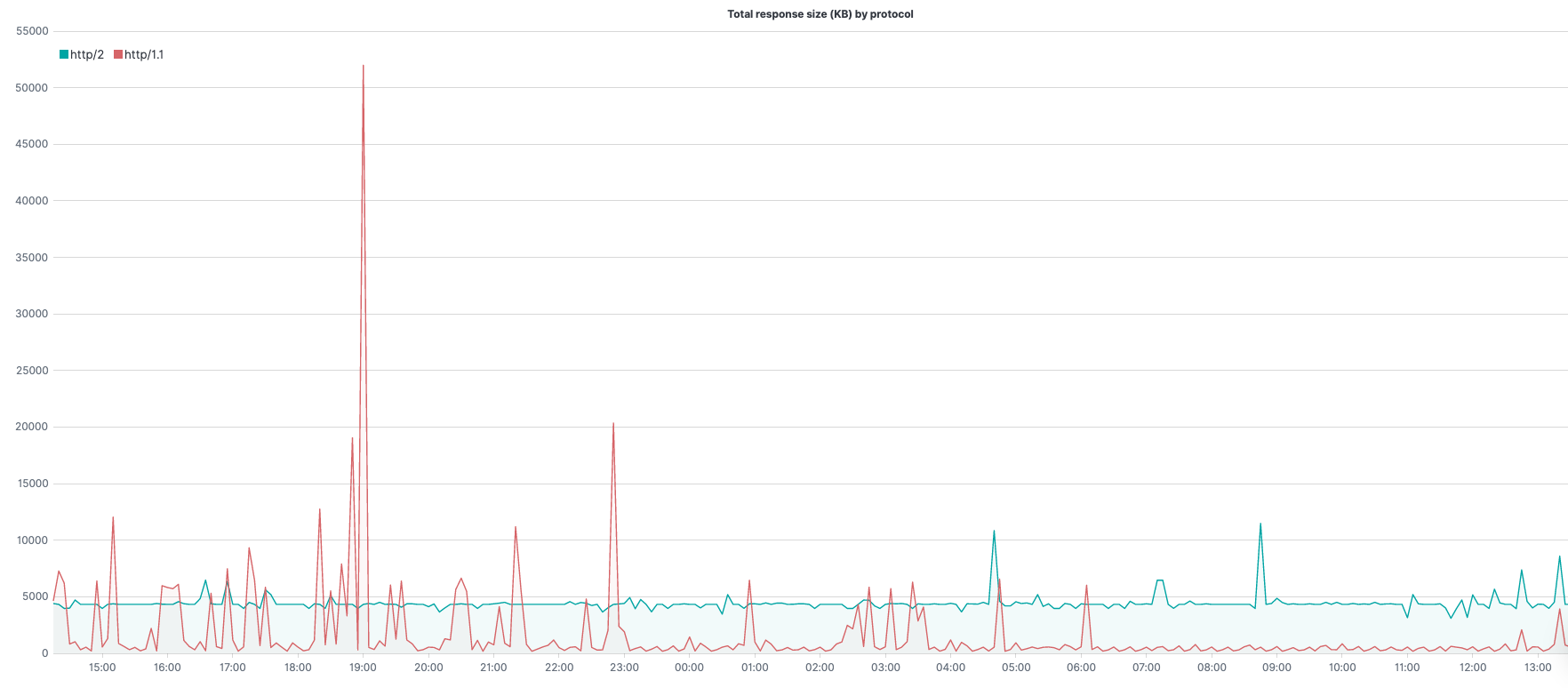
.es(kibana=true,q='_exists_:response.header_size', metric=sum:response.header_size.numeric,split=request.protocol.keyword:5)– query under q=; the metric to use (in this case sum of response header size) under metric=; aggregate, per top 5 unique values of request.protocol, under split=.add()– adding to the series whatever is in parenthesis. In this case –.es(kibana=true,q='_exists_:response.body_size', metric=sum:response.body_size.numeric,split=request.protocol.keyword:5)is the same query above except we are summing the response body size rather than the header size. Together, (1) and (2) provide the total number of bytes for the response..divide(1024)– convert bytes to Kilobytes..label(regex='.*request.protocol.keyword:(.*) > .*', label='$1')– change the label of the legend (match the original value with the regex, create a label with the result)..lines(width=1.4,fill=0.5)– line styling..legend(columns=5, position=nw)– sets 5 columns for the legend, as we have 5 splits in the above series, and place it at the northwest corner..title(title="Total response size (KB) by protocol")– set a title for the graph.
Using the .add() function with the same .es() function for the response body size, we can get the full response size even though our log data includes the size of the header and size of the body separately.
Bytes Sent
.es(metric="percentiles:bytes_sent.numeric:5,25,50,75,95,99").log().lines(width=0.9,steps=true).label(regex="q:* > percentiles([^.]+.numeric):([0-9]+).*",label="bytes sent $1th percentile").legend(columns=3,position=nw,timeFormat="dddd, MMMM Do YYYY, h:mm:ss a").title(title="Bytes sent percentiles, log scale")
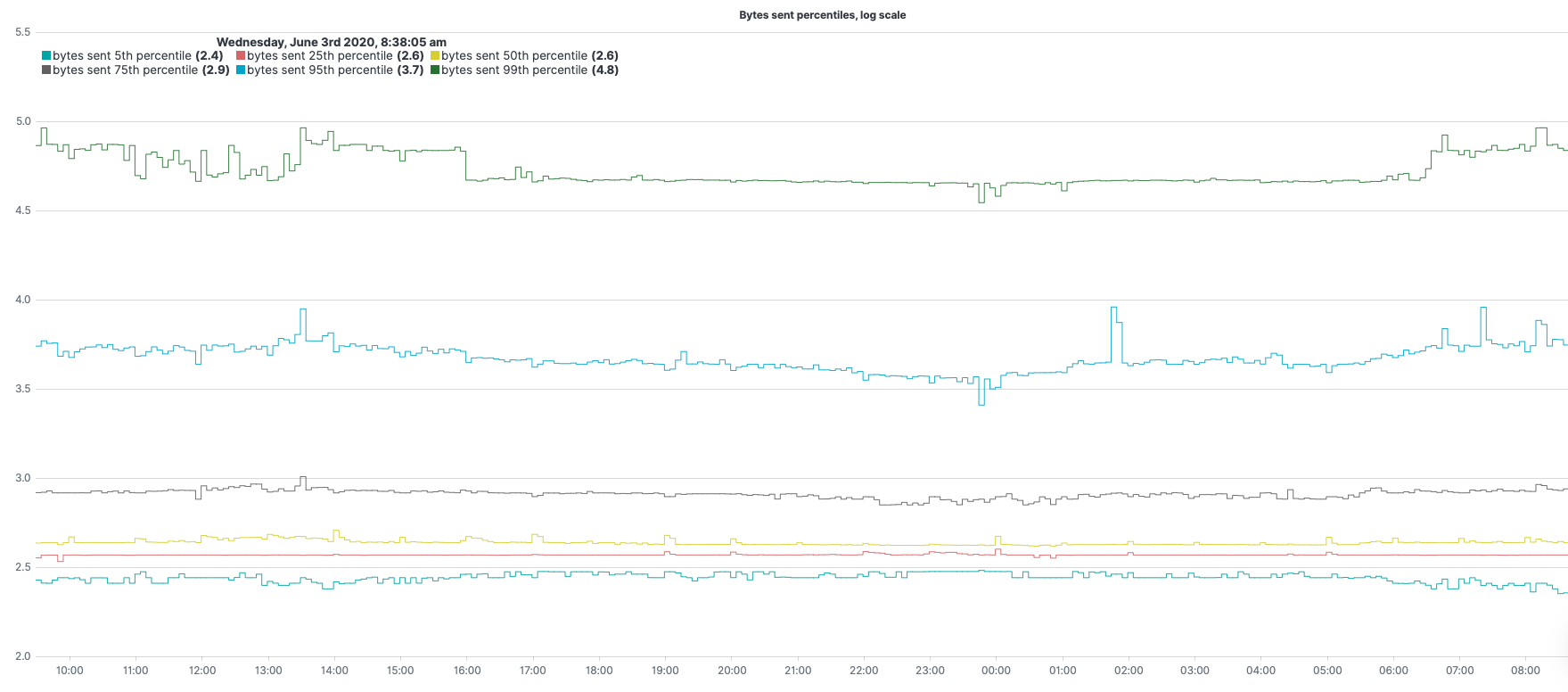
.es(metric="percentiles:bytes_sent.numeric:5,25,50,75,95,99")– metric to use (in this case percentiles of bytes sent) under metric=.log()– calculating log (with base 10 if not specified otherwise) for y-axis values of our expression..label(regex="q:* > percentiles([^.]+.numeric):([0-9]+).*",label="bytes sent $1th percentile")– change the label of the legend (match the original value with the regex, create a label with the result)..lines(width=0.9,steps=true)– line styling..legend(columns=3,position=nw,timeFormat="dddd, MMMM Do YYYY, h:mm:ss a")– sets 3 columns for the legend and place it at the northwest corner..title(title="Bytes sent percentiles, log scale")– set a title for the graph.
High severity logs
.es(q="coralogix.metadata.severity:(5 OR 6)",split=coralogix.metadata.subsystemName:5).lines(width=1.3,fill=2).label(regex=".*subsystemName:(.*) >.*",label="high severity logs count from subsystem $1").title(title="High severity logs count VS moving average per top 5 subsystems").legend(columns=2,position=nw),
.es(q="coralogix.metadata.severity:(5 OR 6)",split=coralogix.metadata.subsystemName:5).lines(width=1.3,fill=2).label(regex=".*subsystemName:(.*) >.*",label="high severity logs moving average from subsystem $1").mvavg(window=10,position=right)
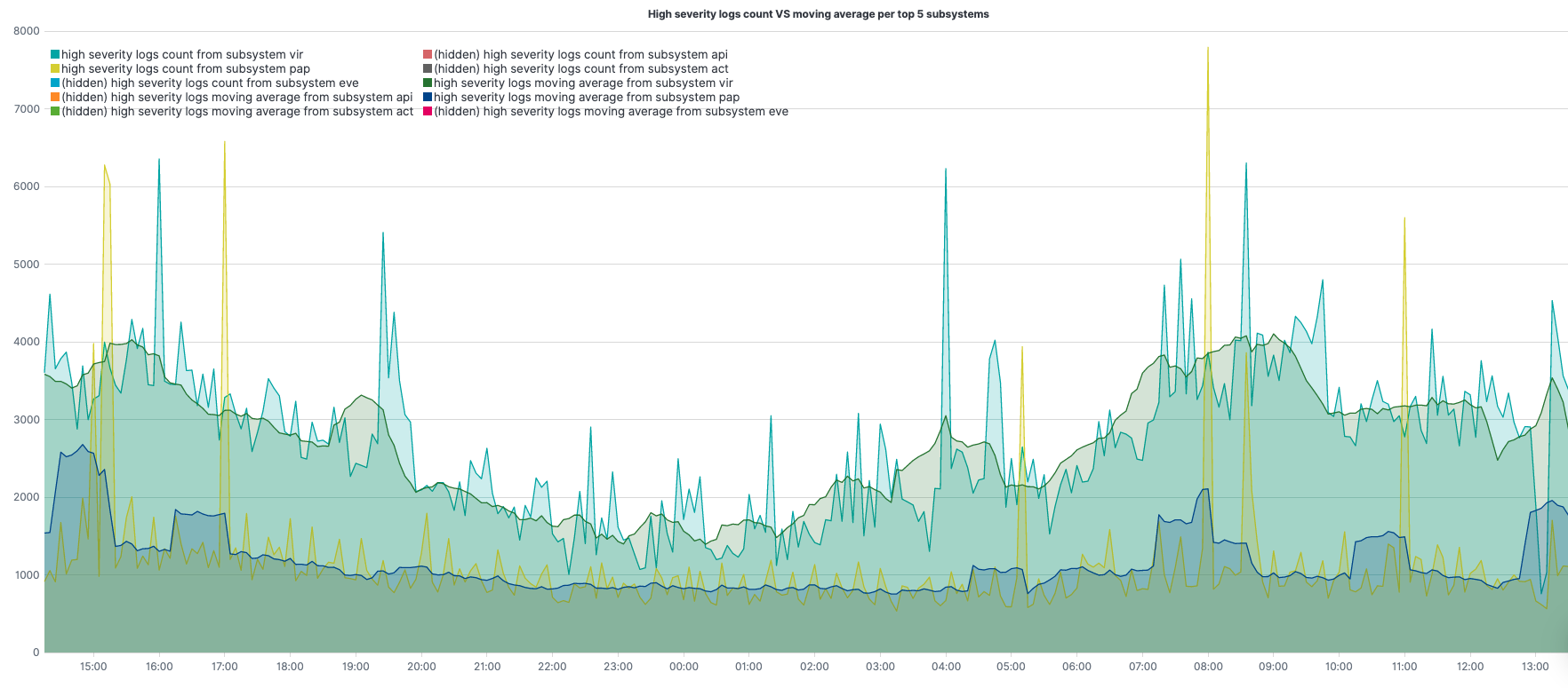
.es(q="coralogix.metadata.severity:(5 OR 6)",split=coralogix.metadata.subsystemName:5)– query under q=; aggregate, per top 5 subsystems, under split=.label(regex=".*subsystemName:(.*) >.*",label="high severity logs count from subsystem $1")– change the label of the legend for the 1st series (match the original value with the regex, create a label with the result)..label(regex=".*subsystemName:(.*) >.*",label="high severity logs moving average from subsystem $1")– change the label of the legend for the 2nd series (match the original value with the regex, create a label with the result)..lines(width=1.3,fill=2)– line styling..legend(columns=2, position=nw)– sets 2 columns for the legend, and place it at the northwest corner..title(title="High severity logs count VS moving average")– set a title for the graph..mvavg(window=10,position=right)– computes the moving average, sliding window of 10 points to the right of each computation point, for each of the different subsystems.
Using two series, 2nd series is the moving average for the 1st, we can get each of the series along with its moving average in the same graph.
5xx responses benchmark
.es(q="status_code.numeric:[500 TO 599]").if(operator=lt,if=3000,then=.es(q="status_code.numeric:[500 TO 599]")).color(color=red).points(symbol=circle,radius=2).label(label="5xx status log count above 3000"),
.es(q="status_code.numeric:[500 TO 599]",offset=-1w).if(operator=lt,if=3000,then=.es(q="status_code.numeric:[500 TO 599]")).color(color=purple).points(symbol=circle,radius=2).label(label="5xx status log count above 3000 a week ago"),
.es(q="status_code.numeric:[500 TO 599]").if(operator=gte,if=3000,then=null).color(color=blue).points(symbol=circle,radius=2).label(label="5xx status log count under 3000"),
.es(q="status_code.numeric:[500 TO 599]",offset=-1w).if(operator=gte,if=3000,then=null).color(color=green).points(symbol=circle,radius=2).label(label="5xx status log count under 3000 a week ago").title(title="5xx log count benchmark")
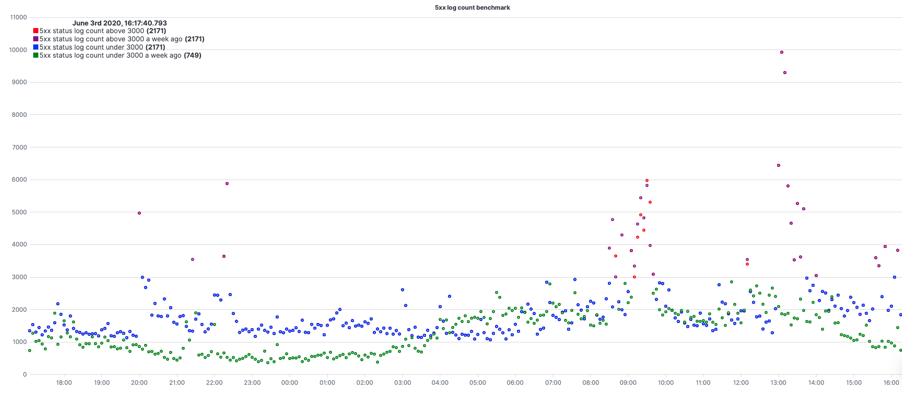
.es(q="status_code.numeric:[500 TO 599]")– query under q=;.es(q="status_code.numeric:[500 TO 599]",offset=-1w)– query with an offset of 1w..if(operator=lt,if=3000,then=.es(q="status_code.numeric:[500 TO 599]"))– when chained to a .es() series, each point from the origin series is compared with the value under the ‘if’ Argument. According to the operator (in this case, lt=less than) if the result is true, the value is set to the value under the ‘then’ Argument for each point of the series.if(operator=gte,if=3000,then=null)– opposite to [3]..color(color=red)– color styling..points(symbol=circle,radius=2)– setting the result to be presented with dots (circle signs) instead of a line..label(label="5xx status log count above 3000")– change the label of the legend..title(title="5xx log count benchmark")– set a title for the graph.
Using 4 series, 2 pairs of same expressions only second pair with an offset and between them setting them with different colors from a certain threshold, gives us a nice benchmark comparing our 5xx status compared with a week earlier.
Need help? Check our website and in-app chat for quick advice from our product specialists.