Grafana Vs Graphite

The amount of data being generated today is unprecedented. In fact, more data has been created in the last 2 years, than in the entire history of the human race. With such volume, it’s crucial for companies to be able to harness their data in order to further their business goals.
A big part of this is analyzing data and seeing trends, and this is where solutions such as Graphite and Grafana become critical.
We’ll look at the 2 solutions, including learning more about each one, their similarities and differences.
Graphite
Graphite was designed and written by Chris Davis in 2006. It started as a side project but ultimately was released under the open source Apache 2.0 license in 2008. It has gone on to gain much popularity and is used by companies such as Booking.com and Salesforce.
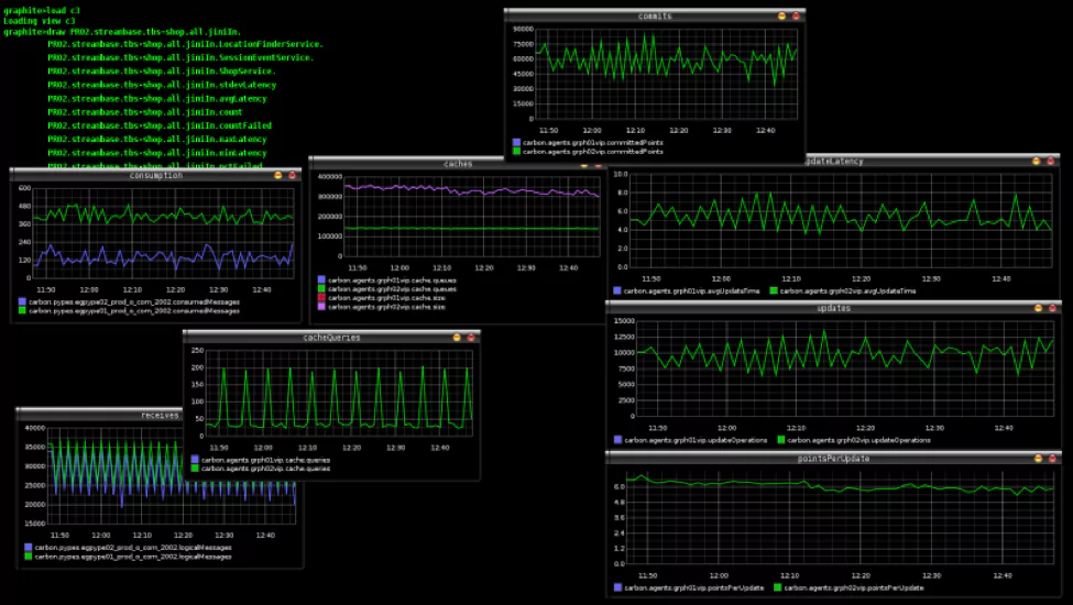
It is essentially a data collection and visualization system, and assists teams in visualizing large amounts of data.
Technically, Graphite does 2 main things: it stores numeric time-series data, and it renders graphs of this data on demand
It’s open source, has a powerful querying API, and contains a number of useful features. It has won over fans with its almost endless customization options, it can render any graph, has well-supported integrations, it includes event tracking, and rolling aggregation makes storage manageable.
Anybody who would want to track values of anything over time. If you have a number that could potentially change over time, and you might want to represent the value over time on a graph, then Graphite can probably meet your needs. For example, it would be excellent for use in graphing stock prices, as they are numbers that change over time.
Graphite’s scalability is an asset (Graphite scales horizontally on both the frontend and the backend, so you can simply add more machines to get more throughput); from a few data points, or multiple of performance metrics from thousands of servers, Graphite will be able to handle the task.
Criticisms of Graphite, in general, include difficulty in deployment, issues with scaling, and its graphs not being the most visually appealing.
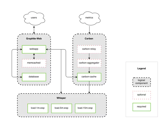
Graphite has 3 main, distinct components, but due to the fact that Graphite doesn’t actually gather metrics itself (rather, it has metrics sent to it), there is a 4th component, that of Metrics Gathering.
We’ll take a more in-depth look at the various components of Graphite, their implementations, and alternatives where relevant.
- Metrics Gathering: The fact that Graphite does not gather its own metrics is offset by the number of metric gatherers available that deliver metrics in the Graphite format.
- Carbon, which listens for time-series data: Carbon, comprising the Carbon metric processing daemons, is responsible for receiving metrics over the network, and writing them down to disk using a storage backend.
Getting data into Graphite (data is actually sent to the Carbon and Carbon-Relay, which then manage the data) is relatively easy, and comprises 3 main methods: Plaintext, Pickle, and AMQP.
For a singular script, or for test data, the plaintext protocol is the most straightforward. For large amounts of data, batch data up and send it to Carbon’s pickle receiver. Alternatively, Carbon can listen to a message bus, via AMQP, or there are various tools and APIs which can feed this data in for you.
Using the plaintext protocol, data sent must be in the following format: <metric path> <metric value> <metric timestamp>. Carbon translates this line of text into a metric that the web interface and Whisper understand.
With the pickle protocol, there is a much more efficient take on the plaintext protocol, and the sending batches of metrics to Carbon is supported. The general idea is that the pickled data forms a list of multi-level tuples:
[(path, (timestamp, value)), …]
When AMQP_METRIC_NAME_IN_BODY is set to True in your carbon.conf file, the data should be in the same format as the plaintext protocol, e.g. echo “local.random.diceroll 4 date +%s”. When AMQP_METRIC_NAME_IN_BODY is set to False, you should omit ‘local.random.diceroll’.
The following steps should be followed when feeding data into Carbon:
- Plan a Naming Hierarchy: Every series stored in Graphite has a unique identifier; decide what your naming scheme will be, ensuring that each path component has a clear and well-defined purpose
- Configure your Data Retention: With Graphite being built on fixed-size databases, you have to configure, in advance, how much data you intend storing and at what level of precision.
- Understand the Graphite Message Format: Graphite understands messages with the format metric_path value timestampn, where “metric_path” is the metric namespace that you want to populate, “value” is the value that you want to assign to the metric, and “timestamp” is the number of seconds since Unix epoch time.
- Whisper – a simple database library for storing time-series data: Graphite has its own specialized database library called whisper, which is a fixed-size database, that provides fast, reliable storage of numeric data over time. Whisper was created to allow Graphite to facilitate visualization of various application metrics that do not always occur regularly, as well as for speed purposes.
Whisper, while technically slower than RRD (less than a millisecond difference for simple cases), has a number of distinct advantages, including the fact that RRD is unable to make updates to a time-slot prior to its most recent update, and that RRD was not designed with irregular updates in mind.
- Graphite web app – renders graphs on demand: The web app is a Django web app that renders graphs on demand, using the Cairo library. Once data has been fed in and stored, it can now be visualized. Graphite has endured criticism of its front-end visualizations, and there are many tools that can be used that leverage Graphite but provide their own visualizations. One of the most popular of these is Grafana.
Grafana
Grafana is an open source visualization tool, that can be integrated with a number of different data stores, but is most commonly used together with Graphite. Its focus is on providing rich ways to visualize time series metrics.
Connecting Grafana to Graphite data source is relatively easy:
-
- Click the Grafana icon in the top header to open the side menu
-
- Under the Configuration link, find Data Sources
-
- Click the “Add data source” button in the top header
- Select Graphite from the dropdown
Grafana enables you to take your graphs to the next level, including charts with smart axis formats, and offers multiple add-ons and features. There is also a large variety of ready-made and pre-built dashboards for different types of data and sources. It’s simple to set up and maintain, is easy to use, and has won much praise for its display style.
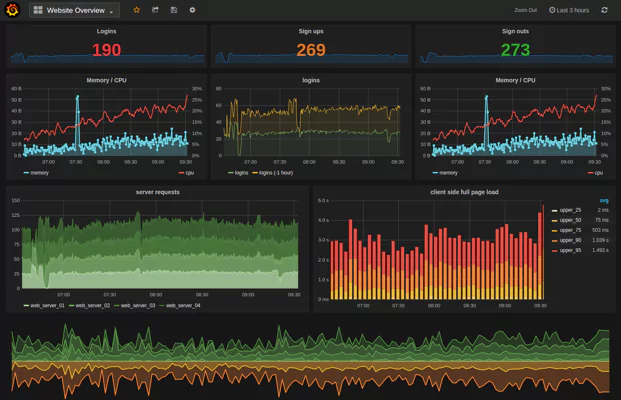
Grafana is traditionally strong in analyzing and visualizing metrics such as memory and system CPU, and does not allow full-text data querying. For general monitoring Grafana is good, however for logs specifically, it is not recommended.
Documentation is excellent, from getting started – which explains all the basic concepts you’ll need to get to grips with the system – to tutorials and plugins. There is even a “GrafanaCon”, a conference with the Grafana team, along with other data scientists and others across the Grafana ecosystem, to gather and discuss monitoring and data visualization.
The place to start is with the “new Dashboard” link, found on the right-hand side of the Dashboard picker. You’ll see the Top Header, with options ranging from adding panels to saving your dashboard.
![]()
With drag-and-drop functionality, panels can be easily moved around, and you can zoom in and out.
Grafana recently launched version 5.0, which includes the following features and updates:
-
- New Dashboard Layout Engine: enables an easier drag, drop and resize experience
-
- New UX: including big improvements in UI, in both look and function
-
- New Light Theme
-
- Dashboard Folders: to help keep dashboards organized
-
- Permissions on folders
-
- Group users into teams
-
- Datasource provisioning: makes it possible to set up data sources via config files
- Persistent dashboard URL’s: now it’s easier to rename dashboards, without breaking links
Differences and Similarities
Graphite has proved itself over time to be a reliable way to collect and portray data. It has its quirks, and many newer solutions are on the market that offers more features or are easier to use, however it has managed to stay relevant and is still preferred by many.
Grafana has been steadily improving its offering, with a number of plugins being available, and is being used by more and more companies.
Graphite is often used in combination with Grafana. Graphite is used for data storage and collection, while Grafana handles the visualization. This way, the best of both worlds (at least in this context) is achieved. Graphite reliably provides the metrics, while Grafana provides a beautiful dashboard for displaying these metrics through a web browser.
Making Data Work For You
Every company, from large to small, is generating significant amounts of extremely useful data. This data can be generated from many sources, such as the use of the company’s product, or from its infrastructure.
Whatever the data being generated, successful businesses are learning from this data to make successful decisions and monitor their performance. This is where tools like Graphite and Grafana come into play; they enable organizations to monitor their data visually, see macro trends, identify abnormal trends, and make informed decisions.
Tools like Graphite and Grafana are not catch-all solutions, however. Some data – such as logs – require specific tools to enable companies to get the most from their analysis. Coralogix maps software flows, automatically detect production problems and clusters log data back into its original patterns so that hours of data can be viewed in seconds. Coralogix can be used to query data, view the live log stream, and define dashboard widgets, for maximum control over data, giving a whole lot more than just data visualization.
Using the right tool to visualize data can significantly increase your ability to detect abnormal behavior in your production, track business KPI’s, and accelerate your delivery lifecycle.