Detecting anomalous spans at scale with DataPrime

Tracing is one of the most transformative gifts of observability. It allows engineers to follow a single request through a distributed system and see every span and dependency along the way.
However, even with that visibility, some of our most basic questions stay unanswered. Why did a specific span behave differently today than it did yesterday? Why did latency rise even when nothing “broke”? A trace shows us what happened, but understanding why it behaved that way at that moment requires the ability to explore its behavior in context.
Coralogix offers two powerful ways to approach these kinds of performance questions. The first is Coralogix Transactions, which groups spans into meaningful business logic and shows how those workflows perform over time. Transactions surface high-level trends and provide a clear, structured view of how core operations behave.
Another approach is to build a span-by-span trace analysis framework with DataPrime. DataPrime is extremely powerful, and can be customized to control custom baselines and measure deviations dynamically, giving engineers full flexibility to inspect individual spans in fine-grained detail.
The Challenge: Seeing without understanding
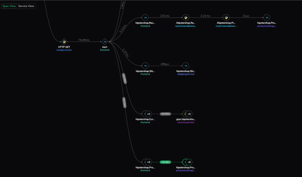
Imagine a developer investigating a sudden latency spike. They open their observability platform, find a slow trace, and expand the familiar Gantt view. One POST /create operation takes 20 milliseconds, but is that fast? Slow? Normal?
That simple uncertainty lies at the heart of most investigations. A trace shows relationships between services, but it doesn’t show behavior over time. Without a baseline, engineers can’t tell whether a current span represents a one-off anomaly or a consistent regression.
Traditional tracing tools are designed for visualization, but not comparison. They reveal a single moment but lack the context that tells us how a span usually behaves. To truly understand system performance, we need to go beyond seeing an instance of what happened and find the context that helps us reason about how performance changed.
What We Really Want to Do
When engineers find a seemingly slow trace, their ask is simple: they want to know whether that span is actually slow, and if so, why.
That means being able to:
- Compare a span’s behavior against its historical behavior to detect anomalies.
- Correlate spans with related logs or events to identify the cause.
- Contextualize traces over time to understand evolving patterns.
To achieve this, we needed a method that could make these kinds of comparisons possible across billions of spans in real-time.
Designing the Method: Comparative Span Analytics
To bridge this gap, we set out to build a method that could put every span in context as part of a dynamically evolving dataset.
This method would need to:
- Evaluate how a span’s duration compares to its historical baseline.
- Quantify deviation as a percentage or delta.
- Identify emerging patterns of regression or improvement.
- Correlate spans with relevant logs and business events.
This approach gives us a comparative span analysis, acting as a framework by which we can understand performance through behavioral comparison over time.
Building this kind of analysis requires a query language that can easily work across historical data, correlate events and event types, and handle dynamic data structures. That’s where DataPrime comes in.
How It Works with DataPrime
To make Comparative Span Analytics practical at scale, we needed a way to express analytical reasoning directly on top of raw spans. That meant being able to select a span, fetch its historical baseline, calculate deviation, classify its performance, and present the results in a concise, explorable output.
This is exactly the type of workflow DataPrime was built for. DataPrime’s elasticity lets users build data transformation step by step until they achieve their desired clarity and results.
Below is the full DataPrime statement the engineering team built. It captures the entire Comparative Span Analytics workflow in a single query:
source spans
| choose traceID as Trace,
         spanID as Span,
         $l.operationName as Action,
         round($m.duration / 1000, 2) as Duration_ms

// Join with a subquery that calculates baseline statistics per action ####
| join inner (
    source spans
    | groupby $l.operationName as Action
        aggregate round(avg($m.duration) / 1000, 2) as Avg_Duration
) using Action into Stats

// Add comparison fields showing deviation from baseline ####
| create Pct from round(100 * Duration_ms / Stats.Avg_Duration, 3)
| create Delta_from_Avg from round(Duration_ms - Stats.Avg_Duration, 2)

//Classify the severity of deviation ####
| create Performance_Rating from case {
    Pct <= 50 -> "Very Fast",
    Pct <= 100 -> "Fast",
    Pct <= 150 -> "Slightly Slow",
    Pct <= 200 -> "Slow",
    Pct > 200 -> "Very Slow"
}

// Select and rename fields for clean output ####
| choose Trace,
         Span,
         Action,
         Duration_ms,
         Stats.Avg_Duration as Avg_Duration_ms,
         Delta_from_Avg,
         Performance_Rating
How This Statement Is Constructed
Step one: filter the trace
We start by isolating the exact trace we want to analyze. Every span in that trace becomes a row in the table.
Step two: extract the essential fields
We pull out the span ID, action name, and raw duration.
Durations are normalized to milliseconds so comparisons are uniform.
Step three: build historical baselines
In the joined subquery, DataPrime scans all spans in the dataset and computes the average duration per action.
This is our baseline for comparison.
Step four: compare against the baseline
Two metrics are created:
- A percentage ratio of span duration to baseline (Pct)
- An absolute difference from the baseline (Delta)
These transform the raw performance into interpretable signals.
Step five: classify behavior
The case block maps numeric deviation into meaningful human labels:
Very Fast, Fast, Slightly Slow, Slow, Very Slow.
Step six: clean up the view for analysis
The final choose step produces a neat table built specifically for investigation.
This query answers one of observability’s most persistent questions: “Is this normal?”
If a span is 40% slower than usual, the engineer immediately knows where to focus without guesswork or complex exports.
The Solution in Action
When one engineering team faced recurring performance questions in a high-traffic API, they realized their existing tracing tools could only take them so far. They could identify slow traces, but not understand why specific spans were slower than usual.
After experimenting with DataPrime, the team used the method above to build a small, reusable analytical framework. The result was transformative: every span could now be positioned relative to its own history and clearly labeled by severity.
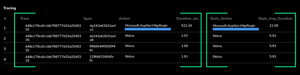
In this case, the “Microsoft.AspNet.HttpReqIn” span stood out immediately as 25× slower than its baseline, while others stayed within normal variance.
In one view, engineers can see both what happened and how it compares to normal. This allowed the team to:
- Focus their investigation on the spans that truly deviated
- Correlate slow outliers with relevant logs
- Identify the root cause in seconds rather than hours
What started as a basic troubleshooting session quickly evolved into a repeatable analysis framework they now rely on during every incident review and performance regression study.
Why DataPrime Makes This Possible (and Why Others Don’t)
Traditional observability tools struggle with this type of analysis because they rely on rigid data models and static metrics pipelines. Adding comparison logic often means exporting trace data, rebuilding schemas, or stitching systems together.
The DataPrime engine treats all observability data as part of one unified data mapping. Its core advantages make comparative span analytics natural and simple:
- Schema-on-read flexibility: for querying evolving data instantly without reindexing.
- Native joins: for correlating trace spans with logs and metrics in real time.
- Inline aggregation: to compute baselines and deviations within the same query.
- Instant visualization: for moving from query to dashboard (or alert) seamlessly.
This architecture removes the friction between exploration and insight. Engineers don’t need to prepare data; they can simply ask and get the answer.
From Observability to Understanding
As systems become more distributed and dynamic, visibility alone isn’t enough. Teams need observability that helps them reason and understand why things behave the way they do.
A flexible schema-aware tool like DataPrime helps engineers easily set up frameworks like the above Comparative Span Analytics, which represents a new stage in that observability evolution. It turns traces and span reports into learning opportunities. Contextual understanding, that’s the future, and with DataPrime, that future is already here.
See it live at AWS re:Invent
Come see DataPrime in action and experience how Coralogix is redefining modern observability. Visit us at booth #1739 at AWS re:Invent.