New features: Introducing Metrics Usage and Query Usage analyzers


As teams grow and telemetry scales, it becomes harder to keep track of which metrics matter. Labels pile up, cardinality increases, and costs start rising faster than anyone expected. At the same time, dashboards often stay quiet and alerts go untouched. The truth is, most teams don’t actually know how and how much of their metric data is being used, let alone which metrics are driving cost.
This is exactly the problem we set out to solve.
We built Metrics Usage Analyzer and Query Usage Analyzer to give teams full transparency and visibility into the value of their metrics. These tools were designed to help answer the real questions that come up when observability costs get out of hand.
What caused our metrics bill to spike last week?
Which service is producing the highest cardinality?
Are we still querying that custom metric we created last quarter?
What would happen if we removed a label from this metric?
Can we safely block unused metrics without breaking anything?
Until now, these answers required guesswork or risky trial and error. With these new features, you can see what’s driving ingestion, how metrics are being queried, and what data is safe to clean up. The goal is to help you tune your pipeline based on actual usage and impact, not assumptions, and to do it without losing the insights that matter.
Metrics Usage Analyzer
The Metrics Usage Analyzer provides a full, real-time breakdown of your metric ingestion. It shows exactly how much data each metric is generating, how many label variations it’s producing, and how those combinations contribute to the overall cardinality and storage costs.
You can inspect usage by metric, label, or label combination, making it easy to trace back spikes in cardinality or unusual ingestion volume. Often, what seems like a simple metric can produce thousands of time series if labels like pod_name, operation, or serviceVersion aren’t carefully controlled. This tool highlights those patterns and enables fast action, including the ability to block specific metrics directly from the UI.
By surfacing this information, teams can detect and remove redundant metrics before they become a performance or cost issue.
Query Usage Analyzer
While Metrics Usage Analyzer focuses on what’s being ingested, the Query Usage Analyzer shows what’s actually being used.
It analyzes how metrics are queried across the platform, in dashboards, alerts, and APIs, and normalizes each query into a pattern. Usage frequency, success rate, and origin (like alerts or dashboards) are all tracked and displayed, making it clear which metrics are actively used and which are sitting idle.
This helps teams distinguish between high-value metrics and metrics that no longer serve a purpose. With this insight, you can clean up unused data confidently, reduce ingestion costs, and prevent future sprawl without worrying about breaking active alerts or dashboards.
Use Case: Revealing Unutilised Metrics
A common problem in growing observability setups is that teams send a lot of metrics but don’t always know which ones are actually being used and queried. Over time, unused metrics can quietly drive up storage, increase cardinality, and inflate your bill without anyone noticing.
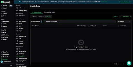
For example, a metric called process_cpu_utilization_1 was taking up almost five percent of total metric usage, with a cardinality of over 14,000 unique time series. On paper, this looks like it could be an important and useful metric. But, when we checked the Query Usage Analyzer, we saw that no one had queried it in a number of days. It wasn’t being used in dashboards, alerts, or any recent queries.

At that point, there are really two options. You can start using the metric more intentionally in your day to day, or you can make the decision to stop sending it altogether.
In this case, we made the decision to block it. With one click, ingestion was turned off, and just like that, we managed to reduce our usage without risking any breakage.
This kind of cleanup is simple and low risk because it’s grounded in real usage data. Instead of guessing what’s safe to remove, you can make confident, data-driven decisions. Applied across your telemetry stack, small changes like these can lead to a meaningful and more efficient observability setup. In just a few clicks, we were able to identify a spike in cardinality, check how often the metric was queried, and confirm it was safe to delete.
Why This Matters
Together, these tools provide end-to-end visibility into your metrics, from ingestion to usage.
They’re especially helpful in environments where teams are shipping more telemetry than they can track, or where high-cardinality data is causing cost overruns and performance degradation. With these analyzers, you get the clarity needed to make safe, impactful decisions about what to keep, what to cut, and how to manage observability at scale.If you’re working to optimize and reduce cost, eliminate noise, or improve the health of your metrics stack, these features are here to help.
Learn more AWS re:Invent
Visit us at booth #1739 at AWS re:Invent. To learn more about Coralogix Metrics and how we are redefining modern observability.