Kibana Dashboard Tutorial: Spice up your Kibana Dashboards


Introduction
When it comes to dashboarding, Kibana is king. Since its release Kibana has changed the way businesses visualize data. Kibana is a fairly intuitive platform and offers some seriously impressive methods of data analysis and visualization. In this kibana dashboard tutorial, we are going to help you unlock the full potential of the platform and help you become a Kibana guru. When it comes to visualizing data Kibana is well-suited for monitoring logs, application monitoring, and operational intelligence. Get ready to blow everyone away with your abilities to visualize data! So without further ado, let’s take a look at some outstanding examples of Kibana dashboards.
Kibana Dashboard Examples
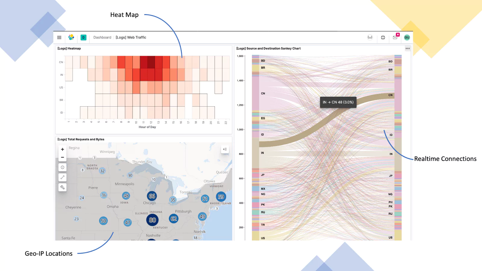
Web Server (Nginx Logs)
In this example, we are using logs from a Nginx server that is configured as a reverse proxy for a corporate website. Here we are providing visualization in the form of a heat map, breaking down the hours of a day, geo-IP addressing for the total number of requests and bytes, and finally geo-IP source and destination.
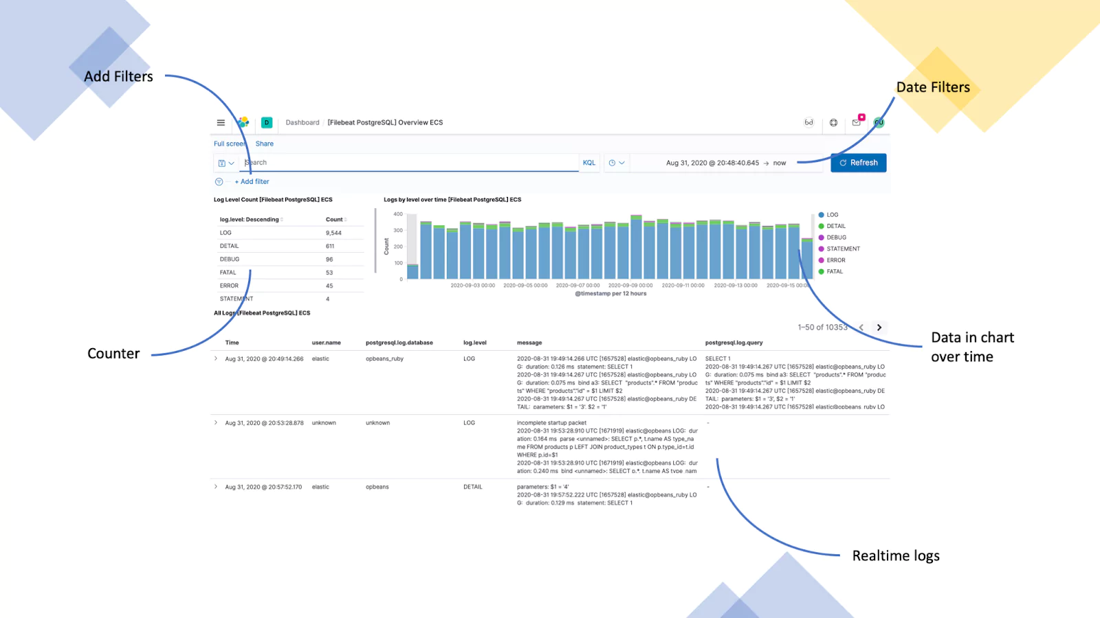
Database Server (PostgreSQL Logs)
This example uses logs from a PostgreSQL server that is used in a web application. We are visualizing the total number of a given log type, logs by level over time, and a list of recent logs.
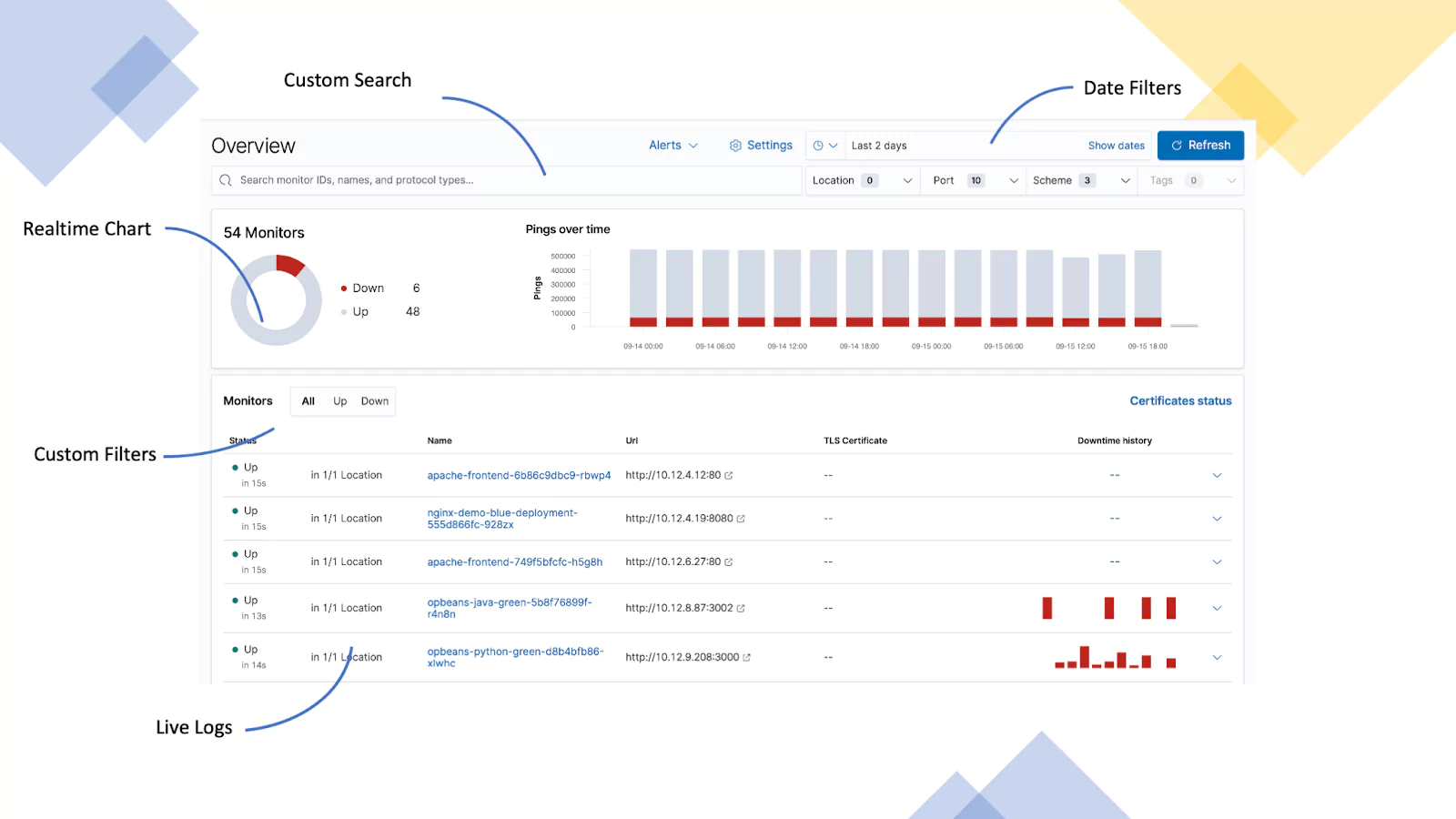
Server Uptime (ICMP Logs)
This dashboard is displaying the availability of several servers. The data is provided as ICMP logs which indicate when the server last responded. If a server does not respond for 60 seconds, it is classed as down.
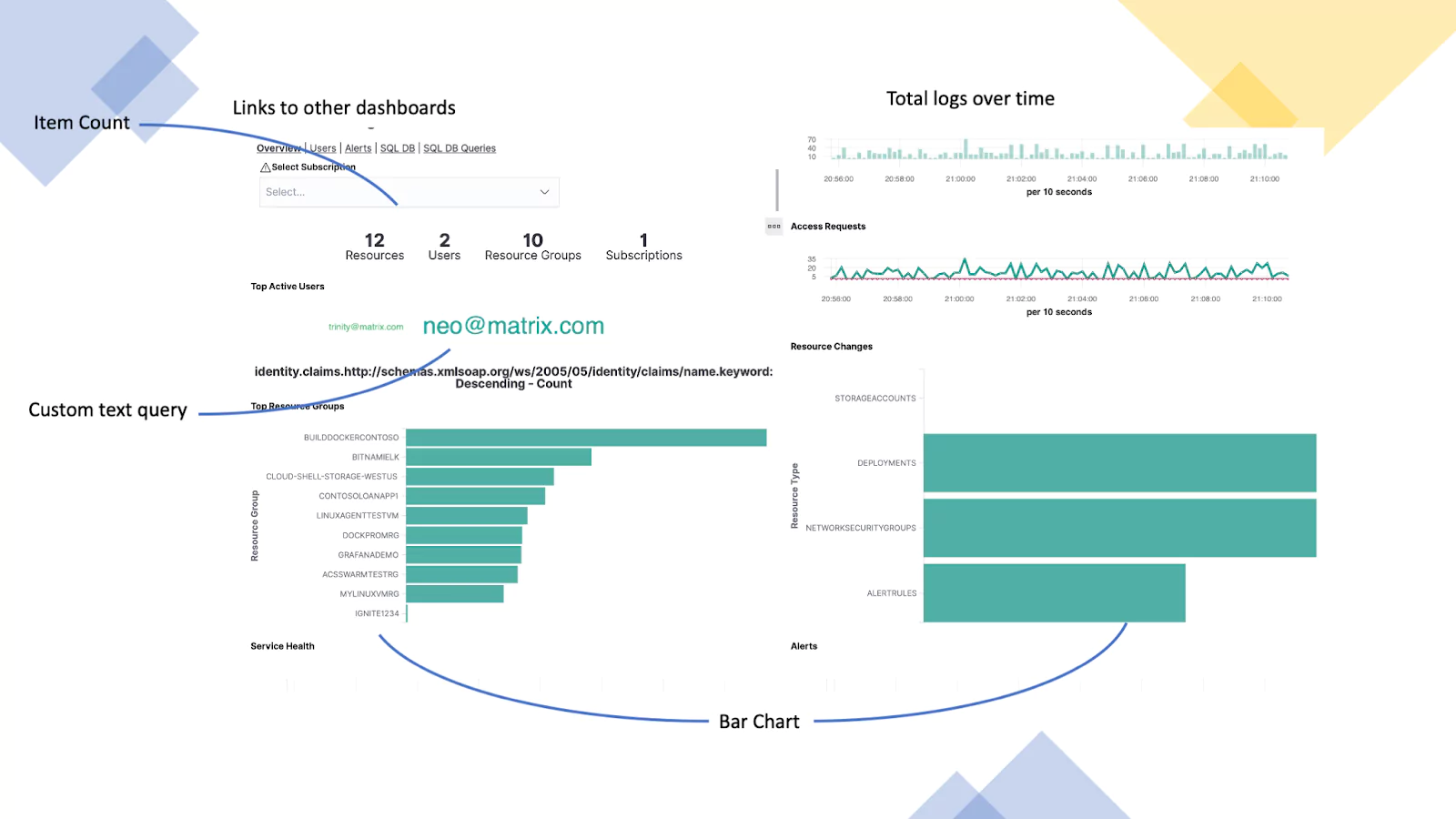
Azure Monitoring (Azure Activity Logs)
This dashboard is using logs from Azure. It provides visibility into user activity. In this screen, we are showing a high-level summary of user activity levels, access requests, the top active users, and any resource groups that have been changed.
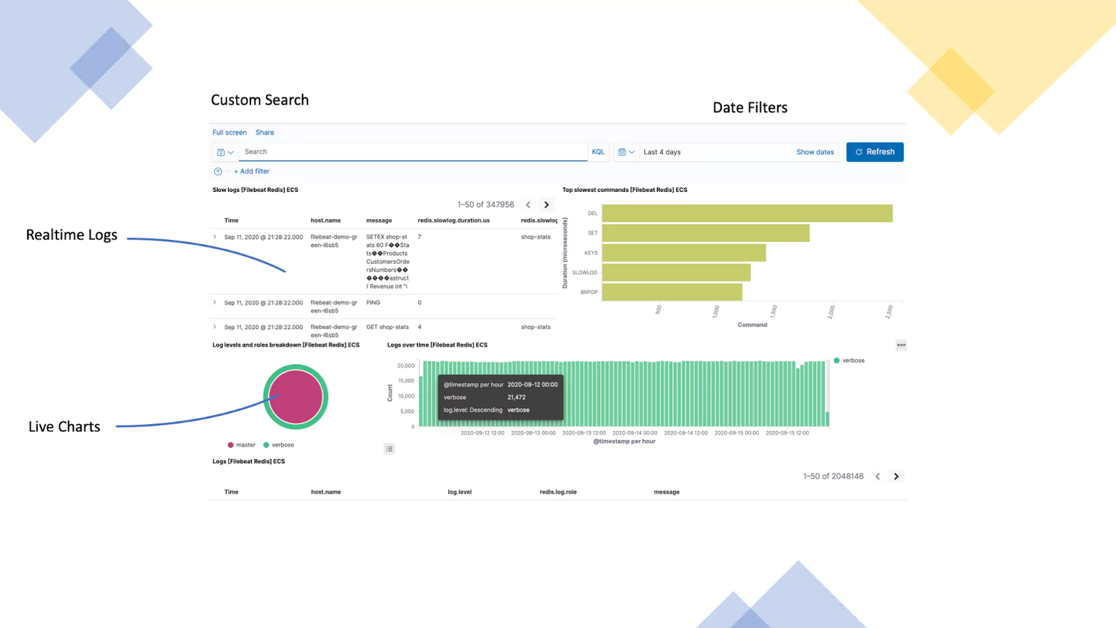
Redis Server (Redis Logs)
This example uses logs from a Redis server that is used in a web application. We are visualizing incoming logs, top commands, logs levels & roles, and finally logs over time.
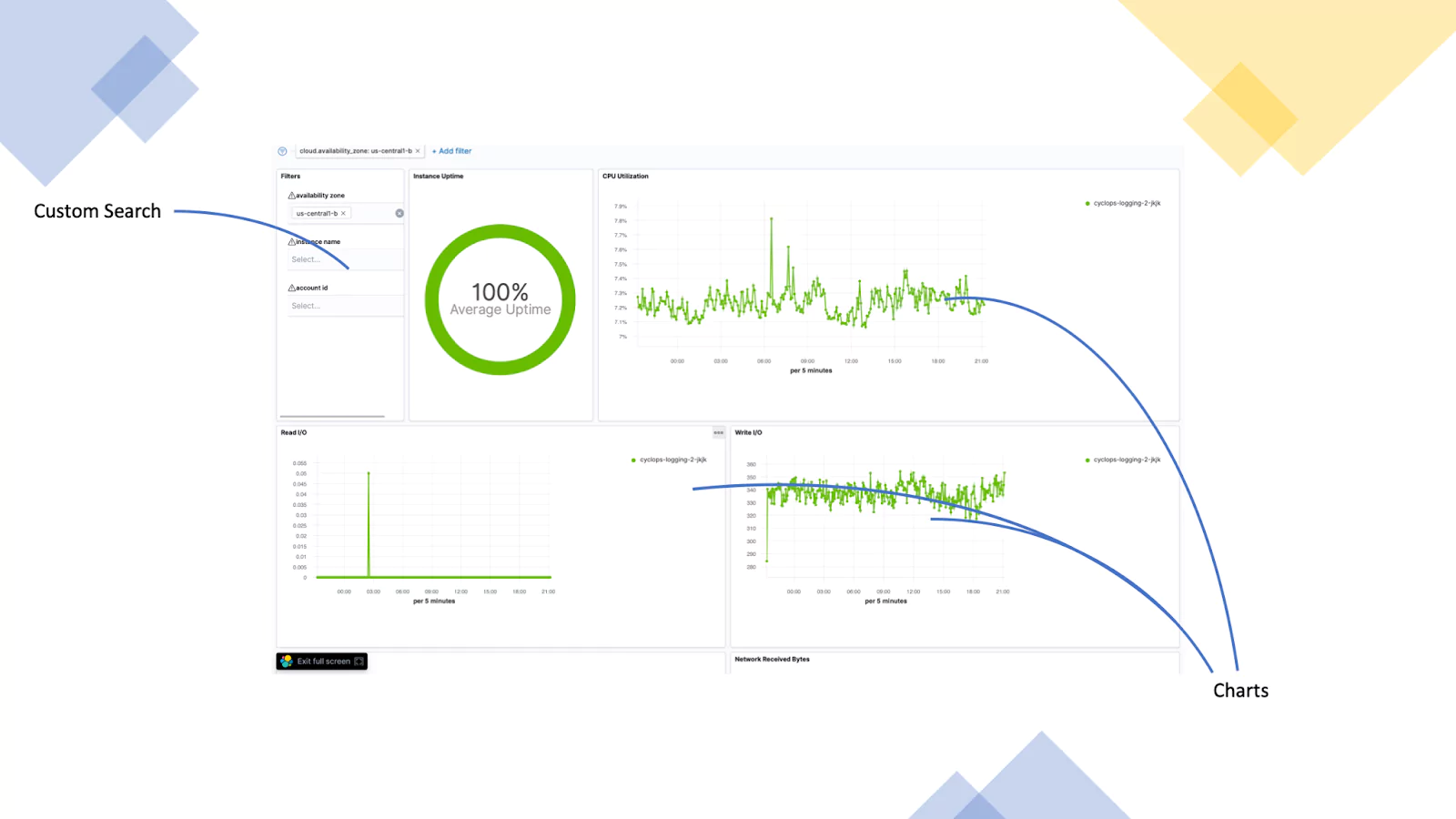
Google Cloud (GC Logs)
This dashboard focuses on the availability of a set of servers. The Dashboard has a filter call out built-in and displays the instances uptime, CPU Utilisation, disk IO and goes on to show much more.
Visualizations Overview
The most frequently used visualizations for Kibana are the Line charts, Area charts, Bar charts, Pie charts, data tables, metric, maps and gauges. When you click to create a new visualization in Kibana you are shown the new visualization screen to the left. Kibana ships with a vast array of visualizations and often this can be overwhelming. Remember the trick to effective dashboards is simplicity. This should enable you to select the correct Kibana visualization to achieve your desired dashboard. If you are unsure though we have put together a handy table that outlines the Kibana visualizations and their function. This should give you some context before we get into the kibana dashboard tutorial.
Charts
| You can use an Area chart to visualize time series data with the functionality for splitting lines based on fields. | Sign-ups over time. | |
 | The horizontal bar chart is used to visualize relationships between two fields. | Social media platform referrer and web page. |
| The line chart visualizes time series data and enable split lines to highlight anomalies. | Memory usage over time by server. | |

| The pie chart visualizes values that, combined, create a total figure. | Top 10 referral websites. |
 | The heat map chart us used to visualize two fields that show the magnitude of a phenomenon as colour. | Clicks on a web page. |
 | Use the Vertical bar chart when you wish to compare one or more fields | Users on page over time. |
Data
 | The data table provides a way to create a basic table representing fields in a custom way. | Sign-ups over time. |
| The goal gauge provides a visual representation of a current figure vs a goal. | Sales target. | |
| The gauge provides a specific metric. Users can create their own thresholds. | CPU utilisation. | |
 | The metric provides a way to display a calculation based on your data as a single figure. | Number of containers running. |
Other

  | The Map visualizations allow a way to aggregate geographical data on a map. | IP based logs as Geo-IP. |

| The markdown visualization allows customized text or image based visualizations to your dashboard based on the markdown syntax. | Organization logo or a call out in a dashboard. |
 | The tag cloud visualization allows you to size groups of words, based on their importance. | A list of products and their popularity. |

 | The time series visualizations allow you to create custom queries based on time series data. | Percentage of access denied error over time. |
 | The Vega visualization provide the ability to add custom visualizations based on Vega and VegaLite. | Advanced Custom SQL |
Before you jump in!
Before you start building any dashboards, it’s important to plan out what you are trying to achieve. Jumping in and just building a dashboard is a recipe for disaster. The key to information-rich dashboards is the quality of the data. With this in mind, you want to start from the objective of the dashboard and work backward. This allows you to map out your required data inputs and ensure your logs are configured to provide the right data. You will also need to think about how you are parsing the data into the platform. If you have allowed elastic to-do this automatically it’s highly probable you are going to need to tweak the fields to ensure they make sense at the dashboarding phase.
To help you think about this process and formulate the best possible plan to successfully implement your dashboard ask yourself the following questions:
- What does your dashboard need to present?
- What data do you need?
- How will your data need to be queried to provide the correct outputs?
- What visualizations will you be using?
The Basics
The first step after you have Kibana deployed is to login! Kibana runs as a service on port 5061. As a result, you need to enter https://YOURADDRESS:5061. Navigating to this will present you with the below page:
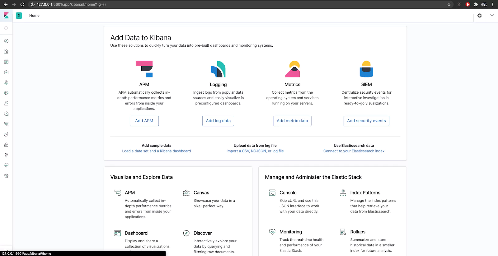
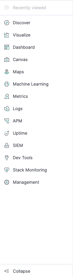
This is the front page of Kibana which displays the menu bar which is used to navigate around the platform. The bottom left hand button will expand the menu bar to display the different menu options.
Creating an Index Pattern
The first part of using Kibana is to set up your data once you have ingested it into Elastic. An index pattern tells Kibana what Elasticsearch index to analyze. The most common way to ingest logs is using Logstash. You can find out how to configure Logstash here.
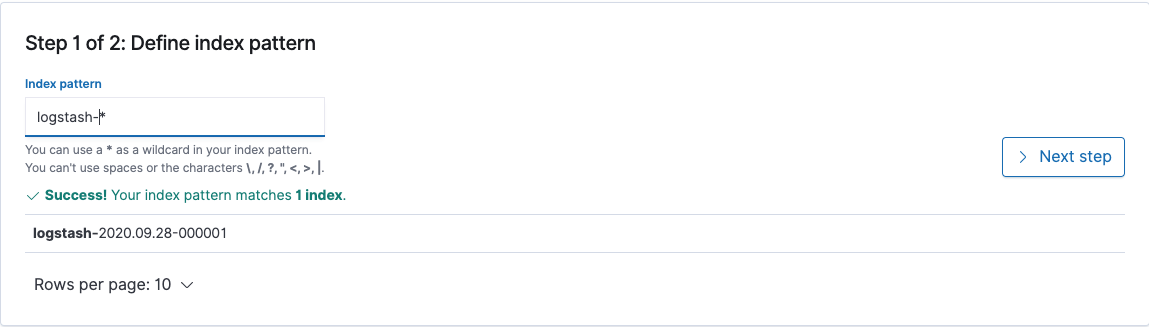
In this example we have logstash shipping logs to our Elasticsearch cluster ready for Kibana. To set up your index patterns Click on the management button and then index patterns. Here you will configure how to group your indexes for use with Kibana. To set up your first index pattern click Create Index Pattern. Here you will need to enter the index pattern definition. In its rawest form this is the name in which the index pattern starts. You can use a * to add a wildcard to the end of your pattern. An example logstash-* will catch any indices that start with logstash-*. An example of this can be found below. You will need to create an index pattern for each data set you wish to visualize in Kibana.
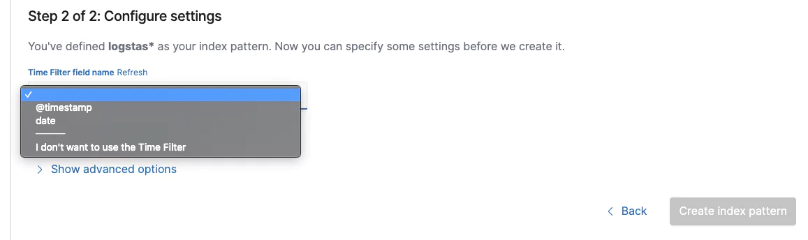
Click ‘Next step’ and then you will need to configure your timestamp. This is how Kibana will know what metrics to use for the time and date in the platform.
In our Logstash example we will be using @timestamp. This is the time and date that kibana takes from the log. You might want to use another field should your logs contain another date source for higher accuracy. Once configured click on the ‘Create index pattern’ button. Your index is now live and ready for usage in Kibana. To verify this, let’s see what data Kibana has access to. On the main menu click ‘Discover’.
If you don’t see any logs, make sure your time and date filter is set to a range that includes data like below (For our example we have it set to last 7 days):
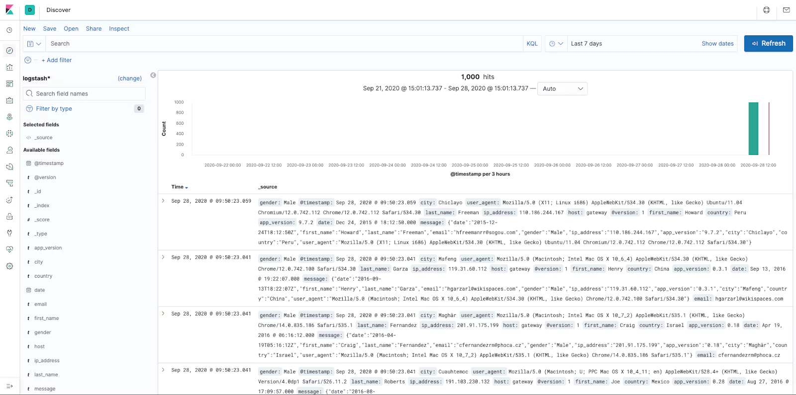
You are now able to see and filter all the data available to Kibana.
Creating searches for presenting data
Now that we have data in Kibana, it’s time to build our searches. Searches help us focus our data for building visualizations. Using the ‘discover’ page from the above enables access to the raw data in the platform allowing you to note your available fields ready for building visualizations, which will ultimately make up your dashboard.
The discover page has a search and filter functionality. Once you have located your desired data set use the save option. You can use saved searches on different datasets and the advantage is changing the saved searches will also update all the linked visualizations negating the need to update them all individually!
Searches that have been saved can also be inserted into the dashboards. Which will provide your dashboard with a quick link to jump into the discover tab allowing users to see the related logs to the dashboard.
Creating a Visualization
Your data is ready, your searches are saved, let’s build our first visualization! On the main menu bar select ‘Visualize’.
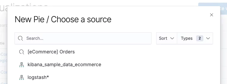
Click on create visualization and select which visualization type you would like to use. In this example we are going to make a pie chart. The sources displayed will be the index patterns we configured earlier.
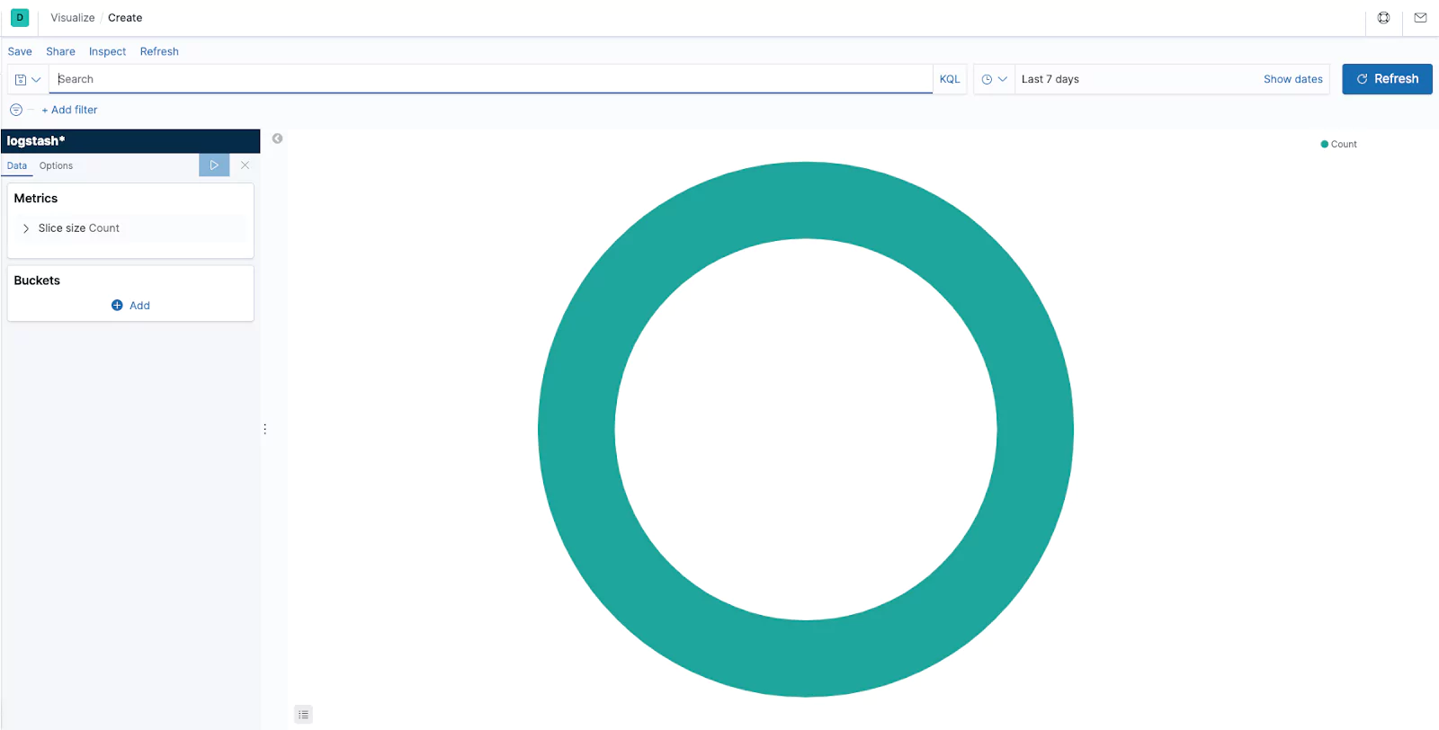
In this example we are going to use our Logstash indexes. Kibana will load with its defaults. You can open your previously created saved searches at the top like you would in the ‘Discover’ page. The left hand menu bar enables you to customize your visualization. Kibana offers two types of data aggregations. The first is Metric aggregations and the second is bucket aggregations.
Buckets create aggregations of data based on a certain criteria. Depending on your aggregation type you can create buckets that provide filtering. This filtering can allow you to present your data in the form of value ranges and intervals for dates, ip ranges and more. You will want to apply a bucket to a pie chart to display the data that provides context. In the below example we have applied a bucket that uses an aggregation of terms on the field email.keyword and specified a size of 5. As a result we see the top five email addresses, in alphabetical order.
Metric aggregations are used to calculate a value for each bucket based on the documents inside the bucket. Every visualization type has its own unique characteristics providing different ways to present buckets and their associated values. In our pie chart example below the slices are determined by the buckets. The size of the slice is determined by the metric aggregation.
Tip – When you make a change click the play button to refresh the chart.
Now our visualization is starting to provide a meaningful chart. We are able to customise the chart further in the advanced tab. Should you wish to interrogate the raw data generating the graph then click on the inspect button.
The advanced tab will provide the capabilities to change the style of our visualization to suit our requirements. We can also add and remove items like labels. Each visualization is independently configurable. It’s best to experiment with the options to find what works best for your own visualizations.
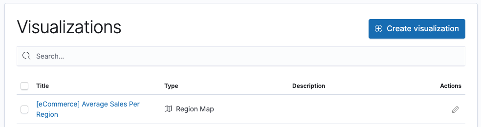
Once you are happy the save button allows you to save your visualization. Enter a title and description. It’s important that these are specific, as you create multiple visualizations it can often be hard to find them without a good naming convention!
Finally, a visualization can be shared. This allows you to provide a link or embed code into a website that will display the visualization. When you share your visualizations you have two options, you can either share a saved visualization or a snapshot of the current state. A saved visualization will allow users to see recent edits, whereas the snapshot option will not.
Tip: If you are looking to share visualizations and dashboards the users you are sharing them with need to have access to the Kibana server.
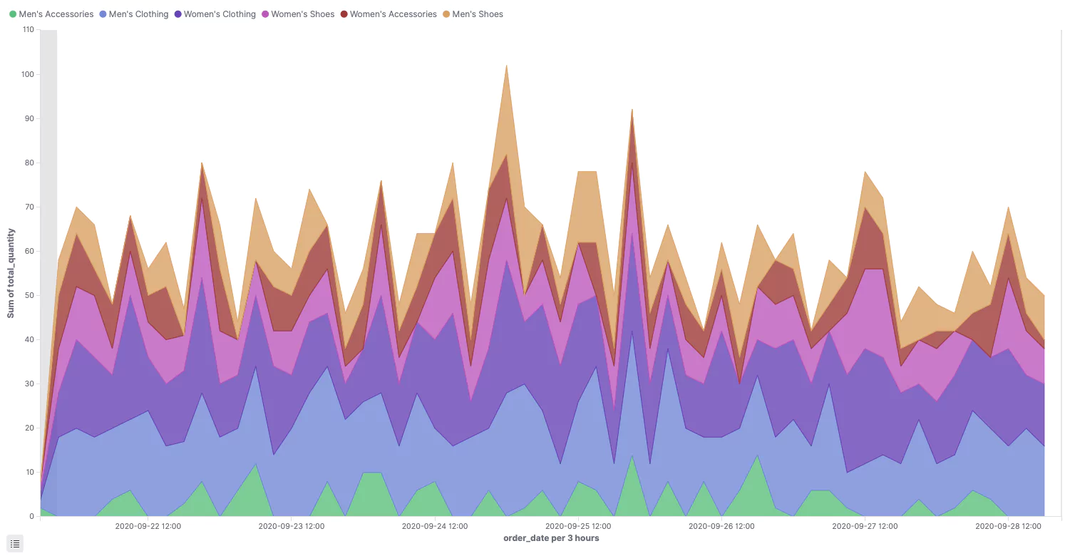
Let’s take a look at creating another type of visualization. In this example we are going to look at creating an area chart. Much like with the pie chart you have your Metric and your Buckets. Our example is based on data from an ecommerce platform. Metrics have been configured as an aggregation type of Sum, a field of total_quantity, and our buckets have been configured with an aggregation type of Date Histogram, using a field of order_date, with a split aggregation of Terms, using the field category, ordered by the Metric: Sum of total_quantity. The results are as below:
A visualization can be edited at any time. This is achieved by opening the visualization on the visualization page! What’s more when you edit a visualization it will also update on your dashboard.
Now that we know how to create visualizations, it’s time to build a dashboard!
Creating a Dashboard
Now let’s bring together all the work we have done creating exciting visualizations. Dashboards use multiple visualisations. Much like we have learnt putting together visualizations it’s important to plan out your dashboards goal. Adding visualizations is super simple as a result dashboards can become over crowded and lose their meaning. As we have discussed previously its import to focus on your dashboards goal and design accordingly.
It’s important to note that multiple data sources enable you to create advanced dashboards that display vast correlated data, however in doing so you lose the ability to drill down. When you drill down Kibana will add a filter to your data sources that will likely only be relevant to the selected source effectively making the visualizations useless. As a result for dashboards where drill down capabilities are required it is important to ensure your visualizations are based on the same data source!
TIP – You should try to ensure you keep your dashboards to a single page to avoid scrolling.
To create your dashboard on the main menu select ‘Dashboard’ and then create dashboard. If you have already been in a dashboard it will load that up, click on the dashboards crumbs in the top left to return to the dashboards home page.
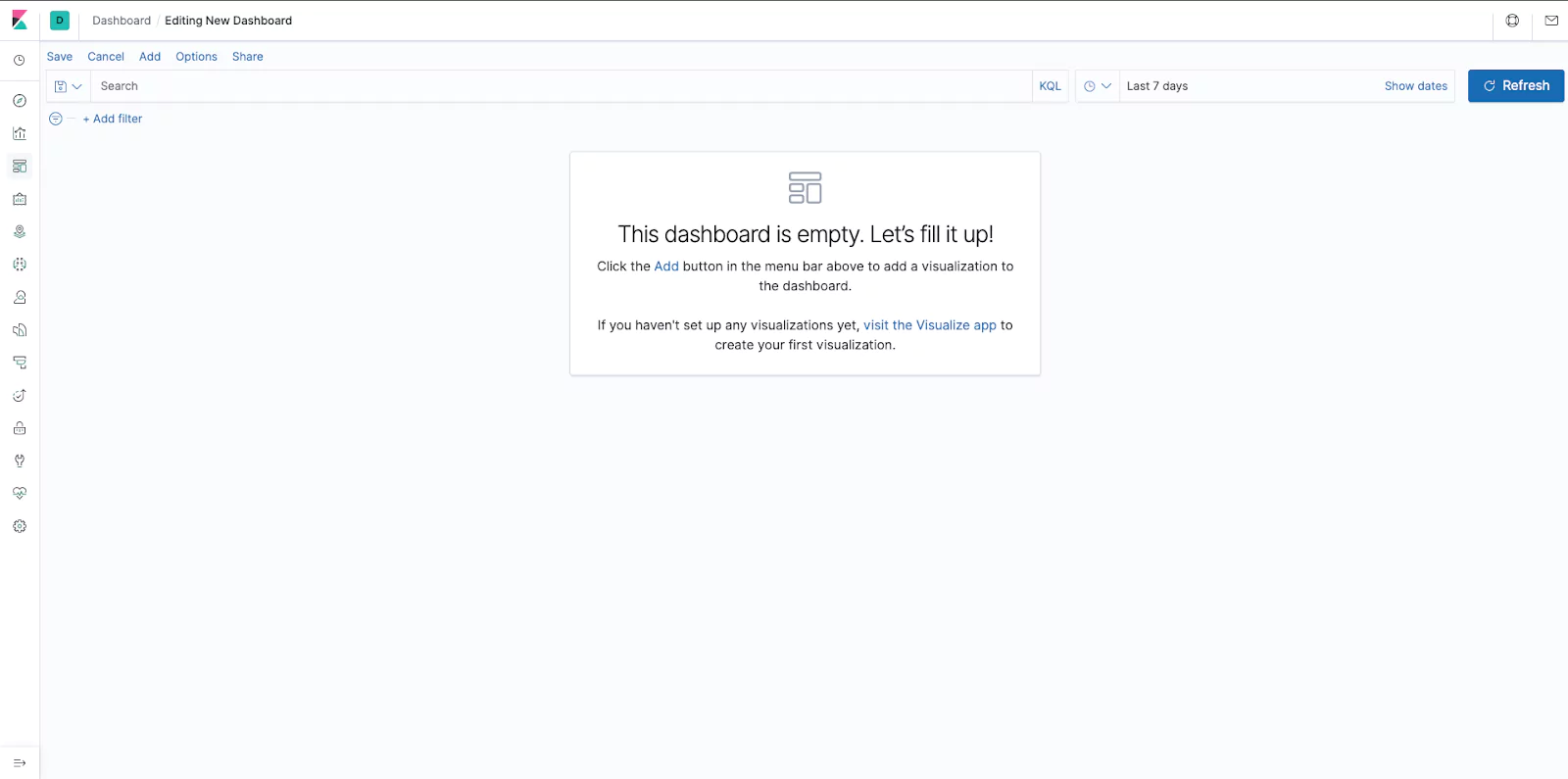
Click on the Add button on the top left to add a visualization. This is where it will pay to have your visualizations well named with a naming convention. Click on the visualization you would like to add. This will add it to the dashboard but you will remain in the add visualization (add panels) page. This enables you to run through and select all of your required visualizations. Once you have added all the visualizations you require you can close the add panels page using the x in the top right corner. You will likely have a screen like the below:
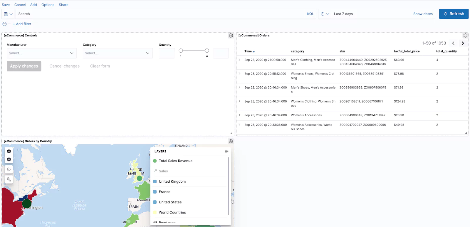
You are now able to move and expand your panels. Once you have your dashboard laid out correctly remember to save it! Much like with our visualizations you can use the Share button in the corner to share your dashboard with other users. You can also change the data set using the search and dates fields at the top of the dashboard.
TIP – The Options button will allow you to remove your visualization title and remove margins between panels.
Finishing Up
Now that we have explored much of the dashboarding capabilities of Kibana you have the power to make powerful dashboards to visualize your data. As demonstrated, Kiabana has many more use cases than just dashboarding, and hopefully, this article has got the creative juices flowing. After you’ve built your perfect dashboard start exploring the other feature, Kibana offers to fully supercharge your data visualization skills. Good luck dashboarding ninjas!