Kibana Lens Tutorial: Easily Create Stunning Visualizations

Millions of people already use Kibana for a wide range of purposes, but it was still a challenge for the average business user to quickly learn. Data visualization tools often require quite a bit of experimentation and several iterations to get the results “just right” and this Kibana Lens tutorial will get you started quickly.
Visualizations in Kibana paired with the speed of Elasticsearch is up to the challenge, but it still requires advance planning or you’ll end up having to redo it a few times.
The new kid on the block, Kibana Lens, was designed to change this and we’re here to learn how to take advantage of this capability. So let’s get started!
Theory
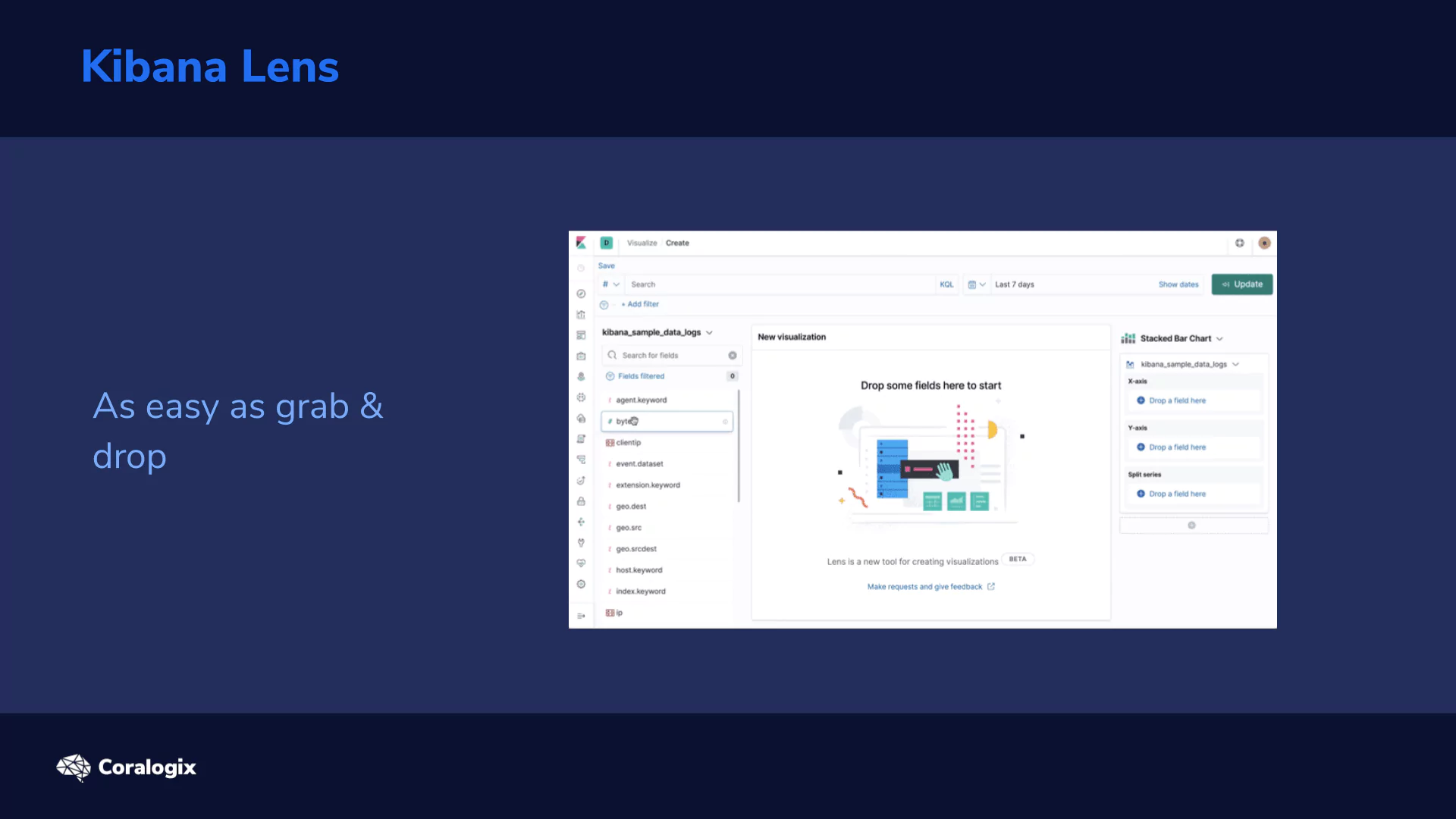
Kibana Lens is changing the traditional visualization approach in Elasticsearch where we were forced to preselect a visualization type along with an index-pattern in advance and then be constrained by those initial settings. As needs naturally evolve, many users have wanted a more flexible approach to visualizations.
Kibana Lens accomplishes this with a single visualization app where you can drag and drop the parameters and change the visualization on the fly.
A few key benefits of Kibana Lens include:
- Convenient features for fields such as:
- Showing their distribution of values
- Searching fields by name for quickly tracking down the data you want
- Quick aggregation metrics like:
- min, max, average, sum, count, and unique count
- Switching between multiple chart types after the fact, such as:
- bar, area, line, and stacked charts
- The ability to drag and drop any field to get it immediately visualized or to breakdown the existing chart by its values
- Automatic suggestions on other possible visualization types
- Showing the raw data in data tables
- Combining the visualization with searching and filtering capabilities
- Combining data from multiple index patterns
- And quickly saving the visualization allowing for easy dashboard composition
Ok, let’s see how Kibana Lens works!
Hands-on Exercises
Setup
First we need to have something to visualize. The power of Lens really comes into play with rich structured and time-oriented data. To get this kind of data quickly, let’s use the Metricbeat tool which enables us to collect dozens of system metrics from linux, out-of-the-box.
Since we’ve already installed a couple of packages from the Elasticsearch apt repository, it is very easy to add another one. Just apt-get install the metricbeat package in a desired version and start the service like so:
sudo apt-get install metricbeat=7.5.2
sudo systemctl start metricbeat
Now all the rich metrics like CPU, load, memory, network, processes etc. are being collected in 10 second intervals to our Elasticsearch.
Now to make things even more interesting let’s perform some load testing while we collect our system metrics to see some of the numbers fluctuate. We will do so by a simple tool called stress. The Installation is simply this command:
sudo apt install stress
Before you start, check out how many cores and available memory you have to define the stress params reasonably.
# processor cores
nproc
# memory
free -h
We will run two loads:
- First spinning two workers which will max the CPU cores for 2 minutes (120 sec):
stress --cpu 2 --timeout 120
- Second running 5 workers that should allocate 256MB of memory each for 3 minutes:
stress --vm 5 --timeout 180
Working with Kibana Lens
Now we are going to create our visualizations using Lens. Follow this tutorial to get the basics around Lens and when you are settled feel free to just “click around” as Lens is exactly the tool with experimentation prebaked in its very nature.
Index pattern
Before we start we need an index pattern that will “point” to the indices that we want to draw the data from. So let’s go ahead and open the Management app → Index Patterns → Create index pattern → and create one for metricbeat* indices. Use @timestamp as the Time Filter.
Creating a visualization
Now we can open the Visualize app in Kibana. You’ll find it in the left menu → Create new visualization → and then pick the Lens visualization type (first in the selection grid). You should be welcomed by an empty screen telling you to Drop some fields.
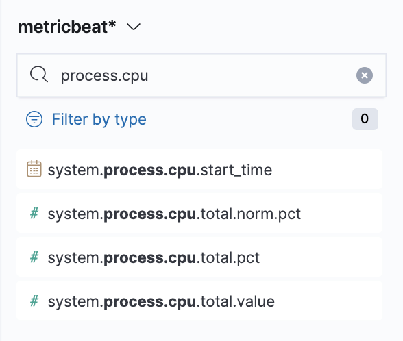
So let’s drop some! Make sure you have selected the metricbeat* index pattern and use the field search on the left panel to search for process.cpu. There will be various options, but we’ll start with system.process.cpu.total.pct → from here just drag it to the main area and see the instant magic that is Kibana Visualization Lens.
Note: if you need to reference the collected metrics of the Metricbeat’s System module, which we’re using, you can find them in the System fields.
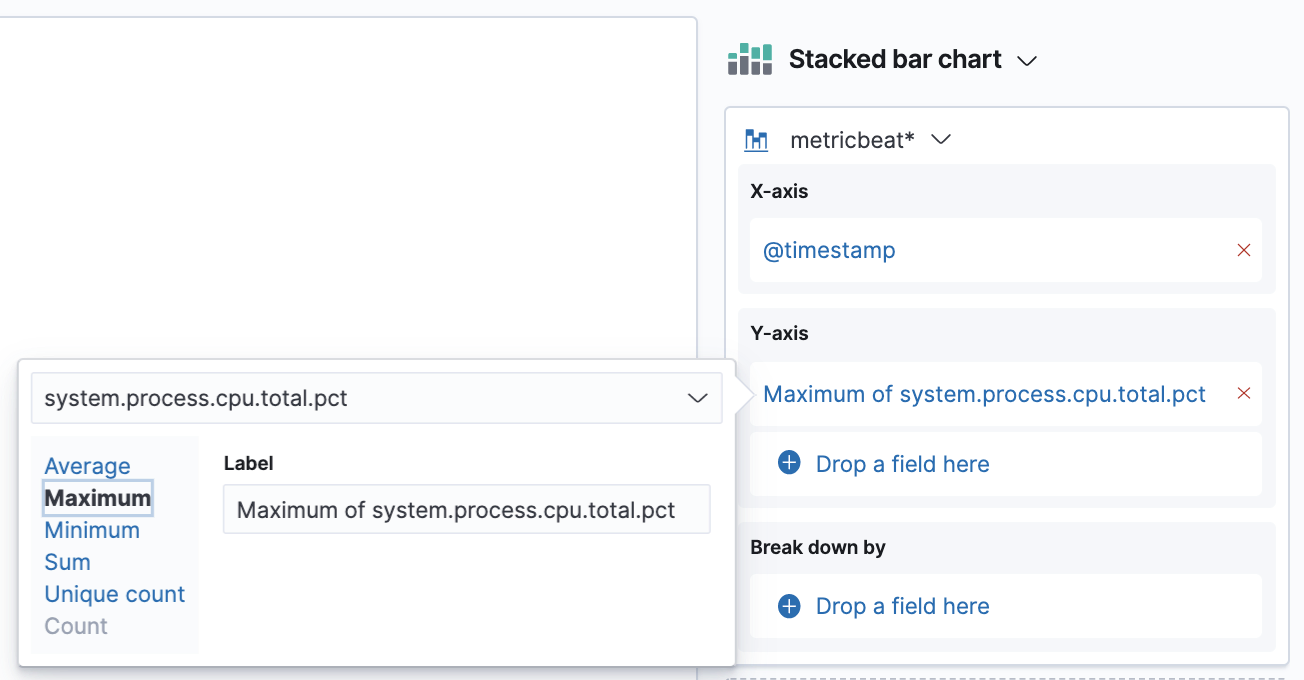
Now we’re going to switch the aggregation we have on our Y-axis. The default averages are not really meaningful in this case, what we are interested in is the maximum. So click on the aggregation we have in our right panel → from here choose the Maximum option.
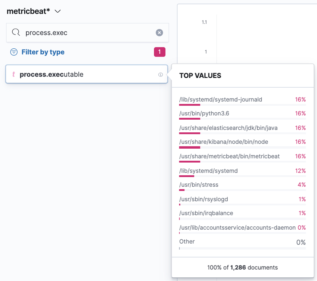
Next, we’ll split the chart by another dimension which is going to be the process.executable to see what binary was running in the process. The technique is the same; just search for the field in the left search panel and it should come up. You can also filter just for string fields first with the Filter by type. If you then click on the given field you’ll find a nice overview of a distribution of the top values for the selected period. In our case, we’ll see which executables had the highest count of collected metrics in the period. To use the field just grab it and drop it to the main area.
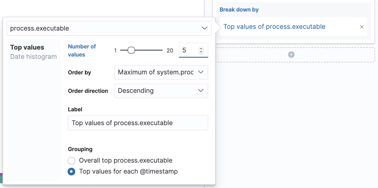
We’re starting to see it coming together here, but let’s iterate further, as would be typical when creating such dashboards for a business.
Let’s increase the number of values we can see in our chart from the default 3 to 5 and let’s switch from seeing the Overall top for the given period to Top value for each @timestamp. Now we’ll see the top 5 processes that consumed the most CPU at that given time slot.
Excellent! Your visualization should look something similar to this:
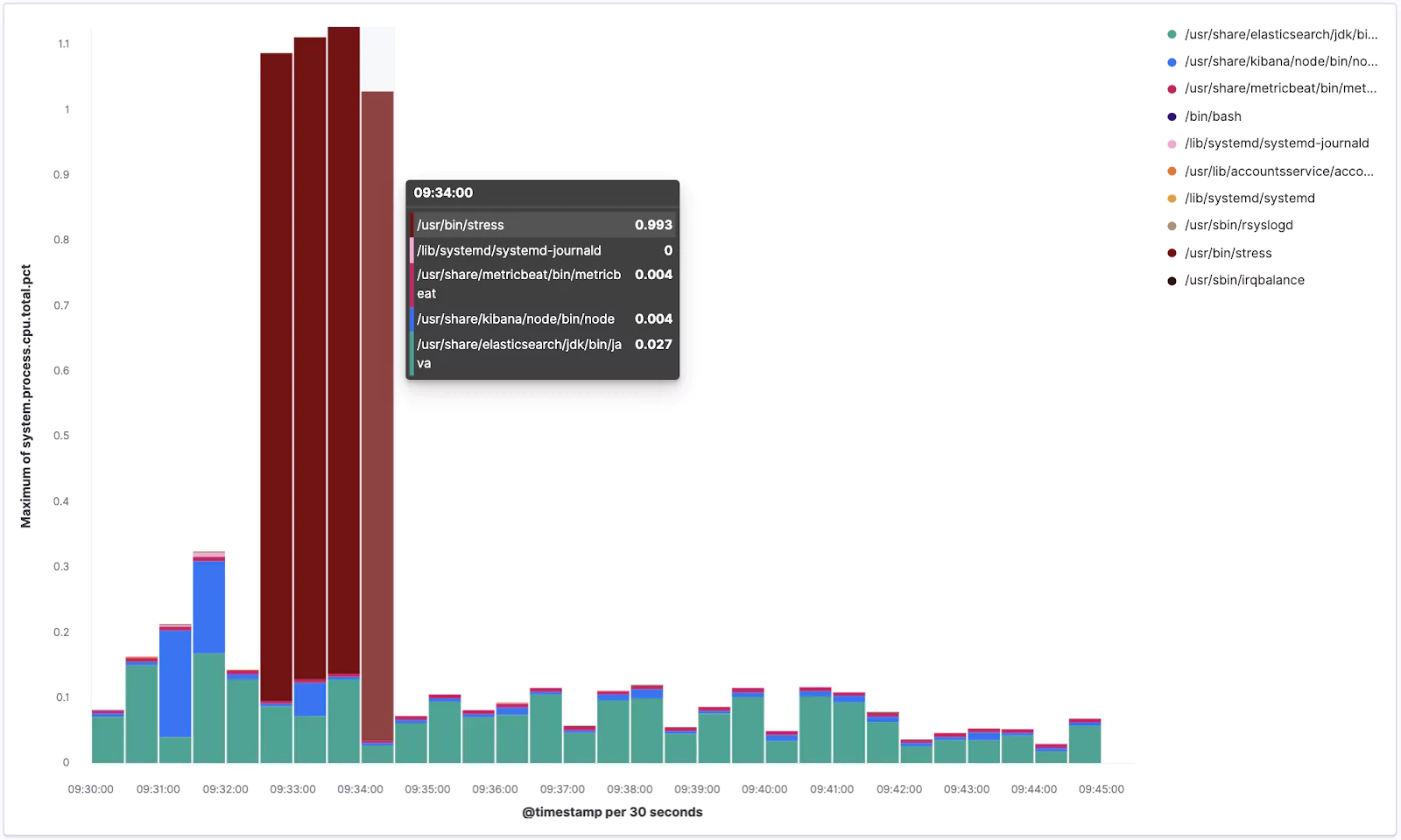
From the chart you can see how our stress tool was pushing the CPU when it was running.
Now click the Save link in the top left corner and save it as new visualization with some meaningful name like Lens – Top 5 processes.
Perfect!
Visualizing Further
To test out some more Lens features, and to have some more material on a dashboard we are going to create later, we are going to create another visualization. So repeat the procedure by going to Visualize → Create visualization → pick Lens.
Now search for the memory.actual fields and drag system.memory.actual.used.bytes and system.memory.actual.free into the main area.
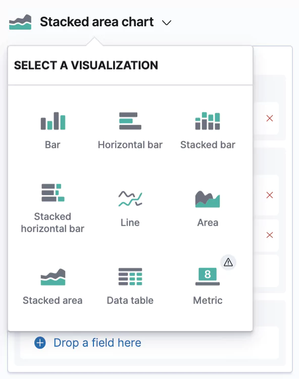
This creates another Stacked barchart, but we’re going to change this to a Stacked area chart. You can do so by clicking on the bigger chart icon → and picking the desired type.
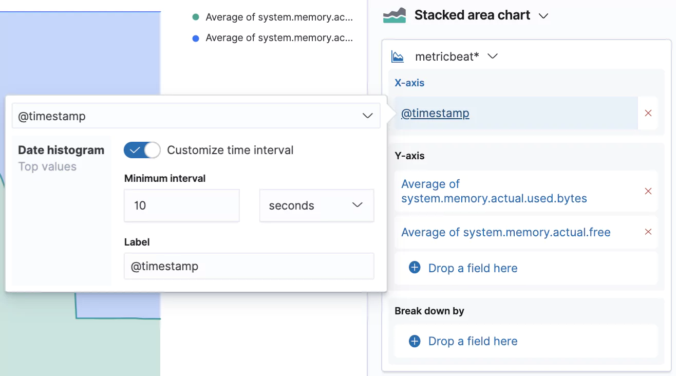
We can also customize the granularity of the displayed data which is by default 30 seconds. Our data is actually captured in 10 second intervals, so let’s switch that interval by clicking on the @timestamp in the X-axis box and selecting Customize time interval.
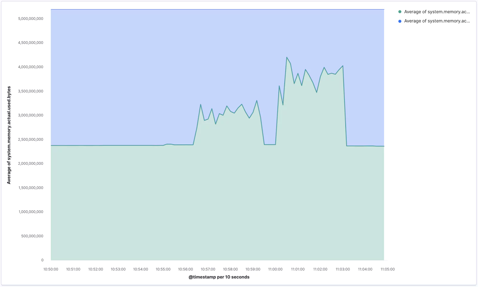
Your new chart, visualizing the memory usage, should look similar to the one below. If you ran the stress command aimed at memory you should see some sharp spikes here.
Make sure you Save your current progress, eg. as Lens – Memory usage.
Layers
The last feature we are going to try out is the ability to stack multiple layers to combine different types of charts in the same visualization.
Again create a new Lens visualization and search for the socket.summary metrics, which is what we are going to use for this step.
Drag and drop the system.socket.summary.all.count field → change the chart type to Line chart → and change the Time interval to 1 minute. Easy!
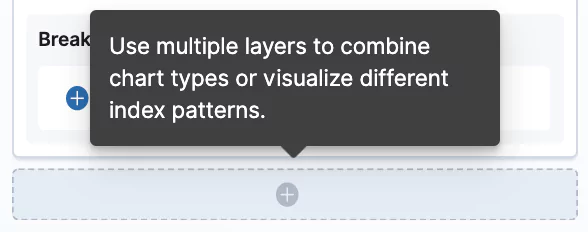
Now click the plus button in the right pane which will add a new visualization layer → change the chart type to Bar chart (you need to do it with the small chart icon of the given layer) → and drop in the @timestamp for the X-Axis and listening, established, time_wait, close_wait from system.socket.summary.tcp.all. → additionally you can add also system.socket.summary.udp.all.count to also see the UDP protocol sockets. Lastly, change the time granularity to the same value as the second layer.
Your visualization should look similar to this:
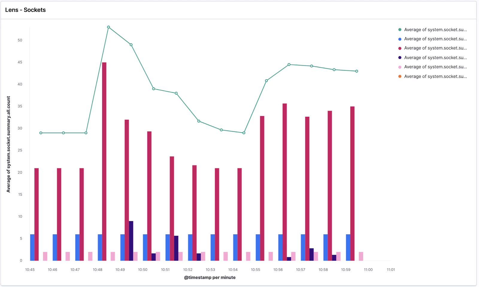
We can see the average of all socket connections in the line chart and TCP/UDP open sockets in various states in the bar chart.
Got ahead and Save it as Lens – Sockets.
Dashboard
Naturally, the final step is combing everything we’ve done into a single dashboard to monitor our vitals.
Let’s open the Dashboard app from the left menu → Create new dashboard → Add visualization → and click on all of our saved Lens visualizations.
Done!
Now feel free to play around with the dashboard and add more visualizations. For example, see if you can add a Data Table of the “raw” data like this:
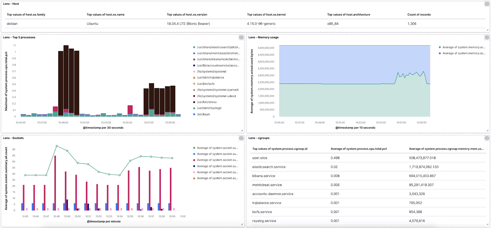
You are well prepared for any data exploration and visualization in the wild! Use Lens whenever you need to perform some data-driven experimentations with various metrics and dimensions that you have in your data visualization tools to tune your dashboards for the most effective storytelling.
Learn More
- on the the System module of Metricbeat
This feature is not part of the open-source license but is free to use


