Master debugging with four ways to visualize your traces
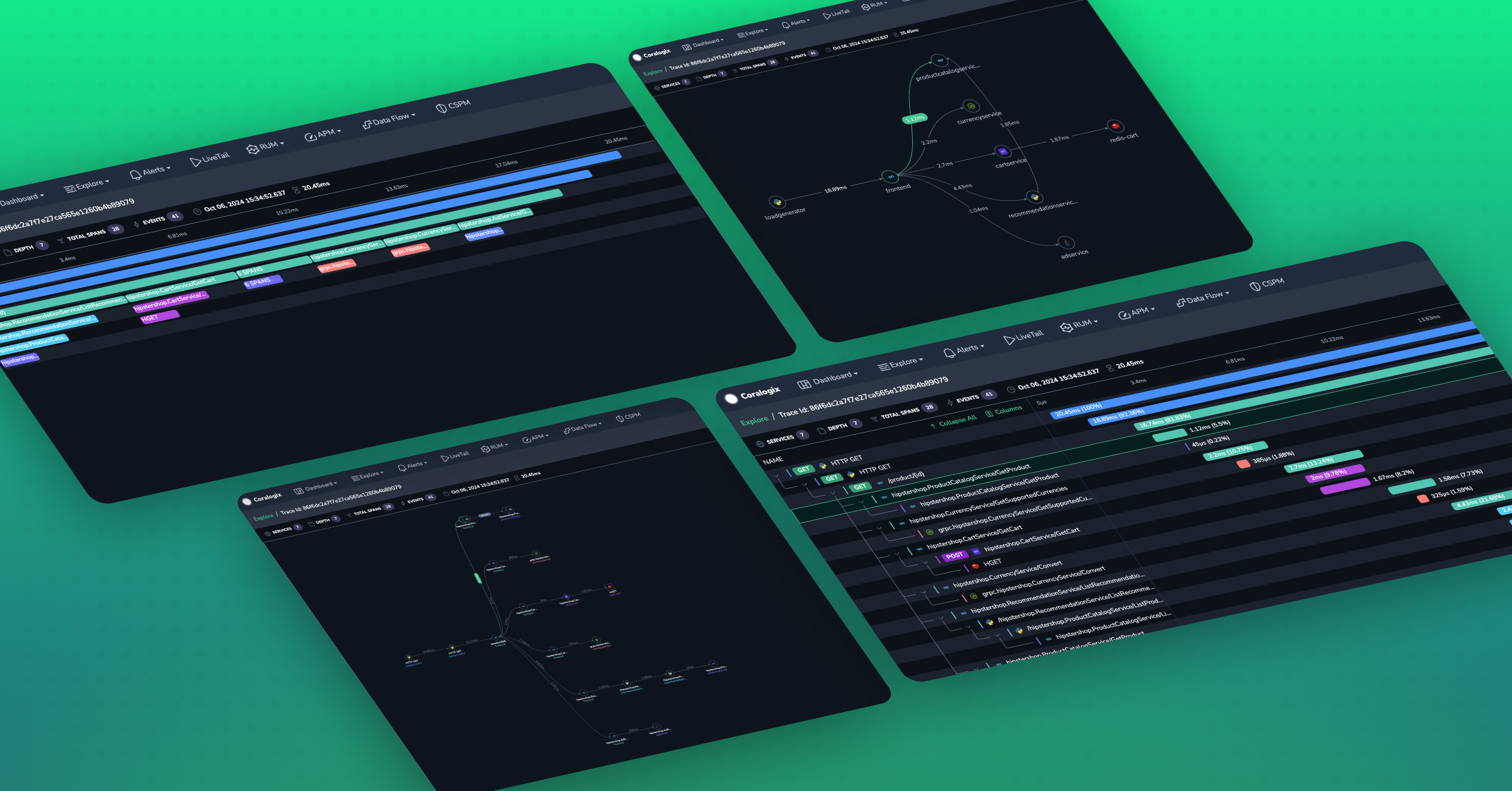
In a world where microservices rule and distributed architectures are the norm, understanding how a single request flows through your system can be an overwhelming challenge. But don’t worry—there’s light at the end of the tunnel! And not just one light, but four.
In this post, we’ll explore how visualizing traces in four different ways—with the Gantt graph, Flame graph, Span Node Graph, and our latest addition, the Service Node Graph—provides you with powerful tools to better understand and troubleshoot your applications.
Let’s dive into the key advantages of each trace visualization and how they can help you tackle performance issues, track down errors, and optimize request flows.
1. Gantt Graph: The go-to visualization
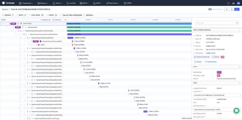
The Gantt graph provides a time-based view of your trace, where each span is represented along a horizontal timeline. This is especially helpful for understanding the duration and sequence of operations in a single request. The Gantt graph allows you to see exactly how long each span took, and which part of your system caused latency or performance bottlenecks.
Key advantages:
- Pinpoint latency issues: By visualizing the duration of each span, you can easily identify which part of the request is causing slowdowns.
- Request flow analysis: See the exact order of operations and how they depend on each other.
The Gantt graph offers a high level of precision when diagnosing performance degradation, helping you make informed decisions about optimizations or fixes.
2. Flame Graph: Quickly identify performance bottlenecks
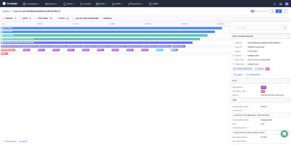
The Flame graph focuses on the span hierarchy of your trace. It shows you the nested relationships between spans and how long each operation took in relation to the others. This graph is invaluable when you’re looking for inefficient or deeply nested operations that could be impacting the performance of your system.
Key advantages:
- Quickly identify slow operations: Flame graphs make it easy to spot which spans consume the most time within your trace.
- Understand call hierarchies: View the structure of nested spans and how they relate to one another, providing clarity on complex call stacks.
For developers dealing with complex, multi-layered systems, the Flame graph delivers a concise way to identify bottlenecks and improve the efficiency of your application.
3. Span Node Graph: Deep dive into granular component relationships
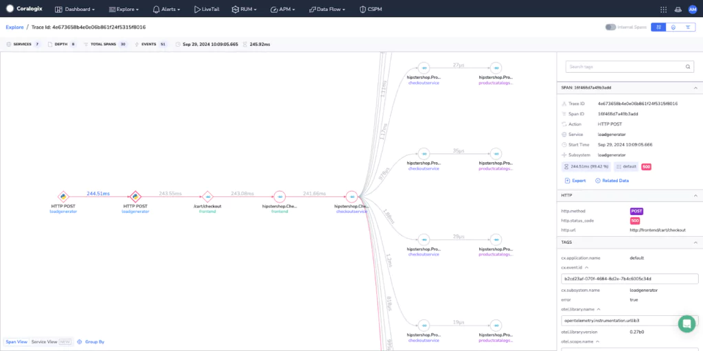
The Span Node Graph breaks your trace down into individual spans, mapping them as nodes. This visualization shows how spans interact with one another, giving you insight into the low-level relationships between the components of your trace.
Key advantages:
- Span interaction insights: Understand how individual spans relate to each other, revealing the connections and flow between components, and uncovering the full story behind your trace.
The Span view is an essential tool when you need a detailed breakdown of how each component of your trace contributes to the performance of a request.
4. Service Node Graph: Visualize service interactions within a trace
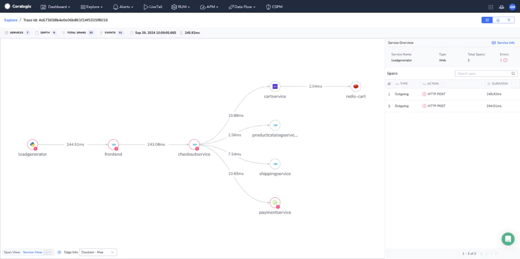
Our latest addition, the Service Node Graph, takes a higher-level approach by grouping spans to their corresponding service. This view helps you understand the relationships between services within your trace, making it easier to see how microservices interact and where performance bottlenecks might occur.
In contrast to the Span Node Graph, the Service Node Graph aggregates spans into logical service groupings, simplifying the visualization of large traces.
Key advantages:
- Big trace visualization: For large traces, Service view simplifies the complexity by grouping spans under their corresponding services, offering a clear overview of how each service contributes to the request.
- Logical flow representation: Requests and responses are grouped, making the flow of a request easier to follow without switching between client and server spans.
- Improved clarity for databases and messaging buses: Services like Kafka, RabbitMQ, and SQS are more clearly visualized, highlighting their role in the trace.
The Service Node Graph is invaluable for making sense of complex requests in environments crowded with microservices, providing a high-level understanding of how they interact and communicate.
Conclusion: A multi-layered approach to trace visualization
WIth four ways to visualize a trace, you can now analyze and troubleshoot performance issues from multiple angles. Each visualization has its strengths, ensuring you can tackle latency, debug errors,and reduce resolution time efficiently. To learn more about our trace visualizations, check out our documentation.


