Sampled analysis of 10 billion spans with Coralogix highlight comparison

The CNCF reported that between 39% and 56% of organizations surveyed are now ingesting traces as part of their observability strategy. Tracing has become a cornerstone of any modern observability operation. Customers are regularly handling 10s of billions of spans every day, but with billions of spans, how can teams quickly figure out what is changing, what’s breaking, or what’s slowing down? At Coralogix, we recognise that a vendorless tracing solution is crucial, which is why our entire tracing stack is powered by OpenTelemetry OTLP traces.
How do we keep analyzing at 10b span scale?
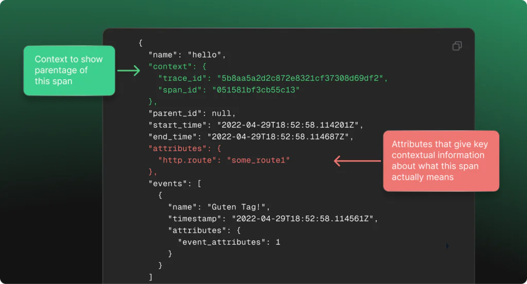
OpenTelemetry spans are composed of some key components. We’ll focus on a few key points today, to show how we have leveraged these fields to cut through billions of spans to find cross-cutting information that would be impossible to find with manual searching and querying.
The OTel docs give the following as an example, that we have annotated for simplicity:
As span volumes scale into the billions, patterns within these attributes start to reveal recurring relationships that cut across services, teams, and even infrastructure layers. A sudden rise in error counts from a specific customer_id, latency spikes correlated with a particular region, or repeated slowdowns traced back to a single API version are not isolated events. They are patterns of behavior embedded within the attributes themselves. When dealing with billions of spans, these sorts of patterns represent a unique opportunity to find new and interesting methods for insight generation, with high performance, pre-computed comparisons that show patterns in their intended context.
Introducing highlight comparison
Trace highlight comparisons are the newest addition to the Coralogix trace analytics product. They allow customers to leverage highlights, which detect patterns and trends in the attributes on trace spans and RUM events, but more than that, they show how those patterns differ from baseline.
How does highlight comparison work?
Using highlight compare, a customer can look for error spans, and select custom time ranges to see both how the flow of data changed over time, and how the distribution of values in common labels have changed. This gives an idea of patterns that are emerging, even over enormous datasets. It does this by intelligently sampling the overall dataset, and comparing label value distributions across spans. So how do we apply this to our workflow?
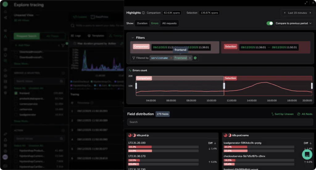
Use Case 1: Identifying errors in underlying infrastructure
The hostname of the server that created the span is a very common attribute in OTel spans. Understanding which underlying server contributes the most errors can give a clear indication of the root cause of a problem.
In this example, the k8s.node.name field shows that one server’s share has increased by 58.7% between the two time periods and now appears in over 9.64K spans, with a sharp rise in errors compared to the other servers.
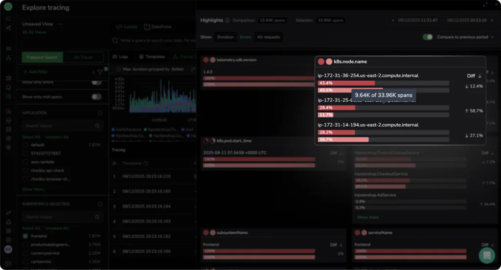
We can also see that the diff column on the right shows that the other two servers actually decreased in error volume over the same period, while the problematic server increased significantly. If we were investigating a new release, this pattern would suggest that the new version is likely failing on a specific node. This helps SREs identify unhealthy nodes early, before they cause customer‑facing issues.
Use Case 2: Identifying slow running AWS Lambda functions
Lambda invocation time is directly connected to overall cost, as well as the potential degraded user experience, so any change to functions should be easy to spot. Fortunately, trace comparison makes this simple.
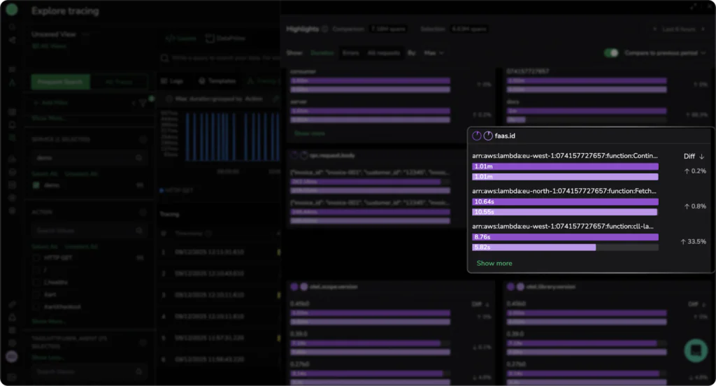
We are now comparing in the duration mode, and we can not only see that our Lambda functions are extremely slow, but also that the last Lambda function in arn:aws:lambda:eu-west-1:074157727657:function:cll-lambda is slow and has degraded by an additional 33.5% during our time comparison window.This is the power of time-based comparison over large scale datasets. More than that, we can see that all of our other lambda functions have become slower too.
These small fluctuations would be difficult to spot with traditional analytics, that might mean these small changes are swallowed up. If we saw a slowdown in a single function, we might be tempted to begin our investigation into the specific code that powers that lambda function. Instead, we can see that this is impacting multiple functions and so might be related to networking, a general release, or cold starts on multiple lambdas occurring due to a broad change in configuration.
Use Case 3: Checking HTTP & RPC user agents for bot detection
Bots now make up about 30% of global traffic, and identifying bot traffic vs normal user traffic has become a cornerstone of good FinOps and engineering practice. Bot spikes can be the precursor to DDoS attacks, or they can indicate content theft and data exfiltration attempts.
By analysing span tags over time, trace highlight comparison can not only indicate the proportion of your traffic that is made up of bot user agents (for example, OpenAI web crawler, or the infamous Google Bot), but also whether that number has dramatically changed in a given timeframe.
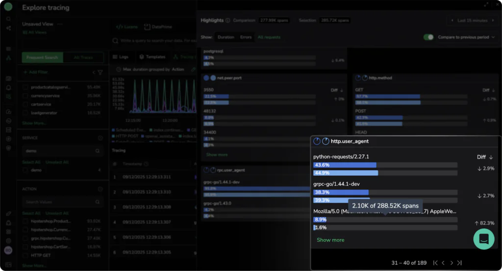
We can see that the most common user agent is actually a combination of a golang library for gRPC traffic and a python request library. They make up the majority of overall traffic, but have notably decreased in the timeframe by 5.6%. To put this kind of change into perspective, scalper bots regularly cost eCommerce platforms 3% of revenue. For a $10m eCommerce platform, this translates to $300,000 lost to bot traffic. This insight is important for engineering teams, but also for your leadership, so they can understand the meaningful impact that bot protection and good security practices have on the bottom line.
Use Case 4: Detecting regional performance degradation
Modern distributed systems span multiple geographic regions to reduce duration and improve resilience. However, regional differences can introduce subtle performance issues that aggregate metrics often hide. For example, we can see here that the vast majority of our infrastructure is operating in us-east-2.
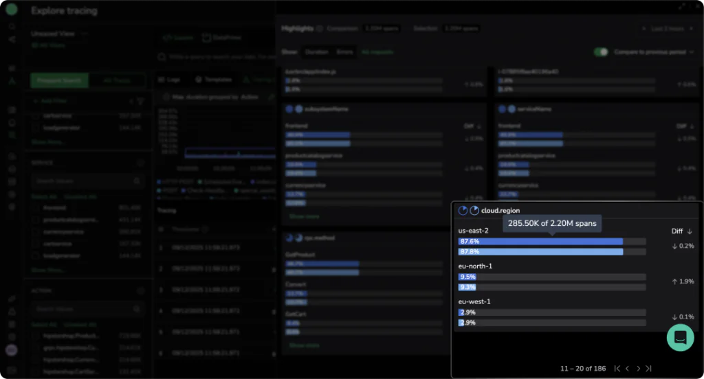
If we view the same slice by errors, we see something very interesting:
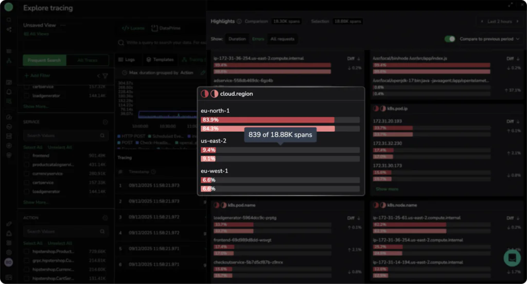
We can see that in a multi‑AZ environment, we would normally expect background errors to be spread evenly and roughly correlate with traffic. This is not the case, indicating the workloads in eu‑north‑1 are experiencing close to ~80% errors, compared with only ~9% in us‑east‑2. This lets us immediately focus the investigation on what is going wrong in eu‑north‑1 and dig deeper into our telemetry.
High volume label comparison unlocks 10b scale for spans
By finding trends across labels and, crucially, putting them into time context, patterns can be found across enormous volumes of spans through sampled analysis of data. This gives Coralogix users the ability to easily investigate their span data without complex querying or long running asynchronous queries that other platforms demand.
If you’d like to learn more, you can check out our documentation or book some time with our sales team, to understand how trace comparison can open up analytics for your OTel span data.