Mastering the Diagnostic pivot from Health Policy to Pod

In the world of modern microservices, scale is a necessary challenge. Enterprise service inventories start modestly with a handful of components, only to balloon to hundreds over time. Traditional monitoring approaches cannot support that weight. The more organizations build, the more work they create, often only to keep systems running.
More Configurations More Problems
Many SRE and DevOps teams face mounting operational overhead due to a lack of visibility. Manually defining health rules, latency thresholds, and error alerts for every new service can drive engineer burnout. Manual definitions create thresholds that are too broad and generate endless “noise”. Meanwhile, those that are too specific require constant, manual tuning as the service evolves. This level of overhead often leads to critical services remaining under-monitored due to an unsustainable manual maintenance workload.
Policy-Driven Health
The solution is to move away from tinkering with individual services towards a Policy-Driven “Source of Truth.” In this system, the moment a new service is detected, it is automatically evaluated against a predefined organizational policy. Then, instead of chasing alerts, teams define what “excellence” looks like for their tier-one services once, and the platform enforces that standard across their entire infrastructure.
The Bridge: Metrics vs. Samples
When the red light goes on in one of your dashboards, it is only the start. Mastering the workflow takes distinction between metrics and samples:
- SLOs and Health Policies are built on Metrics. Metrics represent 100% of your data and represent the ultimate authority that tells you a problem exists.
- Troubleshooting, on the other hand, relies on the quality of your Samples (Traces and Logs).
While a metric-driven policy identifies the breach, your ability to fix it depends on your sampling rate. If your sampling is too thin, you’re left with a “what” but no “why.” Let’s dig deeper.
II. The Proactive Tuning Workflow
To illustrate how policy-driven health works in practice, let’s walk through a real-world scenario using a standard microservices deployment. In this example, we are focusing on the shipping service, a critical part of our checkout pipeline where minor latency issues can lead to abandoned carts.
Step 1: The Baseline
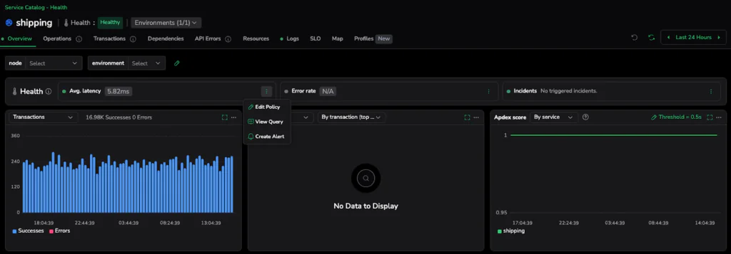
We begin in the Service Catalog. At first glance, everything looks perfect. The shipping service is reporting an average latency of 5.98ms and is labeled with a green Healthy status.
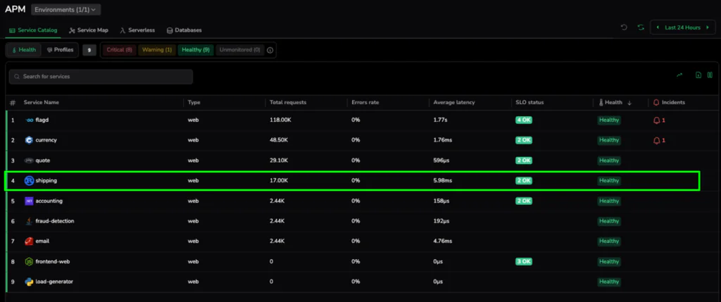
Under a broad, organizational default, 6ms is a great result. However, for a high-performance shipping calculator, this might represent the beginning of a performance drift. This “Healthy” baseline is our starting point. With it, we establish a “before” state where services appear fine on the surface but may not meet the specific, high-precision standards required for their role in the architecture.
Step 2: Defining Excellence
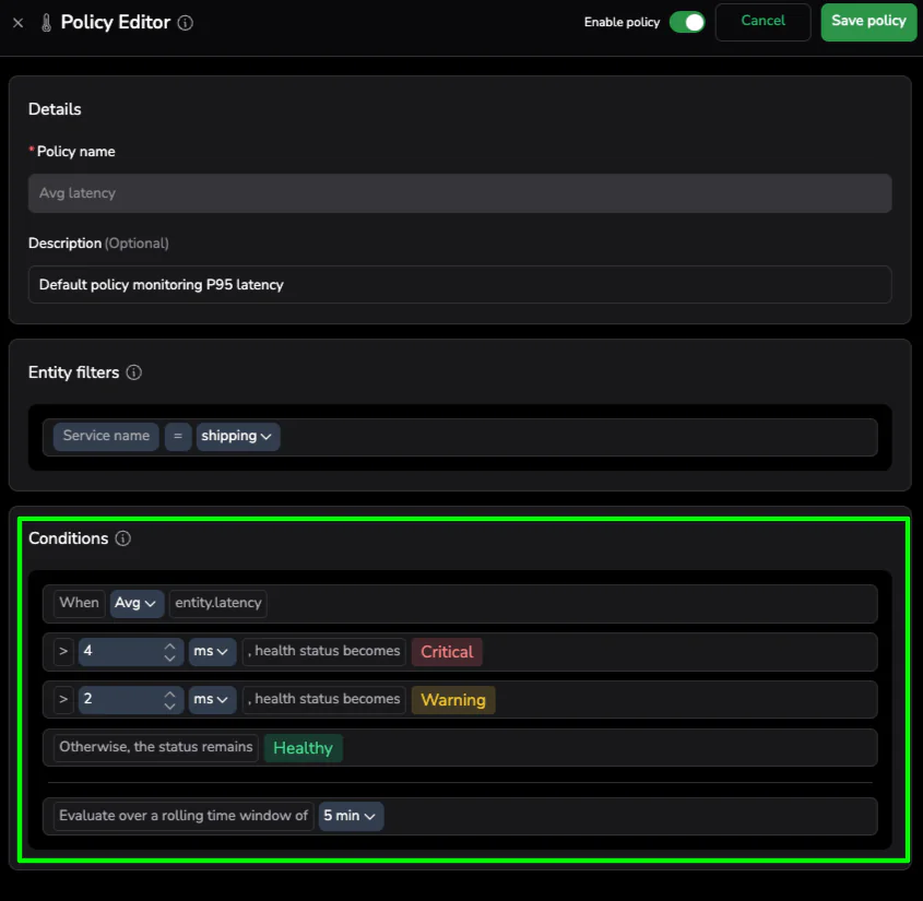
Instead of waiting for a customer-facing incident to trigger a manual alert change, we take a proactive approach. Using the Policy Editor, we can tighten the scenario on this specific service. We aren’t changing the rules for the entire company; we are thoughtfully defining what “Good” looks like for the shipping service specifically.
The Policy Editor is available from the three-dot menu on the health bar in the selected service drilldown.
We adjust the Critical threshold to > 4ms. This is “Proactive Tuning”—moving toward a data-driven definition of excellence. Setting this threshold states that for this specific piece of logic, anything over 4ms is unacceptable.
Step 3: Instant Health Realization
The moment we hit “Save,” the platform goes to work. Unlike traditional systems that wait for the next data point to arrive before evaluating a rule, Coralogix re-evaluates the service against the existing data in the buffer.
Since the current latency is 5.98ms, which we now know is higher than our new 4ms standard, the service instantly flips to 🟥 Critical. There is no waiting period and no manual refresh required. This “Instant Health Realization” provides immediate visibility into performance drift that was previously hidden behind generic health markers. We have effectively unearthed a breach in our existing data by simply defining a better standard.
III. The Diagnostic Pivot: From Metric to Sample
Once the Service Catalog turns red, the clock to resolution starts ticking. One common pitfall in modern observability that we want to avoid is getting stuck at the “Metric” layer. While our health policy used 100% of the metric data, metrics alone cannot tell you why the shipping service is slow.
The Troubleshooting Bridge
To find the root cause, we must bridge Metrics to Samples. Metrics give us the high-level “What” (Average Latency is 5.98ms), but Samples (Traces and Spans) provide the “Why.” Pivoting from the health indicator directly into the underlying transactions moves from aggregate numbers to actual execution paths.
Step 4: Isolating the Bottleneck
With the service flagged as critical, we need to move from aggregate service health to specific code execution. Clicking into the shipping service takes us to the Transactions tab. This view provides a granular breakdown of every endpoint and operation within the service, making it easy to spot exactly which part of the logic is failing to meet our new 4ms standard.
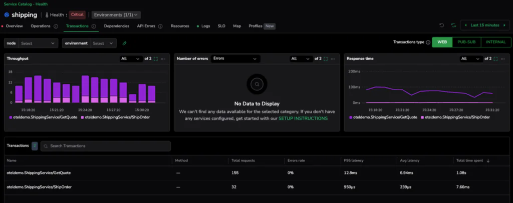
The data is immediate and conclusive. While the ShipOrder transaction is performing exceptionally well with an average latency of just 239µs, the GetQuote operation is clearly the outlier, clocking in at an average of 6.94ms. In just two clicks, we have successfully narrowed the search from the entire service down to the specific transaction responsible for the policy breach.
💡 Pro-Tip: The Sampling Warning
Your ability to diagnose a problem is only as good as the data you keep. Health Policies and SLOs are built on metrics because they need to account for 100% of your traffic to be accurate. However, Troubleshooting relies on the quality and frequency of your samples.
Depending on your chosen sampling rate, you must be wary of your hypothesis testing. If you are only sampling 1% of your traffic, you might miss the specific “slow” traces that represent your P95 spikes. Higher sampling rates = Higher confidence in your hypothesis. When you jump from a metric to a culprit, ensure your sampling criteria are robust enough to capture the representative “drifting” spans you need to see.
IV. Deep Dive: Hypothesis Testing (The “Compare” Method)
Finding a slow transaction is a major milestone, but not the finish line. In modern distributed systems, a transaction is rarely a single unit of work—it’s a collection of methods, database calls, and downstream dependencies. To truly solve the issue, we need to go deeper into the specific method and test our hypothesis using high-fidelity samples.
The Comparison Technique
The most effective way to isolate drift is by comparing a “Slow Sample” against a “Healthy Sample.” In our GetQuote transaction, we can pick a span representing our peak latency (e.g., a 13.35ms request) and hold it up against a standard request that falls within our 4ms target.
Visualizing the Difference
When you look at the span breakdown side-by-side, the “drift” becomes obvious. If the database calls and network overhead are identical in both samples, but the internal processing time of the GetQuote method has doubled, we know exactly where to point the developers. This comparison allows us to differentiate between a widespread code inefficiency and a localized infrastructure bottleneck.
V. The Infrastructure “Root Signal”
Once we’ve isolated the slow method, we need to determine if the issue is systemic or restricted to a specific part of our cluster. This is where the rich metadata attached to our samples becomes invaluable.
Step 5: Connecting to Kubernetes
When we expand the Resources sidebar on one of our high-latency spans, we move from the application layer directly into the infrastructure layer.
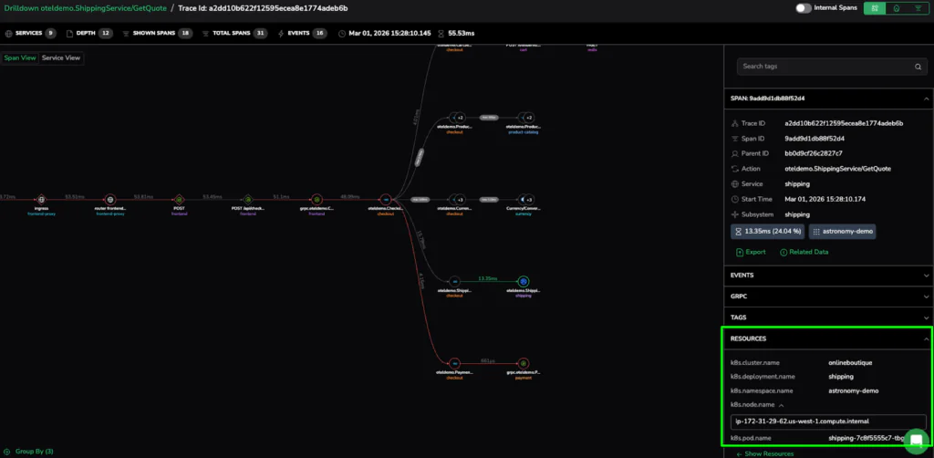
The metadata provides the source: the specific Kubernetes Pod (shipping-7c8f5555c7-tbg7n) and the Node where the request was processed. We can now see that the 6.94ms average wasn’t a service-wide failure, but a localized issue on a specific pod. This seamless link is what allows SRE teams to resolve complex issues in minutes rather than hours.
VI. Precision at Scale
The journey from a broad “red light” to a specific Kubernetes pod demonstrates that scale doesn’t have to come at the expense of precision. Mastering the diagnostic pivot resolves complex performance issues in minutes rather than hours.
Policy Finds the Problem; Sampling Solves It
Policy-driven health removes the manual configuration burden, ensuring that high standards are automatically enforced as service inventories balloon. It provides the high-fidelity metrics needed to detect drift the moment it occurs.
The Final Takeaway
Effective observability is more than just seeing “Red.” It has the sample quality and metadata to prove exactly which method and which pod caused the issue. Bridging the gap between Policy and Pod, help SRE teams stop chasing alerts and start solving root causes with surgical certainty.