5 Essential Capabilities that Make Coralogix an Observability Powerhouse

Sometimes observability can feel like a second job. With many traditional tools, users must become experts in a proprietary language to ask a simple question. In these cases, developers or SRE’s can find themselves spending more time manually sifting through raw text, building complex data pipelines from scratch, and bouncing between fragmented dashboards than actually solving problems. Observability experts need clarity, and systems that create more noise leave users to manually calculate metrics or hunt for root causes across disconnected logs and traces.
Modern observability should be more like a superpower. In the past, the industry seemed to accept tool fatigue as unfortunate but necessary. Engineers would constantly need to wrestle with their platforms rather than actually mitigate errors.
Driven by our belief in constant investment in usability, our mission is to ensure every second spent in the UI is productive, intuitive, and frictionless. Our aim at Coralogix is to separate data complexity from incident response speed, providing a platform that evolves alongside your needs. To help you master the Coralogix workflow without feeling overwhelmed, we’ve highlighted five essential capabilities designed to eliminate manual work and let you focus on what matters most.
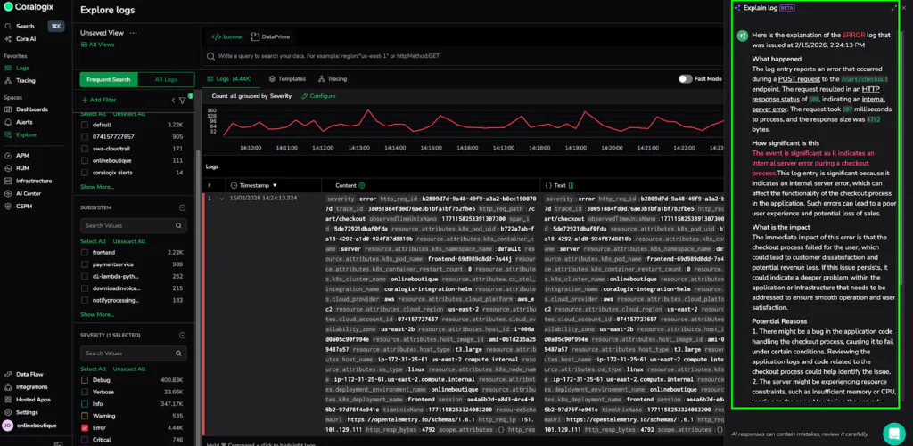
1. Explaining Logs with AI
Almost every developer or SRE has stared at a cryptic, multi-line error log from a service they didn’t write. In a traditional environment, this requires tracking down the service owner or spending precious time digging through documentation just to understand the significance of a single entry.
Now you can hover over any log and click the Explain Log button. The Explain Log capability uses Cora (our AI assistant) to provide a clear, natural language summary of exactly what happened, how significant it is, and the immediate impact on your system.
The capability demystifies technical language with built-in tooltips that offer root cause analysis for logs with a warning level or higher. It empowers every user, regardless of their technical expertise, to aid in an investigation, identify potential issues before they escalate, and make faster decisions.
Real-World Example: Explaining a Checkout Failure
In the example below, we have a raw JSON log for the frontend service showing an HTTP 500 error on the /cart/checkout path. Instead of manually parsing fields like trace_id or k8s_pod_uid, Explain Log instantly tells us that the checkout process failed, potentially leading to customer dissatisfaction and revenue loss. It even suggests looking for application bugs or resource constraints on the t3.large host in the us-east-2 region. What was once a wall of text became an actionable diagnostic report in seconds.
2. Creating Metric Alerts from Logs
A high-velocity workflow is one where you can protect your system without waiting for a complex data pipeline to be built. In traditional observability, when you discover a critical numeric value in a log (e.g., latency spikes, suspicious traffic shifts), you have to manually model, define, and write metric queries before starting alerting.
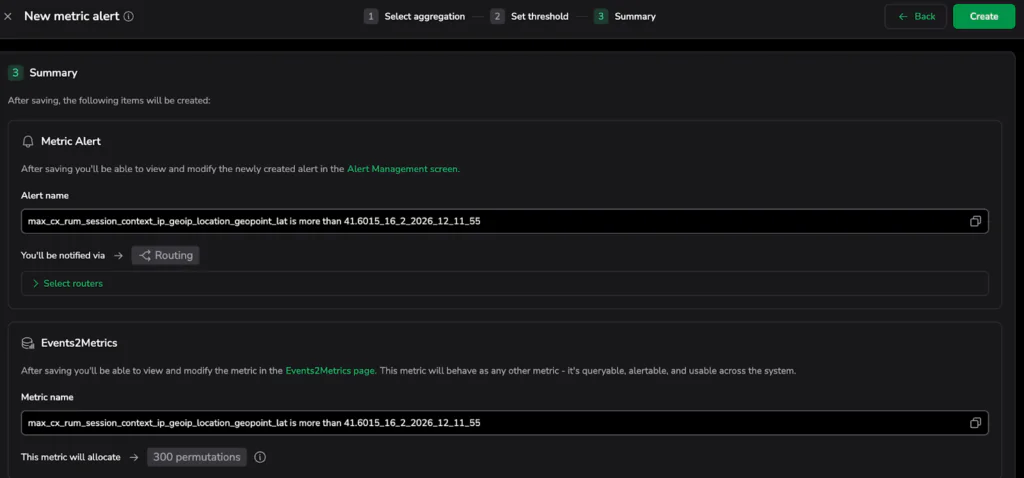
Coralogix eliminates this manual effort. When you discover a numeric value in your logs that represents important behavior, simply right-click that value directly in the Log Details panel and select Create metric alert.
Once pressed, the action automatically keeps active log filters and builds the metric autonomously in the background. Without writing a single line of code, we have moved from raw log analysis to a high-priority guardrail.
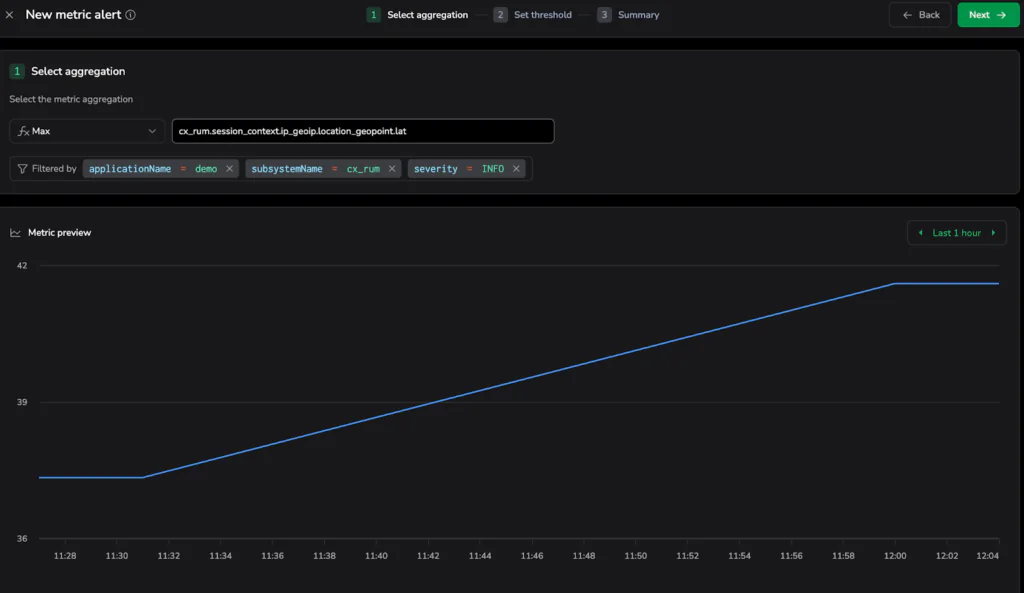
Verify Before You Deploy
The true might of this capability is the Metric Preview chart. During setup, Coralogix displays a historical preview of the newly calculated metric based on your past 24 hours of log data.
In the screenshots below, you can see how this looks in practice:
- Aggregation and Filtering: The system automatically scopes the alert to the demo application and cx_rum subsystem, calculating the Max value for the user’s geographic latitude.
- Visual Tuning: When you click next and go to the Set threshold step, a dashed red line appears over the historical blue data. This allows you to visually “tune” the alert—placing the threshold high enough to ignore operational static, but low enough to catch the critical spikes that actually matter to your business
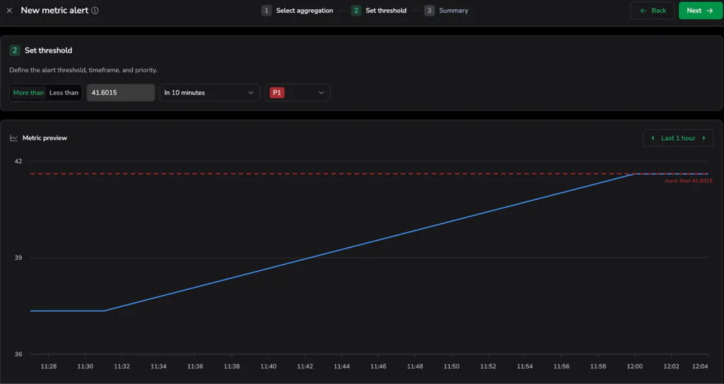
- Once you press the “create” button, you already know exactly how many times that alert would have fired in the past day, giving you immediate confidence in your system’s new defense.
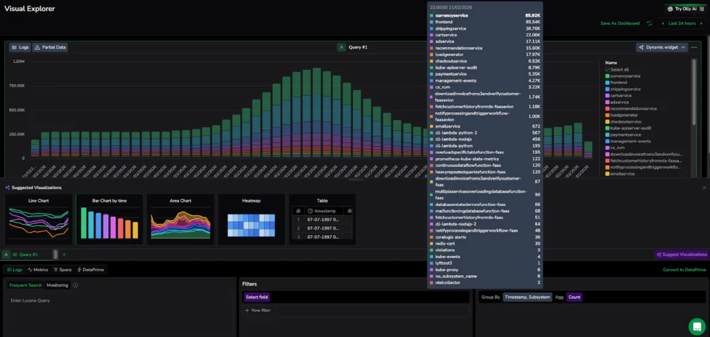
3: Suggested Visualizations
The Visual Explorer eliminates the guesswork about whether you need a heatmap or a gauge. Using dynamic widgets, the Explorer analyzes the structure of your query results, such as whether you are looking at time-series trends or grouped categories. Then it automatically recommends the most intuitive chart, ensuring a strong data story is clear without manual configuration. Whether you are changing groupings, aggregations, or filters, the system will update its suggestions to ensure your data is represented in the most intuitive way possible. This eliminates manual sifting, ensuring you don’t need to be a dashboard expert to get professional-grade results.
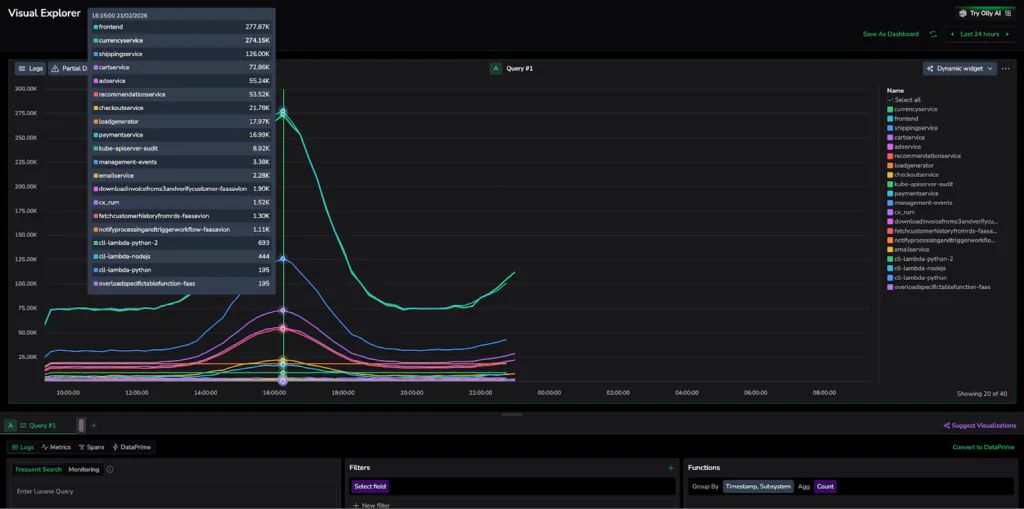
High-Scale Visualization Example:
In the attached screenshot, the Visual Explorer tracks multiple services simultaneously, creating a high-density dataset. Once the “Suggest Visualizations” button is clicked, the UI re-evaluates the query results, offering the best chart type for that specific data point. Once you select a specific chart, the UI preserves your choice, ensuring the system assists your exploration without overriding your intent.
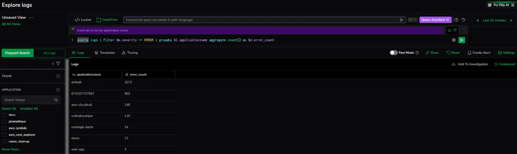
4. Natural Language Querying – Speak DataPrime
Whether you are already a power user or just getting started, you can simply describe the data you need in everyday English and watch the system instantly translate your intent into a structured, high-performance query.
DataPrime Query Assistance provides an intuitive way to interact with your data using natural language. This makes deep data exploration accessible to every member of the team, regardless of their coding expertise. The platform handles the technical heavy lifting by leveraging an advanced LLM, so you can focus on finding answers rather than fixing code.
From Conversation to Code: From the logs explore screen, enabling the Query Assistant turns your search bar into an intelligent collaborator. In the example below, we entered a simple request to “count all errors by application name”. The system instantly generated the exact DataPrime pipeline required to filter by severity and aggregate the results: source logs | filter $m.severity == ERROR | groupby $l.applicationname aggregate count() as $d.error_count. This seamless translation delivers a precise diagnostic report in seconds, proving that you don’t need to be a query expert to get expert-level insights.

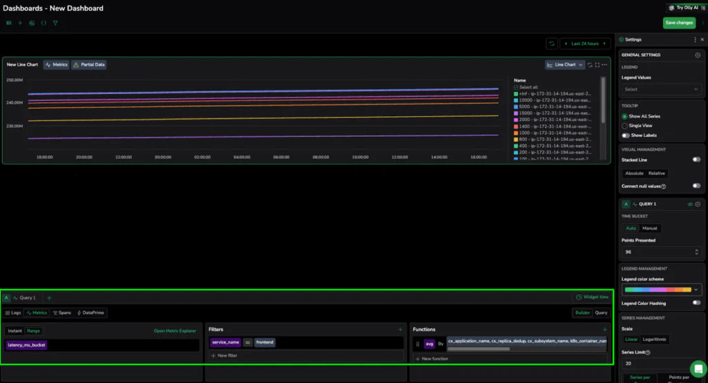
5: The Query Builder – Analytics Without the Code
Building professional-grade dashboards and widgets is easier than ever with our simple point-and-click interface. Instead of writing manual code, you can use intuitive dropdowns and buttons to apply complex filters and aggregations like SUM(), AVG(), or COUNT() directly to your data.
The Query Builder is designed specifically for users who need powerful insights as a convenient shortcut for simpler use cases, bypassing the need to manually draft DataPrime, Lucene, or PromQL syntax. It democratizes data analysis by allowing anyone to create sophisticated metrics and log-based visualizations through a guided UI, ensuring that deep system visibility is never limited by a user’s coding knowledge.
Point-and-Click Metrics in Action In the dashboard setup, the Query Builder allows you to define your data source and instantly begin shaping the output. As seen in the example below, we transformed a single metric into a high-density comparison by simply clicking the “+” icon to add an aggregation. By selecting AVG and grouping the results by infrastructure labels like cx_subsystem_name and k8s_container_name, we created a live leaderboard of system performance—all without writing a single line of query language. This visual approach transforms the technical task of query drafting into a streamlined, frictionless experience that delivers expert-level insights in seconds.
Conclusion: From Manual Toil to Observability Mastery
Observability should not be a tax on your engineering team’s time. Through our explorations, we have shown that the transition from manually digging through messy data to fixing problems is fueled by tools that prioritize human intuition over proprietary syntax.
Leveraging AI-powered log explanations, natural language querying, and point-and-click metric generation with Coralogix effectively removes the technical barriers that traditionally slow down incident response. These five capabilities embody a fundamental shift in the debugging workflow where the platform handles the data complexity so your developers can focus on innovation.
Ultimately, an “observability powerhouse” isn’t defined by how much data it can ingest, but by how quickly it can turn that data into a clear narrative. With Coralogix, you aren’t just watching your system; you’re mastering it with a frictionless, intelligent partner that scales alongside your ambitions.