Beyond a billion spans: Using Highlights for high-speed root cause analysis at scale

In late 2025, we introduced Trace Highlight Comparison. This capability was designed to solve the problem of having too many spans. This causes technical and financial challenges when identifying performance patterns within high-volume telemetry streams. The goal is to avoid massive indexing costs and eliminate the ingestion latency associated with indexing every record.
However, knowing these trends is only half the battle. True analytical value comes from integrating these trends into an active incident response. To demonstrate this, we will move from a high-level performance spike to a specific root cause confirmation in under five minutes using a top-down workflow.
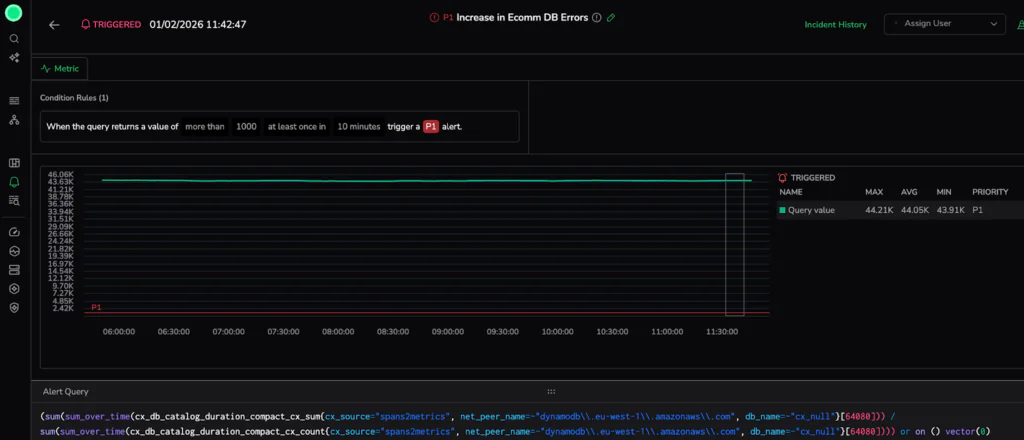
The Incident: 11:52 AM
In a global microservices architecture, a Priority 1 (P1) alert triggers an immediate operational pivot. At 11:52 AM, the main obstacle is an overwhelming volume of data. As millions of spans are generated during downtime, manual searches will sink your Mean Time to Recovery (MTTR). For this scenario, our trigger is a Critical Latency Spike in our eCommerce flow, where the response duration exceeded the predicted threshold.
Responding effectively requires a shift to automated structural analysis. We do not want to browse millions of records; we want to reduce the search space, bypassing the “noise” of raw telemetry to identify underlying system stability patterns.
Phase 1: Trace Explore
With the incident in progress, we must first establish the scope of the impact. In a distributed architecture, frontend latency spikes are typically symptoms of failures buried deep within the stack. To find the source, we start at the macro level to aggregate the “big picture” and identify the outlier before we dive into the high-resolution details.
Visualize Service Behavior with RED Metrics
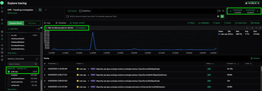
For a fast start, we utilize the RED metrics graph (Requests, Errors, and Duration). Specifically, we examine Max Duration grouped by Service. This shows us when a specific service separates from its baseline without writing a single line of code.
The Action: In the Explore Tracing dashboard, we set the alert window to the same time as the alert. We then configure the graph to display Max Duration grouped by Service and use the metadata filters to isolate the web-app service. This immediately confirms that this specific service is the primary driver of the latency spike.
The Discovery: The graph confirms that while most of our global architecture remains within a healthy baseline, the web-app service is experiencing a massive outlier with 3.52k traces captured during the incident window. The most efficient path is to use this visual evidence to narrow our focus.
Phase 2: Finding the Pattern in Trace Highlights
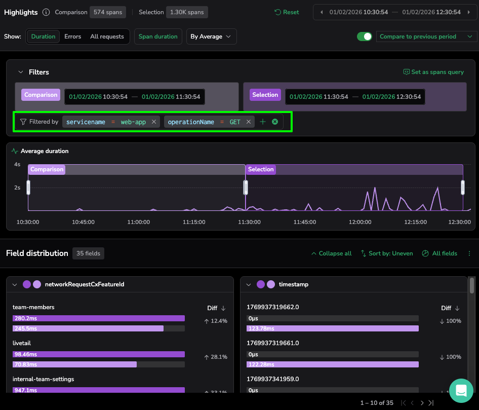
Now that we have identified the “where” (the web-app service latency), we need to find the “why.” We pivot from raw aggregation to metadata distribution using the Highlights panel to find the common denominator behind the failure.
- The Action: Opening the Highlights panel, we first set the Comparison to the “previous period” (indicated by the pink bars). This differentiates a unique operational breach, ensuring we are chasing a genuine performance regression.
- The Technical Logic: We select the Duration view and toggle Sort by: Uneven. The platform automatically ranks metadata by the magnitude of change in duration. Comparing the current window (purple bars) against the previous period immediately distinguishes between stable infrastructure variables and this specific application-level anomaly.
- The Discovery: The platform immediately flags a significant outlier in the operationName card… the GET action is averaging a response time significantly higher than the comparison period.
- The Insight: This represents a 264ms “hang” for the end-user. The status code might remain a deceptive 200 OK, so this latency would have bypassed traditional error-based alerts. However, by using Trace Highlight Comparison, we can distinguish between stable third-party traffic and this specific, high-latency regression within our core domain.
Phase 3: The Surgical Drill-Down (Closing the Loop)
Our investigation reaches its apex as we move from statistical patterns to raw, code-level evidence. To bridge this gap, we utilize the automated refinement capabilities of the Highlights panel to isolate the “needle” in our 3.52k span haystack.
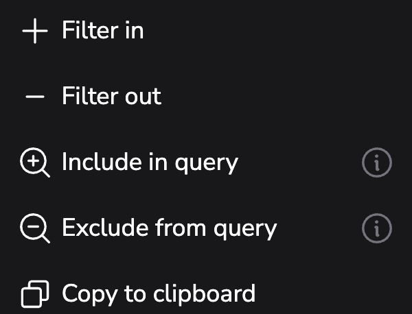
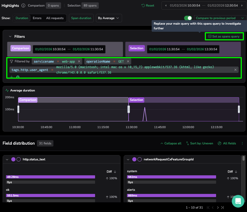
- The Action: Selecting the “three-dot” more actions menu on our identified operationName card, we use the “Filter in” command. This specific action narrows results to include only the GET actions within our selection. We then further refine our search by the identified user_agent outlier.
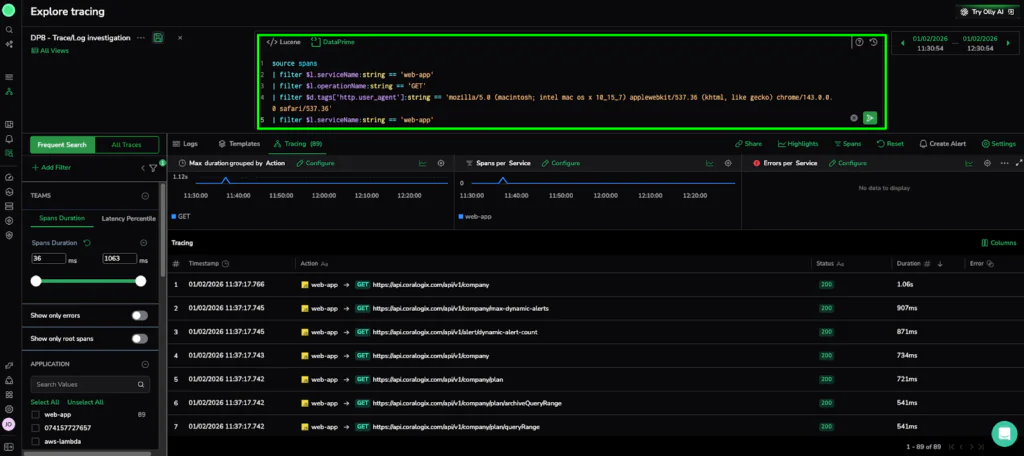
- The Technical Logic: This automated refinement instantly updates the Trace Explore view. To finalize our investigation, we click “Set as spans query” in the Highlights panel. This action automatically populates the DataPrime field with our query, allowing us to pivot from a high-level distribution to the specific trace. list.
source spans
| filter $l.serviceName == ‘web-app’
| filter $l.operationName == ‘GET’
| filter $d.tags[‘http.user_agent’] == ‘mozilla/5.0 (macintosh; intel mac os x 10_15_7)…’
- The Reveal: This final query reduced our original 3,520 traces to only 89.
- The Verdict: High-Resolution Evidence
The telemetry points directly to the specific execution path seen in our drill-down. We have successfully navigated from a global performance alert to a specific failure in the frontend component—all without writing a single complex query or manually searching through billions of logs.
The Resolution: From 3.5k Spans to One Line of Code
Navigating from a macro-aggregation of thousands of spans down to these specific metadata tags confirms that this latency is not a random glitch. This workflow provides the exact evidence—and the specific query—needed to isolate the root cause. Let’s take a closer look at our error span to see what information it has for us.
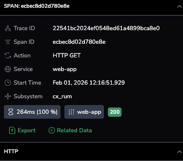
The span summary confirms a 100% latency increase for the web-app service during an HTTP GET action. Despite a deceptive 200 OK status, the 264ms duration marks a critical performance regression captured directly from the end-user via cx_rum.
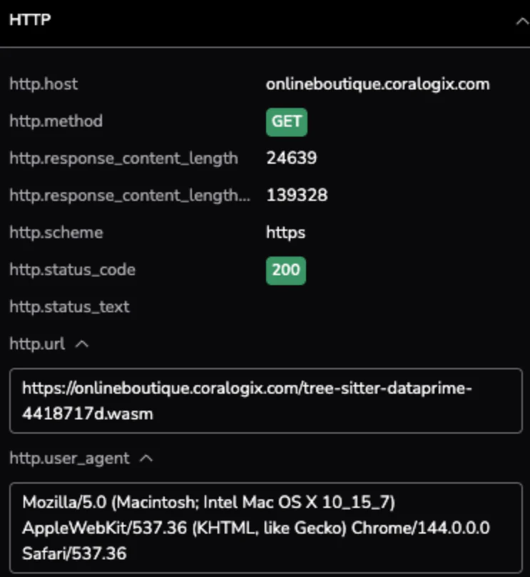
Taking a closer look at the HTTP attributes, we see the specific request path and the environment it was executed in. The metadata identifies a specific .wasm resource being fetched via the Chrome browser, confirming that the latency impact occurs at the edge for users on the latest version of macOS.
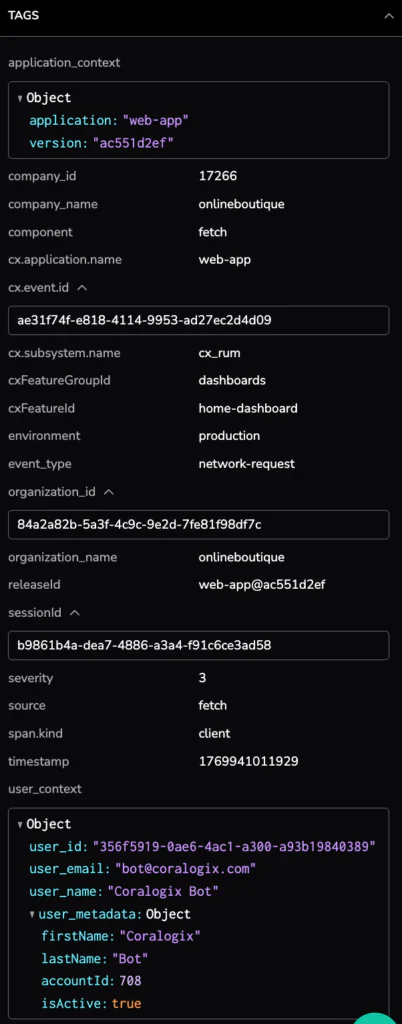
The tags section provides the critical link to our deployment pipeline, identifying the specific service version as web-app@ac551d2ef. Surfacing the user_id and detailed session metadata allows us to move beyond generic metrics and understand exactly which users experienced this performance “hang”.
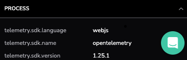
The final section reveals the technical foundation of the span, identifying the webjs language and the use of the OpenTelemetry SDK version 1.25.1. This confirms that our high-resolution evidence is built on standard, open-source telemetry protocols, ensuring data consistency as we hand this error span over to the development team for a final fix.
- The Technical Verdict: We have confirmed a significant latency outlier within the web-app service during HTTP GET actions. While the system returned a deceptive 200 OK status, the transaction duration reached 264ms—a 100% increase from its baseline.
- The User Impact: This wasn’t a silent background error; it resulted in a multi-second “hang” for end-users.
- The Actionable Insight: Instead of a long emergency session, we have the “Smoking Gun” ready for the frontend team. We can now initiate a targeted rollback of the identified release or jump directly into Loggregation to see if this specific latency template is spiking elsewhere in the cluster.
Efficiency as a Standard of Governance
Transitioning from a massive span haystack to a specific regression in under five minutes signals a shift in operational governance. Adopting a top-down workflow allows organizations to decouple the volume of their telemetry from the latency of their investigations.
- Eliminating the Index Tax: Traditional observability models often fail at scale because they rely on indexing every record. We treat telemetry as a structured dataset, identifying patterns—like our 264ms latency outlier—without the burden of continuous indexing.
- Pattern-First Resolution: Moving from Phase 1 (Macro) to Phase 3 (Evidence) proves that during a P1 incident, the most valuable asset is the ability to identify where the system has drifted from its baseline.
- Unified Observability in Practice: Using Compare mode, we bridge the gap between infrastructure stability and application performance. Users can compare the current incident window against the previous period, day, or week to control for seasonal cycles.
Ultimately, the Trace Highlight Comparison capability allows SRE and DevOps teams to maintain a high-resolution view of their microservices without the scalability penalty. We have moved past the era of “browsing” data. In a world of 10-billion spans, the only way forward is through.
Check out this great demo: