Data Quality Metrics: 5 Tips to Optimize Yours

Amid a big data boom, more and more information is being generated from various sources at staggering rates. But without the proper metrics for your data, businesses with large quantities of information may find it challenging to effectively and grow in competitive markets.

For example, high-quality data lets you make informed decisions that are based on derived insights, enhance customer experiences, and drive sustainable growth. On the other hand, poor data quality can set companies back an average of $12.9 million annually, according to Gartner. To help you improve your company’s data quality and drive higher return on investment, we’ll go over what data quality metrics are and offer pro-tips on optimizing your own metrics. 

What are data quality metrics?

A measurement system needs to be used to rank data quality. Data quality metrics are key performance indicators (KPIs) that indicate data is healthy and ready to be used. Data observability standards use six metrics that demonstrate data quality. The metrics include:

  • Accuracy

Accuracy measures whether data conveys true information or not. Ask yourself, does the data reflect reality accurately and factually?

  • Completeness

Your data should contain all information needed to serve its intended purpose, which could vary from sending an email to a list of customers to a complex analysis of last year’s sales.

  • Consistency

Different databases may measure the same information but record different values. Does your data differ depending on the source?

  • Timeliness or currency

Timeliness measures the age of data. The more current the data is, the more likely the information is to be accurate and relevant. Timeliness also requires timestamps to be recorded with all data.

  • Uniqueness

Uniqueness checks for duplicates in a data set. Duplicates can skew analytics, so any found should be merged or removed.

  • Validity or uniformity

Validity measures whether or not data is presented in the same format. Data should have proper types, and the data format should be consistent for analysis. 

5 tips to optimize data quality metrics

Data collected and stored should meet quality standards to be trusted and used meaningfully. Data quality standards should also take subjective definitions of quality that apply to your company and data set in order to convert them into qualitative values that indicate data health.

Below are expert tips to help understand what to prioritize when generating and using data quality metrics:

  1. Let use-cases drive data quality metrics

Design your data quality metrics using the understanding of what data in your company is used for. For example, data may be used in gaming to customize a user’s in-game experience.

Data could also be used to drive ad campaigns for new in-game features. Write down use cases that connect data quality metrics to their ultimate goals. This will help developers understand why specific data quality metrics are important, and what tolerances may be applied to them. 

Data quality metrics may also link to other metrics already recorded in your observability platform. Link data quality metrics to use cases and marketing metrics to measure outcomes resulting from data usage quantitatively.

  1. Identify pain points

After use cases are identified, a list of valuable metrics to generate can be prioritized based on which has been the most troublesome. Ask yourself the following questions, have game user’s not responded as well as expected to recently launched features? Have users complained about a game experience that data showed they would likely enjoy?

Look at the data associated with these use cases first. If no data metrics exist, generate these before other, more stable, data is reviewed. If metrics do already exist, check them to see if there were data issues present that would have affected stakeholders’ decisions. Use results to drive better metrics, alerting, and data quality.

  1. Implement data profiling and cleansing

Data profiling involves analyzing data to identify anomalies, inconsistencies, or missing values. Use data profiling in conjunction with data quality metrics to gain insights into the quality of your data in real time and identify areas that need improvement. 

After profiling, if necessary, perform data cleansing to address issues such as duplicate records, missing values, and incorrect entries. Regularly scheduled data cleansing routines help maintain data accuracy. Data cleansing can also be run whenever data corruption reaches some threshold level.

Be aware that profiling and cleansing data both may take significant memory. Ensure memory usage is kept within required limits by monitoring data usage while performing these tasks. 

  1. Continuously monitor metrics

Monitor data quality metrics to identify trends, patterns, and potential issues. Define key performance indicators (KPIs) related to data quality and track them regularly. 

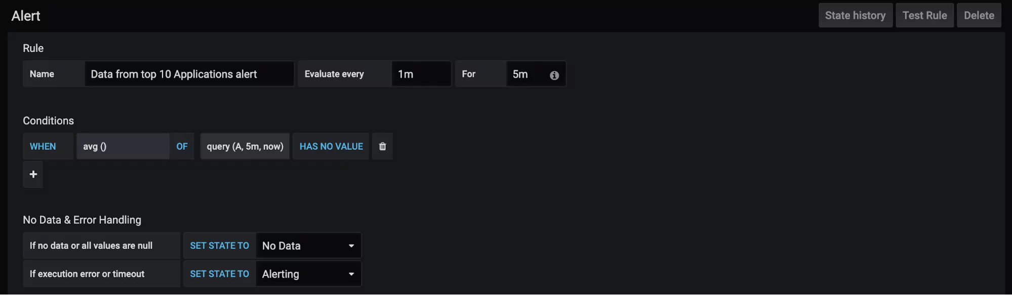
Set up alerts or notifications to flag potential data quality problems as soon as they arise so that action can be taken promptly. Regularly reviewing data quality metrics allows you to identify areas of improvement and make necessary adjustments to maintain high data quality standards.

  1. Make metrics actionable

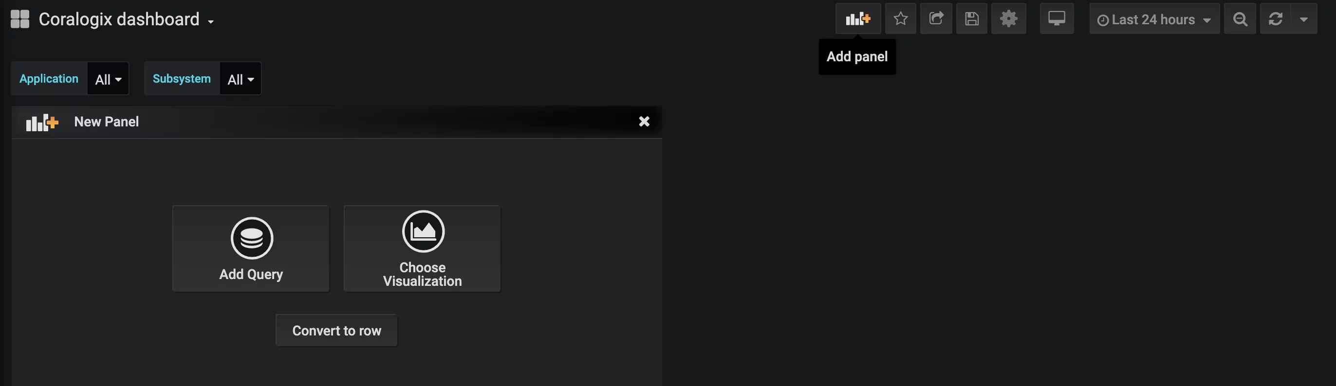
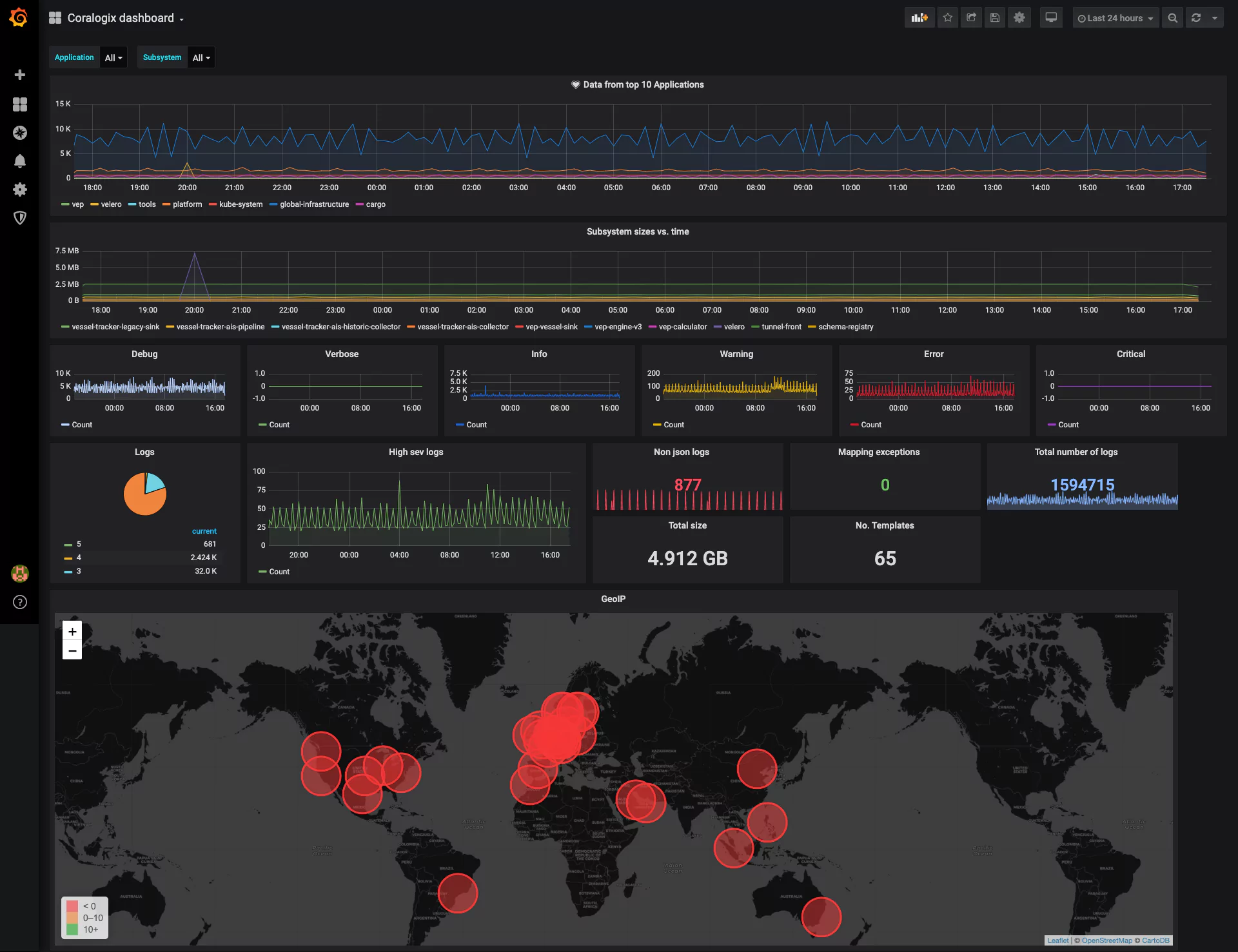
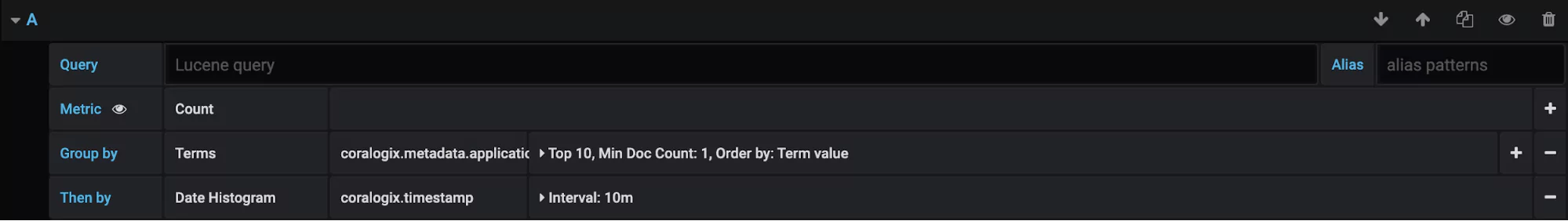
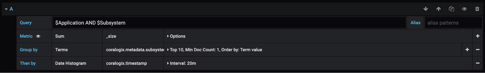
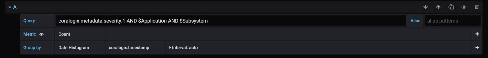
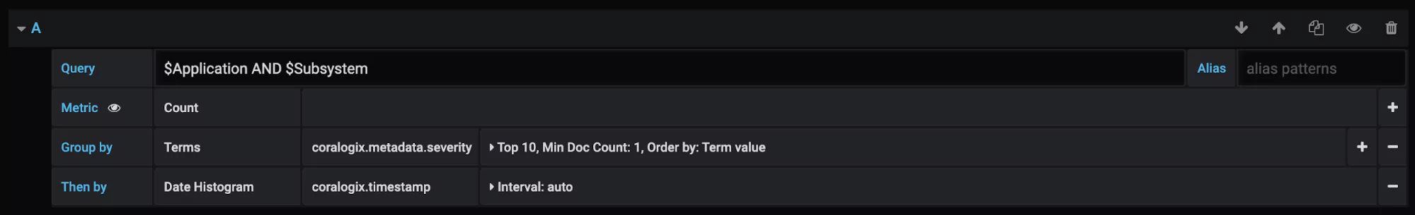
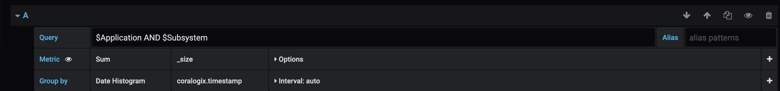
Data quality metrics and KPIs must be created and displayed so actions can be easily seen and taken. Up-to-date metrics should always be available for viewing on the Coralogix custom dashboard configured in a way that can be easily understood by data engineers, developers, and stakeholders alike. (You should be able to see the data health status at a glance to know if actions should be taken to fix anything.)

Each metric should be displayed based on its usefulness. The timeliness metric measuring how old data is should be updated periodically to indicate the current age of data. When data becomes too old, action should be taken to update or remove expired data. The Coralogix custom webhooks alert could be used to trigger automatic actions wherever available.

Logs vs Metrics: What Are They and How to Benefit From Them

In a rapidly evolving realm of IT, organizations are constantly seeking peak performance and dependability, leading them to rely on a full stack observability platform to obtain valuable system insights.

That’s why the topic of logs vs metrics is so important with both of these data sources playing a vital role, as any full-stack observability guide would tell you, serving as essential elements for efficient system monitoring and troubleshooting. But what are logs and metrics, exactly?

In this article, we’ll take a closer look at logs vs metrics, explore their differences, and see how they can work together to achieve even better results.

What are logs? 

Logs serve as a detailed record of events and activities within a system. They provide a chronological narrative of what happens in the system, enabling teams to gain visibility into the inner workings of applications, servers, and networks.

Log messages can contain information about user authentication, database queries, or error messages. They can present different levels, for instance:

  • Information for every action that was successful, like a server start.
  • Debug for information that is useful in a development environment, but rarely in production
  • Warning, which is slightly less severe than errors, signaling that something might fail in the future if no action is taken
  • Error when something has gone wrong and a failure has been detected in the system.

Logs usually take the form of unstructured text with a timestamp:

Logs offer numerous benefits. They are crucial during troubleshooting to diagnose issues and identify the root cause of problems. By analyzing logs, IT professionals and DevOps teams can gain valuable insights into system behavior and quickly resolve issues.

Logs also play a vital role in meeting regulatory requirements and ensuring system security. They offer a comprehensive audit trail, enabling organizations to track and monitor user activities, identify potential security breaches, and maintain compliance with industry standards. They also provide a wealth of performance-related information, allowing teams to monitor system behavior, track response times, identify bottlenecks, and optimize performance.

Despite their many advantages, working with logs can present certain challenges. Logs often generate massive volumes of data, making it difficult to filter through and extract the relevant information. It is also important to note that logs don’t always have the same structure and format, which means that developers need to set up specific parsing and filtering capabilities.

What are metrics?

Metrics, on the other hand, provide a more aggregated and high-level view of system performance. They offer quantifiable measurements and statistical data, providing insights into overall system health, capacity, and usage. Examples of metrics include measurements such as response time, error rate, request throughput, and CPU usage.

Metrics offer several benefits, including:

  • Real-time monitoring: Metrics provide continuous monitoring capabilities, allowing teams to gain immediate insights into system performance and detect anomalies in real time. This enables proactive troubleshooting and rapid response to potential issues.
  • Scalability and capacity planning: Metrics help organizations understand system capacity and scalability needs. By monitoring key metrics such as CPU utilization, memory usage, and network throughput, teams can make informed decisions about resource allocation and ensure optimal performance.
  • Trend analysis: Metrics provide historical data that can be analyzed to identify patterns and trends. This information can be invaluable for capacity planning, forecasting, and identifying long-term performance trends.

While metrics offer significant advantages, they also have limitations. Metrics provide aggregated data, which means that detailed event-level information may be lost. Additionally, some complex system behaviors and edge cases may not be captured effectively through metrics alone.

Logs vs metrics: Do I need both?

The decision to use both metrics and logs depends on the specific requirements of your organization. In many cases, leveraging both logs and metrics is highly recommended, as they complement each other and provide a holistic view of system behavior. While metrics offer a high-level overview of system performance and health, logs provide the necessary context and details for in-depth analysis. 

Let’s say you’re a site reliability engineer responsible for maintaining a large e-commerce platform. You have a set of metrics in place to monitor key performance indicators such as response time, error rate, and transaction throughput.

While analyzing the metrics, you notice a sudden increase in the error rate for the checkout process. The error rate metric shows a significant spike, indicating that a problem has occurred. This metric alerts you to the presence of an issue that needs investigation.

To investigate the root cause of the increased error rate, you turn to the logs associated with the checkout process. These logs contain detailed information about each step of the checkout flow, including customer interactions, API calls, and system responses. 

By examining the logs during the time period of the increased error rate, you can pinpoint the specific errors and related events that contributed to the problem. You may discover that a new version of a payment gateway integration was deployed during that time, causing compatibility issues with the existing system. 

The logs might reveal errors related to failed API calls, timeouts, or incorrect data formats. Armed with the insights gained from the logs, you can take appropriate actions to resolve the issue. In this example, you might roll back the problematic payment gateway integration to a previous version or collaborate with the development team to fix the compatibility issues. 

After implementing the necessary changes, you can monitor both metrics and logs to ensure that the error rate returns to normal and the checkout process functions smoothly.

Using metrics and logs with Coralogix

Coralogix is a powerful observability platform that offers full-stack observability capabilities, combining metrics and logs in a unified interface. With Coralogix, IT professionals can effortlessly collect, analyze, and visualize both metrics and logs, gaining deep insights into system performance.

By integrating with Coralogix, you can benefit from its advanced log parsing and analysis features, as well as its ability to extract metrics from logs. You can aggregate and visualize logs in real-time, making it easier to spot patterns, anomalies, and potential issues. 

Additionally, Coralogix allows you to define custom metrics and key performance indicators (KPIs) based on the extracted data from logs. This combination of metrics and logs enables you to gain comprehensive insights into your system’s behavior, efficiently identify the root causes of problems, and make data-driven decisions for optimizing performance and maintaining robustness in your applications.

Getting Started with Grafana Dashboards using Coralogix

One of the most common dashboards for metric visualization and alerting is, of course, Grafana. In addition to logs, we use metrics to ensure the stability and operational observability of our product. 

This document will describe some basic Grafana operations you can perform with the Coralogix-Grafana integration. We will use a generic Coralogix Grafana dashboard that has statistics and information based on logs. It was built to be portable across accounts. 


Grafana Dashboard Setup

The first step will be to configure Grafana to work with Coralogix. Please follow the steps described in this tutorial.

Download Coralogix-Grafana-Dashboard

Import Dashboard:

  1. Click the plus sign on the left pane in the Grafana window and choose import
  2. Click on “upload .json file” and select the file that you previously downloaded
  3. Choose the data source that you’ve configured
  4. Enjoy your dashboard 🙂


Basic Dashboard Settings

Grafana Time Frame

  1. Change the timeframe easily by clicking on the time button on the upper right corner.
  2. You can select the auto-refresh or any other refresh timeframe using the refresh button on the upper right corner.


Grafana Panels

Panels are the basic visualization building block in Grafana.

Let’s add a new panel to our dashboard:

1. Click the graph button with the plus sign on the upper right corner – A new empty panel should open. 

2. Choose the panel type using the 3 buttons:

  • “Convert to row” – A row is a logical divider within a dashboard that can be used to group panels together. Practically creating a sub dashboard within the main dashboard.
  • “Add a new query” – “Query” is a graph that describes the results of a query. It outlines the log count that the query returns per the time frame. Queries support alerts.
  • “Add a new visualization” – Visualsions allows for a much reacher format, giving the user the option to choose between graph bars, lines. Heat maps etc.

3. Select “Add a new query”. It will open the query settings form and you will be able to make the following selections:

  • choose the data source that you want to query.
  • Write your query in Lucene (Elastic) syntax. 
  • Choose your metric
  • You can adjust the interval to your needs


Grafana Variables

Variables are the filters at the top of the dashboard.

To configure a new variable:

  1. Go to dashboard settings (the gear at the top right)
  2. Choose variables and click new
  3. Give it a name, choose your data source, and set the type to query
  4. Define your filter query. As an example, the following filter query will create a selection list that includes the first 1000 usernames, ordered alphabetically {“find”: “terms”, “field”: “username”, “size”: 1000}
  5. Add the variables’ names to each panel you would like the filter to be applied to. The format is $username (using the example from step 4).


Grafana Dashboard Visualizations

Now, let’s explore the new dashboard visualizations:


  1. Data from the top 10 applications: This panel (of type query) displays the account data flow (count of logs) aggregated by applications. You can change the number of applications that you want to monitor by increasing/decreasing the term size. You can see the panel definition here:

This panel includes an alert that will be triggered if an average of zero logs were sent during the past 5 minutes. To access the alert definition screen click on the bell icon on the panel definition pane. Note that you can’t define an alert when you apply a variable on the panel.

  1. Subsystem sizes vs. time: in this panel (of type query), you can see the sum by size. The sums are grouped by a subsystem, you can see the panel definition here:
  2. Debug, Verbose, Info, Warning, Error, Critical:  In these panels (of type query), you can see the data flow segmented by severity. Coralogix severities are identified by numbers 1-6 designating debug to critical. Here is the panel definition for debug:
  3. Logs:  In this panel (of type visualization), we’ve used the pie chart plugin, it shows all the logs of the selected timeframe grouped by severity. You can use this kind of panel when you want to aggregate your data by a specific field. You can see the panel definition here:
  4. The following 5 panels (of type visualization) are similar to each other regarding definition. They use the stat visualization format and show a number indicating the selected metric within the time frame. Here’s on example of the panel definition screen:
  5. GeoIP: In this panel (of type visualization), we use a world map plugin. Also, we’ve enabled the geo enrichment feature in Coralogix. Here is the panel definition:

Under the “queries” settings choose to group by “Geo Hash Grid”, the field should be from geo_point type.

Under the Visualization, settings select these parameters in “map data options” and add to the field mapping the name of the field that contains the coordinates (the same field you chose to group by). To access visualizations settings click on the graph icon on the left-hand side.


For any further questions on Grafana and how you can utilize it using Coralogix or even if managing your own Elasticseach, feel free to reach out via chat. We’re always available right here at the bottom right chat bubble.