Like many cool tools out there, this project started from a request made by a customer of ours.
Having recently migrated to our service, this customer had ~30TB of historical logging data. This is a considerable amount of operational data to leave behind when moving from one SaaS platform to another. Unfortunately, most observability solutions are built around the working assumption that data flows are future-facing.
To put it in layman’s terms, most services won’t accept an event message older than 24 hours. So, we have this customer coming to us and asking how we can migrate this data over, but those events were over a year old! So, of course, we got to thinking…
Data Source Requirements
This would be a good time to describe the data sources and requirements that we received from the customer.
We were dealing with:
~30 TB of data
Mostly plain text logs
Various sizes of gzip files from 1GB to 200KB
A mix of spaces and tabs
No standardized time structure
Most of the text represents a certain key/value structure
So, we brewed a fresh pot of coffee and rolled out the whiteboards…
Sending the Data to Coralogix
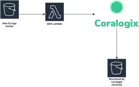
First, we created a small bit of code to introduce the log lines into Coralogix. The code should work in parallel and be as frugal as possible.
Once the data is coming into Coralogix, the formatting and structuring of the data can be done by our rules engine. All we needed is to extract the timestamp, make it UNIX compatible, and we are good to go.
We chose to do this by implementing a Lambda function with a SAM receipt. The Lambda will trigger for each S3 PUT event so we can have a static system costing us nothing on idle and always ready to handle any size of data dump we throw its way.
Now that we have the data streaming in, we need to make sure it keeps its original timestamp. Don’t forget it basically has two timestamps now:
Time of original message
Time of entry to Coralogix
In this part, we make the past timestamp the field by which we will want to search our data.
Like every good magic trick, the secret is in the moment of the swap, and for this solution this is it.
Since we have the original time stamp, we can configure it to be of a Date type. All we need to do in Coralogix is make sure the field name has the string timestamp in its name (i.e. coralogix_custom_timestamp).
Some parts of Coralogix are based on the community versions of Elastic stack, so we also place some of the advanced configurations at the user’s disposal (i.e. creation of index templates or Kibana configurations).
Creating Index Patterns
At this point, we need to create a template for new indexes to use our custom timestamp field.
While the Elastic engine will detect new fields and classify them accordingly by default, we can override this as part of the advanced capabilities of Coralogix.
Once this part is done, we will have the ability to search the “Past” in a native way. We will be able to set an absolute time in the past.
To create the templates, click on the Kibana logo on the top right of the Coralogix UI -> select Management -> Index Patterns. This is essentially where we can control the template which creates the data structures of Coralogix.
First, we should remove the current pattern template (i.e. *:111111_newlogs*).
Note – This step will only take effect on the creation of the new index (00:00:00 UTC).
Clicking on Create index format, one of the first parameters we are asked to provide is the field which will indicate the absolute time for new indices. In this case, “Time filter field name”.
If using the example field name suggested earlier, the field selected should be “coralogix_custom_timestamp”.
Sending Data to S3
Now that we have a team with flowing historical data and a time axis aware of the original time, all we have left is to point the Coralogix account to an S3 bucket to grant us endless retention. Essentially, the data goes through Coralogix but does not stay there.
For this step, we will use our TCO optimizer feature to configure a new policy for the application name we set on our Lambda. This policy will send all of our data to our S3 bucket.
Now the magic is ready!
Wrapping Up
Once a log gzip file is placed in S3, it will trigger an event for our Lambda to do some pre-parsing for it, and send it to Coralogix.
As data flows through Coralogix, it will be formatted by the rules we set for that application.
The data will then be structured and sent to S3 in a structured format. Once the data is sent to S3, it is no longer stored in the Coralogix platform in order to save on storage costs. You can still use Athena or any search engine to query the data with low latency. Behold! Your very own data lake was created with the help of Coralogix. If you have any questions about this or are interested in implementing something similar with us, don’t hesitate to reach out!
Kibana is the most popular open-source analytics and visualization platform designed to offer faster and better insights into your data. It is a visual interface tool that allows you to explore, visualize, and build a dashboard over the log data massed in Elasticsearch clusters.
An Elasticsearch cluster contains many moving parts. These clusters need modern authentication mechanisms and they require security controls to be configured to prevent unauthorized access. To prevent unauthorized access to your Elasticsearch cluster, you must have a way to authenticate users.
Using SAML (Security Assertion Mark-up Language) authentication is one of them. SAML authentication allows users to log in to Kibana with an external Identity Provider, such as Google using OAuth as the authentication protocol. The current version is OAuth2.
Basic Description of OAuth2
OAuth2 works by delegating user authentication to the service that hosts a user account and authorizing third-party applications to access that user account. It provides authorization flows for web and desktop applications, and mobile devices.
To follow is a functional guide on how to use an OAuth authentication system like Google Sign-In to log in to Kibana.
Authenticating Kibana with Google & OAuth 2
Prerequisites
The following assumptions are to be made:
That your cluster version is 7.x or above
That your Kibana instance version is 7.x or above
Configuring SAML single-sign-on on the Elastic Stack for Kibana
The Elastic Stack supports SAML SSO (single sign-on) into Kibana, using Elasticsearch as a backend service. To enable SAML single-sign-on, you require the Identity Provider, which acts as the service that handles your credentials (such as Google log-in details) and performs that actual authentication of users. This means providing Elasticsearch with information about the OAuth Identity Provider and registering the Elastic Stack as a known Service Provider within the same Identity Provider. A few configuration changes are required in Kibana to activate the SAML authentication provider. Once you enable SAML authentication in Kibana it will affect all users who try to log in.
Configuring your Elasticsearch cluster to use SAML
You must edit your cluster configuration, to point to the SAML Identity Provider before you can complete the configuration in Kibana.
Before any messages can be exchanged between an Identity Provider and a Service Provider, you need to know the configuration details and capabilities of the other. This configuration and the capabilities are encoded in an XML document, that is the SAML Metadata of the SAML entity. This is known as a SAML realm used within the authentication chain for Elasticsearch. It will define the capabilities and features of your identity provider such as Google.
Most Identity Providers such as Google will provide an appropriate metadata file with all the features that the Elastic Stack requires.
Assuming that your Identity Provider is up and running, there are only two prerequisites: TLS for the HTTP layer and the Token Service needs to be enabled in Elasticsearch.
Creating the SAML Realm
You create a realm by adding the following to your elasticsearch.yml configuration file.
The following configuration example represents a minimal functional configuration. This configuration creates a SAML authentication realm with a saml-realm name of saml1.
Where ‘kibana.example.com‘ is represented in the SAML authentication realm, it actually defines the <KIBANA_ENDPOINT_URL>
You can retrieve your <KIBANA_ENDPOINT_URL> from the Elasticsearch Service Console by clicking on the Kibana Copy endpoint in the details of your deployment.
Defining your Configuration Properties
The key configuration properties of a SAML authentication realm consist of:
Property Name
Property Description
Order
This represents the order of the SAML realm in your authentication chain. Allowed values are between 2 and 100. Set to 2 unless you plan on configuring multiple SSO realms for this cluster.
idp.metadata.path
This is the file path or the HTTPS URL where your Identity Provider metadata is available, such as https://idpurl.com/sso/saml/metadata. The path that you enter here is relative to your config directory. Elasticsearch will automatically monitor this file for changes and will reload the configuration whenever it is updated.
idp.entity_id
This is the SAML EntityID of your Identity Provider. This can be read from the configuration page of the Identity Provider, or its SAML metadata, such as https://idpurl.com/entity_id. It should match the EntityID attribute within the metadata file.
sp.entity_id
This is the SAML EntityID of the Service Provider. This can be any URI but it’s good practice to set it to the URL where Kibana is accepting connections. You will use this value when you add Kibana as a service provider within your Identity Provider. It is recommended that you use the base URL for your Kibana instance as the entity ID.
sp.acs
This is the Assertion Consumer Service (ACS) URL where Kibana is listening for incoming SAML messages. This ACS endpoint supports the SAML HTTP-POST binding only. It must be a URL that is accessible from the web browser of the user who is attempting to log in to Kibana. It does not need to be directly accessible by Elasticsearch or the Identity Provider. This should be the /api/security/v1/saml endpoint of your Kibana server.
sp.logout
This is the SingleLogout endpoint where the Service Provider is listening for incoming SAML LogoutResponse and LogoutRequest messages. This is the URL within Kibana that accepts logout messages from the Identity Provider. This should be the /logout endpoint of your Kibana server.
attributes.principal
This defines which SAML attribute is going to be mapped to the principal (username) of the authenticated user in Kibana. You would use the special nameid:persistent which will map the NameID with urn:oasis:names:tc:SAML:2.0:nameid-format:persistent format from the Subject of the SAML Assertion. You can use any SAML attribute that carries the necessary value for your use case in this setting.
Identity Provider URL/EntityID Mappings used in the SAML authentication realm
To identify the URL of where your Identity Provider metadata is, it is best to reference the admin console of that Identity Provider. This can provide key configuration settings including the SAML EntityID.
Configuring your Google Identity Provider
Specific to the Google Identity Provider, the following steps can be followed:
Sign in to your Google Admin console at: https://admin.google.com/
You need to sign in using an account with super administrator privileges (not your current google account)
Navigate to Apps > SAML Apps, and click
The Enable SSO for SAML Application screen displays
Click Setup My Own Custom App
Write down the Entity ID and download the Identity Provider metadata file
This information will provide the necessary details for the SAML authentication realm. In the preceding steps, further actions or next steps can be taken by adding the <KIBANA_ENDPOINT_URL> to the URL and ID configurations in the Service Provider Details screen.
On completion of these steps, this would enable a SAML application for Kibana using the Google Identity Provider. User Access will still need to be activated from the Google Admin console and select the created application.
Configuring Kibana
Elasticsearch Service supports most of the standard Kibana and X-Pack settings. Through a YAML editor in the console, you can append Kibana properties to the kibana.yml file. Your changes to the configuration file are read on startup.
SAML authentication in Kibana requires a small number of additional settings in addition to the standard Kibana security configuration. In particular, your Elasticsearch nodes will have been configured to use TLS on the HTTP interface, so you must configure Kibana to use a HTTPS URL to connect to Elasticsearch. SAML authentication in Kibana is also subject to the xpack.security.sessionTimeout setting and you may wish to adjust this timeout to meet your local needs.
Configuration Settings depending on Kibana Instance Version
Version 7.7
If you are using a Kibana instance of version 7.7 or later add to the configuration file:
This configuration disables all other realms and only allows users to authenticate with SAML. If you wish to allow your native realm users to authenticate, you need to also enable the basic provider like this:
xpack.security.authc.providers:
  saml.saml1:
    order: 0
    realm: saml-realm-name
    description: "Log in with my SAML"
  basic.basic1:
    order: 1
This might come in handy for administrative access and as a fallback authentication mechanism, in case the Identity Provider is unresponsive.
Versions 7.3 to 7.6
If you are using a Kibana instance between versions 7.3 – 7.6 then add to the configuration file:
This configuration disables all other realms and only allows users to authenticate with SAML. If you wish to allow your native realm users to authenticate, you need to also enable the basic provider by setting xpack.security.authc.providers: [saml, basic] in the configuration of Kibana.
Version 7.2
If you are using a Kibana instance of version 7.2 then add to the configuration file:
xpack.security.authProviders: [saml]
server.xsrf.whitelist: [/api/security/v1/saml]
xpack.security.public:
  protocol: https
  hostname: [hostname from your Kibana endpoint URL]
  port: 9243
The cloud endpoint port: 9243 is the port on which Elasticsearch and Kibana are listening.
This configuration will also disable all other realms and only allows users to authenticate with SAML. If you wish to allow your native realm users to authenticate, you can enable the basic authProvider by setting xpack.security.authProviders: [saml, basic] in the configuration of Kibana.
Operating multiple Kibana instances
If you wish to have multiple Kibana instances that authenticate against the same Elasticsearch cluster, then each Kibana instance that is configured for SAML authentication requires its own SAML realm.
Each SAML realm must have its own unique Entity ID (sp.entity_id), and its own Assertion Consumer Service (sp.acs). Each Kibana instance will be mapped to the correct realm by looking up the matching sp.acs value.
These realms may use the same Identity Provider but are not required to.
The following is an example of having 2 different Kibana instances, 1 of which uses the same internal Identity Provider, and another which uses a different external Identity Provider (such as Google).
It is possible to have one or more Kibana instances that use SAML, while other instances use basic authentication against another realm type.
All in all…
What we’ve been through is using Google to log into your Kibana instance. The Elastic Stack security features now support user authentication, using techniques such as SAML SSO for external identity providers, including OAuth. It is a protocol specifically designed to support authentication via an interactive web browser. There are now Kibana and Elasticsearch security features that work together to enable interactive SAML sessions, and enable you to log in with your Google account.
Being able to log into Kibana with a Google sign-in, will enable you to analyze data source logs in the form of line graphs, bar graphs, pie charts, heat maps, region maps, coordinate maps, gauges, goals, timelion, etc. These visualizations will make it easy to predict or to see the changes in trends of errors or other significant events of the input source.
When it comes to dashboarding, Kibana is king. Since its release Kibana has changed the way businesses visualize data. Kibana is a fairly intuitive platform and offers some seriously impressive methods ofdata analysis and visualization. In this kibana dashboard tutorial, we are going to help you unlock the full potential of the platform and help you become a Kibana guru. When it comes to visualizing data Kibana is well-suited for monitoring logs, application monitoring, and operational intelligence. Get ready to blow everyone away with your abilities to visualize data! So without further ado, let’s take a look at some outstanding examples of Kibana dashboards.
Kibana Dashboard Examples
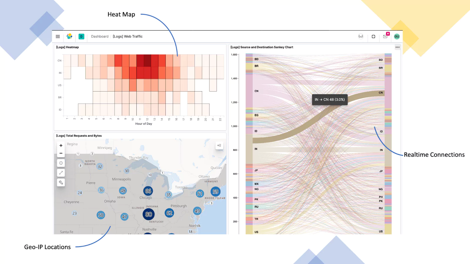
Web Server (Nginx Logs)
In this example, we are using logs from a Nginx server that is configured as a reverse proxy for a corporate website. Here we are providing visualization in the form of a heat map, breaking down the hours of a day, geo-IP addressing for the total number of requests and bytes, and finally geo-IP source and destination.
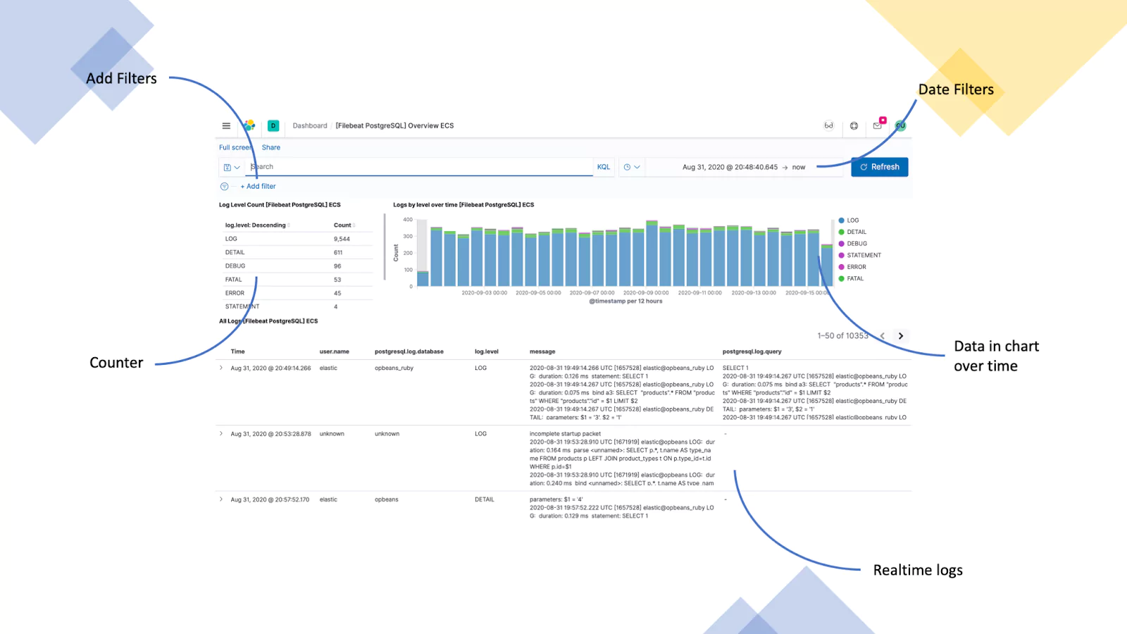
Database Server (PostgreSQL Logs)
This example uses logs from a PostgreSQL server that is used in a web application. We are visualizing the total number of a given log type, logs by level over time, and a list of recent logs.
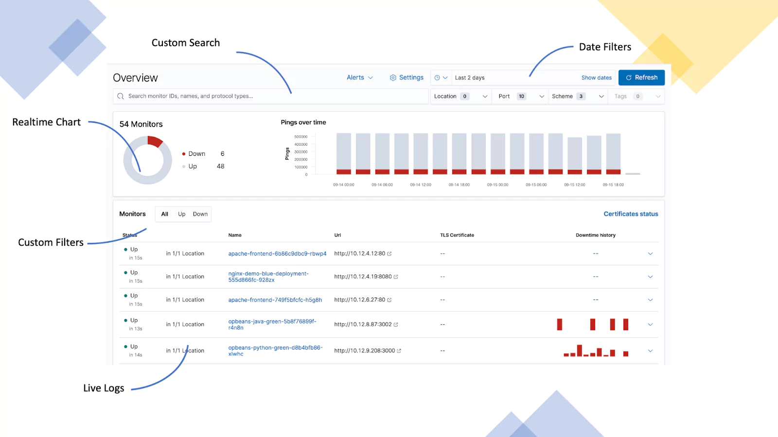
Server Uptime (ICMP Logs)
This dashboard is displaying the availability of several servers. The data is provided as ICMP logs which indicate when the server last responded. If a server does not respond for 60 seconds, it is classed as down.
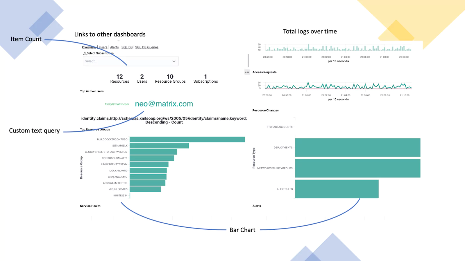
Azure Monitoring (Azure Activity Logs)
This dashboard is using logs from Azure. It provides visibility into user activity. In this screen, we are showing a high-level summary of user activity levels, access requests, the top active users, and any resource groups that have been changed.
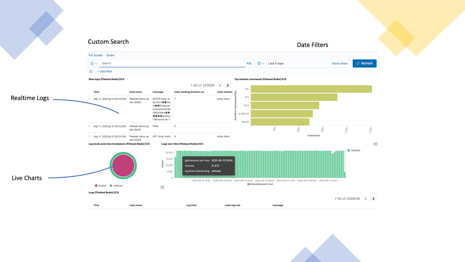
Redis Server (Redis Logs)
This example uses logs from a Redis server that is used in a web application. We are visualizing incoming logs, top commands, logs levels & roles, and finally logs over time.
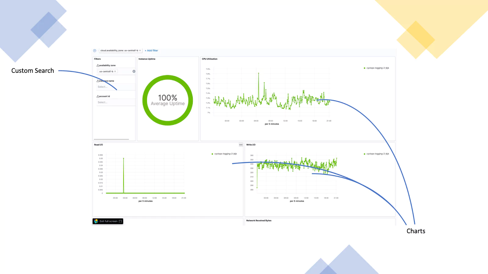
Google Cloud (GC Logs)
This dashboard focuses on the availability of a set of servers. The Dashboard has a filter call out built-in and displays the instances uptime, CPU Utilisation, disk IO and goes on to show much more.
Visualizations Overview
The most frequently used visualizations for Kibana are the Line charts, Area charts, Bar charts, Pie charts, data tables, metric, maps and gauges. When you click to create a new visualization in Kibana you are shown the new visualization screen to the left. Kibana ships with a vast array of visualizations and often this can be overwhelming. Remember the trick to effective dashboards is simplicity. This should enable you to select the correct Kibana visualization to achieve your desired dashboard. If you are unsure though we have put together a handy table that outlines the Kibana visualizations and their function. This should give you some context before we get into the kibana dashboard tutorial.
Charts
You can use an Area chart to visualize time series data with the functionality for splitting lines based on fields.
Sign-ups over time.
The horizontal bar chart is used to visualize relationships between two fields.
Social media platform referrer and web page.
The line chart visualizes time series data and enable split lines to highlight anomalies.
Memory usage over time by server.
The pie chart visualizes values that, combined, create a total figure.
Top 10 referral websites.
The heat map chart us used to visualize two fields that show the magnitude of a phenomenon as colour.
Clicks on a web page.
Use the Vertical bar chart when you wish to compare one or more fields
Users on page over time.
Data
The data table provides a way to create a basic table representing fields in a custom way.
Sign-ups over time.
The goal gauge provides a visual representation of a current figure vs a goal.
Sales target.
The gauge provides a specific metric. Users can create their own thresholds.
CPU utilisation.
The metric provides a way to display a calculation based on your data as a single figure.
Number of containers running.
Other
The Map visualizations allow a way to aggregate geographical data on a map.
IP based logs as Geo-IP.
The markdown visualization allows customized text or image based visualizations to your dashboard based on the markdown syntax.
Organization logo or a call out in a dashboard.
The tag cloud visualization allows you to size groups of words, based on their importance.
A list of products and their popularity.
The time series visualizations allow you to create custom queries based on time series data.
Percentage of access denied error over time.
The Vega visualization provide the ability to add custom visualizations based on Vega and VegaLite.
Advanced Custom SQL
Before you jump in!
Before you start building any dashboards, it’s important to plan out what you are trying to achieve. Jumping in and just building a dashboard is a recipe for disaster. The key to information-rich dashboards is the quality of the data. With this in mind, you want to start from the objective of the dashboard and work backward. This allows you to map out your required data inputs and ensure your logs are configured to provide the right data. You will also need to think about how you are parsing the data into the platform. If you have allowed elastic to-do this automatically it’s highly probable you are going to need to tweak the fields to ensure they make sense at the dashboarding phase.
To help you think about this process and formulate the best possible plan to successfully implement your dashboard ask yourself the following questions:
What does your dashboard need to present?
What data do you need?
How will your data need to be queried to provide the correct outputs?
What visualizations will you be using?
The Basics
The first step after you have Kibana deployed is to login! Kibana runs as a service on port 5061. As a result, you need to enter https://YOURADDRESS:5061. Navigating to this will present you with the below page:
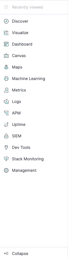
This is the front page of Kibana which displays the menu bar which is used to navigate around the platform. The bottom left hand button will expand the menu bar to display the different menu options.
Creating an Index Pattern
The first part of using Kibana is to set up your data once you have ingested it into Elastic. An index pattern tells Kibana what Elasticsearch index to analyze. The most common way to ingest logs is using Logstash. You can find out how to configure Logstash here.
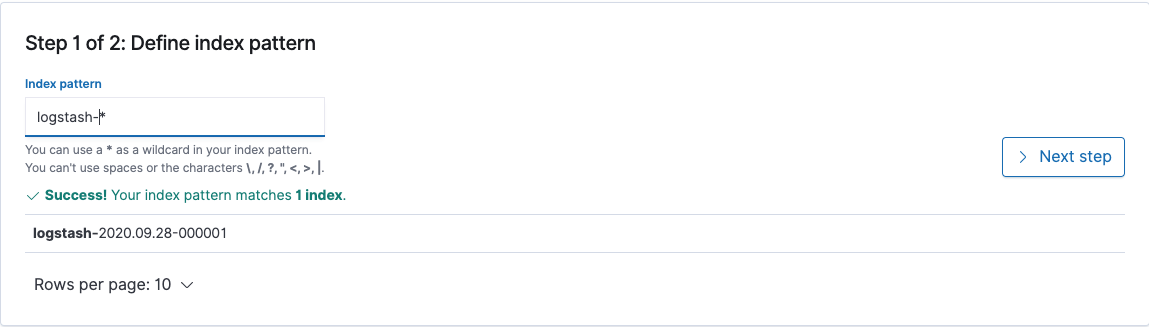
In this example we have logstash shipping logs to our Elasticsearch cluster ready for Kibana. To set up your index patterns Click on the management button and then index patterns. Here you will configure how to group your indexes for use with Kibana. To set up your first index pattern click Create Index Pattern. Here you will need to enter the index pattern definition. In its rawest form this is the name in which the index pattern starts. You can use a * to add a wildcard to the end of your pattern. An example logstash-* will catch any indices that start with logstash-*. An example of this can be found below. You will need to create an index pattern for each data set you wish to visualize in Kibana.
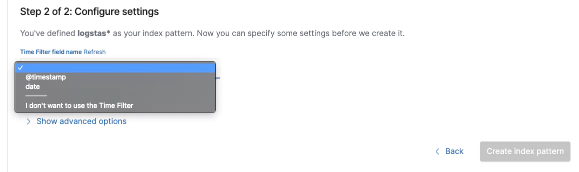
Click ‘Next step’ and then you will need to configure your timestamp. This is how Kibana will know what metrics to use for the time and date in the platform.
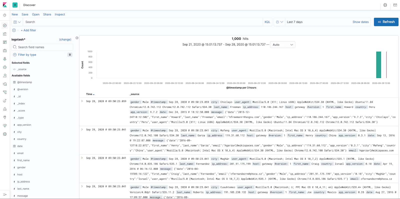
In our Logstash example we will be using @timestamp. This is the time and date that kibana takes from the log. You might want to use another field should your logs contain another date source for higher accuracy. Once configured click on the ‘Create index pattern’ button. Your index is now live and ready for usage in Kibana. To verify this, let’s see what data Kibana has access to. On the main menu click ‘Discover’.
If you don’t see any logs, make sure your time and date filter is set to a range that includes data like below (For our example we have it set to last 7 days):
You are now able to see and filter all the data available to Kibana.
Creating searches for presenting data
Now that we have data in Kibana, it’s time to build our searches. Searches help us focus our data for building visualizations. Using the ‘discover’ page from the above enables access to the raw data in the platform allowing you to note your available fields ready for building visualizations, which will ultimately make up your dashboard.
The discover page has a search and filter functionality. Once you have located your desired data set use the save option. You can use saved searches on different datasets and the advantage is changing the saved searches will also update all the linked visualizations negating the need to update them all individually!
Searches that have been saved can also be inserted into the dashboards. Which will provide your dashboard with a quick link to jump into the discover tab allowing users to see the related logs to the dashboard.
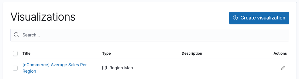
Creating a Visualization
Your data is ready, your searches are saved, let’s build our first visualization! On the main menu bar select ‘Visualize’.
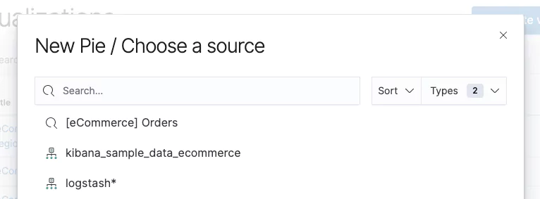
Click on create visualization and select which visualization type you would like to use. In this example we are going to make a pie chart. The sources displayed will be the index patterns we configured earlier.
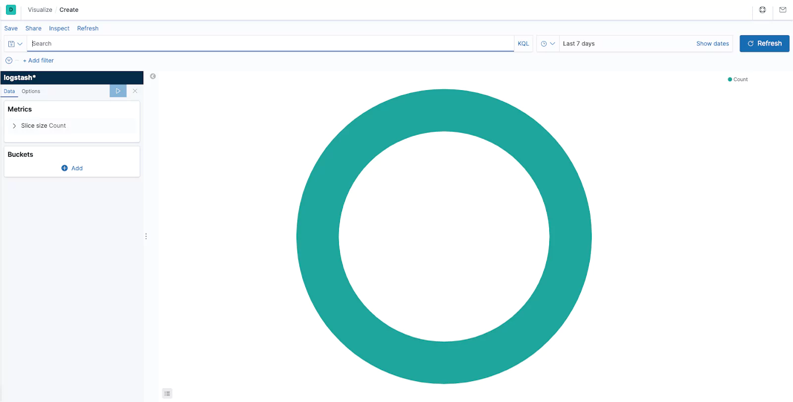
In this example we are going to use our Logstash indexes. Kibana will load with its defaults. You can open your previously created saved searches at the top like you would in the ‘Discover’ page. The left hand menu bar enables you to customize your visualization. Kibana offers two types of data aggregations. The first is Metric aggregations and the second is bucket aggregations.
Buckets create aggregations of data based on a certain criteria. Depending on your aggregation type you can create buckets that provide filtering. This filtering can allow you to present your data in the form of value ranges and intervals for dates, ip ranges and more. You will want to apply a bucket to a pie chart to display the data that provides context. In the below example we have applied a bucket that uses an aggregation of terms on the field email.keyword and specified a size of 5. As a result we see the top five email addresses, in alphabetical order.
Metric aggregations are used to calculate a value for each bucket based on the documents inside the bucket. Every visualization type has its own unique characteristics providing different ways to present buckets and their associated values. In our pie chart example below the slices are determined by the buckets. The size of the slice is determined by the metric aggregation.
Tip – When you make a change click the play button to refresh the chart.
Now our visualization is starting to provide a meaningful chart. We are able to customise the chart further in the advanced tab. Should you wish to interrogate the raw data generating the graph then click on the inspect button.
The advanced tab will provide the capabilities to change the style of our visualization to suit our requirements. We can also add and remove items like labels. Each visualization is independently configurable. It’s best to experiment with the options to find what works best for your own visualizations.
Once you are happy the save button allows you to save your visualization. Enter a title and description. It’s important that these are specific, as you create multiple visualizations it can often be hard to find them without a good naming convention!
Finally, a visualization can be shared. This allows you to provide a link or embed code into a website that will display the visualization. When you share your visualizations you have two options, you can either share a saved visualization or a snapshot of the current state. A saved visualization will allow users to see recent edits, whereas the snapshot option will not.
Tip: If you are looking to share visualizations and dashboards the users you are sharing them with need to have access to the Kibana server.
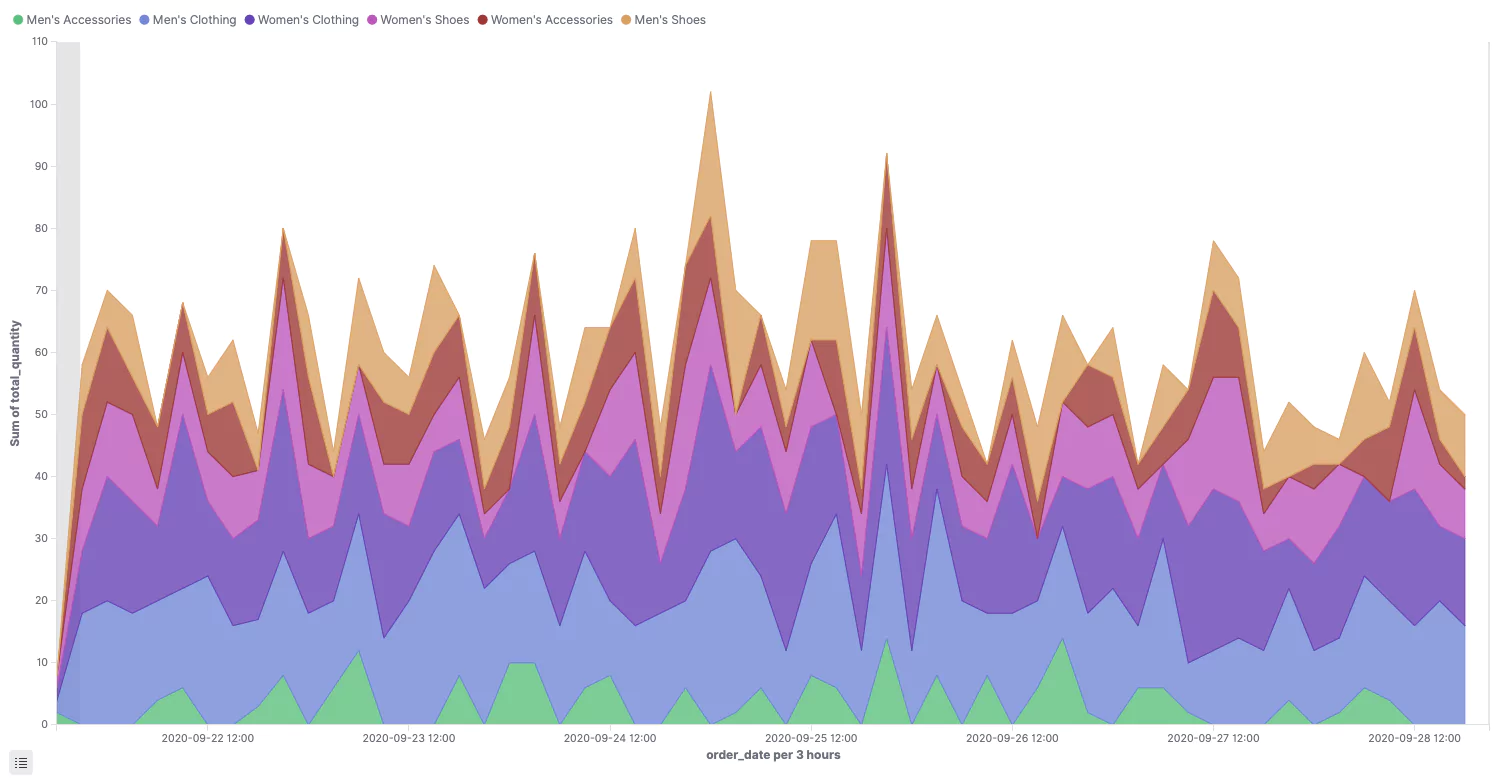
Let’s take a look at creating another type of visualization. In this example we are going to look at creating an area chart. Much like with the pie chart you have your Metric and your Buckets. Our example is based on data from an ecommerce platform. Metrics have been configured as an aggregation type of Sum, a field of total_quantity, and our buckets have been configured with an aggregation type of Date Histogram, using a field of order_date, with a split aggregation of Terms, using the field category, ordered by the Metric: Sum of total_quantity. The results are as below:
A visualization can be edited at any time. This is achieved by opening the visualization on the visualization page! What’s more when you edit a visualization it will also update on your dashboard.
Now that we know how to create visualizations, it’s time to build a dashboard!
Creating a Dashboard
Now let’s bring together all the work we have done creating exciting visualizations. Dashboards use multiple visualisations. Much like we have learnt putting together visualizations it’s important to plan out your dashboards goal. Adding visualizations is super simple as a result dashboards can become over crowded and lose their meaning. As we have discussed previously its import to focus on your dashboards goal and design accordingly.
It’s important to note that multiple data sources enable you to create advanced dashboards that display vast correlated data, however in doing so you lose the ability to drill down. When you drill down Kibana will add a filter to your data sources that will likely only be relevant to the selected source effectively making the visualizations useless. As a result for dashboards where drill down capabilities are required it is important to ensure your visualizations are based on the same data source!
TIP – You should try to ensure you keep your dashboards to a single page to avoid scrolling.
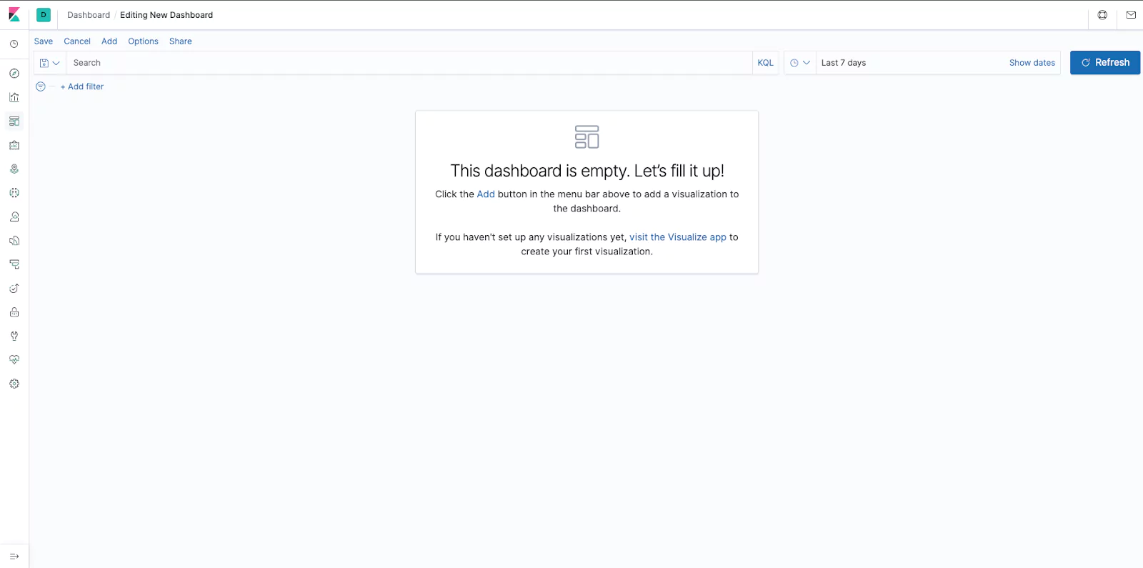
To create your dashboard on the main menu select ‘Dashboard’ and then create dashboard. If you have already been in a dashboard it will load that up, click on the dashboards crumbs in the top left to return to the dashboards home page.
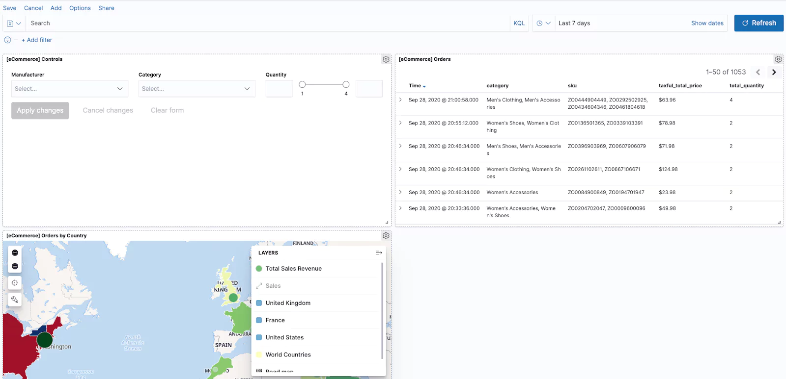
Click on the Add button on the top left to add a visualization. This is where it will pay to have your visualizations well named with a naming convention. Click on the visualization you would like to add. This will add it to the dashboard but you will remain in the add visualization (add panels) page. This enables you to run through and select all of your required visualizations. Once you have added all the visualizations you require you can close the add panels page using the x in the top right corner. You will likely have a screen like the below:
You are now able to move and expand your panels. Once you have your dashboard laid out correctly remember to save it! Much like with our visualizations you can use the Share button in the corner to share your dashboard with other users. You can also change the data set using the search and dates fields at the top of the dashboard.
TIP – The Options button will allow you to remove your visualization title and remove margins between panels.
Finishing Up
Now that we have explored much of the dashboarding capabilities of Kibana you have the power to make powerful dashboards to visualize your data. As demonstrated, Kiabana has many more use cases than just dashboarding, and hopefully, this article has got the creative juices flowing. After you’ve built your perfect dashboard start exploring the other feature, Kibana offers to fully supercharge your data visualization skills. Good luck dashboarding ninjas!
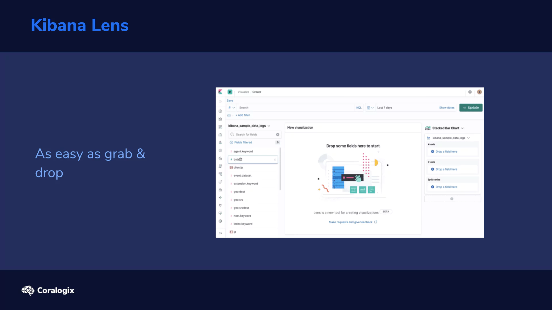
Millions of people already use Kibana for a wide range of purposes, but it was still a challenge for the average business user to quickly learn. Data visualization tools often require quite a bit of experimentation and several iterations to get the results “just right” and this Kibana Lens tutorial will get you started quickly.
Visualizations in Kibana paired with the speed of Elasticsearch is up to the challenge, but it still requires advance planning or you’ll end up having to redo it a few times.
The new kid on the block, Kibana Lens, was designed to change this and we’re here to learn how to take advantage of this capability. So let’s get started!
Theory
Kibana Lens is changing the traditional visualization approach in Elasticsearch where we were forced to preselect a visualization type along with an index-pattern in advance and then be constrained by those initial settings. As needs naturally evolve, many users have wanted a more flexible approach to visualizations.
Kibana Lens accomplishes this with a single visualization app where you can drag and drop the parameters and change the visualization on the fly.
A few key benefits of Kibana Lens include:
Convenient features for fields such as:
Showing their distribution of values
Searching fields by name for quickly tracking down the data you want
Quick aggregation metrics like:
min, max, average, sum, count, and unique count
Switching between multiple chart types after the fact, such as:
bar, area, line, and stacked charts
The ability to drag and drop any field to get it immediately visualized or to breakdown the existing chart by its values
Automatic suggestions on other possible visualization types
Showing the raw data in data tables
Combining the visualization with searching and filtering capabilities
Combining data from multiple index patterns
And quickly saving the visualization allowing for easy dashboard composition
Ok, let’s see how Kibana Lens works!
Hands-on Exercises
Setup
First we need to have something to visualize. The power of Lens really comes into play with rich structured and time-oriented data. To get this kind of data quickly, let’s use the Metricbeat tool which enables us to collect dozens of system metrics from linux, out-of-the-box.
Since we’ve already installed a couple of packages from the Elasticsearch apt repository, it is very easy to add another one. Just apt-get install the metricbeatpackage in a desired version and start the service like so:
Now all the rich metrics like CPU, load, memory, network, processes etc. are being collected in 10 second intervals to our Elasticsearch.
Now to make things even more interesting let’s perform some load testing while we collect our system metrics to see some of the numbers fluctuate. We will do so by a simple tool called stress. The Installation is simply this command:
sudo apt install stress
Before you start, check out how many cores and available memory you have to define the stress params reasonably.
# processor cores
nproc
# memory
free -h
We will run two loads:
First spinning two workers which will max the CPU cores for 2 minutes (120 sec):
stress --cpu 2 --timeout 120
Second running 5 workers that should allocate 256MB of memory each for 3 minutes:
stress --vm 5 --timeout 180
Working with Kibana Lens
Now we are going to create our visualizations using Lens. Follow this tutorial to get the basics around Lens and when you are settled feel free to just “click around” as Lens is exactly the tool with experimentation prebaked in its very nature.
Index pattern
Before we start we need an index pattern that will “point” to the indices that we want to draw the data from. So let’s go ahead and open the Management app → Index Patterns → Create index pattern → and create one for metricbeat* indices. Use @timestamp as the Time Filter.
Creating a visualization
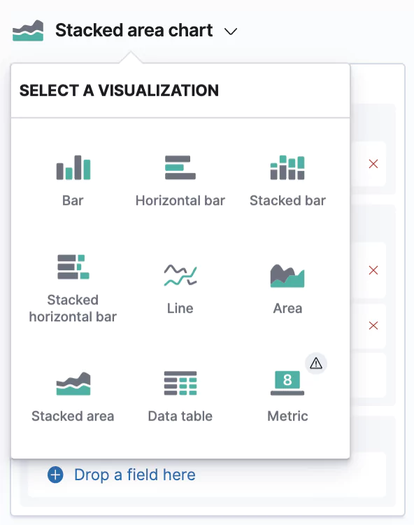
Now we can open the Visualize app in Kibana. You’ll find it in the left menu → Create new visualization → and then pick the Lens visualization type (first in the selection grid). You should be welcomed by an empty screen telling you to Drop some fields.
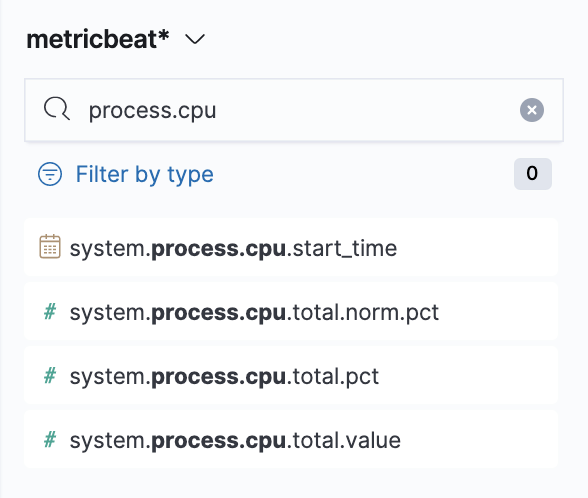
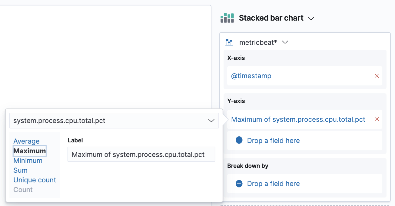
So let’s drop some! Make sure you have selected the metricbeat* index pattern and use the field search on the left panel to search for process.cpu. There will be various options, but we’ll start with system.process.cpu.total.pct → from here just drag it to the main area and see the instant magic that is Kibana VisualizationLens.
Note: if you need to reference the collected metrics of the Metricbeat’s System module, which we’re using, you can find them in the System fields.
Now we’re going to switch the aggregation we have on our Y-axis. The default averages are not really meaningful in this case, what we are interested in is the maximum. So click on the aggregation we have in our right panel → from here choose the Maximum option.
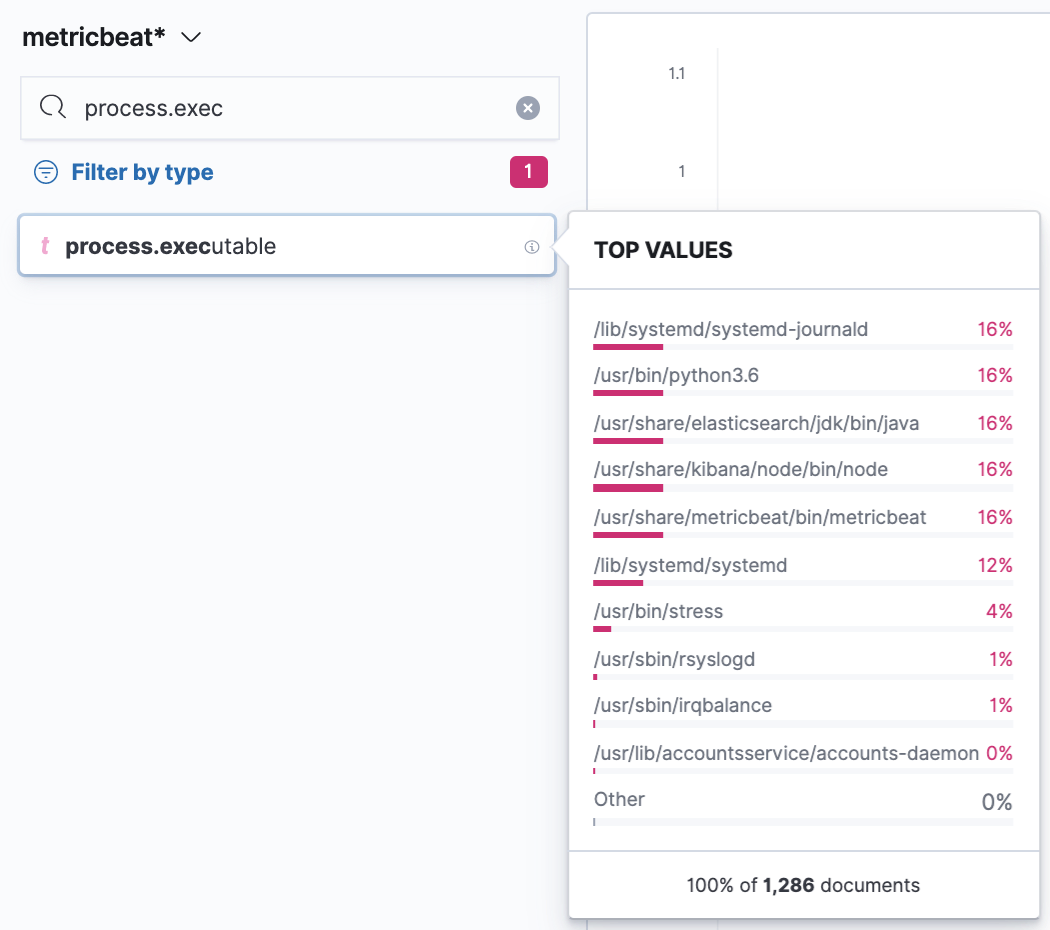
Next, we’ll split the chart by another dimension which is going to be the process.executable to see what binary was running in the process. The technique is the same; just search for the field in the left search panel and it should come up. You can also filter just for string fields first with the Filter by type. If you then click on the given field you’ll find a nice overview of a distribution of the top values for the selected period. In our case, we’ll see which executables had the highest count of collected metrics in the period. To use the field just grab it and drop it to the main area.
We’re starting to see it coming together here, but let’s iterate further, as would be typical when creating such dashboards for a business.
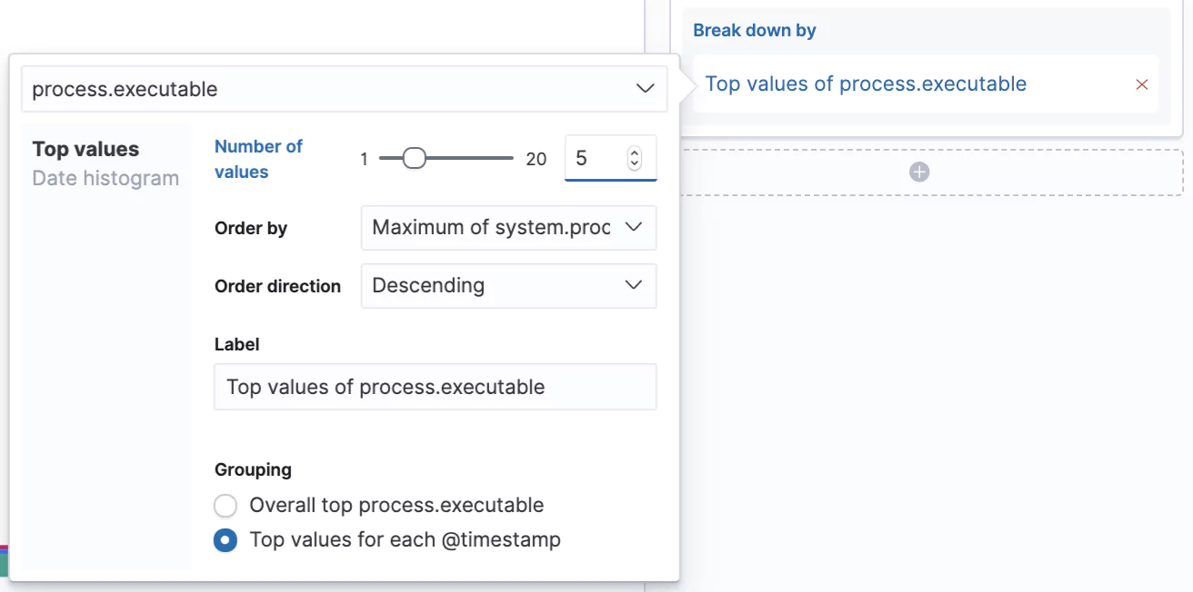
Let’s increase the number of values we can see in our chart from the default 3 to 5 and let’s switch from seeing the Overall top for the given period to Top value for each @timestamp. Now we’ll see the top 5 processes that consumed the most CPU at that given time slot.
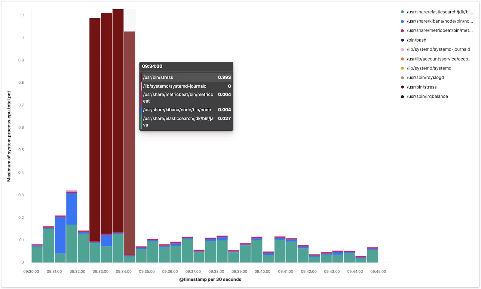
Excellent! Your visualization should look something similar to this:
From the chart you can see how our stress tool was pushing the CPU when it was running.
Now click the Save link in the top left corner and save it as new visualization with some meaningful name like Lens – Top 5 processes.
Perfect!
Visualizing Further
To test out some more Lens features, and to have some more material on a dashboard we are going to create later, we are going to create another visualization. So repeat the procedure by going to Visualize → Create visualization → pick Lens.
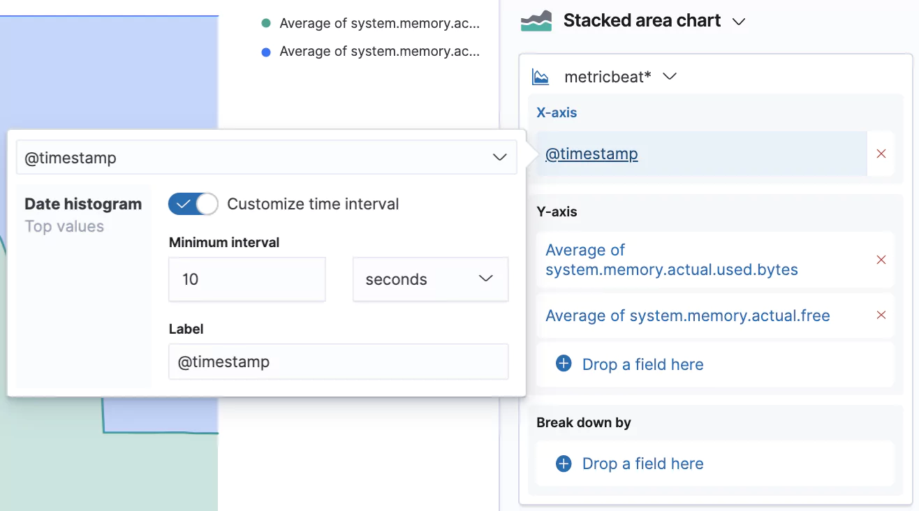
Now search for the memory.actual fields and drag system.memory.actual.used.bytes and system.memory.actual.free into the main area.
This creates another Stacked barchart, but we’re going to change this to a Stacked area chart. You can do so by clicking on the bigger chart icon → and picking the desired type.
We can also customize the granularity of the displayed data which is by default 30 seconds. Our data is actually captured in 10 second intervals, so let’s switch that interval by clicking on the @timestamp in the X-axis box and selecting Customize time interval.
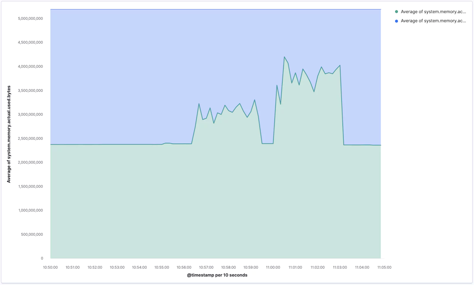
Your new chart, visualizing the memory usage, should look similar to the one below. If you ran the stress command aimed at memory you should see some sharp spikes here.
Make sure you Save your current progress, eg. as Lens – Memory usage.
Layers
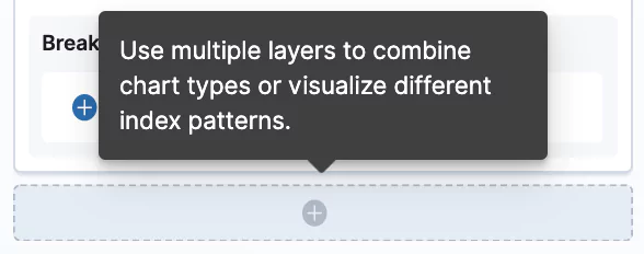
The last feature we are going to try out is the ability to stack multiple layers to combine different types of charts in the same visualization.
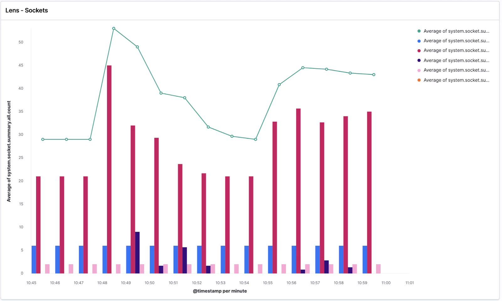
Again create a new Lens visualization and search for the socket.summary metrics, which is what we are going to use for this step.
Drag and drop the system.socket.summary.all.count field → change the chart type to Line chart → and change the Time interval to 1 minute. Easy!
Now click the plus button in the right pane which will add a new visualization layer → change the chart type to Bar chart (you need to do it with the small chart icon of the given layer) → and drop in the @timestamp for the X-Axis and listening, established, time_wait, close_wait from system.socket.summary.tcp.all. → additionally you can add also system.socket.summary.udp.all.count to also see the UDP protocol sockets. Lastly, change the time granularity to the same value as the second layer.
Your visualization should look similar to this:
We can see the average of all socket connections in the line chart and TCP/UDP open sockets in various states in the bar chart.
Got ahead and Save it as Lens – Sockets.
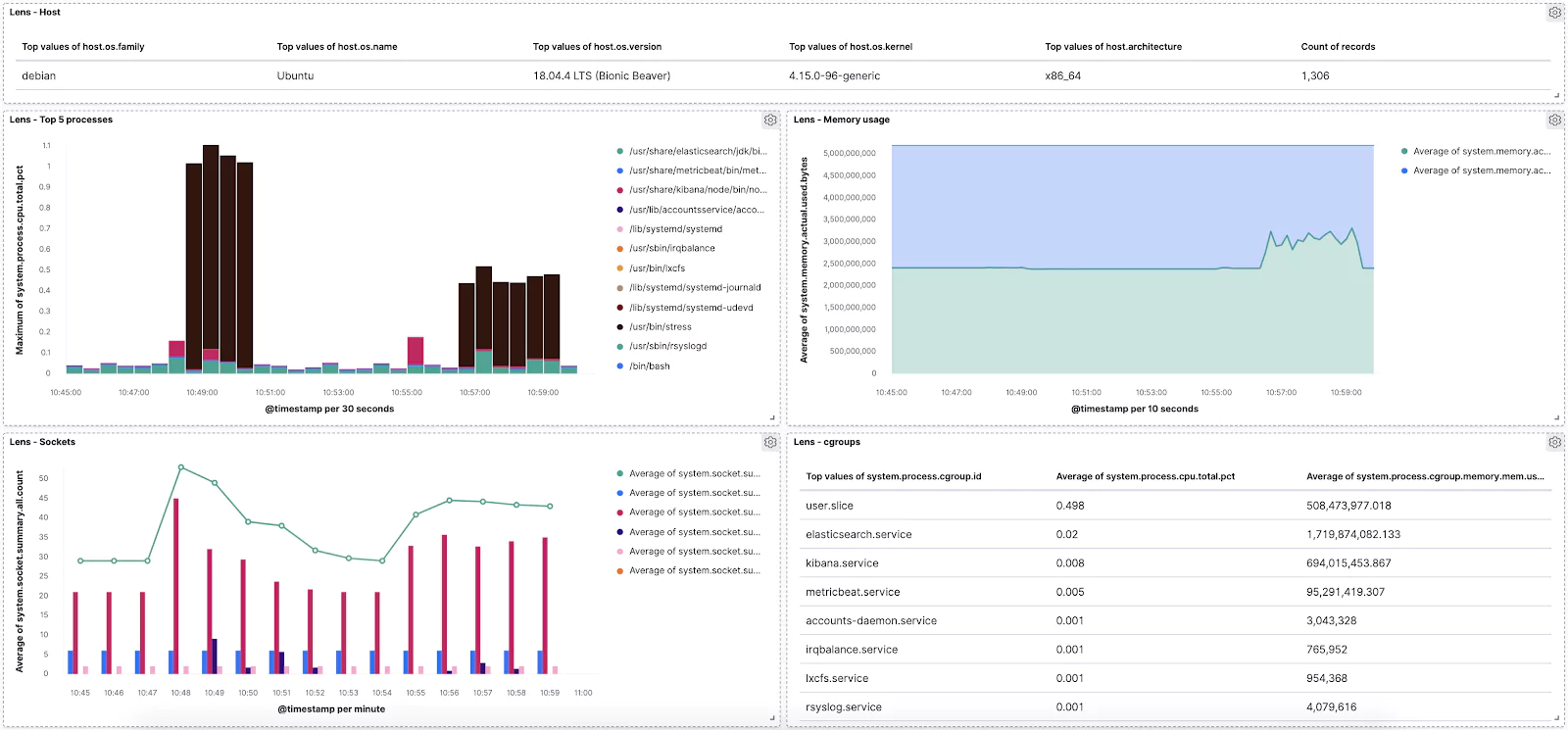
Dashboard
Naturally, the final step is combing everything we’ve done into a single dashboard to monitor our vitals.
Let’s open the Dashboard app from the left menu → Create new dashboard → Add visualization → and click on all of our saved Lens visualizations.
Done!
Now feel free to play around with the dashboard and add more visualizations. For example, see if you can add a Data Table of the “raw” data like this:
You are well prepared for any data exploration and visualization in the wild! Use Lens whenever you need to perform some data-driven experimentations with various metrics and dimensions that you have in your data visualization tools to tune your dashboards for the most effective storytelling.
Learn More
on the the System module of Metricbeat
This feature is not part of the open-source license but is free to use
Kibana Timelion is a time-series based visualization language that enables you to analyze time-series data in a more flexible way. compared to other visualization types that Kibana offers.
Instead of using a visual editor to create visualizations, Timelion uses a combination of chained functions, with a unique syntax, to depict any visualization, as complex as it may be.
The biggest value of using Timelion comes from the fact that you can concatenate any function on any log data. This means that you can plot a combination of functions made of different sets of logs within your index. It’s like creating a Join between uncorrelated logs except you don’t just fetch the entire set of data, but rather visualize their relationship. This is something no other Kibana visualization tool provides.
In this post, we’ll explore the variety of functions that Kibana Timelion supports, their syntax and options, and see some examples.
Return the absolute value of each value in the series list (Chainable)
.add() or .plus() or .sum()
Adds the values of one or more series in a seriesList to each position, in each series, of the input seriesList. (Chainable)
.aggregate()
Creates a static line based on result of processing all points in the series. (Chainable)
.bars()
Show the seriesList as bars (Chainable)
.color()
Change the color of the series (Chainable)
.cusum()
Return the cumulative sum of series, starting at a base. (Chainable)
.derivative()
Plot the change in values over time. (Chainable)
.divide()
Divides the values of one or more series in a seriesList to each position, in each series, of the input seriesList. (Chainable)
.es()
Pull data from an elasticsearch instance (Data Source)
.es(q)
Query in lucene query string syntax
.es(metric)
An elasticsearch metric aggregation: avg, sum, min, max, percentiles or cardinality, followed by a field. E.g. “sum:bytes_sent.numeric”, “percentiles:bytes_sent.numeric:1,25,50,75,95,99” or just “count”. If metric is not specified default option is count so it is redundant to use metric=count
.es(split)
An elasticsearch field to split the series on and a limit. E.g., “hostname:10” to get the top 10 hostnames
.es(index)
Index to query, wildcards accepted. Provide Index Pattern name for scripted fields and field name type ahead suggestions for metrics, split, and timefield arguments.
.es(timefield)
Field of type “date” to use for x-axis
.es(kibana)
Respect filters on Kibana dashboards. Only has an effect when using on Kibana dashboards
.es(offset)
Offset the series retrieval by a date expression, e.g., -1M to make events from one month ago appear as if they are happening now. Offset the series relative to the charts overall time range, by using the value “timerange”, e.g. “timerange:-2” will specify an offset that is twice the overall chart time range to the past.
.es(fit)
Algorithm to use for fitting series to the target time span and interval.
.fit()
Fill null values using a defined fit function (Chainable)
.hide()
Hide the series by default (Chainable)
.holt()
Sample the beginning of a series and use it to forecast what should happen via several optional parameters. In general, this doesn’t really predict the future, but predicts what should be happening right now according to past data, which can be useful for anomaly detection. Note that nulls will be filled with forecasted values. (Chainable)
.holt(alpha)
Smoothing weight from 0 to 1. Increasing alpha will make the new series more closely follow the original. Lowering it will make the series smoother.
.holt(beta)
Trending weight from 0 to 1. Increasing beta will make rising/falling lines continue to rise/fall longer. Lowering it will make the function learn the new trend faster.
.holt(gamma)
Seasonal weight from 0 to 1. Does your data look like a wave? Increasing this will give recent seasons more importance, thus changing the wave form faster. Lowering it will reduce the importance of new seasons, making history more important.
.holt(season)
How long is the season, e.g., 1w if your pattern repeats weekly. (Only useful with gamma)
.holt(sample)
The number of seasons to sample before starting to “predict” in a seasonal series. (Only useful with gamma, Default: all)
.if()
Compares each point to a number, or the same point in another series using an operator, then sets its value to the result if the condition proves true, with an optional else. (Chainable)
.if(operator)
comparison operator to use for comparison, valid operators are eq (equal), ne (not equal), lt (less than), lte (less than equal), gt (greater than), gte (greater than equal)
.if(if)
The value to which the point will be compared. If you pass a seriesList here the first series will be used
.if(then)
The value the point will be set to if the comparison is true. If you pass a seriesList here the first series will be used
.if(else)
The value the point will be set to if the comparison is false. If you pass a seriesList here the first series will be used
.label()
Change the label of the series. Use %s to reference the existing label. (Chainable)
.legend()
Set the position and style of the legend on the plot. (Chainable)
.legend(position)
Corner to place the legend in: nw, ne, se, sw. You can also pass false to disable the legend.
.legend(columns)
Number of columns to divide the legend into.
.legend(showTime)
Show the time value in legend when hovering over graph. Default: true.
.legend(timeFormat)
moment.js format pattern. Default: MMMM Do YYYY, HH:mm:ss.SSS
.lines()
Show the seriesList as lines. (Chainable)
.lines(fill)
Number between 0 and 10. Use for making area charts.
.lines(width)
Line thickness.
.lines(show)
Show or hide lines.
.lines(stack)
Stack lines, often misleading. At least use some fill if you use this.
.lines(steps)
Show line as step, e.g, do not interpolate between points
.log()
Return the logarithm value of each value in the seriesList (default base: 10). (Chainable)
.max()
Maximum values of one or more series in a seriesList to each position, in each series, of the input seriesList. (Chainable)
.min()
Minimum values of one or more series in a seriesList to each position, in each series, of the input seriesList. (Chainable)
.multiply()
Multiply the values of one or more series in a seriesList to each position, in each series, of the input seriesList. (Chainable)
.mvavg()
Calculate the moving average over a given window. Nice for smoothing noisy series. (Chainable)
.mvstd()
Calculate the moving standard deviation over a given window. Uses naive two-pass algorithm. Rounding errors may become more noticeav
.points()
Show the series as points. (Chainable)
.precision()
Number of digits to round the decimal portion of the value to. (Chainable)
.range()
Changes the max and min of the series while keeping the same shape. (Chainable)
.scale_interval()
Changes scales of a value (usually a sum or a count) to a new interval. For example, as a per-second rate. (Chainable)
.static() or .value()
Draws a single value across the chart. (Data Source)
.subtract()
Adds the values of one or more series in a seriesList to each position, in each series, of the input seriesList. (Chainable)
.title()
Adds a title to the top of the plot. If called on more than 1 seriesList the last call will be used. (Chainable)
.trend()
Draws a trend line using a specified regression algorithm. (Chainable)
.trim()
Set N buckets at the start or end of a series to null to fit the “partial bucket issue”. (Chainable)
.yaxis()
Configures a variety of y-axis options, the most important likely being the ability to add an Nth (e.g. 2nd) y-axis. (Chainable)
.yaxis(color)
Color of axis label
.yaxis(label)
Label for axis
.yaxis(max)
Max value
.yaxis(min)
Max value
.yaxis(position)
left or right
.yaxis(tickDecimals)
The number of decimal places for the y-axis tick labels.
.yaxis(units)
The function to use for formatting y-axis labels. One of: bits, bits/s, bytes, bytes/s, currency(:ISO 4217 currency code), percent, custom(:prefix:suffix)
.yaxis(yaxis)
The numbered y-axis to plot this series on, e.g., .yaxis(yaxis=2) for 2nd y-axis. If you are not plotting more than one .es() expression there is no meaning to yaxis=2,3,..
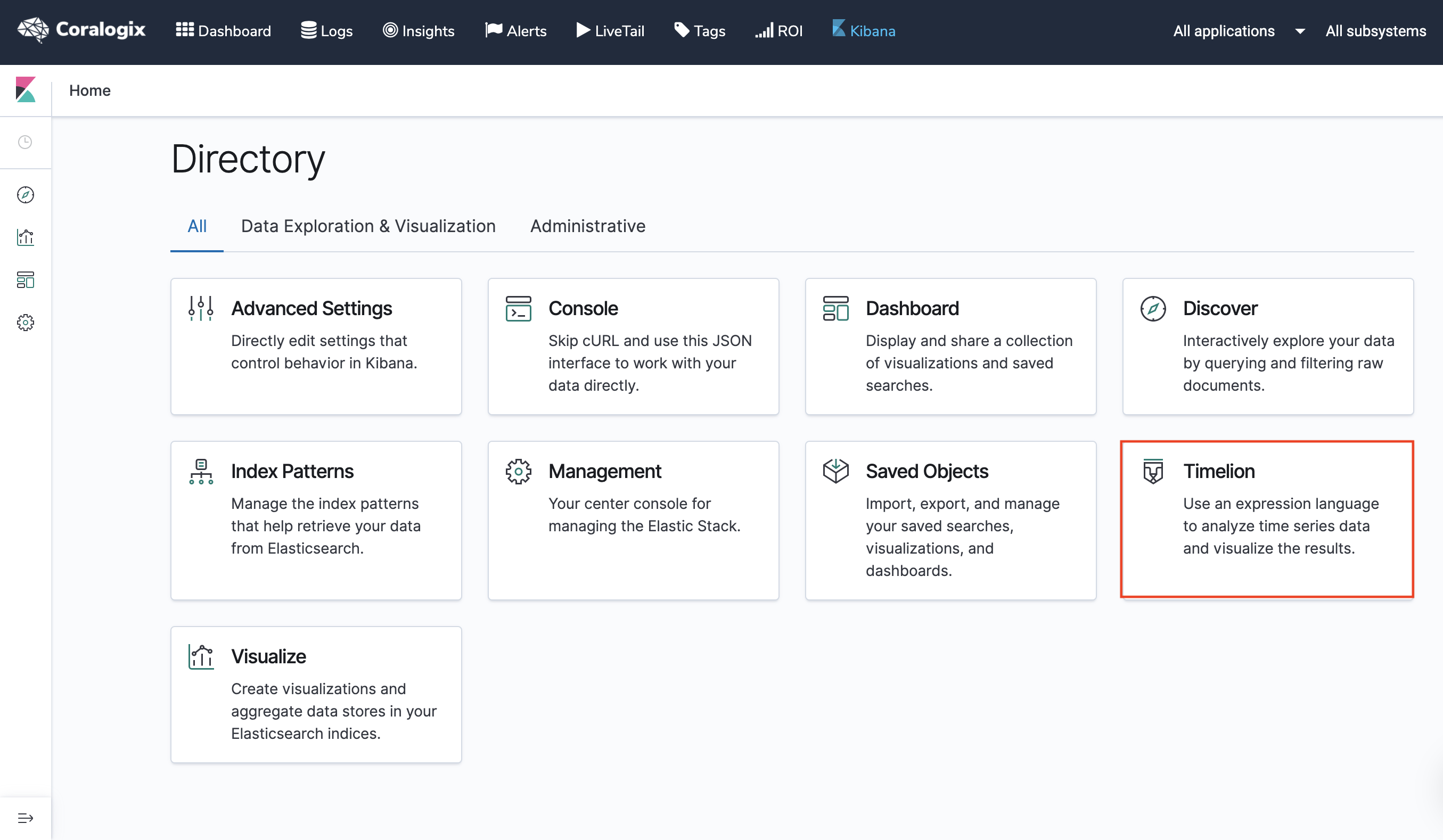
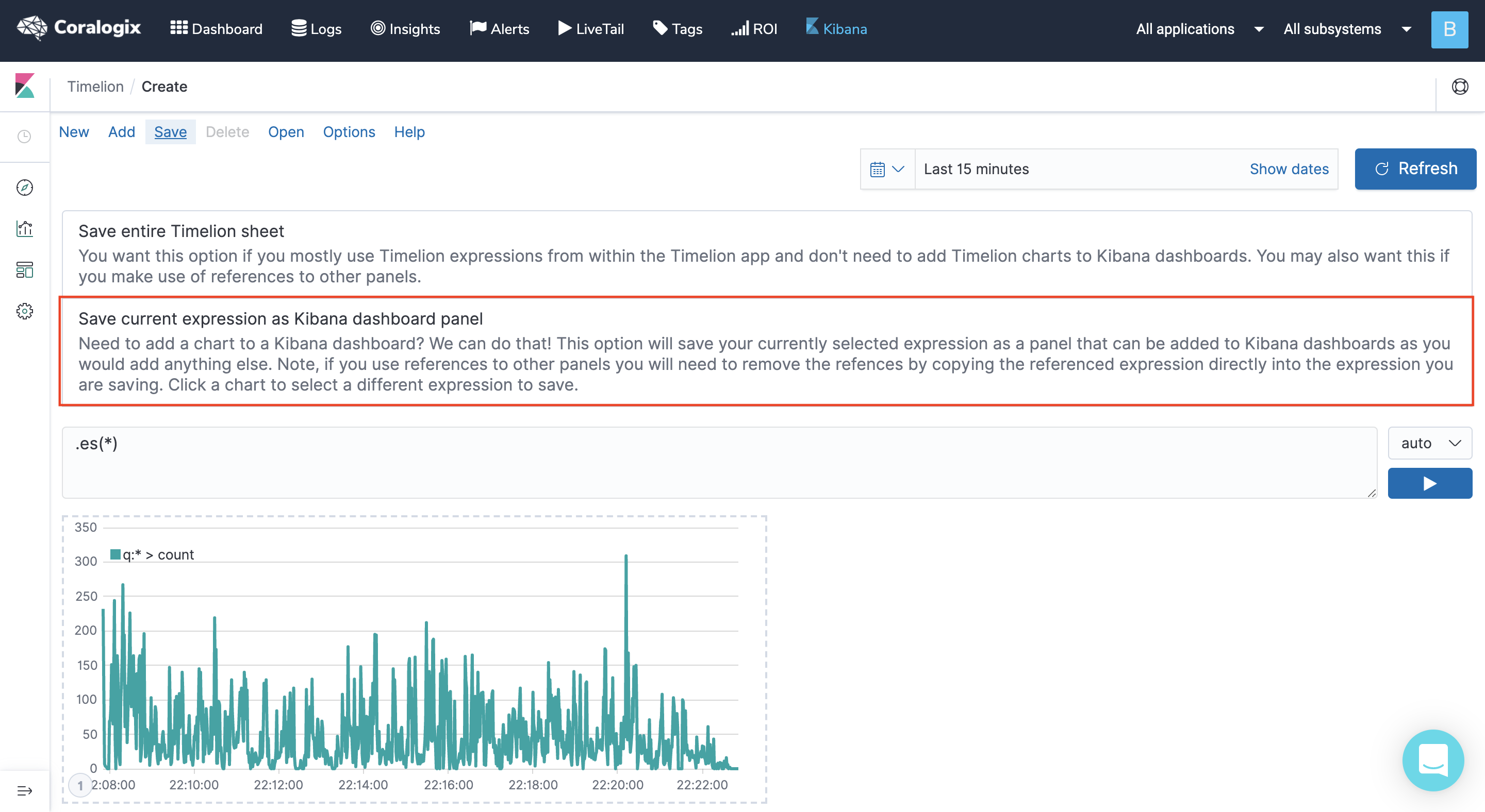
You can enter the Timelion wizard either from the main page when entering Kibana or from the visualizations section. If you enter it from the main screen make sure you choose “save current expression as Kibana dashboard panel” if your goal is to add the Timelion visualization to a Dashboard.
Use the index Argument in your .es() functions when building your Timelion expressions. By using it, any element you add, such as a metric, or a field will have auto-suggestions for names when starting to type. For example, .es(index=*:9466_newlogs*).
If you enable the Coralogix Logs2metrics feature and start to collect aggregations of your logs, using .es(index=*:9466_log_metrics*) lets you visualize those metrics. Using both index patterns in the same expression lets you visualize separate data sources like your logs and metrics. No other Kibana visualization gives you such an option. It will look like this: .es(index=*:9466_newlogs*),.es(index=*:9466_log_metrics*).
Use the Kibana Argument, with the true option in your .es() functions when building your Timelion expressions if you plan on integrating them with a Dashboard so that they’ll apply the filters in your dashboard. For example, .es(kibana=true).
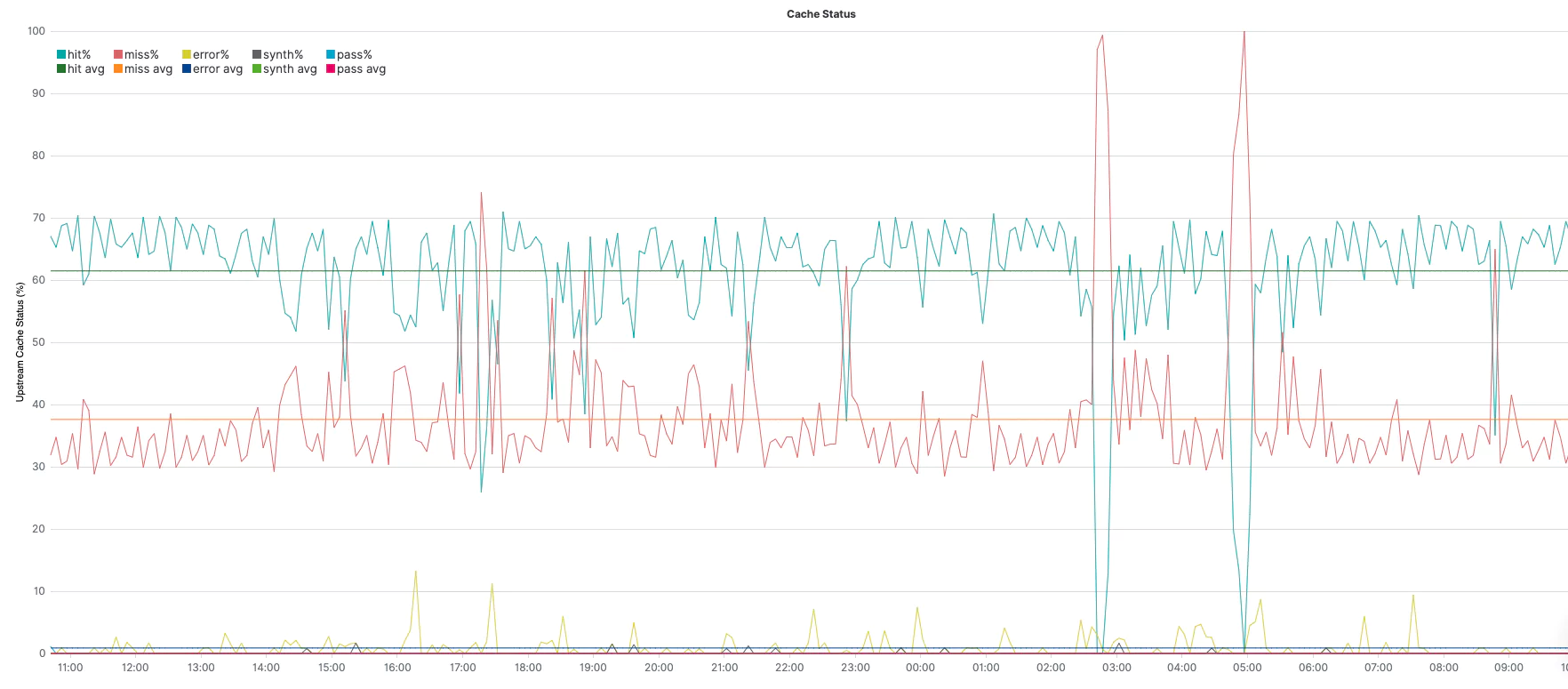
.es(q="_exists_:cache_status.keyword", split=cache_status.keyword:5) – query under q=; aggregate, per top 5 unique values of cache_status field, under split=
.divide() – divide the series by whatever is in parenthesis. In this case: .es(q="_exists_:upstream_cache_status.keyword") is the same query above, but without aggregating different values (=all values together). Together, (1) and (2) provide the % of each value.
.multiply(100) – convert 0..1 to 0..100 for an easier view of %.
.label(regex='.*upstream_cache_status.keyword:(.*) > .*', label='avg $1%') – change the label of the legend (match the original value with the regex and create a label with the result).
.lines(show=true,width=1) – This is the line styling.
.yaxis(1,min=0,max=100,null,'Upstream Cache Status (%)') the y-axis styling sets the min and max as constants for the %.
.legend(columns=5, position=nw) – sets 5 columns for the legend, as we have 5 splits in the above series, and place it at the northwest corner.
.title(title="Upstream Cache Status") – sets a title for the graph.
.aggregate(function=avg) – averages each of the different series (throughout the whole query timeframe).
Using two series, one for 1 through 8 (without averaging) and another series for 1 through 9 (with averaging), we can get each of the series along with its average in the same graph.
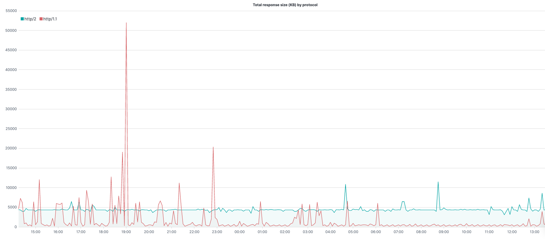
.es(kibana=true,q='_exists_:response.header_size', metric=sum:response.header_size.numeric,split=request.protocol.keyword:5) – query under q=; the metric to use (in this case sum of response header size) under metric=; aggregate, per top 5 unique values of request.protocol, under split=
.add() – adding to the series whatever is in parenthesis. In this case – .es(kibana=true,q='_exists_:response.body_size', metric=sum:response.body_size.numeric,split=request.protocol.keyword:5) is the same query above except we are summing the response body size rather than the header size. Together, (1) and (2) provide the total number of bytes for the response.
.divide(1024) – convert bytes to Kilobytes.
.label(regex='.*request.protocol.keyword:(.*) > .*', label='$1') – change the label of the legend (match the original value with the regex, create a label with the result).
.lines(width=1.4,fill=0.5) – line styling.
.legend(columns=5, position=nw) – sets 5 columns for the legend, as we have 5 splits in the above series, and place it at the northwest corner.
.title(title="Total response size (KB) by protocol") – set a title for the graph.
Using the .add() function with the same .es() function for the response body size, we can get the full response size even though our log data includes the size of the header and size of the body separately.
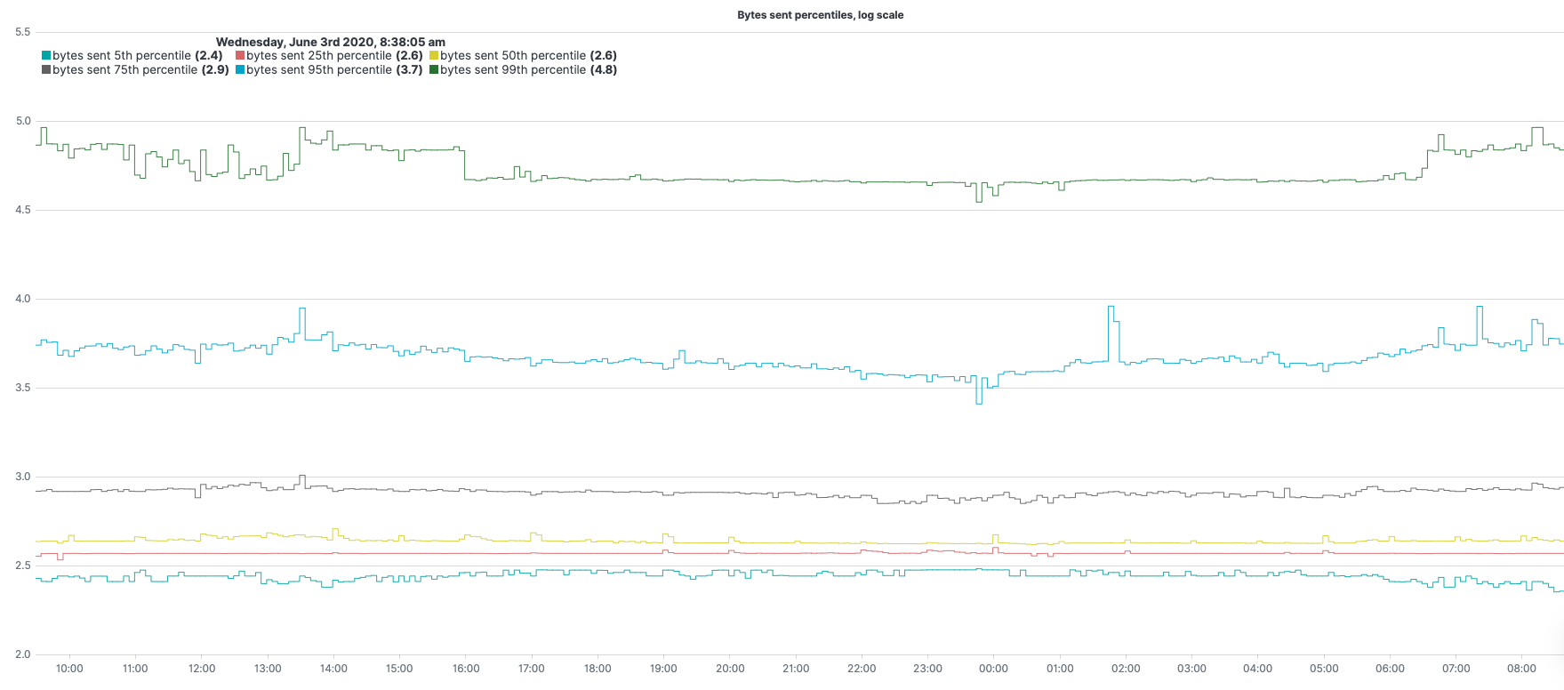
Bytes Sent
.es(metric="percentiles:bytes_sent.numeric:5,25,50,75,95,99").log().lines(width=0.9,steps=true).label(regex="q:* > percentiles([^.]+.numeric):([0-9]+).*",label="bytes sent $1th percentile").legend(columns=3,position=nw,timeFormat="dddd, MMMM Do YYYY, h:mm:ss a").title(title="Bytes sent percentiles, log scale")
.es(metric="percentiles:bytes_sent.numeric:5,25,50,75,95,99") – metric to use (in this case percentiles of bytes sent) under metric=
.log() – calculating log (with base 10 if not specified otherwise) for y-axis values of our expression.
.label(regex="q:* > percentiles([^.]+.numeric):([0-9]+).*",label="bytes sent $1th percentile") – change the label of the legend (match the original value with the regex, create a label with the result).
.lines(width=0.9,steps=true) – line styling.
.legend(columns=3,position=nw,timeFormat="dddd, MMMM Do YYYY, h:mm:ss a") – sets 3 columns for the legend and place it at the northwest corner.
.title(title="Bytes sent percentiles, log scale") – set a title for the graph.
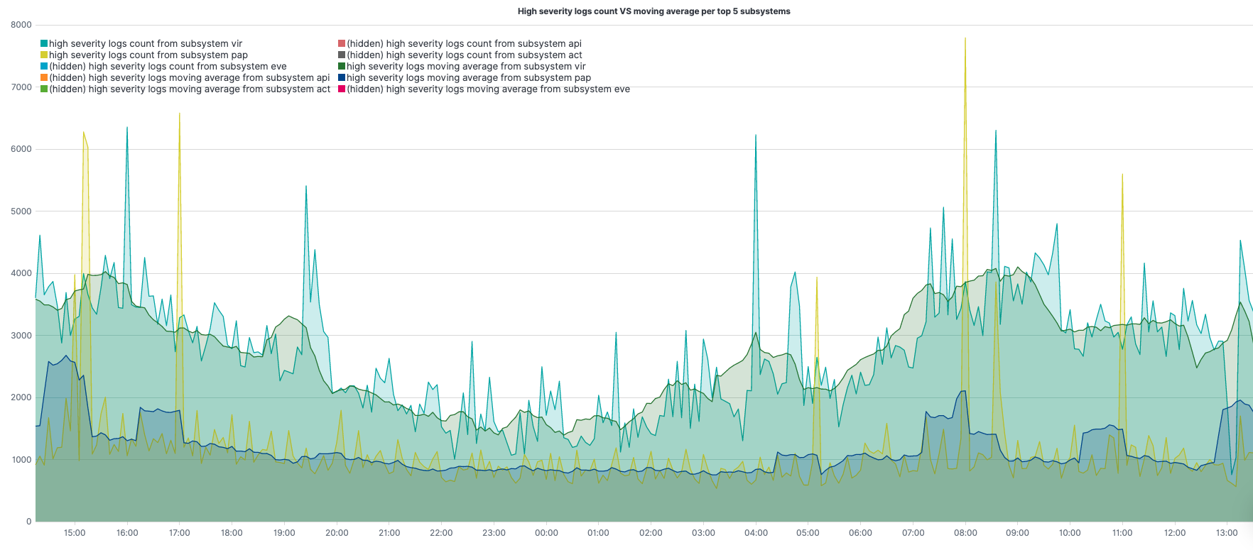
High severity logs
.es(q="coralogix.metadata.severity:(5 OR 6)",split=coralogix.metadata.subsystemName:5).lines(width=1.3,fill=2).label(regex=".*subsystemName:(.*) >.*",label="high severity logs count from subsystem $1").title(title="High severity logs count VS moving average per top 5 subsystems").legend(columns=2,position=nw),
.es(q="coralogix.metadata.severity:(5 OR 6)",split=coralogix.metadata.subsystemName:5).lines(width=1.3,fill=2).label(regex=".*subsystemName:(.*) >.*",label="high severity logs moving average from subsystem $1").mvavg(window=10,position=right)
.es(q="coralogix.metadata.severity:(5 OR 6)",split=coralogix.metadata.subsystemName:5) – query under q=; aggregate, per top 5 subsystems, under split=
.label(regex=".*subsystemName:(.*) >.*",label="high severity logs count from subsystem $1") – change the label of the legend for the 1st series (match the original value with the regex, create a label with the result).
.label(regex=".*subsystemName:(.*) >.*",label="high severity logs moving average from subsystem $1") – change the label of the legend for the 2nd series (match the original value with the regex, create a label with the result).
.lines(width=1.3,fill=2) – line styling.
.legend(columns=2, position=nw) – sets 2 columns for the legend, and place it at the northwest corner.
.title(title="High severity logs count VS moving average") – set a title for the graph.
.mvavg(window=10,position=right) – computes the moving average, sliding window of 10 points to the right of each computation point, for each of the different subsystems.
Using two series, 2nd series is the moving average for the 1st, we can get each of the series along with its moving average in the same graph.
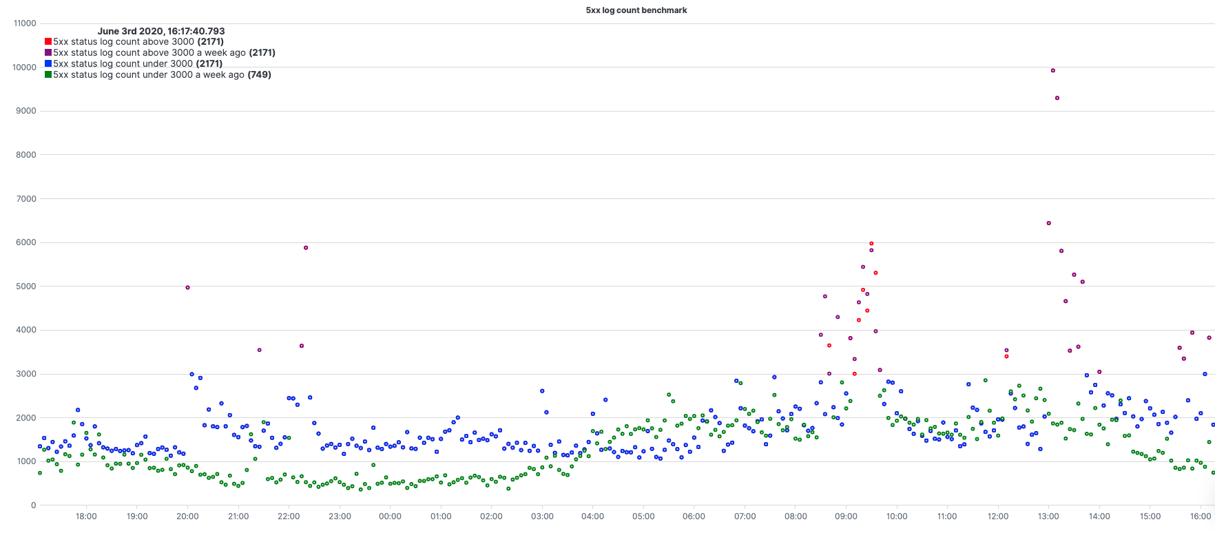
5xx responses benchmark
.es(q="status_code.numeric:[500 TO 599]").if(operator=lt,if=3000,then=.es(q="status_code.numeric:[500 TO 599]")).color(color=red).points(symbol=circle,radius=2).label(label="5xx status log count above 3000"),
.es(q="status_code.numeric:[500 TO 599]",offset=-1w).if(operator=lt,if=3000,then=.es(q="status_code.numeric:[500 TO 599]")).color(color=purple).points(symbol=circle,radius=2).label(label="5xx status log count above 3000 a week ago"),
.es(q="status_code.numeric:[500 TO 599]").if(operator=gte,if=3000,then=null).color(color=blue).points(symbol=circle,radius=2).label(label="5xx status log count under 3000"),
.es(q="status_code.numeric:[500 TO 599]",offset=-1w).if(operator=gte,if=3000,then=null).color(color=green).points(symbol=circle,radius=2).label(label="5xx status log count under 3000 a week ago").title(title="5xx log count benchmark")
.es(q="status_code.numeric:[500 TO 599]") – query under q=;
.es(q="status_code.numeric:[500 TO 599]",offset=-1w) – query with an offset of 1w.
.if(operator=lt,if=3000,then=.es(q="status_code.numeric:[500 TO 599]")) – when chained to a .es() series, each point from the origin series is compared with the value under the ‘if’ Argument. According to the operator (in this case, lt=less than) if the result is true, the value is set to the value under the ‘then’ Argument for each point of the series
.if(operator=gte,if=3000,then=null) – opposite to [3].
.color(color=red) – color styling.
.points(symbol=circle,radius=2) – setting the result to be presented with dots (circle signs) instead of a line.
.label(label="5xx status log count above 3000") – change the label of the legend.
.title(title="5xx log count benchmark") – set a title for the graph.
Using 4 series, 2 pairs of same expressions only second pair with an offset and between them setting them with different colors from a certain threshold, gives us a nice benchmark comparing our 5xx status compared with a week earlier.
Need help? Check our website and in-app chat for quick advice from our product specialists.
Amazon ELB (Elastic Load Balancing) allows you to make your applications highly available by using health checks and intelligently distributing traffic across a number of instances. It distributes incoming application traffic across multiple targets, such as Amazon EC2 instances, containers, IP addresses, and Lambda functions. You might have heard the terms, CLB, ALB, and NLB. All of them are types of load balancers under the ELB umbrella.
Types of Load Balancers
CLB: Classic Load Balancer is the previous generation of EC2 load balancer
ALB: Application Load Balancer is designed for web applications
NLB: Network Load Balancer operates at the network layer
This article will focus on ELB logs, you can get more in-depth information about ELB itself in this post
ELB Logs
Elastic Load Balancing provides access logs that capture detailed information about requests sent to your load balancer. Each ELB log contains information such as the time the request was received, the client’s IP address, latencies, request paths, and server responses.
ELB logs structure
Because of the evolution of ELB, documentation can be a bit confusing. Not surprisingly, there are three variations of the AWS ALB access logs; ALB, NLB, and CLB. We need to rely on the document header to understand which of the variant logs it describes (the URL and body will usually reference ELB generically).
How to collect ELB logs
The ELB access logging monitoring capability is integrated with Coralogix. The logs can be easily collected and sent straight to the Coralogix log management solution.
ALB Log Example
This is an example of a parsed ALB HTTP entry log:
Note that if you compare this log to the AWS log syntax table, we split the client address and port and target address and port into four different fields to make it easier.
ELB logs contain unstructured data. Using Coralogix parsing rules, you can easily transform the unstructured ELB logs into JSON format to get the full power of Coralogix and the Elastic stack working for you. Parsing rules use RegEx and I created the expressions for NLB, ALB-1,ALB-2, and CLB logs. The two ALB regexes cover “normal” ALB logs and the special cases of WAF, Lambda, or failed or partially fulfilled requests. In this cases AWS assigns the value ‘-‘ to the target_addr field with no port. You will see some time measurements assigned the value -1. Make sure you take it into account in your visualizations filters. Otherwise averages and other aggregations could be skewed. Amazon may add fields and change the log structure from time to time, so always check these against your own logs and make changes if needed. The examples should provide a solid foundation.
The following section requires some familiarity with regular expressions but just skip directly to the examples if you prefer.
A bit about why the regexes were created the way they were. Naturally, we always want to use a regex that is simple and efficient. At the same time, we should make sure that each rule captures the correct logs in the correct way (correct values matched with the correct fields). Think about a regex that starts with the following expression:
^(?P<timestamp>[^s]+)s*
It will work as long as the first field in the unstructured log is a timestamp, like in the case of CLB logs. However, in the case of NLB and ALB logs, the expression will capture the “type” field instead. Since the regex and rule have no context, it will just place the wrong value in the wrong JSON key. There are other differences that can cause problems like different numbers of fields or field order. To avoid this problem, we use the fact that NLB logs always start with ‘tls 1.0’ standing for the fields ’type’ and ‘version’, and that ALB logs start with a ‘type’ field with 6 optional values (http, https, h2, ws, wss).
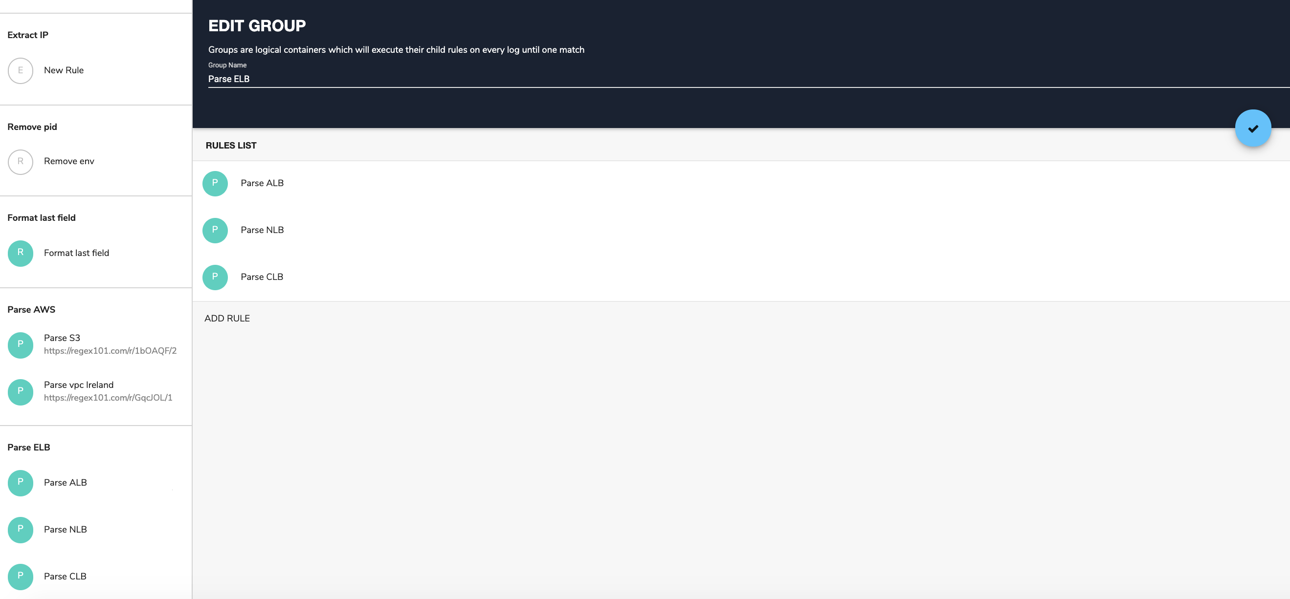
Note: As explained in the Coralogix rule tutorial, rules are organized by groups and executed by the order they appear within the group. When a rule matches a log, the log will move to the next group without processing the remaining rules within the same group.
Taking all this into account, we should:
Create a rule group called ‘Parse ELB’
Put the ALB and NLB rules first (these are the rules that look for the specific beginning of the respective logs) in the group
This approach will guarantee that each rule matches with the correct log.Now we are ready for the main part of this post.
In the following examples, we’ll describe how different ELB log fields can be used to indicate operational status. In the examples, we assume that the logs were parsed into JSON format. The examples will rely on the Coralogix alerts engine and on Kibana visualizations. They also provide additional insights into the different keys and values within the logs. Like always, we give you ideas and guidance on how to get more value out of your logs. However, every business environment is different and you are encouraged to take these ideas and build on top of them based on the best implementation for your infrastructure and goals. Last but not least, Elastic Load Balancing logs requests on a best-effort basis. The logs should be used to understand the nature of the requests, not as a complete accounting of all requests. In some cases, we will use ‘notify immediately’ alerts, but you should use ELB as a backup and not as the main vehicle for these types of alerts.
Tip: To learn the details of how to create Coralogix alerts you can read this guide.
Alerts
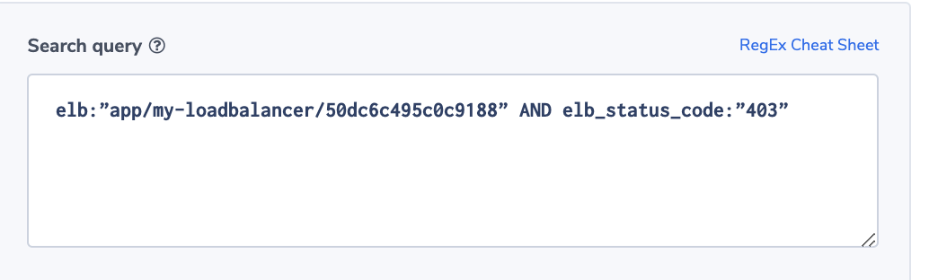
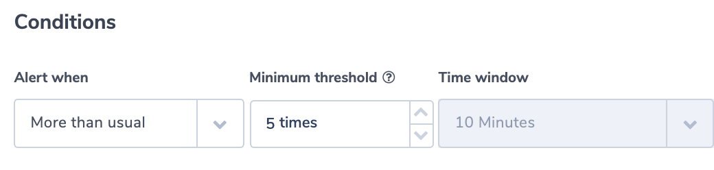
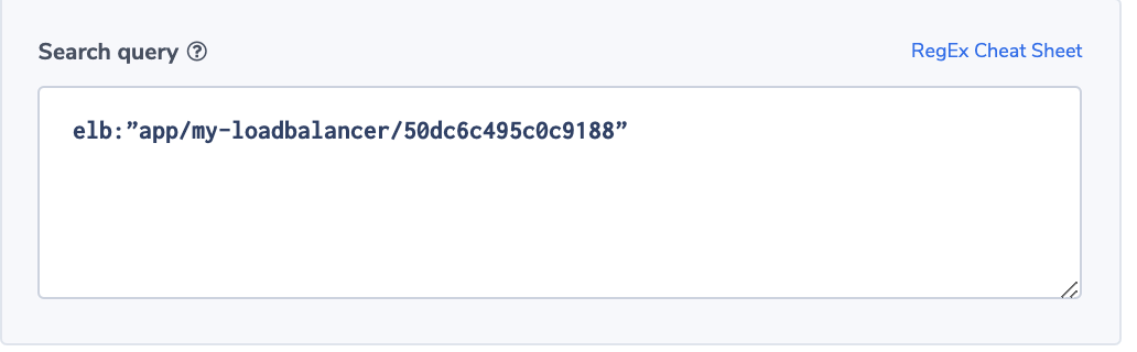
Increase in ELB WAF errors
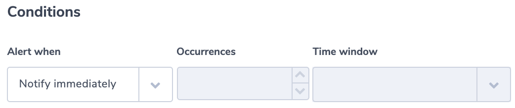
This alert identifies if a specific ELB generates 403 errors more than usual. A 403 error results from a request that is blocked by AWS WAF, Web Application Firewall. The alert uses the ‘more than usual’ option. With this option, Coraloix’s ML algorithms will identify normal behavior for every time period. It will trigger an alert if the number of errors is more than normal and is above the optional threshold supplied by the user.
Alert Filter:
elb:”app/my-loadbalancer/50dc6c495c0c9188” AND elb_status_code:”403”
Alert Condition: ‘More than usual’. The field elb_status_code can be found across ALB, CLB logs.
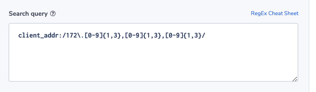
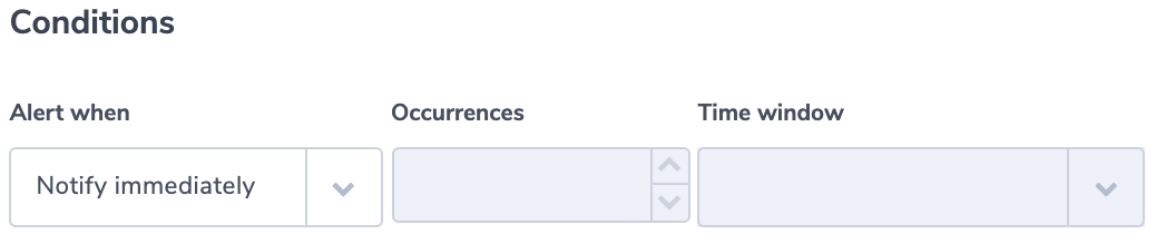
Outbound Traffic from a Restricted Address
In this example, we use the client field. It contains the IP of the requesting client. The alert will trigger if a request is coming from a restricted address. For the purpose of this example, we assume that permitted addresses are all under the subnet 172.xxx.xxx.xxx.
Note: Client_addr is found across NLB, ALB, and CLB.
Alert Condition:‘Notify immediately’.
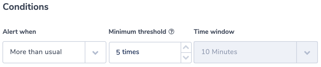
ELB Down
This alert identifies an inactive ELB. It uses the ‘less than’ alert condition. The threshold is set to no logs in 5 minutes. This should be adapted to your specific environment.
Alert Filter:
elb:”app/my-loadbalancer/50dc6c495c0c9188”
Alert Condition: ‘less than 1 in 5 minutes’’
This alert works across NLB, ALB, and CLB.
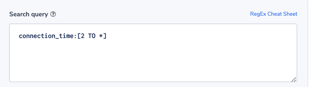
Long Connection Time
Knowing the type of transactions running on a specific ELB, ops would like to be alerted if connection times are unusually long. Here again, the Coralogix ‘more than usual” alert option will be very handy.
Alert Filter:
connection_time:[2 TO *]
Note: Connectiion_time is specific to NLB logs. You can create similar alerts on any of the time-related fields in any of the logs.
Alert Condition: ‘more than usual’
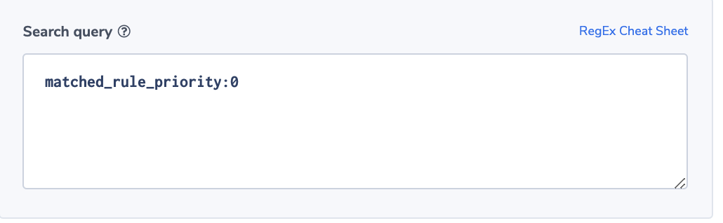
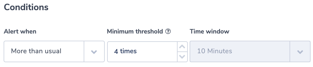
A Surge in ‘no rule’ Requests
The field ‘matched_rule_priority’ indicates the priority value of the rule that matched the request. The value 0 indicates that no rule was applied and the load balancer resorted to the default. Applying rules to requests is specifically important in highly regulated or secured environments. For such environments, it will be important to identify rule patterns and abnormal behavior. Coralogix has powerful ML algorithms focused on identifying deviation from a normal flow of logs. This alert will notify users if the number of requests not matched with a rule is more than the usual number.
Alert Filter:
matched_rule_priority:0
Note: This is an ALB field.
Alert Condition: ‘more than usual’
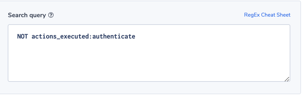
No Authentication
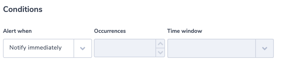
In this example, we assume a regulated environment. One of the requirements is that for every ELB request the load balancer should validate the session, authenticate the user, and add the user information to the request header, as specified by the rule configuration. This sequence of actions will be indicated by having the value ‘authenticate’ in the ‘actions_executed’ field. The field can include a few actions separated by ‘,’. Though ELB doesn’t guarantee that every request will be recorded, it is important to be notified of the existence of such a problem, so we will use the ‘notify immediately’ condition.
Alert Filter:
NOT actions_executed:authenticate
Note: This is an ALB field.
Alert Condition: ‘notify immediately’
Visualizations
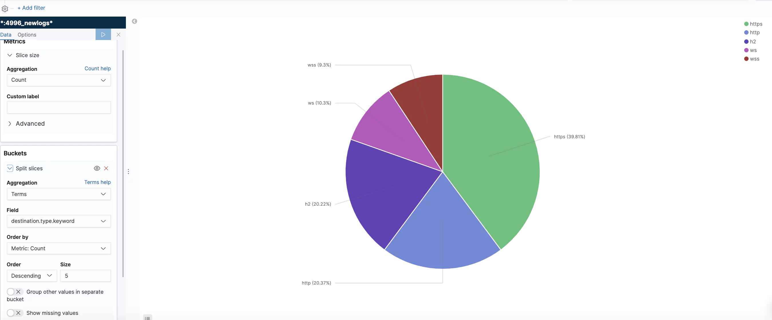
Traffic Type Distribution
Using the ‘type’ field this visualization shows the distribution of the different requests and connection types.
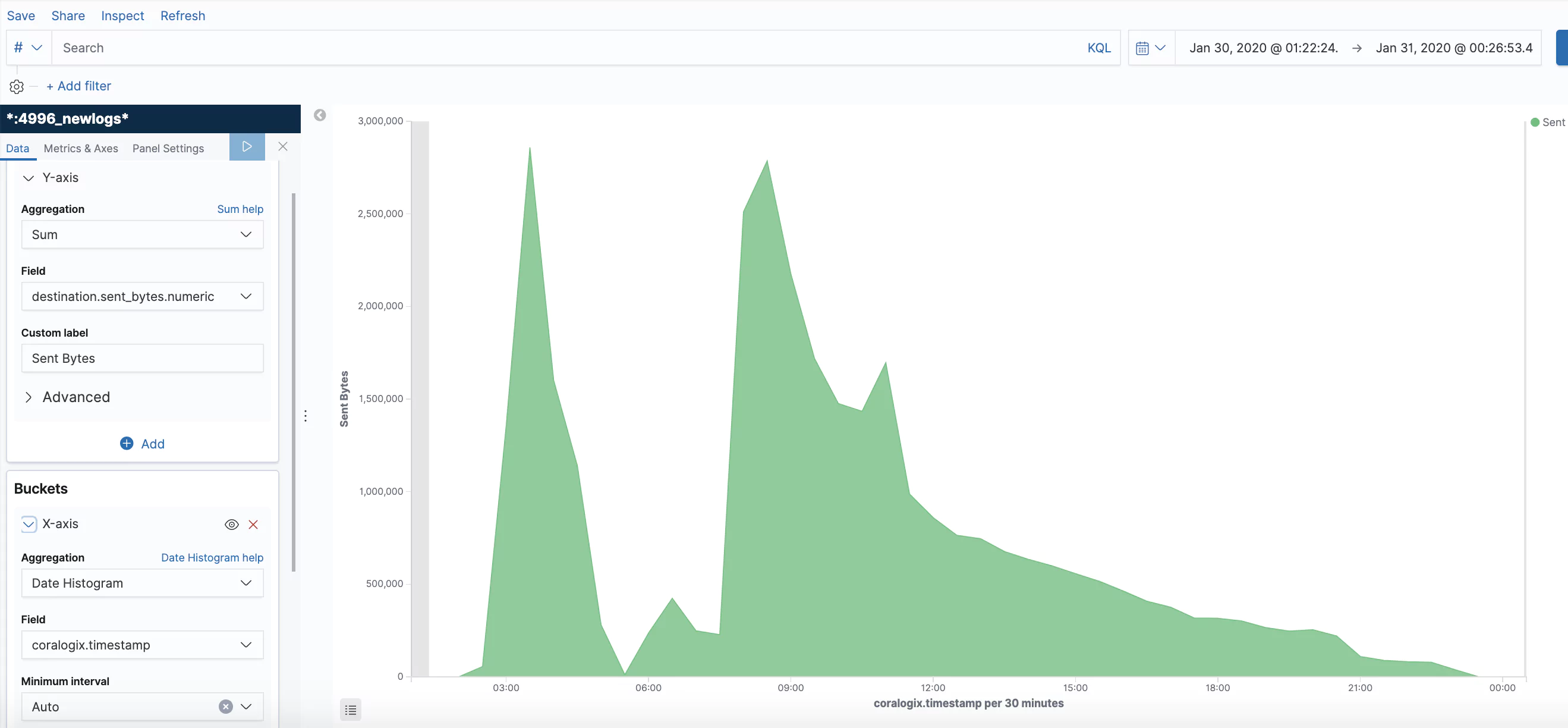
Bytes Sent
Summation of the number of bytes sent.
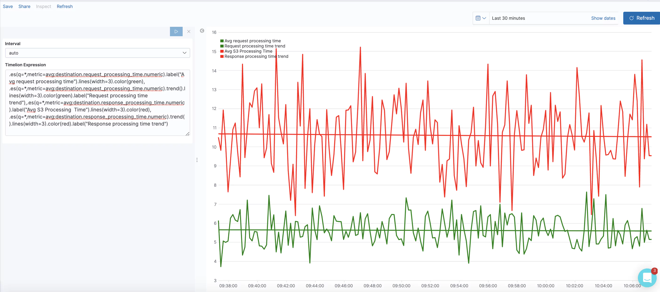
Average Request/Response Processing Time
Request processing time is the total time elapsed from the time the load balancer received the request until the time it sent it to a target. Response processing time is the total time elapsed from the time the load balancer received the response header from the target until it started to send the response to the client. In this visualization, we are using Timelion to track the average over time and generate a trend line.
Timelion expression:
.es(q=*,metric=avg:destination.request_processing_time.numeric).label("Avg request processing time").lines(width=3).color(green), .es(q=*,metric=avg:destination.request_processing_time.numeric).trend().lines(width=3).color(green).label("Avg request processing time trend"),.es(q=*,metric=avg:destination.response_processing_time.numeric).label("Avg response processing Time").lines(width=3).color(red), .es(q=*,metric=avg:destination.response_processing_time.numeric).trend().lines(width=3).color(red).label("Avg response processing time trend")
Average Response Processing Time by ELB
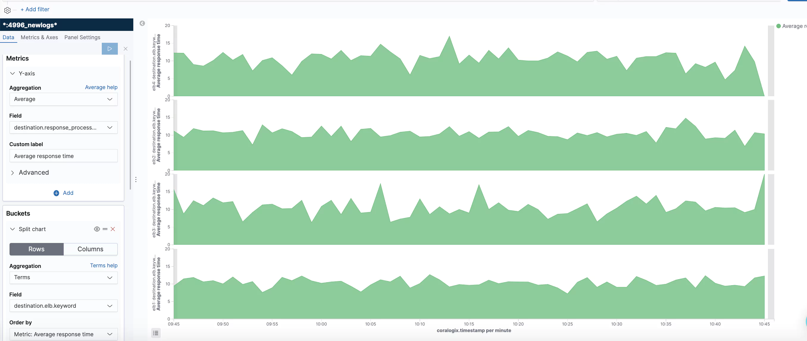
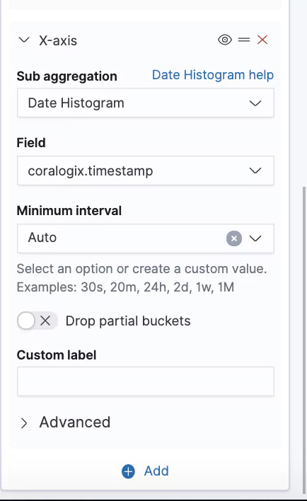
In this visualization, we show the average response processing time by ELB. We used the horizontal option. See the definition screens.
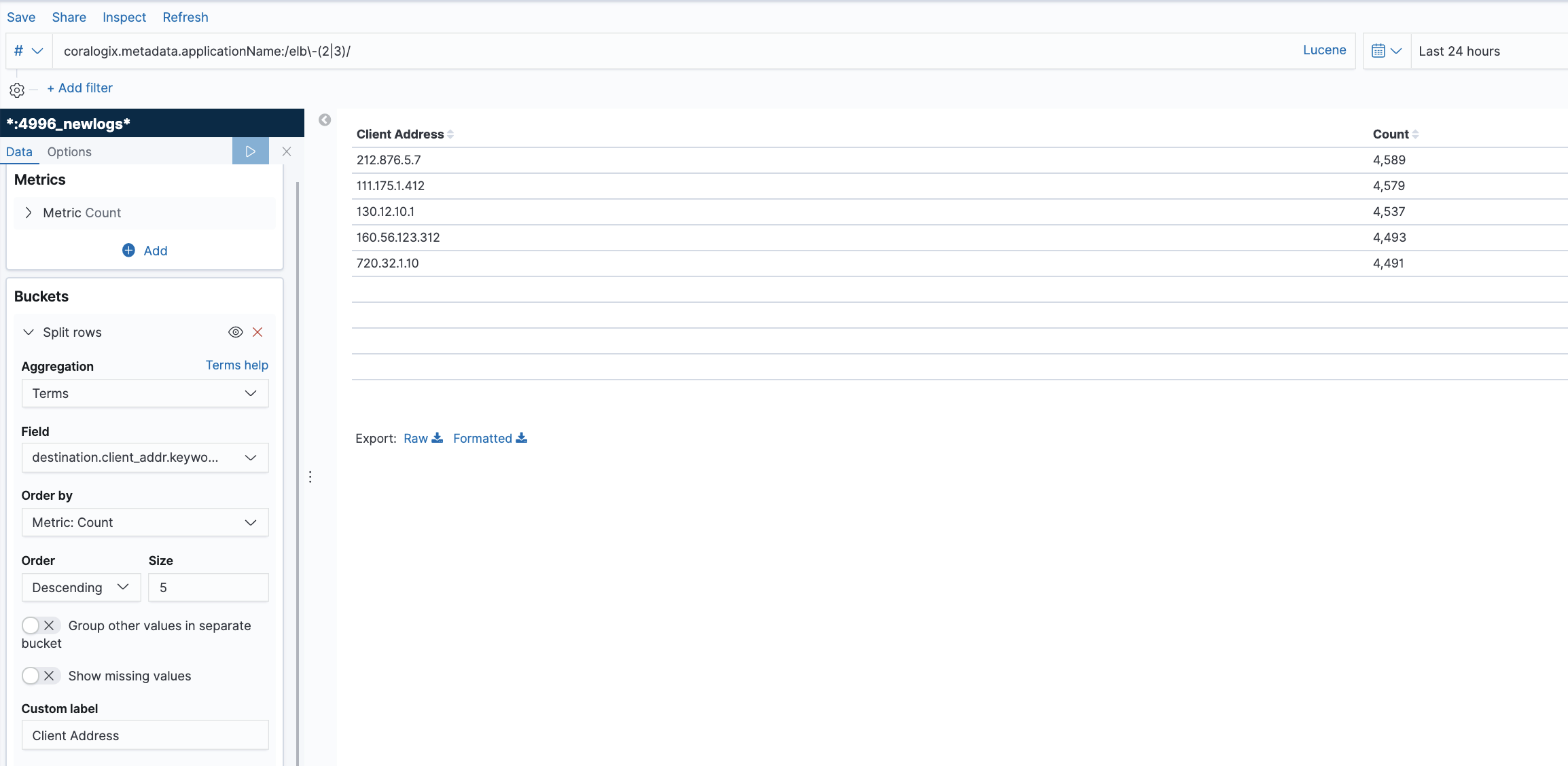
Top Client Requesters for a specific ELB
This table lists the top IP addresses generating requests to specific ELB’s. The ELB’s are separated by the metadata applicationName. This metadata field is assigned to the load balancer when you configure the integration. We created a Kibana filter that looks only at these two devices. You can read about filtering and querying in our tutorial.
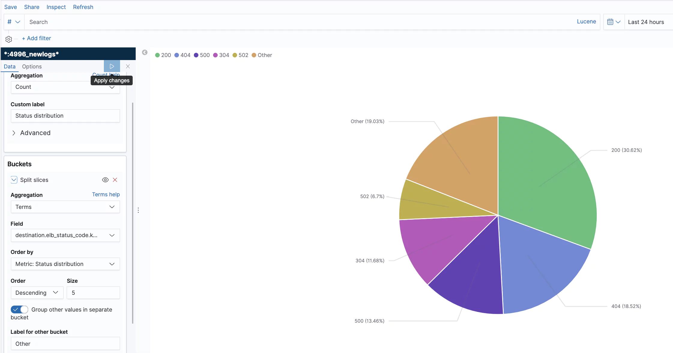
ELB Status Codes
This is an example showing the status code distribution for the last 24 hours.
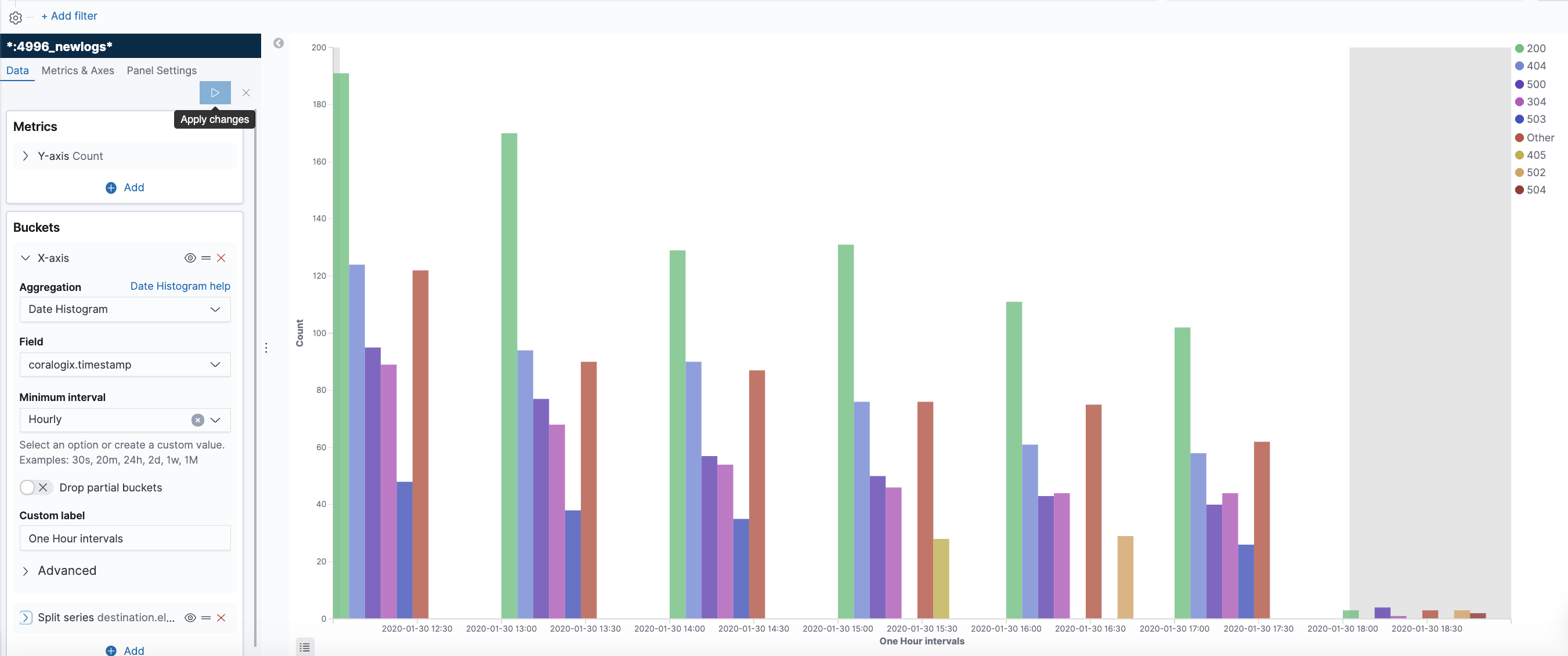
You can also create a more dynamic representation showing how the distribution behaves over time.
This blog post covered the different types of services that AWS provides under the ELB umbrella, NLB, ALB, and CLB. We focused on the logs these services generate and their structure, and showed some examples of alerts and visualizations that can help you unlock the value of these logs. Remember that every user is unique and has its own use case and data. Your logs might be customized and configured differently and you will most likely have your own requirements. So, you are encouraged to take the methods and concepts showed here and adapt them to your own needs. If you need help or have any questions, don’t hesitate and reach out to [email protected]. You can learn more about unlocking the value embedded in AWS ALB logs and other logs in some of our other blog posts.
Be Our Partner
Complete this form to speak with one of our partner managers.
Thank You
Someone from our team will reach out shortly. Talk to you soon!
 The new standard of observability is here. Discover Olly, the industry’s first