Unlocking Hidden Business Observability with Holistic Data Collection

Why do organizations invest in data observability?

Because it adds value. Sometimes we forget this when we’re building our observability solutions. We get so excited about what we’re tracking that we can lose sight of why we’re tracking it.

Technical metrics reveal how systems react to change. What they don’t give is a picture of how change impacts the broader business goals. The importance of qualitative data in business observability is often overlooked.

Data-driven insights which only include technical or quantitative modeling miss the big picture. Pulling data from holistic sources unlocks the full power of business observability.

Including holistic data collectors in your observability stack grants visibility not just into what’s happening, but why it happened, and the impact it has on your business outside of your systems.

What are Holistic Data Collectors?

Holistic data collectors draw from unusual or uncommon sources. They log information that wouldn’t usually be tracked, enabling businesses to get a holistic view of their systems. A holistic view means observability of all interconnected components.

A data strategy that includes the collection of holistic data empowers effective business observability. By logging as hidden pockets of data much clearer insight can be generated, and data-backed strategic decisions become much better informed.

The list of data sources it is possible to include is potentially limitless. With the proper application of collectors, any communication platform or user service can become a source of data and insight. Holistic data collectors exist for code repositories such as GitHub, collaboration tools like Teams or Slack, and even marketing data aggregators such as Tableau.

When and How to Use Holistic Data Collection

With some creative thinking and technical know-how, almost anything can be a source of holistic data. Common business tools, software, and platforms can be mined for useful data and analysis.

Below are some examples that exemplify and illustrate the usefulness of this approach to data-driven insight.

Microsoft Teams

Microsoft Teams has become a vital communication channel for the modern enterprise. As one of the most popular internal communication platforms on the market, Teams can be an invaluable source of holistic data from within your workforce.

Integrating webhooks into Teams enables you to monitor and track specific activity. Webhooks are a simple HTTP callback, usually in JSON format. They’re one of the simplest ways to connect your systems to an externally hosted channel such as Teams.

Pushing holistic, qualitative Teams data to a third party platform using webhooks enables correlation of non-numeric insight with finance and marketing figures and system metrics. 

As Teams is most often used internally, this is an invaluable asset for understanding how changes to your organization are reflected in the morale of your staff. Many developers use Teams to discuss issues and outages. Having visibility of your IT team’s responses identifies which tasks take the most of their time and what knowledge blindspots exist in their collective technical skillset.

PagerDuty

PagerDuty is transforming the way IT teams deal with incidents. Integrating holistic data collectors greatly expands the level of insight gained from this powerful tool.

High levels of criteria specificity on alerts and push notifications to enable effective prioritizing of support. IT teams can manage large sets of alerts without risking an overwhelming amount of notifications.

As with Teams, webhooks are one of the most common and simplest methods of collecting holistic data from PagerDuty. By collecting enriched event data around incidents, outages, and how your IT teams respond can be analyzed in the context of the wider business organization.

GitHub

Scraping GitHub provides great insight into the performance of your dev teams. What’s not as widely known is the business insight that can be gained by correlating GitHub commits on repositories.

Commits are changes to code in GitHub. Each commit comes with a comment message and log. Keeping GitHub commits under the eye of your monitoring stack reveals a fascinating hidden pocket of data that could change the way your teams approach outages and troubleshooting.

Outages occur for many reasons. Some require more work and code changes than others. Bad or lazy coding creates a lot of outages. Tracking and logging GitHub commits will reveal both the kinds of outages and the specific chunks of code that take up the most time for your engineers.

GitOps

Monitoring GitOps declarations and version edits pinpoint not only where weaknesses exist at an architectural level, but when they were implemented and whether the problem is isolated or part of a wider trend.  

Tableau

Tableau is an invaluable source of marketing data. Integrating Tableau with your log analytics platform opens up integral insight.

Digital marketing is an essential business aspect of modern enterprises. An effective digital marketing presence is key to success, and Tableau is the go-to tool for many organizations.

Tableau is useful for market strategy. It’s when Tableau data is included as part of a wider, holistic picture that organizational intelligence and insight can be gained from it. Scraping Tableau for data such as page bounce rates and read time allows you to see how technical measurements correlate with your marketing metrics.

Silo-Free Reporting

Say you’ve experienced a sudden dip in online sales despite an advertising drive. Your first reaction could be to blame the marketing material.

By including Tableau data in your analytics and reporting you can see that the advertising campaign was successful. Your website had a spike in visitors. This spike in traffic led to lag and a poor customer experience, visible due to an equally large spike in bounce rate. 

Scraping Tableau as a source of holistic data reveals that the sales dip was down to issues with your systems. Your strategy can then be to improve your systems so they can keep up with your successful marketing and large digital presence.

Jira

Integrating your analytics and monitoring platform with Jira can yield powerful results, both in alerting capabilities and collecting insight-generating data.

Using webhooks, your integrated platform can create Jira tickets based on predefined criteria. These criteria can be defined based on data from other sources in your ecosystem, as the issue is being raised and pushed from a third party platform.

Automating this process enables your IT team to deploy themselves both efficiently and with speed. It allows them to concentrate on resolving issues without getting bogged down in logging and pushing the alerts manually.

By having tickets raised by an ML-powered platform with observability over your whole infrastructure, your engineers won’t be blindsided by errors occurring in areas they may not have predicted.  

Use Case: Measuring the Business Impact of Third Party Outages with Holistic Collectors

Third party outages are one of the most common reasons for lost productivity and revenue. Many enterprises rely on third party software, systems, or services to deliver their own. Reliance on one or more third parties is the norm for many sectors and industries.

A third party will inevitably experience an outage at some point.  There’s no way to avoid this. Even the most reliable provider can fall victim to unforeseen circumstances such as power cuts or emergency server maintenance from time to time.

Third party outages can have huge ramifications. These services are often business-critical, and the financial costs of even brief outages can reach far past the hundred thousand dollar mark. 

Lost revenue is one way to measure the impact of such an outage. While financial data helps understand the initial impact of unforeseen downtime, alone it doesn’t provide full visibility of long-term consequences or the reaction of the business and consumers.

Collecting holistic data alongside the usual logging metrics helps to fill in the blanks. It allows a business to answer questions like:

  • Has this affected our public reputation?
  • Are users speaking positively about our response?
  • Did we respond faster or slower to this outage than usual?
  • Was our response effective at returning us to BAU as soon as possible?
  • Is this affecting the morale of our staff?
  • How much work is this making for my IT team?
  • Has web traffic taken a hit?

This leaves any business or organization in a much better position to control and mitigate the long-term impact of a third party outage. 

A study by Deloitte found that direct losses due to third party mismanagement have been found to directly cost businesses as much as $48m. This is before indirect losses are factored in. An outage could have minor immediate financial ramifications but damage long-term prospects through reputational damage. It would be almost impossible to gain the insight to prevent this using financial or systems metrics alone.

A Complete Holistic Data Solution

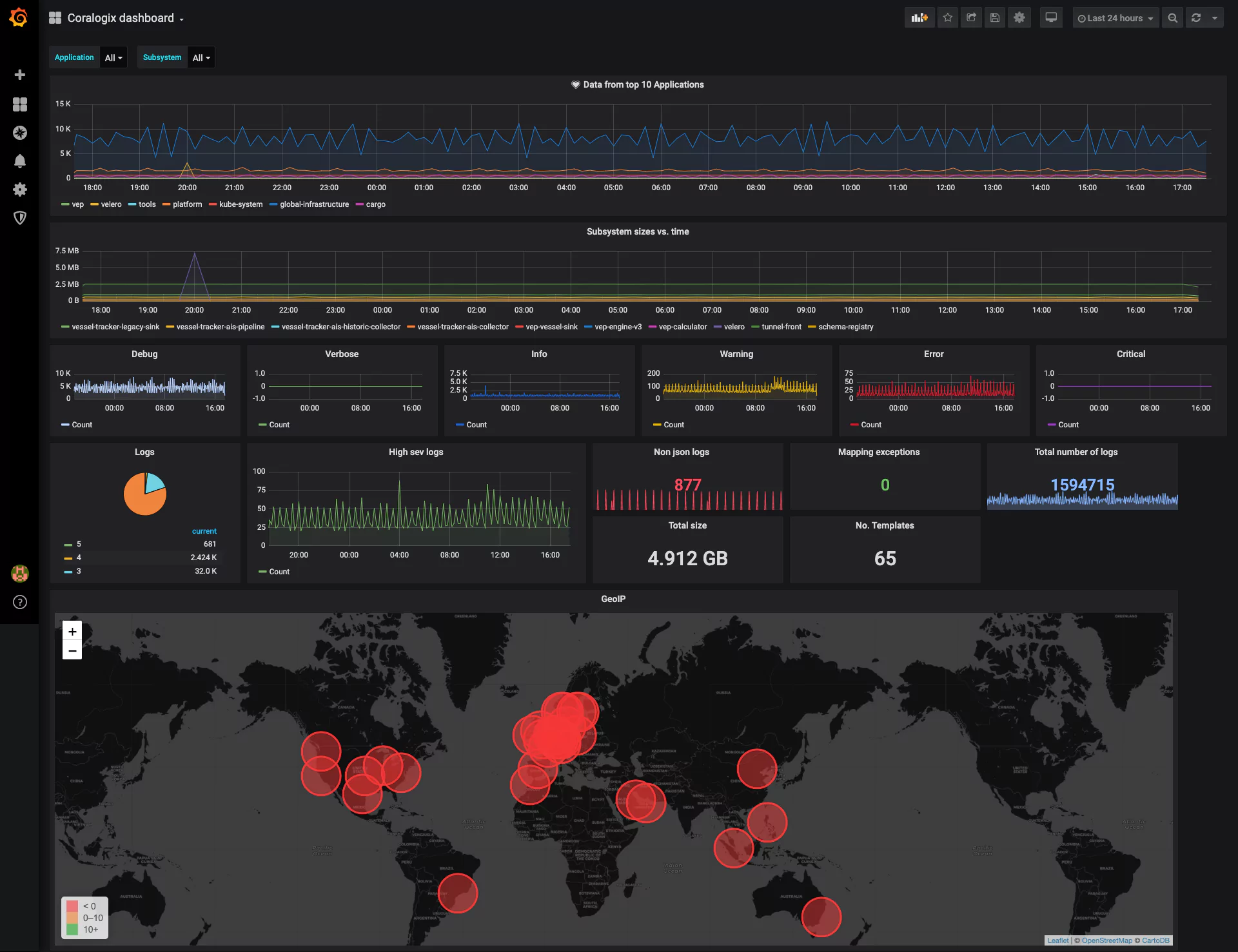
The Coralogix observability platform is a monitoring solution that enables holistic data collection from sources such as Teams, GitHub, PagerDuty, Slack, Tableau, and many others.

Collecting and logging data from multiple sources, both traditional and unorthodox, can be difficult to manage. Business intelligence and organizational insight are difficult to gain if information is stored and reported from dozens of sources in as many formats.

Coralogix’s observability platform provides a holistic system and organized view in a single pane. Using machine learning, our platform creates a comprehensive picture of your technical estate that comes with actionable business context. For visibility and insight that extends beyond the purely technical, the Coralogix platform is the solution your business needs.

Where is Your Next Release Bottleneck? 

A typical modern DevOps pipeline includes eight major stages, and unfortunately, a release bottleneck can appear at any point:

devops pipeline

These may slow down productivity and limit a company’s ability to progress. This could damage their reputation, especially if a bug fix needs to be immediately deployed into production.

This article will cover three key ways using data gathered from your DevOps pipeline can help you find and alleviate bottlenecks in your DevOps pipeline.

1. Increasing the velocity of your team

To improve velocity in DevOps, it’s important to understand the end-to-end application delivery lifecycle to map the time and effort in each phase. This mapping is performed using the data pulled directly and continuously from the tools and systems in the delivery lifecycle. It helps detect and eliminate bottlenecks and ‘waste’ in the overall system. 

Teams gather data and metrics from build, configuration, deployment and release tools. This data can contain information such as release details, duration of each phase, whether the phase is successful and more. However, none of these tools paint the whole picture.

By analyzing and monitoring this data in aggregate, DevOps teams benefit from an actionable view of the end-to-end application delivery value stream, both in real-time and historically. This data can be used to streamline or eliminate the bottlenecks that are slowing the next release down and also enable continuous improvement in delivery cycle time.

2. Improving the quality of your code

Analyzing data from the testing performed for a release, enables the DevOps teams to see all the quality issues in new releases and remediate them before implementing into production. Ideally preventing post-implementation fixes.

In modern DevOps environments, most (if not all) of the testing process is achieved with automated testing tools. Different tools are usually used for ‘white box’ testing versus ‘black box’ testing. While the former aims to cover code security, dependencies, comments, policy, quality, and compliance testing, the latter covers functionality, regression, performance, resilience, penetration testing, and meta-analysis like code coverage and test duration.

Again, none of these tools paints the whole picture, but analyzing the aggregate data enables DevOps teams to make faster and better decisions about overall application quality, even across multiple QA teams and tools. This data can even be fed into further automation. For example:

  • Notify the development team of failing code which breaks the latest build. 
  • Send a new code review notification to a different developer or team.
  • Push the fix forward into UAT/pre-prod.
  • Implement the fix into production.

There are some great static analysis tools that can be integrated into the developers’ pipeline to validate the quality, security, and unit test coverage of the code before it even gets to the testers. 

This ability to ‘shift left’ to the Test stage in the DevOps loop (to find and prevent defects early) enables rapid go/no-go decisions based on real-world data. It also dramatically improves the quality of the code that is implemented into production, by ensuring failing or poor quality code is fixed or improved. Therefore reducing ‘defect’ bottlenecks in the codebase

3. Focusing in on your market

Data analytics from real-world customer experience enables DevOps teams to reliably connect application delivery with business goals. It is critical to connect technology and application delivery with business data. While technical teams need data on timings like website page rendering speeds, the business needs data on the impact of new releases.

This includes metrics like new users / closed accounts, completed sales/items stuck in the shopping cart and income. No single source provides a complete view of this data, as it’s isolated across multiple applications, middleware, web servers, mobile devices, APIs, and more.

Fail Fast, Fail Small, Fail Cheap!

Analyzing and monitoring the aggregate data to generate business-relevant impact metrics enables DevOps teams to:

  • Innovate in increments 
  • Try new things
  • Inspect the results
  • Compare with business goals
  • Iterate quickly

Blocking low-quality releases can ultimately help contain several bottlenecks that are likely to crop up further along in the pipeline. This is the key behind ‘fail fast, fail small, fail cheap’, a core principle behind successful innovation.

Bottlenecks can appear in a release pipeline. Individually, many different tools all paint part of the release picture. But only by analyzing and monitoring data from all these tools can you see a full end-to-end, data-driven approach that can assist in eliminating bottlenecks. This can improve the overall effectiveness of DevOps teams by enabling increased velocity, improved code quality and increased business impact.

Getting Started with Grafana Dashboards using Coralogix

One of the most common dashboards for metric visualization and alerting is, of course, Grafana. In addition to logs, we use metrics to ensure the stability and operational observability of our product. 

This document will describe some basic Grafana operations you can perform with the Coralogix-Grafana integration. We will use a generic Coralogix Grafana dashboard that has statistics and information based on logs. It was built to be portable across accounts. 


Grafana Dashboard Setup

The first step will be to configure Grafana to work with Coralogix. Please follow the steps described in this tutorial.

Download Coralogix-Grafana-Dashboard

Import Dashboard:

  1. Click the plus sign on the left pane in the Grafana window and choose import
  2. Click on “upload .json file” and select the file that you previously downloaded
  3. Choose the data source that you’ve configured
  4. Enjoy your dashboard 🙂


Basic Dashboard Settings

Grafana Time Frame

  1. Change the timeframe easily by clicking on the time button on the upper right corner.
  2. You can select the auto-refresh or any other refresh timeframe using the refresh button on the upper right corner.


Grafana Panels

Panels are the basic visualization building block in Grafana.

Let’s add a new panel to our dashboard:

1. Click the graph button with the plus sign on the upper right corner – A new empty panel should open. 

2. Choose the panel type using the 3 buttons:

  • “Convert to row” – A row is a logical divider within a dashboard that can be used to group panels together. Practically creating a sub dashboard within the main dashboard.
  • “Add a new query” – “Query” is a graph that describes the results of a query. It outlines the log count that the query returns per the time frame. Queries support alerts.
  • “Add a new visualization” – Visualsions allows for a much reacher format, giving the user the option to choose between graph bars, lines. Heat maps etc.

3. Select “Add a new query”. It will open the query settings form and you will be able to make the following selections:

  • choose the data source that you want to query.
  • Write your query in Lucene (Elastic) syntax. 
  • Choose your metric
  • You can adjust the interval to your needs


Grafana Variables

Variables are the filters at the top of the dashboard.

To configure a new variable:

  1. Go to dashboard settings (the gear at the top right)
  2. Choose variables and click new
  3. Give it a name, choose your data source, and set the type to query
  4. Define your filter query. As an example, the following filter query will create a selection list that includes the first 1000 usernames, ordered alphabetically {“find”: “terms”, “field”: “username”, “size”: 1000}
  5. Add the variables’ names to each panel you would like the filter to be applied to. The format is $username (using the example from step 4).


Grafana Dashboard Visualizations

Now, let’s explore the new dashboard visualizations:


  1. Data from the top 10 applications: This panel (of type query) displays the account data flow (count of logs) aggregated by applications. You can change the number of applications that you want to monitor by increasing/decreasing the term size. You can see the panel definition here:

This panel includes an alert that will be triggered if an average of zero logs were sent during the past 5 minutes. To access the alert definition screen click on the bell icon on the panel definition pane. Note that you can’t define an alert when you apply a variable on the panel.

  1. Subsystem sizes vs. time: in this panel (of type query), you can see the sum by size. The sums are grouped by a subsystem, you can see the panel definition here:
  2. Debug, Verbose, Info, Warning, Error, Critical:  In these panels (of type query), you can see the data flow segmented by severity. Coralogix severities are identified by numbers 1-6 designating debug to critical. Here is the panel definition for debug:
  3. Logs:  In this panel (of type visualization), we’ve used the pie chart plugin, it shows all the logs of the selected timeframe grouped by severity. You can use this kind of panel when you want to aggregate your data by a specific field. You can see the panel definition here:
  4. The following 5 panels (of type visualization) are similar to each other regarding definition. They use the stat visualization format and show a number indicating the selected metric within the time frame. Here’s on example of the panel definition screen:
  5. GeoIP: In this panel (of type visualization), we use a world map plugin. Also, we’ve enabled the geo enrichment feature in Coralogix. Here is the panel definition:

Under the “queries” settings choose to group by “Geo Hash Grid”, the field should be from geo_point type.

Under the Visualization, settings select these parameters in “map data options” and add to the field mapping the name of the field that contains the coordinates (the same field you chose to group by). To access visualizations settings click on the graph icon on the left-hand side.


For any further questions on Grafana and how you can utilize it using Coralogix or even if managing your own Elasticseach, feel free to reach out via chat. We’re always available right here at the bottom right chat bubble.